Color theory warm and cool colors neutral colors tricks for artists

Artists should know about warm colors, cool colors, and neutral colors for making the art communicative and attractive.
Warm and cool colors in a color wheel of six colors.
It has primary and secondary colors. Blue is the only primary color that is cool. The other two primary colors, viz, yellow and red are warm colors.
Take a look at them.

Red, orange, and yellow are warm colors. Green, blue, and purple are cool colors. Warm and cool colors have effects on viewer psychology and perception.
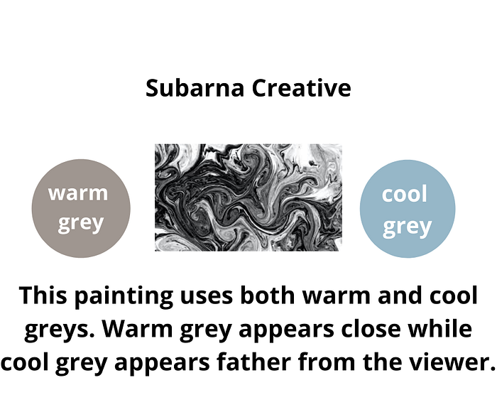
The viewer perceives warm colors to be closer to them. While the viewer perceives the cool colors to be away from them. So, when you are going to show greenery at a distance, consider using a cool green. While, when you want to show trees in the foreground, use warm greens.
In large rooms, use warm colors to produce a cozy feeling. In small rooms, use cool colors to make them look larger.
Warm colors heighten our passions and make us playful. So, you could use them in activity rooms.
Cool colors are relaxing and meditative. So, bedrooms and bathrooms should use cool colors.
If you live in a warm tropical climate then use cool colors to create a calm feeling. If you live in cooler regions then use warm colors to create vibrance.
Hope this gave a fair idea about warm and cool colors and color temperature.
When you mix colors, mix warm with warm and cool with cool. If you try to mix warm with cool then you will get a brownish and dull color.
Color bias
In the color wheel, the color between red and blue is magenta. It is red with a blue bias. It is a cool color.
We also have orange between red and yellow. We can have a red color with a yellow bias. It is a warm color.

Clean color
The color that has no bias is a clean color. We should not prefer clean colors because they are dull and unattractive.
Neutral colors
We do not find neutral colors on the color wheel. They are neither warm nor cool. Neutral colors only supplement the warm and cool colors. Black, white, grey, brown, and tan are neutral colors. The neutral colors influence viewer psychology on the basis of other colors around them.

Grey and black are neutral colors but we can get warm and cool greys and blacks. Here’s the trick.
Mix brown and blue. You get black. If you mix a larger proportion of brown then you get a warmer black. If you mix a larger proportion of blue then you get a cooler black.
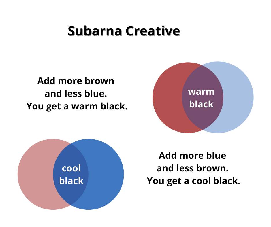
If we mix white with warm black then we get warm grey. If we mix white with cool black then we get cool grey.
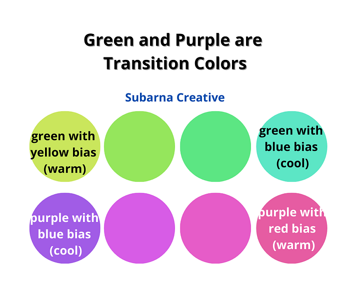
Transition colors
Green and purple are transition colors. On one extreme of green is blue (cool color), at other extreme is yellow (warm color). At one extreme of purple is red (warm color), at the other extreme is blue (cool color).
Conclusion
Color theory is a vast topic. I am trying to find color theory tricks that can help designers to make eye-catching works of art. In my previous blog, I have talked about top color wheel formulae. If you want all my colour theory blogs then click here.
Email me at subarnacreative@gmail.com.

