Color theory: The basics that everyone should know
Be it a designer (they must know or things can go drastically wrong) or a developer (they need the very basic understanding at least) Color Theory is a topic that everyone should have some knowledge about.

From the name, it may seem that just because it's named as “Theory’ it is a lot to take in, but I have tried to sum up the very basics here and broke them down into points so that you can understand it better. So without further ado, these are the very basics that you should and must know:
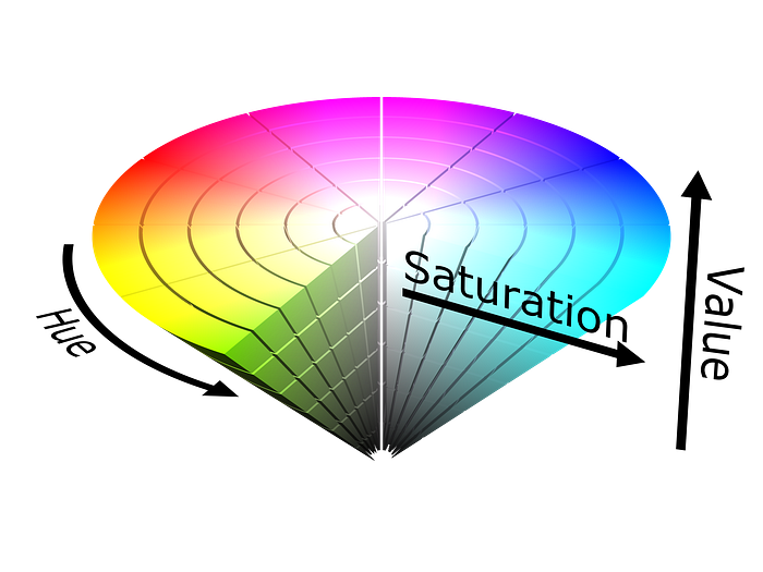
Each color breaks down into three basic ingredients: saturation, hue, and value.

Hue is literally the color we’re looking at. It’s the main ingredient in a recipe for color.
Saturation is the intensity of the shade (like the spiciness of food).
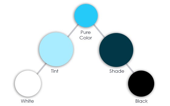
Value is essentially the brightness of the color. There are two terms that are commonly used: Tint & Shade.

A tint is the brighter color version, which means it’s mixed with white. Whereas, Shade is the darker color version, which means it’s mixed with black.
And, to be honest, these are the very basics that are there to be known by everybody.
Now, while our daily consumption period of digital media, we observe many color combinations that seem to be just not working. There can be many reasons for that, but with respect to the basics that we discussed here, there are mainly three reasons:
- You use too many colors. Stick with a few, unless you make a rainbow. The best way to understand this is: while cooking a certain dish, you don’t need to use any and all of the spices and ingredients in your kitchen, you only need to use the same colors.
- Saturation is the second cause. You need to experiment with it and set it to the right tone. Think of it like this, while music is playing, you don’t want to hear every instrument at its highest volume or intensity, it’s just the perfect blend of every instrument that makes great music. It’s the same thing for colors, you need to experiment with the saturation of every color you’ve used to know what percentage of saturation is good for each color.
- Number three is the contrast that life is all about. Just as you can’t have light without the presence of darkness or happy moments without the sad ones, you also have to make sure, while you’re using colors, that you have enough contrast between them.

