Color psychology in UX

Introduction
Color is believed to be an essential visual experience for human beings as it is the easiest element to remember when it comes to encountering new things. Any time we open our eyes, our visual senses are bombarded with continuous optical stimuli, with surrounding sights competing for attention. Colors function as a powerful information medium and can be used to support the overall human cognitive system. Using the right selection and correct placement of colors, we can induce positive feelings and behavior within ourselves.
Colors are known to possess physiological and psychological properties due to which different colors hold different meanings that vary across different cultures. This fact is extremely significant to UX design of any company because the power of a brand is highly dependent on this particular factor. Color is one of the many marketing tools that product managers use to create, maintain, and modify brand images in customers’ minds to convey the meaning of their product. Brand of any product company involves its logo, color and overall interface of the application or website. Due to various symbolic meanings that each color hold across cultures, colors can enhance memory performance by creating an emotional effect. Thus, colors can enhance the usability of any software by guiding the attention of the end-users and at the same time providing enriched User Experience by creating an atmosphere that affects positive emotions. The careful selection of appropriate colors can optimize desired interactions and the effectiveness of a task. A well-considered color palette can upgrade a design while a not-so-well thought color palette can decrease users’ experience and interfere with their ability to use a website or a mobile application efficiently. The emotional impact of interface colors including their categorization, symbolism and preference cannot be overlooked. Although some colors are universal in UX design, other colors they are combined with can have a huge impact on users’ perception.

Colors and Perception
The base for each visual experience is the eye. Color is light carried through wavelengths which are absorbed by the eyes and converted by the brain. Light can be decomposed into a spectrum of five distinct colors: red, orange, yellow, green and blue. The red has the longest wavelength whereas blue has the shortest. An object appearing red absorbs all of the colors in the spectrum except the red light. This unabsorbed light is reflected back from the object into the eyes. From here, it travels to the brain and is interpreted as red. The lens of our eyes focus the approaching light on the retina, which contains two unique sorts of photo receptors. These are: rods for monochromatic vision around night-time and cones, which are color sensitive, requiring a more significant level of light intensity to be initiated and therefore are utilized at daytime. These cones and rods allow us to see color and light, respectively. There are three types of cones: type I associated with blue, type II with green, and type III with red. Other colors are combination of these three colors. For example, we see an apple and perceive as red in color. So, sunlight hits the apple. Some wavelengths are blocked by the chemicals in the apple’s skin but the other reflected wavelengths pass through the pupil and excite the cone cells at the back of the eye. The cones send a coded message to the brain about the wavelengths entering the eye. The brain translates this code into a sensation of “red”.

Colors and Emotions
To understand color psychology in UX design, one must also consider if colors provoke emotions in people due to which their decision-making process of visiting a webpage or choosing a product gets greatly affected.
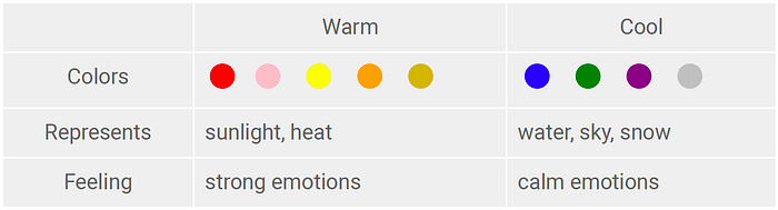
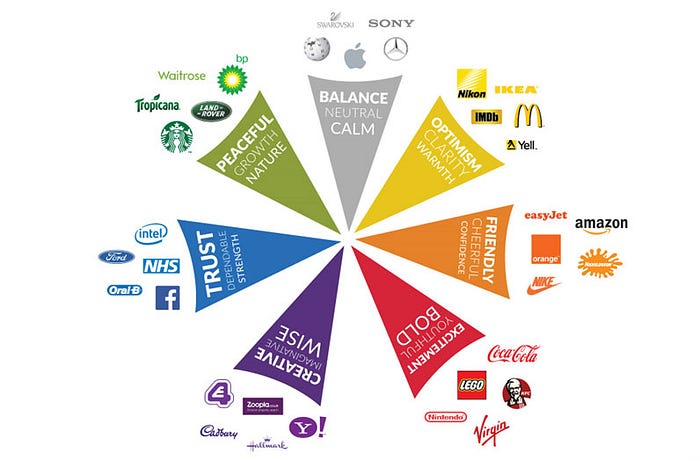
Colors are so ubiquitous in regular day to day existence that it appears to be incomprehensible having them not associated with various cognitive units. So, with the perception of a color an entire network of these units is activated. Red for instance will generally catch the eye as it triggers cognitions like blood, hot, danger, excitement, warning, error, whereas green may deliver cognitions like nature, serenity, hope. Psychologists have classified colors as warm (red and yellow) and cool (blue and green) colors. However, the differentiation among warm and cool colors is relative; for instance, when red and yellow are matched together, yellow is viewed as warmer than red. White, black, and grey are viewed as neutral colors. Since color encounters shift from individual to individual, it is preposterous to expect to realize how someone else encounters color. One individual’s experience of a color of red can be seen uniquely in contrast to someone else. Colors impact both human behavior and human physiology.
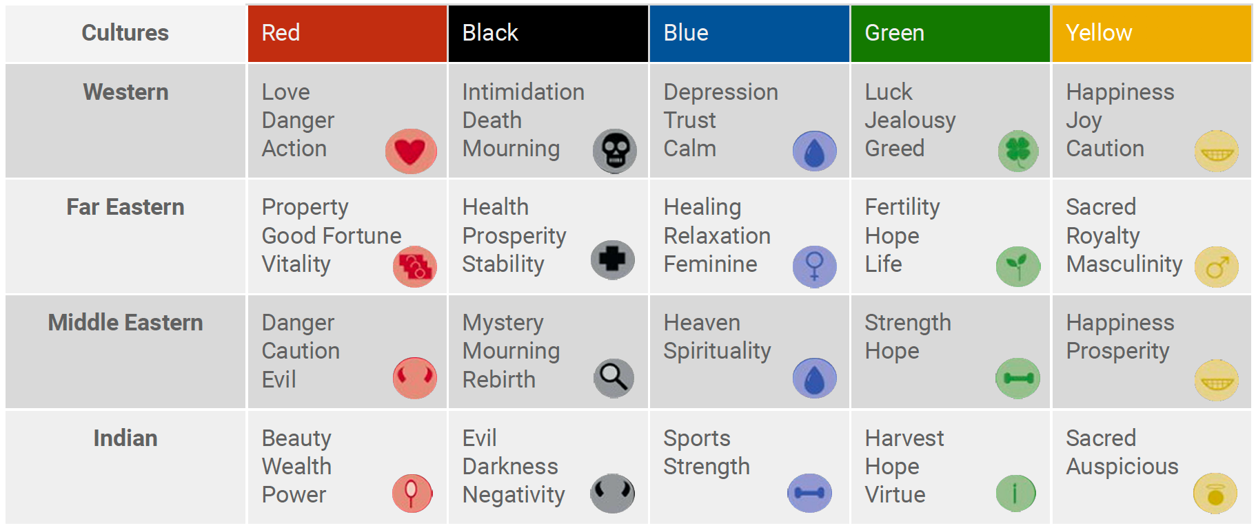
Colors and Culture
It helps designers when they look at the cultural implications of their color palettes based on the intended audience for the product.
The specific affiliations shift marginally on the individual level however there are certain relationships for color coding which are created as a part of culture. Social contrasts in meanings of colors and associations have been recognized. For instance, in India, Hindus consider orange the most sacred color, while in Zambia, individuals don’t even consider orange as a separate color. Thus, it is significant for UX designers to comprehend which colors are favored by individuals. Commonly, brands and their packaging are explicit combinations of color. Color combinations are viewed as socially bound with specific belief systems and conventions. In Western culture, black color represents death and mourning, though in Far Eastern culture, it represents health and prosperity. The blend of colors chosen for items, logos, products etc. may convey meaning as a result of the specific color pairings.
Colors and UX Design
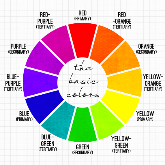
Each UX designer should be acquainted with color theory. Color theory is knowing about color wheel and color dimensions. Color wheel gives us an idea about color harmony and what colors can be mixed to create a meaningful visual effect. Dimensions of color are hue, saturation and value. Colors manage the attention of users and demonstrate order whenever utilized properly. The less regularly a color is utilized, the better it will catch the user’s eye. The mixture of such a large number of colors make the presentation look cluttered, confuses the user, makes tasks more unpredictable, increases blunders and decreases profitability. Pretty much five unique colors are proposed with respect to the paradigm of cognitive psychology. In this way, the perception of a color is viewed as an activation of a cognitive unit. The conscious mind can be regarded as the example of activated units. So, the decrease of the quantity of colors whenever utilized as coding for information communication as well as the consistent use of color will support the cognitive performance of the users. The studies have shown that our personal preferences, experiences, upbringings and cultural differences affect our choice of colors. This information can be considered as factors when one makes a UX plan. Exploring these factors can help a product to stand out by choosing the right color.

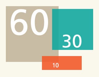
The 60–30–10 rule is a theory applied by almost every designer for making color palettes that are aesthetically pleasing and sufficiently balanced. It’s a classic decor rule that helps decide to make a color palette for a space. It expresses that 60% of the room should be a predominant color, 30% should be the secondary color and the last 10% should be a highlight.
UX designers or marketers will in general use color for product promotions and advertisements. In this sense, color turns into a significant component of a brand’s visual value and the worth derived from this “look and feel” adds to brand recognition and image. As does a deliberately picked brand name, color conveys inherent meaning that gets fundamental to the brand’s personality which empowers consumers to utilize color cues to evaluate products and make a decision. Apparently, understanding the role that color plays in marketing becomes more urgent as technological advances in techniques to make color increment the variety of consumer contributions and consider more creative uses of color, like more effective screens for electronic gadgets (e.g., smartphones, tablets) and new color choices for consumer-packaged goods. The significance and accessibility of color choices appear to have advanced over time.
Conclusion
Color is a tool that allows objects to become more nuanced and meaningful, through its richness and beauty. Color is more than just an aesthetical element. When our eyes perceive color, they connect with the brain which gives signals to the endocrine system releasing hormones responsible for the shifts in mood and emotions. In simple terms, color stimulates our vision, which is directly connected to the brain, where it immediately provokes emotions. Color can affect everyday behavior as well as stimulate emotions in people because every single color has a special meaning. The meanings associated with different colors are important to companies because the tools used to communicate brand image are mechanisms of meaning transfer. Color is an essential instrument in any designer’s tool stack. As interfaces have to consist of at least two different colors, it is of interest to optimize color combinations and color themes in order to be pleasant and thereby supporting the end-user cognitive performance. Since many color affiliations are found out, cultural aesthetic contrasts can alter product assessments. Furthermore, globalization and the increasing influence of Western culture has had a key influence on cultural color meanings and thus, cultural meanings can shift over time. I think that appropriate usage of colors in building different applications and businesses can bring a deep impact in the overall user experiences. Cultural, economic, social, and other differences make it difficult for companies to identify single brand image strategies that have global appeal. Therefore, global companies need to specify a brand image strategy as well as a clearly developed marketing program that creates and maintains the desired image in the customer’s mind across cultural borders.
If you liked this article, check out this article on UX as part of the product strategy. Hope you find it interesting! 😊

