
Color is a highly stimulating visual language. This element is mainly used to make the user act on the screen or to highlight information that they must know.
Even if it is the same flower, the feeling conveyed by the blue flower and the red flower is different. They have to be handled with care, as they are more irritating than any design element. It not only conveys a mood or nuance, but also serves to convey information. Like traffic lights, green indicates positive, yellow indicates warning, and red indicates prohibition.
The color is like fire. Proper use will give you the results you want, but overuse can ruin my design. In digital product design where you need to help users act quickly based on priorities, you need to use color really carefully. Let's find out what properties it has to handle the fire of color well.
Color Properties
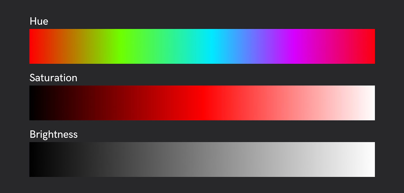
To know how colors work, we need to know what properties they have. A color has three properties. There are hue (hue) that distinguishes the types of unique colors, saturation (saturation) that distinguishes the depth of primary colors, and brightness (Brightness) that distinguishes between light and dark. These three properties are used to create a variety of visual effects. First, the shape is composed mainly using brightness, and the colors are classified according to the function of the element. In general, I tend to use black and white and one accent color. Sometimes more than one color is used for different functions but important information.

Color model
You will often see this shape when working with sketches or figma. What is RGB and what is HEX? How are colors expressed in a digital environment? The colors used in design, the colors processed by the computer, and the colors displayed by the monitor all vary according to their specifications. Color space refers to a standard for managing colors expressed in this digital environment. In digital products, colors are mainly RGB, HSL, HSB, etc., and HEX and RGB are mainly used when working.

- RGBA (Red, Green, Blue, Alpha): This is a basic method of expressing various colors by combining the three primary colors of light, red, green, and blue, and alpha, which represents transparency.
- HSV/HSB (Hue, Saturation, Value or Brightness): This is an intuitive and easy to handle color property).
- HEX: A code converted from RGB to hexadecimal, has the advantage of being able to copy and paste at once compared to other elements, and is a universally used color value that is easy to input in various environments.

All major programs use HSB to select colors and display them using Hex. When you want to darken a color, it is much more convenient when designing because HSB can handle color properties more intuitively when you see a case of HSB where you can just reduce B rather than RGBA that darkens by mixing red, green, and blue. However, when developing, it is cumbersome to type each attribute and hit a comma, so I tend to use HEX, which has the least typing and is easy to distinguish.
Primary Color & Secondary Color

I tend to use color strictly and restrictively because misuse of color in my digital product UI can interfere with navigating through content. We define a hierarchy of colors to manage the criteria. The color service used in the service basically uses primary color, secondary color, and black and white (Black, White). Depending on the nature of the service, we may decide on more different color combinations. The primary colors to be used in the service largely follow the brand's graphic conventions.

- Primary color: The most used color where color is needed
- Secondary color: A color used when the primary color is used and it is necessary to distinguish it from other elements.
- Black and White: Mainly used for backgrounds and text, the lightest and darkest colors
Hierarchy

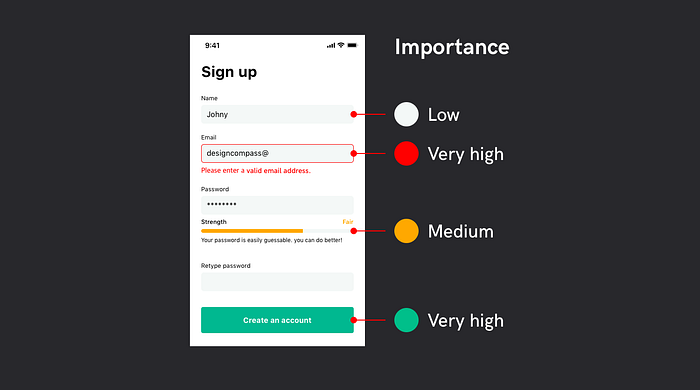
Now that the type of color to be used in the product has been decided, it is time to use it, right? When using color on a page, follow the importance of the information. The basic skeleton is composed of black and white, and important elements such as functional or must-know information are emphasized using primary and secondary colors. In this case, when cognition or behavior is an important factor in a special situation, unlike other information, use a color appropriate for the meaning. It highlights the important final behavioral elements and the information that must be verified to do so.
Ratio
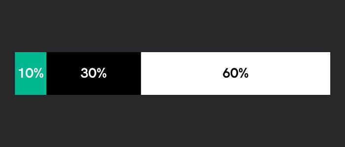
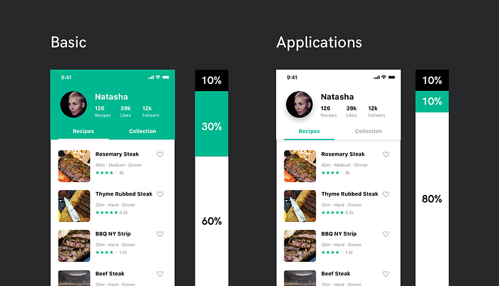
After deciding which materials to use, you need to decide what proportions to use. Since color is a strong stimulus, you should avoid eye strain by using color for all elements. The most comfortable and acceptable proportions can utilize the 60-30-10 rule used in interiors. The background color is distributed using 60% and 30%, and 10% is allocated for elements or text-oriented services to be emphasized. After distributing the background color considering the total amount, adjust the color ratio by adding the point color little by little within 10%.
Just as the interior space design changes depending on the purpose, color matching is applied to the space.
Contrast
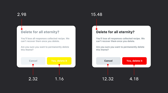
If the colors are blurred, the eye needs to focus to see the nuances, so it's best to give the contrast as strong as possible. If you are in a situation where you have to distinguish colors vaguely, you need to think about whether the elements are really enough to distinguish them by using colors. If you decide to express a color differently, you need to provide enough contrast for the color to be clearly distinguished from other colors. Adjust the color considering the background color and the relative relationship with other elements. The color contrast follows the levels divided by WCAG, mainly AA level is used as the standard.
- A (at least) — 3:1
- AA - 4.5:1
- AAA — 7:1
This is a useful tool for contrast check and is used to measure the contrast level between the background color and text.
Combination

Even if you have decided which colors to use a lot, there are times when you need a different color. In this case, you need to choose a color that matches the main color based on the color wheel. All elements are mainly expressed with a single color, and although it is a concept similar to the main color, analogous colors are used when differentiation is required, and complementary colors are used for information that the user needs to recognize more clearly than any other element.
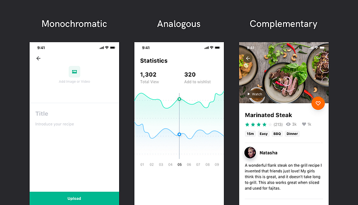
- Monochromatic: Use the main color for important information, and use the same tone as the main color for gray areas.
- Analogous: A similar concept, but analogous is used when a distinction is needed.
- Complementary color Complemntary: Used when it is necessary to emphasize more strongly than other elements.
Light & Dark

If it is difficult to distinguish information with one primary color, light and dark colors are used. At this time, a color lighter than the main color and a color darker than the main color are defined, and the color is transformed in the order of brightness-saturation-hue according to the color change rule in nature.

- Darken color: Move to RGB-based hue, increase saturation and decrease brightness.
- Lighten Color: Moves to CMY tones, decreases saturation and increases brightness.
Reason 1. Color Change in Nature
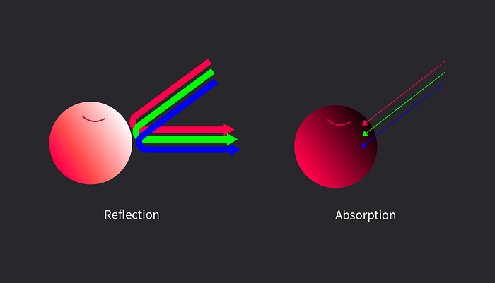
In real nature, when the light is strong, the color saturation of the object becomes weaker (imagine when you put a flashlight right in front of an apple). The color appears because light is reflected off the material. Too little reflection will make it look dark. When the color of an object becomes brighter, it is desaturated and the brightness is increased, and when the color of the object is darkened, the saturation is increased and the brightness is decreased.
Reason 2. The brightness of the hue itself
Although yellow is bright and difficult to write on a white background, and blue is dark and difficult to write on a black background, it is difficult to imagine the difference in brightness between the different colors. How do you know the brightness of the hue itself seen on the screen?
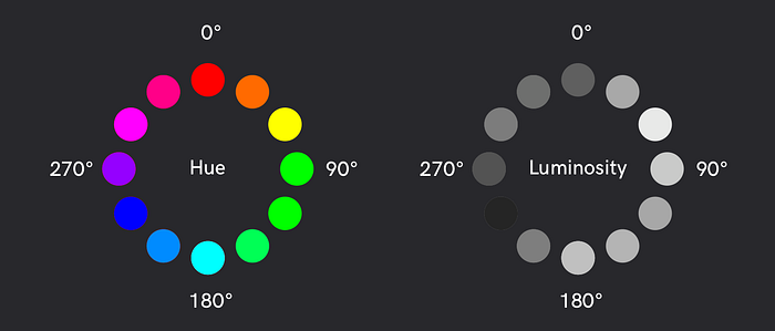
I adjusted the Hue of HSB with illustrator and assigned 12 colors. I copied it as is and then converted it to black and white. Yellow and blue are predicted, but the rest of the colors don't look very regular. Why are the colors at 180 and 300 degrees brighter?
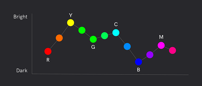
Comparing the graph for each number, it gets darker as it goes to Red Green Blue and gets brighter as it goes to Cyan Magenta Yellow. As RGB and CMY are the standard, the screen uses the three primary colors of light, so the more colors are mixed, the closer to white, so CMY with the most primary colors is brighter.
Background color
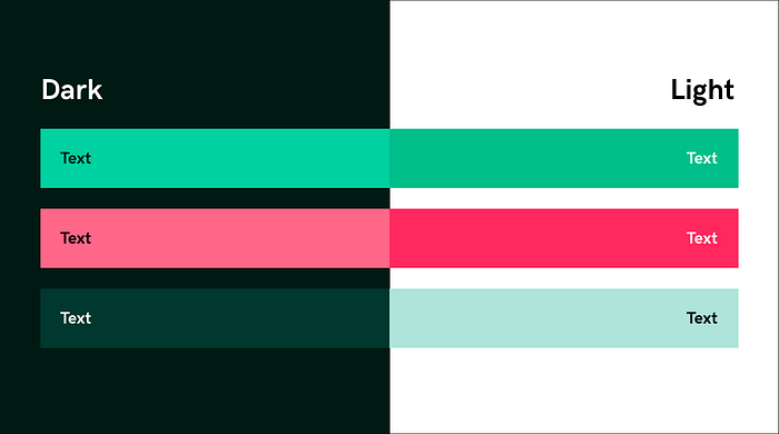
Because colors are relative, their properties change depending on what colors are around them. When designing dark mode, the background color is inverted, so instead of using the same color, use the appropriate color for each theme.
- dark background + light area + dark interior elements
- light background + dark area + light interior elements


