City mobility: easing urban citizens transportation via design thinking

Let’s state the obvious, navigating in big crowded cities requires a good amount of resilience sparkled with a pinch of information. I personally uses my bike as much as I can — a daily-life saver especially over the last months!
I recently started a UX project on city mobility. In this 8min article, I will go through the different steps of the design thinking process I used with my team in order to give an appropriate answer to urban citizens using any kind of transportation to travel from ‘point A’ to ‘point B’.
Steps you can expect:
- City mobility research: urban areas are transforming fast
- Knowing your user is key: the power of data & empathy combination
- Problem = Solution
1. City mobility research: urban areas are transforming fast!
After some research and observations it appears that as the relationship between the metropolis and rural areas is transforming fast: a lot of types of transportation popped up, such as electric scooters, bikes, public bikes, metro, tram, taxis… you name it!

But in cities such as Paris, if the amount of daily travellers is also increasing (Paris>Paris / Paris<>suburbs), the travels conditions citizens have to face worsen.
2. Knowing your users is key: the power of data & empathy combination
Data, data, data…from a survey??
Let’s start with a a good survey. Yes it seems obvious. Yes it seems to be outdated. But it’s not…If you ask the good questions — of course — and take time to extract the datas and analyse them properly.
In order to prepare the survey efficiently, we used a lean survey canvas. It helps organising ideas in an efficient way and to aim for the right direction. If you want to know more about the process, you can find all info about ‘lean survey canvas’ here.

Here are some of the main informations we aimed to collect:
- what are the most used mode of transportations and why
- what are the problems encountered
- what criterias are taken into consideration while it comes to planning a trip
- emotions/needs before/during/after a trip
- contextual influences (ei. COVID) and impacts
- visions for the future/wishes
33 persons have answered the survey that has been sent to the targeted users. That’s a good starting point. To show you what it’s about, here are some questions the users answered:
- Whenever you using public transportations how many children may you be travelling with?
- How likely is it that you use this kind of transportation? (options such as ‘subway’, ‘tram’… + weighting from ‘never’ to ‘always’
- Where do you currently live?
- ….
Interviews: let’s face to face
5 interviews get conducted allowing us to have more flexibility and a larger spectrum in the information collected by tackling questions with a more personal approach.
Here are some quotes I collected:
When I’m driving my car, I feel home
I don’t take the bus because I get confused; route maps are not clear enough
I think the COVID situation encourages individualism — I think people tend to use their car more than before
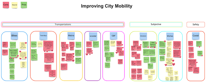
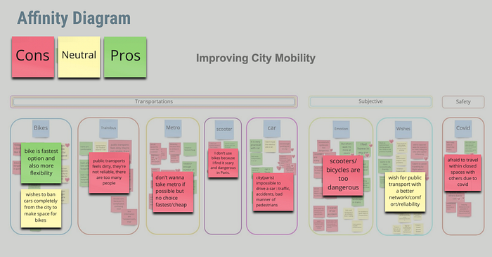
Organising data for visualisation: affinity diagram
Sticky notes are a really good way to summarise quantitative and qualitative data collected from interviews and surveys. It’s an instant visualisation that can be organised afterwards in order to find main trends and organise ideas.
The affinity diagram tool precisely helps to reach this goal.
The following affinity diagram has been built very simply but efficiently tagged in 3 categories ‘Cons’, ‘Neutral’, ‘Pros: easy to read, easy to categorise, easy to use afterwards!
You will:
- “1.” see the whole overview
- “2.” zoom-in
Now is time to go deeper into empathy: Empathy map, User persona & user journey
Yes data is important and at this point we have a pretty good overview of our users. But it is crucial to take a step further. In order to do this, we used the ‘empathy map’ who allowed us to create our user persona later on.

I present you Jean-Pierre (oui, oui, il est français), a graphic designer living in Paris. He is very conscious about global warming and is trying to reduce his footprint impact. He lives in a crowded city but he is trying to avoid his fellow citizens as much as possible, especially in public transports — he doesn’t like to get squished. So biking is a great answer to his needs and values.
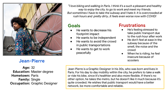
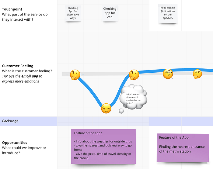
Now that we started to build a little story from the data we collected (yes we’re staying consistant here!), we need to create a ‘plot’ in order to identify pain points and opportunities.
This plot is called a ‘user journey’: Jean Pierre needs to leave work but it’s pouring with rain and he definitely can’t bike home in these conditions so he decides to take the metro. It’s overcrowded, warm, humid, smelly… you probably picture the situation pretty well! In short, he doesn’t have a pleasant experience and arrives home wishing for a more pleasant alternative.
This user journey allows us to concretise data we collected in order to identify pain points and opportunities which will later evolve into app features . We will come back to it just now.


3. Problem = Solution
Now is time for formulating a problem statement that will be the ‘breadcrumb’ of our excursion towards a concrete solution.
Problem statement & hypothesis statement
After a good brainstorming session, we came up with a lot of idea and validated the following problem statement:
Urban citizens needs a way to personalised plan and flexible travel routes because they want to avoid certain unpleasant situations (rush hours/problems/crowd)
= let’s build a transit app with personalised features based on the pain points we dug out!
Solution V.0: crazy brainstorm
In order to generate as many ideas as possible — in other words ‘future features’ — we decided to use a tool called ‘Crazy 8’s’. The goal is to draw 8 ideas/solutions that will match our problem statement…in 8 minutes. It’s a challenging method but also really rewarding.
Here is the ‘Crazy 8’ I came up with:
Of course, I also gave some explanation during the a quick meeting with team afterwards to explain my ideas but I guess you can already understand that I generated ideas for future features that allow the user to build a specific route based on criteria such as influx, weather, time…
Oh and you maybe noticed the colourful emojis. These are the result of dot voting we performed in order to pick the best solutions and afterwards jump into prototyping.
“Long story short”: low-fi prototyping
Good old pen and paper is a smart way to literally visualise your concept focusing on your main goals and to not waste time with details. And trust me I’m really details oriented; that’s one of the drawback of being a graphic designer. You’ve probably heard at lease once about Pareto principle; you know the ‘80/20’ rule. This is the perfect example!
So here are the low-fidelity app prototypes I quickly draw:
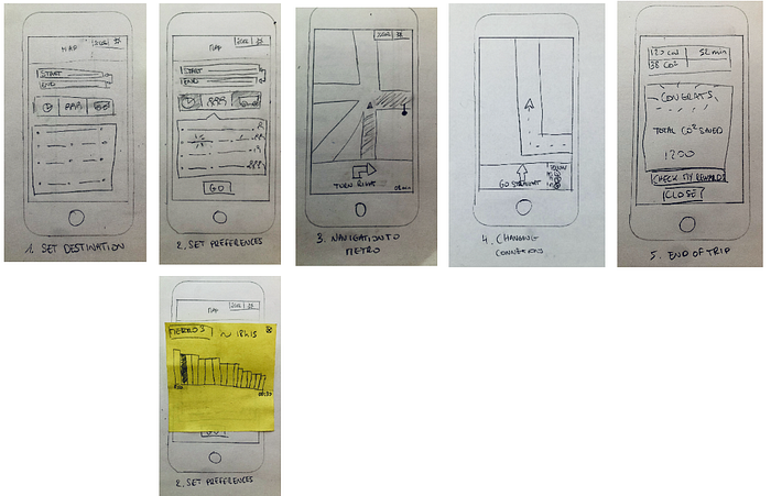
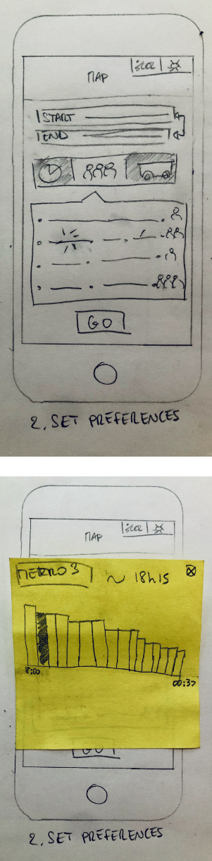
As you can see in screen “2.” (see close-up below) where I decided to incorporate a passenger influx filter feature — pen and paper is not limiting. I even created a pop-up window with a simple sticky note.
After few more brainstorms and dot votings, we came up with a solid pen and paper prototype we exported on Figma so it can be tested on users.
Feel free to take a tour on the interactive prototype just below or via this link. Of course not much actions are possible (we focused only on the main user flow) but keep in mind that we tested these prototype with potential users on our side and we could see and note every action a and comment they did, questions they asked, things they didn’t see etc. And that’s exactly what we are looking for during a test.

Some more details about the screens:
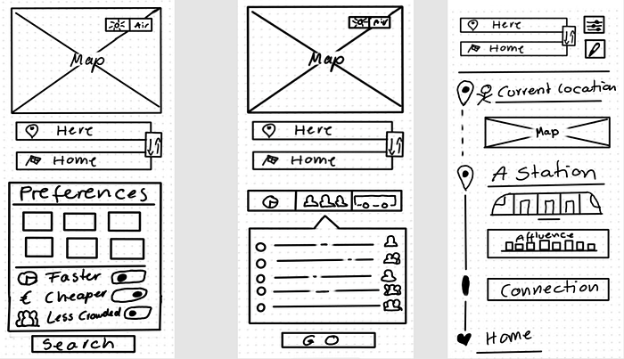
- Set your starting point, destination + set transportation preferences and priority (ie. ‘less crowded’)
- Pick your route among the different options displayed
- Oversee your route in real time with smart information such as metro influx
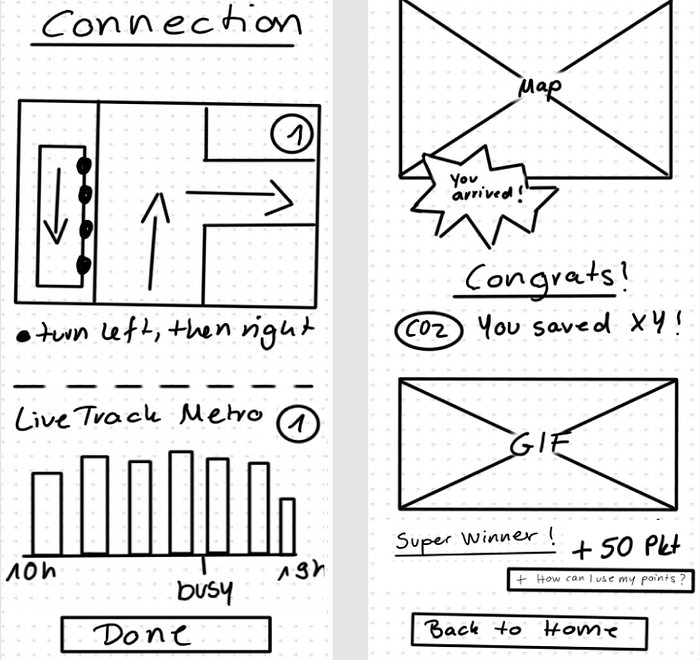
4. Navigate in the street, metro, platforms,…using live location and influx live tracking
5. Arrive home safe and happy and get rewarded for using ‘green’ transportation
Test / collect / revamp / repeat
After performing a bunch of live tests, we identified what we needed to keep, what we needed to improve and what we needed to change.
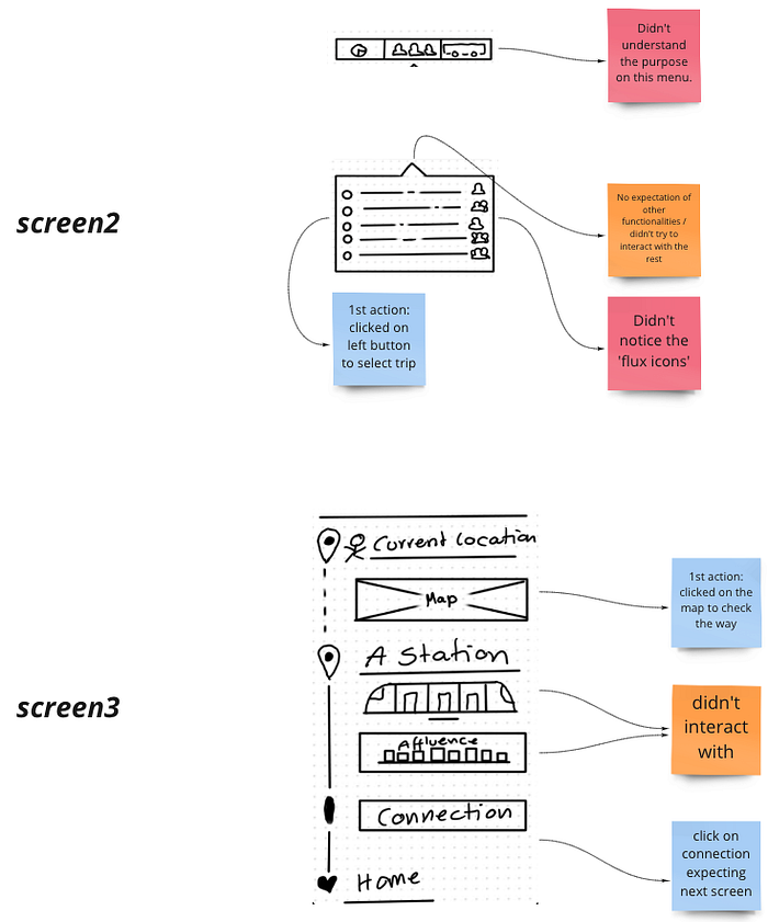
Here is a sum-up of the tests’ analyses:
- To keep: CTA (Call To Actions), main features, filters, contextual information
- To improve: Map size, influx option on tap feature, reward information
- To change: Influx display, connection feature, multi destination option (to add), more navigation option (to add)
The full report is meant to be deeply analyse in order to come up with new low fidelity prototypes which will be tested, analysed, revamped… to finally jump to… mid-fidelity prototypes!
What’s next?
Wait..what? It’s over?
Yes and no!
It was an overall very interesting project and I learned a lot about the importance of following a clearly defined process in order to not get lost into details and being able to focus on what’s important at the right moment. But for the purpose of this article, I’m stopping my case study here and I will go into more details regarding the next steps of this user centred method — aka ‘UX design thinking’— in another article I will publish in few weeks.
So stay tuned! You can get notified by following me here.
Thank you for reading! I hope you enjoyed the journey. Feel free to like/clap and comment ↓
This project has been conducted with Yumi Onezou, Naomi Victor, Cecilia Bridot and Jasmin Schmitz 💪 Ironhack / Ironhack Paris