Case Study: An app for electric charger owners to commercialize and manage their chargers

Project Brief
This project was a part of 10K Product Design C5, where we were tasked to design an app from scratch with the option to work alongside a fellow cohort member. I teamed up with Haritha, who worked on the consumer side of the project. We conducted research together and set the base in terms of expectations for the project.
Problem Statment
An app for electric charger owners to commercialize and manage their chargers.
As an owner,
- I am looking for an easier way to manage my chargers.
- I want to increase discovery for my chargers.
- I want to earn money through my chargers.
Outcome
With the problem statement in mind, we came up with multiple outcomes for the projects success
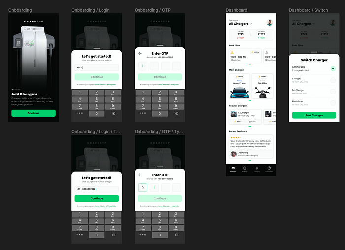
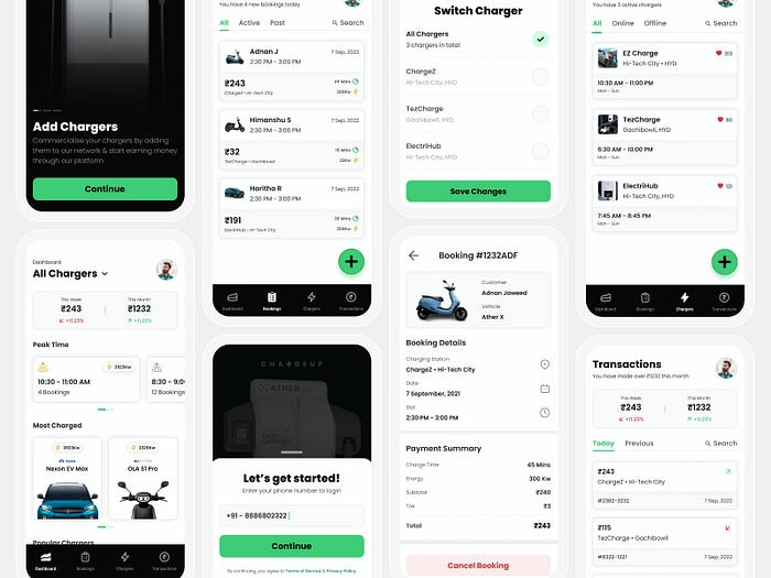
- Onboard chargers which can later be discovered on the consumer app
- Track revenue made through different chargers
- Read and reply to feedback
- View & manage bookings for a charger
Research Process
The research process consists of multiple stages through which we discovered the user’s pain points and understood how our application could solve their problems.
Figjam Board —
Competitive Analysis
We understood that plenty of solutions are already available in the market, so we wanted to leverage that and see what solutions don’t exist.
- Conducted competitive analysis for five applications that exist in the Indian market
- Read app reviews to learn what features users like/dislike
- Based on our understanding, we created a list of pro’s & con’s for these apps

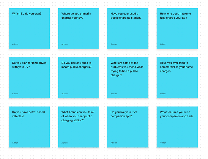
User Interviews
EVs are new in India, and to understand the users’ pain points in-depth, we planned to conduct user interviews with four people, all of whom owned an EV.
- Learned what applications they use to discover chargers
- Understood their workflow from discovering a charger → charging. their EV
- Uncovered problems they faced during their discovery stage
- Discussed potential features that are on their wish-list
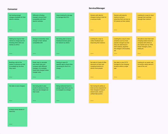
Discovering Problems
Based on our competitive analysis and user interviews, we started to see a pattern and noted any interesting potential problems we thought we could solve with our application.
- We divided the problems into two separate lists, the consumer and manager side
- Combined all of the issues we discovered through our previous research phases
- Actively brainstormed our approach as well while noting down the problems
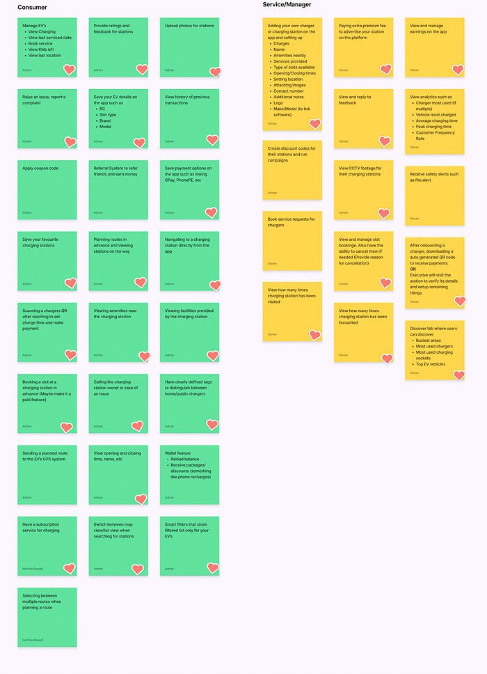
Features
We now had a list of potential problems to solve for both the consumer and manager app. Using this list, we started developing features we could incorporate into our application.
- Listed down the simplest of ideas to the craziest ones we thought of
- Put a heart sticker on the ones we thought we should include in the MVP
- After identifying the MVP feature list, we had our scope of work ready
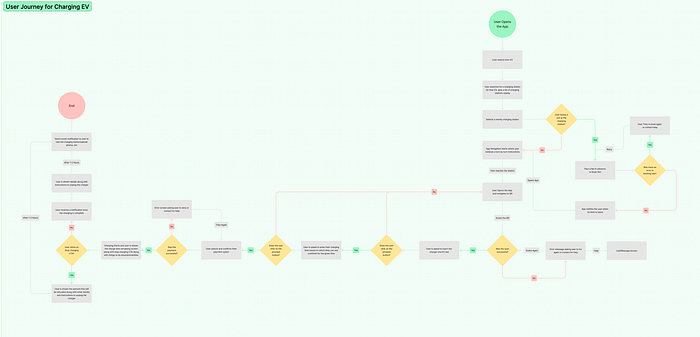
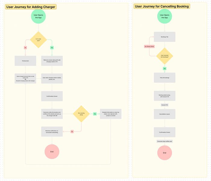
User Flows
User experience inside and outside of the application was our highest priority, and we wanted to make it as seamless as possible.
- We created user flows for the most critical aspects of the application
- Brainstormed on different ways users can book a charger in advance
- Finalised more minor details such as when can payment be made, how refunds will work, etc
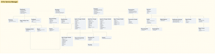
Information Architecture
We now had enough information to start laying down the map for our application based on our previous research stages.
- We started with menu items for the navigation menu
- Identified potential UI components
- Simplified flows for a better user experience
Visuals Process
Once we had enough information and data to rely on, we moved on to the visual process stage, where we worked on the final look and feel of the application.
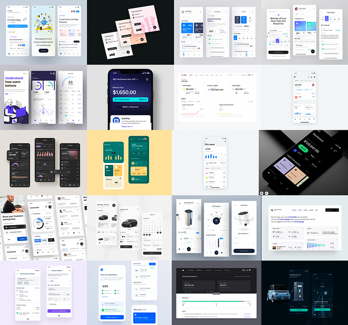
Moodboard & inspiration
I started collecting inspirations from dribble, behance, pinterest and applications live in the market.
- I was aiming for a minimal and simple look
- Collected screens with data visualization components for my applications dashboard
- Identified colors that I would like to play with
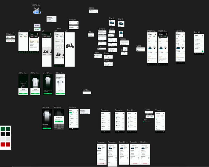
UI Exploration
Since we already had our IA done, I would start by placing the ticket in my canvas and then laying down the skeleton for the application.
- Experimented with different colors & fonts
- Created a logo for the application
- Iterated multiple versions of UI components

Finalising UI
Once I was happy with the application’s colors, fonts & styling, I started finalizing the core screens using the IA.
- Created components for buttons and fields
- Created potential states (0–1-Infinity)
- Each component was made in auto-layout to help out developers
- Followed 4-pixel grid
- 4-columns layout with 24 margin and 16 gutter
- Named all the layers on the screen (Not a fan of rectangle 27424)
Completing Project
After many iterations and screens, the core screens were done with a simple to use user interface.
- Changed copy where needed
- Cross-checked spacing & alignment
- Polished UI
Learnings
- Spent too much time on explorations and didn’t finalize the final style of the app in time, which delayed the project
- I didn’t have enough time to do field research which is something I would do next time for a project like this
- Learned how to experiment with the HSB color scale to tweak colors further
Thank you for checking out my case study. You can reach out to me on LinkedIN

