Case study: why is Netflix such a good app?
This is the moment for a “behind the scenes” pun, isn’t it?
*this article was written as part of Ironhack’s UX/UI Bootcamp pre work.
When it comes to streaming services, Netflix stands out as having undoubtedly the best user experience, which has led to heated discutions among other streamings fans about what is more important, usability or content.
It is also one of the reasons why, despite having more competitors each year, Netflix has maintained it’s position as leader of the industry. No matter how many other companies release their own streaming apps, Netflix is still the default name that comes to mind when we think about going home after a long day of work and relaxing in front of the TV.
But how have they achieved such user experience mastery? What is so special about this app?
First of all, everything works effortlessly. Have you tried using that other app that “is not TV, is that-streaming-service”? As much as I love their content, opening up the app feels dreadful even before I click on the icon.
Also, on Netflix’s home screen, every thumbnail for movies and shows has the same size. It is soothing and takes me back to Blockbuster times, when all those movies would be neatly set on the walls of the store, and I could check a bunch of covers at once while deciding what little rectangle would have the pleasure of being taken home with me. Other streaming apps have various sizes of banners fighting over our attention on this tiny space that is our phone screen. It feels overwhelming and reminds me of an online shopping experience, not a movie rental one.

And the best part of Netflix’s visual strategy? They keep changing the thumbnails, so if something didn’t catch your attention on the first try, it might get noticed once the image is updated. Genious.
(they have a whole article about the thumbnails on the Netflix Technology Blog, in case you are interested in knowing more)

Another thing to love: Netflix solves all the usability without having an expandable menu on the side. The last thing I want when looking for a TV show, is to be opening menus and scrolling to find user information, favorites, categories, or anything else. I’m sorry, other apps, but Netflix has got you cornered.
The “skip intro” option is also an essential part of the experience. I have recently watched a TV show on another app and was shocked to see that a function as basic as that was not available, which led me to clicking on the “skip 15 seconds” button multiple times while trying to figure out the duration of the intro.
While it all seems too good to be true, I do have one complaint. If you are watching something on your phone, it doesn’t let you take a screenshot. I can’t count the times I wanted to share a scene with a friend but couldn’t because the screenshot came out all black. For a company that invests so hard on social media, making memes and now even WhatsApp stickers, this feels like a major mishap.
But I mean, no one is perfect, right?
There are other simple strategies that are absent in some competing streaming services. One thing I missed when using some of these apps was the redundant “play video” button options. On Netflix I can press play:
- directly on the home screen for shows on my “keep watching” row
- pressing the “watch” button on the show/film page
- clicking on the episode button
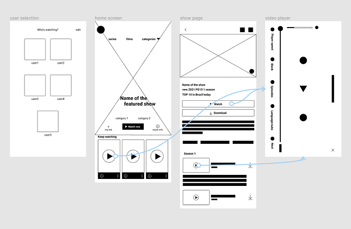
This is great, because no matter where I am in the navigation, I can easily start watching without having to take extra steps to get there.
Netflix is known for doing a lot of UX research, and it shows. They have an experience that feels tailored to the user, recommending appropriate content, with the best thumbnail, to be watched with the click of a button. That’s why, no matter how good the shows from other apps are, Netflix still covers a lot of ground, and will probably remain a market reference for some time.
About the content? Yes, other companies make great movies and series as well. I wish they’d invest as much as they do on scripts and production, on the user experience of their apps. I have a degree in filmmaking, and I know for a fact that movies are all about user experience. If you study screenwriting and film editing, you’ll see the structure behind the story always follows the same basic rules, it’s the content that actually takes the movie one step ahead and makes it stand out from the others. Maybe for these other streaming apps it could be the same. No reinventing the wheel, just making one that takes you to better places.

