Design Case Study: Solving problem for booking carpenters
Hello everyone! I am harshvardhan, a product and design enthusiast.
This case study was part of an assignment I did with 10kdesigners masterclass. (C5-UI/UX)
Problem statement
“An app to discover carpenters in the city and book them.”

My role
Individual Product Designer (UI/UX).
My goal
My goal in this assignment was to create onboarding, Home(discover), details, and booking screens.
Research
I looked up for different apps and platforms that were providing carpenter’s services and how were they doing things.


Research helped me think more clearly about the problem statement.
Insights: -
- Carpenters are available at hourly rate for small work.
- Some platforms have general rate card for all carpenters.
- Carpenter and their ratings can be found on generic platform such as Justdial but most users don’t use it because of its complex and manual process.
I have also looked up reviews of some competitor apps and found users facing some problems with long tenure related major work.

I have designed the app in such a way that the users will discover carpenters and their ratings first rather than services. Even new users can check the ratings and reviews of all the carpenters listed in the platform. This approach will reduce this problem significantly.
Target users
- Users who need to get some repair (small size projects) work done.
- Users who need carpenters for major work such as renovation/new major furniture building.
Pain points of users
- It is difficult to find carpenters in a crowded city.
- Even after finding someone, people don’t know about their work and etiquettes.
- Customers don’t know how they are going to be charged as most of the time there is no rate card or no prior info is shared with the customer. Sometimes Customers gets overcharged because of this.
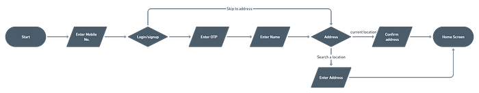
Onboarding journey
Information architecture
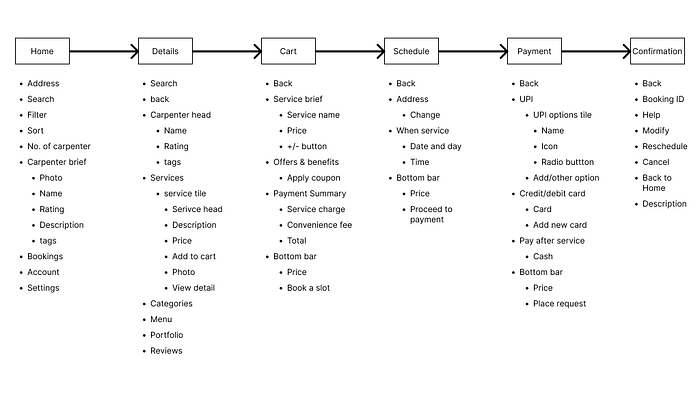
Here, I decided on what metadata and actions the app should have. It is a little rough IA. I also tried to make wireframes at this stage in my process.
Wireframes
Wireframes helped me accurately lay the flow the app. It also helped recognize what I want and want I don’t want in the final screens. The final designs are the updated iteration of this wireframes.
Visuals
Onboarding flow
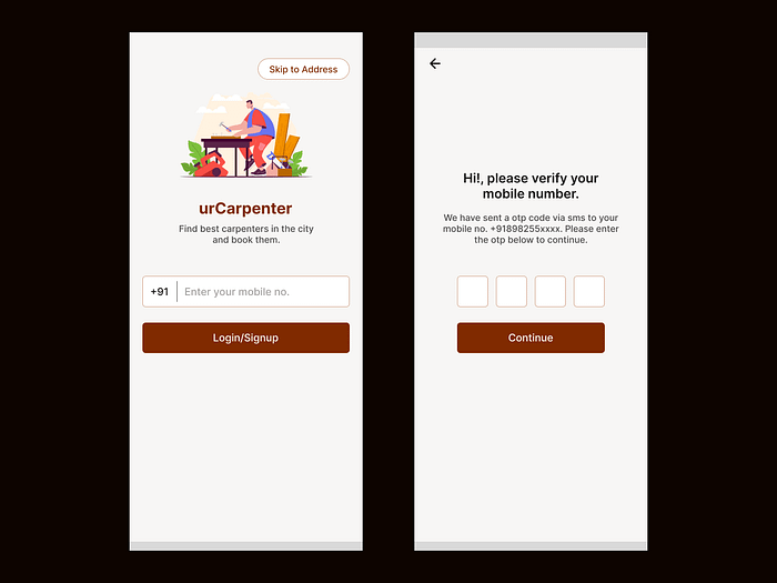

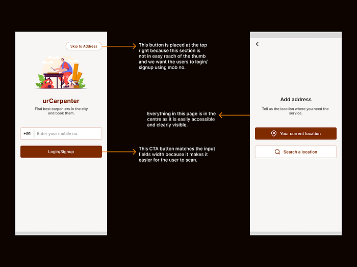
- I have used mobile no. login as it is quick way to login, and it also help in verifying users with otp. Users don’t have to remember anything extra here.
- The skip to address button is intentionally placed at the top right corner of the screen as I want the users to use mob no. login.
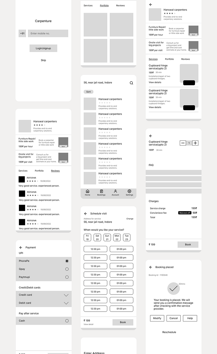
Home screen
- All important information sections are kept at the bottom so that the user can easily navigate between different pages and can easily find the right information.
- The whole layout is designed considering user psychology and design principles.
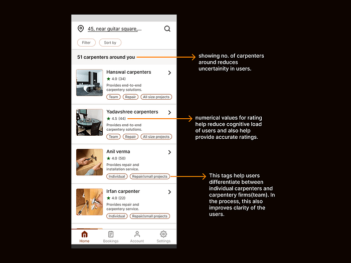
- Showing no. of carpenters around, helps users feel freedom of choice as they see they have many options.
- Using numeric values for rating reduces cognitive load of users and also prevents calculation errors caused by only visual representation.
- The tags are used to fasten the decision-making process of the users according to their use case.
Details screen
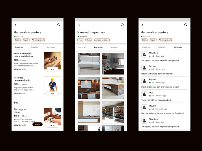
- I have included all the important information that a user may need in the relevant section i.e., Services, Portfolio, Reviews.
- ‘View detail’ is clearly visible and is explicit.
- Services section shows the service options available to the users by the carpenters.
- Portfolio sections shows images of carpenter’s previous work.
- Reviews sections shows rating and reviews provided by the users to the carpenter.
- In reviews, I have kept the date format to show ‘1 day ago’, ‘6 month ago’ etc. because it feels more natural for users and they can relate more to it.
Booking flow
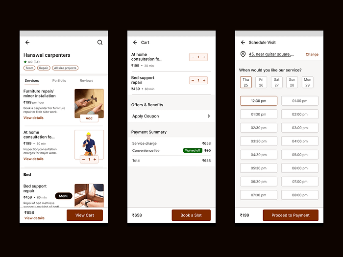
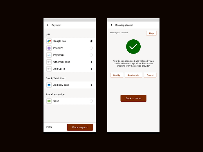
- The main CTA in this flow is kept at the bottom as it is right under the thumb and easier for the users to touch.
- The ‘waived off’ sticker in payment summary delights users that they are getting a discount and is represented visually in a clear way.
- The ‘schedule visit’ page is thoughtfully designed. The address is clearly visible and cta to change the address is explicit.
- The booking placed confirmation page delights users and also provides them certainty. The main cta here is to go back to home screen, both the back button and ‘back to home’ button takes user to home screen.
Prototype
Prototype of booking flow: -
Prototype- link
Learnings
- Iteration is the key to good designs.
- Designing with keepings users and business in mind leads to better designs.
- Design process depends a lot on the kind of problem. Different problems(projects) require different process.
What would I do different next time?
- We can use AR and AI to Analyse the space where users want some major work and provide some approximate estimate of the cost.
- We can also provide a video call consultancy service to the users at minimal cost.
Thank you so much for reading!
I would love to hear your feedback and suggestions. Feel free to reach out to me on LinkedIn or Twitter.

