Case study: Tips from designing a volunteer app for students
I present the design process of a mobile app supporting the voluntary service of grammar school students to share checklist-like general and specific design tips with you.

Introduction
In the first part of this case study, I present the design process up to the hi-fi screens. In this second part, I share my tips with you in alphabetical order, in some cases with illustrations from the present project. Many of the hi-fi screens are included in Project Highlights.
However, the tips also include lessons learned from my previous projects.
I also prepared this Case study in the hope that it would be useful for beginners in UX design and career changers.
Design Tips
So, here are my tips. For your pleasure, without claiming completeness, of course. I think it is useful to bear all these in mind in a UX design process.
ACCENTUATION
What is the main information or action on a specific screen? You should always ask this question yourself.

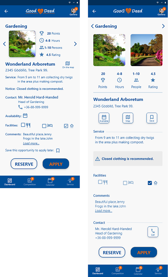
Accented information should have a visual separation: a larger font size, a bolder font, a different colour, and be highlighted with appropriate white space. An example is my dashboard which shows the hours done, needed and the point earned as key information. If several, various information is emphasized in the same way then it is a mistake. As I look at it now, I haven’t even stressed it out enough.
APP NAMING
I first imagined its name in Hungarian, although I knew I would make everything in English. So, it became ‘GoodDeed’ in English. Sure, for sure, I’ve looked at at least two name generators. I also liked: Voluntarik, Voluntar.iq, Volunteery as well. But these suggested the inclusion of adults for me and the word volunteer used often. I also checked the names with my UX ex-classmates, and finally, GoodDeed remained. I recommend these (brand/company whatever) name generators, you can test your own ideas. Some said to use AI and capable to generate names flexible according to several aspects or criteria. Some checks whether that name exists on the market already.
BREAKS & RELAXATION
If there is no break in a comprehensive design process that is the problem, if it is too much then it is. There are times when prototyping ideas or UI solutions don’t come and you don’t feel like the case study either. Then you need to disconnect. I don’t recommend taking too long a break in a project because, even with the best documentation, it’s time for you to bounce back and don’t even remember why you wrote what you wrote in the case study. But you definitely need relaxing techniques to avoid burnout despite this is more of a creative profession.
CALENDAR VIEW
In Calendar view, place a month on one screen, highlight the name of the month, the days of the week.
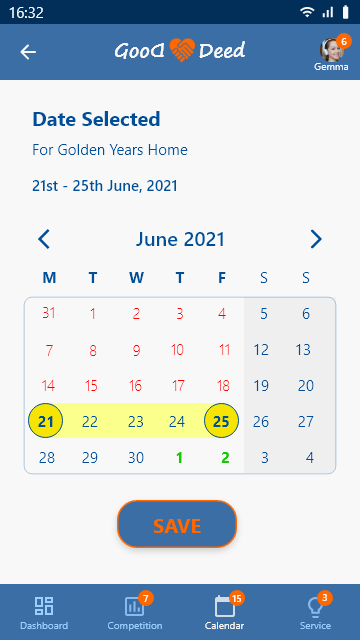
Weekends are always marked with a separate background or in another way because there are typically no work activities, but leisure, of course. The presentation of the week originating in the U.S. I suppose, when the week begins on Sunday (still in Google Calendar as of today) are completely strange and extremely confusing in other cultures. In Central Europe, but I assume that in the whole of Europe the week begins on Monday, being the first working day. If you make a design of global relevance, or to the worldwide audience, I suggest starting the week with Monday.
CASE STUDY
The case study is still underrated compared to hi-fi shots and clickable prototypes. However, the case study is probably your most important product because it shows how you think and work. When to write the case study? My tip is to start writing it already during prototyping, or even sooner block by block in the double diamond design process. If a building block has its results starting with the UX research, you write it down. The downside is that there will be parts in the end that you pull out, throw out. The huge advantage is that you can close it in a relatively short time compared to the recording of the clickable prototype if you keep working on it in the meantime. Why is this good? I have already seen many cases where the case study of interesting projects is completed long after the project closes. Or never. It’s a waste.
Is there an ideal length of the case study? The length of Medium articles is advised to be set at 4–5 minutes, otherwise, no one else reads them as said. However, the presentation of a complete product design or concept does not fall within this scope. At least, I never succeeded. One possible solution is to present a limited number of design challenges in detail in your case study in addition to the outline presentation of your product concept.
COLOUR SELECTION
Colour selection is not so trivial as it seems. The colours are, sorry to say, like football, marketing and women. Everyone is an expert. The reality is a little different. It is true that there is a well-elaborated theoretical background to the content of the meaning of colours, and everything is very easily available on the internet as well, including tons of palette generators. Surprise can happen, however. In this design, in the research phase, I asked what colour would be associated with the app considering the topic. In order of 1) blue, 2) green, 3) blue-orange or 4) I do not know they came out. I discarded the green because I felt it would associate too much with some of the activities only, or associate with those better. So I was looking for a blue colour palette with orange not to be boring. I chose neither the most popular nor the most creepy one.
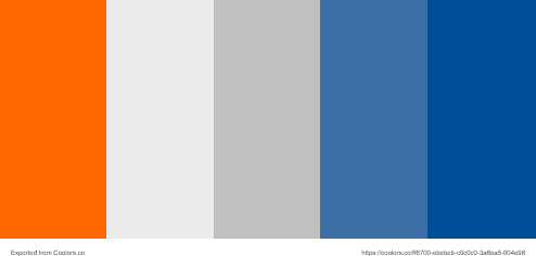
I put the whole design on a nice dark blue background. Looking at it all at the end, I was insecure. What was my goal? I design for teens, on a positive topic, the goal is to make community service fun too. My design, by contrast, though very elegant, was way too serious with its dark blue colour. I made two changes.

The CTAs got the orange stroke or border from the palette (my ex UX classmate opposed it vehemently), and I put the base colour on the other blue in the palette. I tested the latter with my two permanent ex UX classmates. Only with my vote did the design finally become the current lighter blue. By all this, I am only suggesting that this is not the most trivial topic despite beliefs. The colours need to fit the context and be tested.
CONVENTIONS
Considering conventions reasonably is not at all equal with planning out of routine, it is advised in fact. Let’s look at saved search items. If one of the most used apps of your users is Instagram, for example, you will know that you can find your saved search items in your profile. Thus, you don’t have to invent this.
COVER SCREEN
App cover screen. On the cover, everything, the logo, font size, illustration were changed because they were all too small initially. It’s interesting how I noticed here how serious my dark blue used until then was. As a result, I exchanged it throughout the whole design, so the new blue eventually became the base colour of the app.
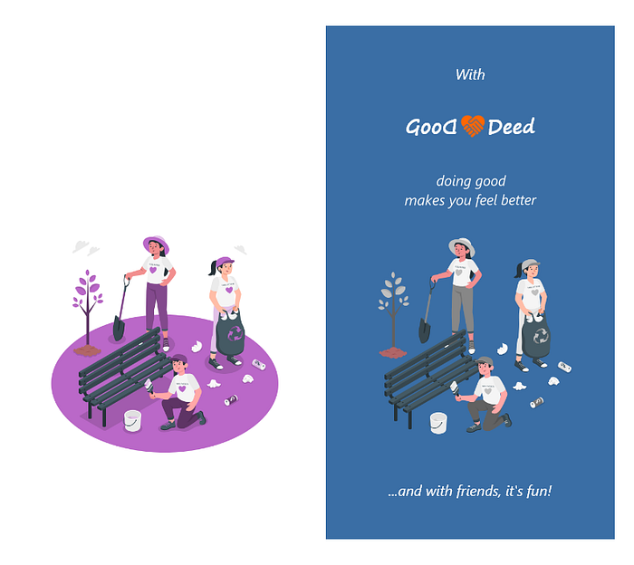
From the drawing type illustration, I kept the main figures only, taking out the irrelevant elements to make the cover clearer, noiseless. The three figures may still seem like a lot, but I wanted to show the variety of volunteer work. Don’t leave the app cover screen design at the end of all screens because it can affect the colour of the app.
DESIGN DECISIONS
Why? It is one of, if not the most important keyword in UX design. Be able to justify all of your design decisions. Why did you choose that methodology, UI, interaction etc. ? You don’t have to be afraid of choosing the wrong solution. Either they fail on the user tests or they are criticised by senior designers. No problem, you will iterate. The point is that there is awareness behind your decisions, methodologies, principles, best practices. That’s how you think and work as a designer.
DOCUMENTATION
Most UX/UI designers hate to document, probably. This is the explanation for the visual fireworks (screen ideas) that appear on some professional websites with no explanation as to why. You need the ability and effort to document your design because you work with various stakeholders in real life. In a product design project, you will most likely work with IT developers, the business side, marketing, other product owners or even company owners, founders, investors etc. and you should be able to communicate with them the UX/UI design part. The point is that there is awareness, methodologies, principles, best practices, iterations behind your decisions and that is all documented. The other simple reason is that if not documented you forgot all these ‘whys’ in complex longer projects.
In my case, the definition of complete documentation hinders three elements in terms of content and publication channel: the fastest ready is what I called 1) the Project Highlights. Going along the user flow it highlights hi-fi screens, it tells the essence of the app. On some sites, these are called shots and many prefer a few screens only, with minimalist design, in contrast, I like a lot, not just cherry-picking. Then normally, 2) the clickable prototype is created, which on the one hand contains all the screens, and it can influence and modify the previously created screens due to the final interaction design, on the other. The end product of it is practically a few minutes of screen recording, with text, possibly narration. Finally, 3) the case study of the project is completed. It includes the conclusions of the prototype as well as new exhibits that make either the process or the case study itself easier to understand and are then completed only. If you have this same attitude for all your UX design work you also understand why many designers hate to document their work in this way or at all. I would like to believe that this is also a skill to be developed.
GREY
Use of grey. Gray has a special role in the design, in applications. For instance, icons should not be grey I received this criticism. The use of grey needs to be rethought every time.
INTERACTION DESIGN
When I present an institution where community service can be done, a lot and variety of information need to be presented to potential applicants in an understandable, structured way.
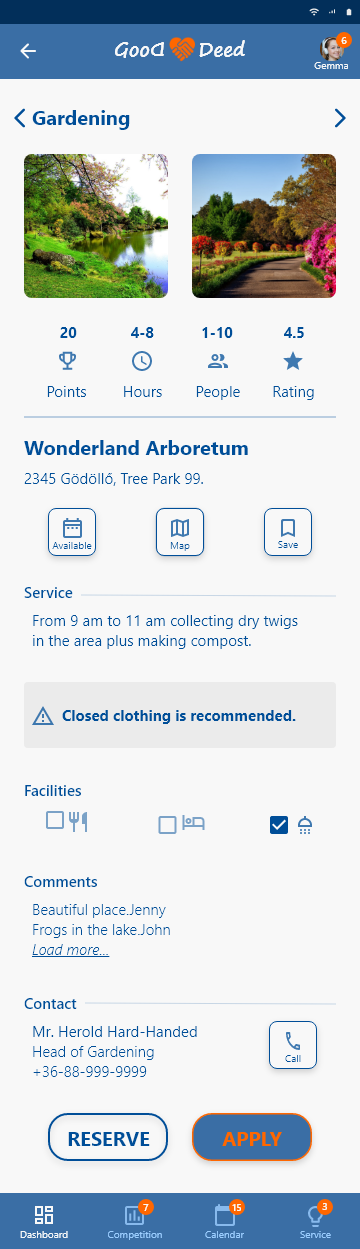
These are currently on a vertically scrollable screen.
Not a very elegant solution.
For this, I got the tip from my former UX classmates to make some grouping then drawable cards so you don’t have to scroll down indefinitely for information.
I haven’t finished yet, but this screen suggests it’s really still worth experimenting with.
LEARNING
UX /UI or product design is continuous learning of all of its elements. For example: currently, the most hyped software is Figma. There are regular bloody discussions in UX forums about which is the best. Now, I’m not analyzing why, as a beginner, it may make sense to just work with that. I have worked with Figma accordingly and I will. At the same time, I strive to get to know all the most important software in order to form my own opinion about them. Therefore, I also consciously chose other software in this project. The most trivial conclusion: the quality of your UX design does not depend on the software. I think, being a designer is an openness. One must remain flexible and open to new influences, apply new methods and tools in subsequent projects.
LOGO
With the app logo, I tried with little effort to create something unique. I knew the app name, I have ideated and checked some figurative elements including hands.
Then I found one with the heart. I knew that the colour could not be red since the two together are generally used for health. My first logo design included a line and reminded me of something else, an existing brand, that I didn’t want to copy. I suggest you apply a tool for a fast, comparative selection of fonts, XD is not appropriate for that. I only recommend that you draw the logo completely from scratch if you have a graphic background. Otherwise, it can be time-consuming, and your focus is on the whole design project and not the logo. I tried out a logo generator briefly but was not happy with the result. However, one option here is to use a generator. The logo must also be tested separately.
MESSAGES
There are several types of messages. Here we have to consider whether these are system messages, in-app messages, then these are push notifications or pop-ups, or the message sending function is not developed in the app, but then an external application is opened for the user to input the message etc. You need to rethink the interaction and that defines the design of the message. If needed it is better to consult with a relevant IT expert about the technology which can mark the path for the design.
MISTAKING
UX / UI design is about making mistakes. If you don’t make enough mistakes, it also means you haven’t experimented and iterated enough. The point is not to be perfect (especially after few projects), the point is to develop something from project to project and become aware of what you have developed.
MOCKUPS
Of course, it is the final stage. Yet, if you have any idea about your end product, in this case, the project highlights with mockups, you might want to check out what mockups your software can provide free or in a paid plan. This can affect what device or screen size you plan on. I e.g. I switched at the beginning of the design project because there were simply few mockups of the phone type offered in the default, free version of the prototyping software, in this case, XD. To avoid this you can look at the pixel dimensions and use several phone brands as mockups with the same screen dimensions, although it may be a bit confusing.
PRESENTATION OF YOUR DESIGN
Your ability to present your work. It is not enough that you have structured the project, and the MVP, the prototype all work. The whole must be presented in a properly UI-like manner. The middle road is rare, either I see very little of the UX projects in terms of content, or in my case, for example, a lot, like baroque. This skill needs to be practised and developed. It is also a skill to make the presentation fit into the context and not be repetitive. Stock photos, icons, neutral backgrounds, drawings, animation or everything else can work in a specific context, the point is experimentation and fit.
PROPORTIONS
Suppose, although you do not draw your icons yourself, you want a little different, more spectacular than the ones you use most often.

You will happily find one, for Service icon in my case referring to regulatory news for Voluntary Service, or my first Competiton icon, the same pixel size as the others, you put it into the tap bar. Your UX ex-classmates immediately tell you that the proportions, the size is wrong. Even if you increase its size it will not get better. The solution: don’t want to be bombastic always, rather search for what fits. Always check the relative proportions of the UI elements how they fit the context and the main information or CTA of the screen. Icons must be clear, clearly visible and consistent with the others. Either outlined, filled etc. but all of the same types.
ROUTINE IN DESIGN
Avoid the routine in your design process. This can be a challenge because you automatically go back to your previous solutions or think in repetitive patterns to speed up the design process. All of which is completely rational. Yet I advise item by item to decide what to repeat. For example, during an onboarding, only require the user to allow what the app needs. If the app does not need a camera, don’t ask the user for access because you did it at X of your previous projects. Ask for all permissions at the beginning of onboarding, only then present to the user what the app knows.
SEARCH
The (one) main function of the app is SEARCH.
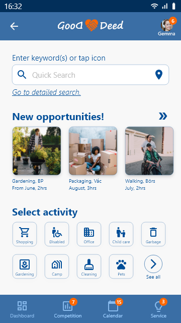
Thus, the free keyword search box should be highlighted at the top of the quick search screen. In the first version, it was at the bottom of the screen.
The other selectable options are larger in size, users see those anyway.
And because search is one of the main functions that go through the user flow, the design decision was not to get a dedicated icon in the lower tap bar. The logic was that first the user checks its performance on the dashboard screen and then just start the search on that screen.
(You can notice two mistakes on this screen: the right arrows are not needed most likely, since it is intuitive enough to be a horizontal scroll. The other is that the right distance is not kept for ‘New opportunities’ picture icon. The possible solution could be a right fading transition of this picture to show that there are more new opportunities to discover.)
SEARCHING RESULTS
List of searching results. In this case, the entities need community service. Listing the TOP 3 is recommended (contrary to my 5), the others can be found under ‘More’.
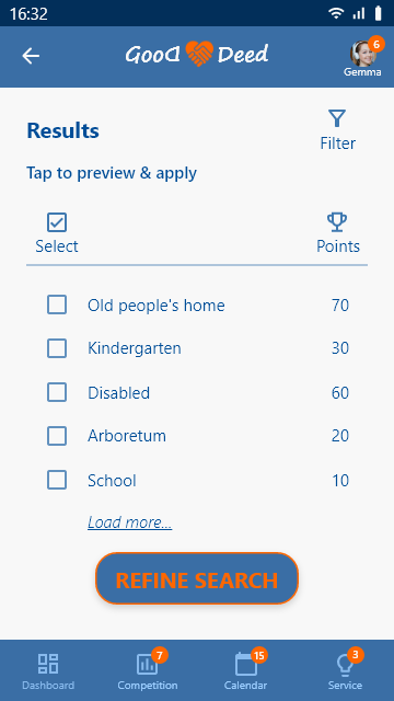
The question may arise as to whether it is possible to simply apply for them here since e.g. based on the detailed search screen, the student got here (not necessarily, in fact).
I don’t think so, because you can give extra information on a detailed fact screen of the specific entity that even influences your decision. So I put the APPLY button there. That’s a question, and I haven’t tested yet whether in practice the searching results are sent to each other one by one, or in a list.
SIMPLICITY
The arc of the prototyping process is probably individual and practice dependent. For me, it has always moved from the complex to the simpler, clearer. The direction of UI during a project is to reduce visual load, increase aeration. To simplify means fewer font size variations, and increased small-sized fonts (eg. my experience is that the body text on the screen must be at least 15 to be readable effortlessly.), fewer colours, reduction of boxes, borders or strokes, leaving out screens etc.
Consciously watch your own evolution in this ‘arc of prototyping.’
TESTING
Always test. As you gain more practice, your ability and confidence that you can complete any UX design project end-to-end will increase. This is true, you can. Even then, the chances of everything being perfect at first remain slim. Nothing went up that you had to test several times in a design process. If you don’t have the opportunity to test with a representative sample of users, then test with those you have worked with or studied with before (I always do this because of their critical UX/UI vision) or with your friends and relatives. If you have not been able to test, I suggest disclosing it clearly in your publication that eg. this is my product concept, which is subject to user tests.
TOOLBOX
Develop your own UX/UI Toolbox. A complex UX design process requires countless tools in each of its elements. The good news is that there is an abundance of free solutions for every element. Respectively, many companies are trying to integrate a lot of UX design elements into their own ultimate solution. There is always fashion and hype. However, if you can, try several suppliers and work with what is handy for you. But have your own tool list for research, questionnaire, synthesis, typo check, name generator, logo generator, colour generator, function selection, lo-fi wireframe, workflow, persona creation, hi-fi prototyping, accessibility check, video recording, mockups, remote testing etc. for everything.
UI IDEAS FIXING
Finalize your main UI ideas at your few most complex screens at the beginning of hi-fi prototyping. Many people find setting colour and typo an easy task. It’s not. My experience is to select the 2–3 most seemingly complex screens, try to design them as hi-fi as your targeted level for the whole project, adjust the font size and colours there, and test them with just this focus. Because if it’s good for these, it will also work for simpler screens, most likely. You can do this later, but if you’ve already made over 70 hi-fi screens for example and it comes out in a subsequent test that unfortunately neither the font size nor the colours come in for the testers, it’s extremely frustrating when you have to change it all the way through. Needless to say, I ran into this in this project.
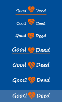
UNIQUENESS
Uniqueness in design. UX design is not an art, but your design is your trademark. I believe that while completely designing for customer needs, and real-life problems the designer should put into it something that is her/his trademark, let’s call it ‘a twist’. Probably not many would agree with me. This example will be familiar to you. You can get a variety of cars, all rolling, taking you from A to B. Then why we are more attracted to the products of Pininfarina, Bertone or Italdesign? Why do we think aesthetics are not an issue in digital products? It is not easy to reflect your style in a design, but I suggest doing so. Here, I reversed the first D in GoodDeed (despite the opinion of one of my ex UX classmates) put the heart in the middle, and applied the orange stroke/border for the buttons as can be seen above. All this made the design ‘younger, cheerful’ so to say. Not a big deal, but not the most trivial solution and it made me feel like I had put my signature on it.
UNNECESSARY DATA
Do not request data from the user unnecessarily. I’m not talking about the tightened data protection rules in the last couple of years just the UX. Do not solicit data that is not used by the app for the core function or by the user during the use of the app.
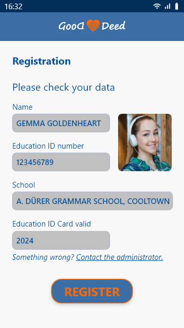
For example, if the underlying database of the app stores user data, after a simple but secure and fast registration, load in those to be checked by the user, but do not ask the user to input all those in the onboarding process.
Here on the previous screen Gemma only had to enter her education ID number, all her details will be filled in automatically on this screen. If they are okay, she just has to approve with tapping REGISTER. And in order to perform community service, we do not need the name of her mother for sure.
VARIETY TO WORK
Bring variety to work. If you only design 70 screens, you can get tired of it too. Divide the user flow into main blocks. So you can deal with the block, the screens you just like. But there is also a variety if you try to experiment with how to present the highlights of the project mentioned above or start writing the case study during the project. This has worked for me I can highly recommend it. Or simply just watch tutorials or design shots for a solution detail or get inspired. Or don’t. Anything can work to avoid burnout.
WHITE SPACE
White space, white space, white space. It cannot be stressed enough. The design must breathe. Don’t be afraid to employ 48–72 pixels distances among screen elements. If you don’t have a graphic or similar background, you may be struggling with this while you get used to it. It was scary when I heard this magnitude from my former UX classmate, but it is right.
That’s all I wanted to say now, thanks for reading this article.

You find the Highlights of the Project with hi-fi screens here. I intend to disclose the clickable prototype at a later stage. It is my pleasure to recommend my other writings here on Medium and you can reach me here.

