Case Study: Practice management software design
A clinic management software has many masters. Receptionists, doctors, and nurses all rely on it to complete their tasks effectively. It is partly due to them and their specific needs that the design process for patient management systems is overrun with challenges and complexities.
In order to establish what they were up against, we conducted a competitive analysis of 20 such systems. This research includes both medical and veterinary management software, as the in-clinic appointment flow and daily challenges are roughly the same for both.
The present article aims to clarify what works and what doesn’t for practice management systems from a design point of view. The 3 main discussion points are:
- How navigation is organized;
- The mechanics of patient search;
- How a patient file is structured.
Practice Management Systems In Use
We observed over 150 users at all levels of proficiency in order to narrow down the main use cases and pain points pertaining to practice management systems. The design of each page aims to resolve various user needs.
For a digital product as complex as a patient management system, it’s important to clarify and understand user intent in the initial stages of the design process. To exemplify, a person looking up a patient within a database has specific needs tailored to their goal.

These systems are also abundant in data. Clinics have an impressive number of patients: 1000 to 5000 individuals come in for checkups each day. Every visit means 2 to 5 interactions with the practice management system for the receptionist, nurse, and doctor. Each case has unique aspects, and this creates exceptions and challenges in terms of system use.
A lot of users are not tech savvy. For example, most new hires in a receptionist role aren’t accustomed to using an information system at work. This also goes to show that most users don’t have time to discover how to accomplish a certain task or “play around” in the practice management system. It is difficult to create a balanced interface design which will work just as well for a first timer and a pro.
The Difference Between Veterinary And Medical Management Systems
The fact that an animal patient has a human owner might sound trivial, but it complicates the information architecture more than anyone would expect. On one hand, it means that the customer relationship management section will include two types of entities, which also makes the main menu more complex.

On the other hand, search will also be more complicated. Users can search by owner or by pet name, because a pet can have multiple owners within a family or change owners during its lifespan. The patient record also comes with a client record, which further overcomplicates things.
Navigation
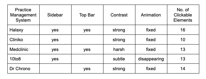
Creating intuitive navigation for practice management systems is a high stake objective, as these digital products have many features which are used in several different ways. For example, the systems we benchmarked include anywhere between 10 and 20 clickable elements. All that, even after the respective design teams worked on reducing the quantity of items and hid a lot of the functionality.
Common Patterns:
- Navigation leads the user towards the system modules (Appointments/Calendar, Patients, Messages, Financial, Reports, Products etc.) and then towards a series of features which support the main modules (tasks, notifications, settings, logout etc.) or towards elements which have been taken out of their respective modules because they are used very often (New Appointment, Patient Search etc.);
- Even though the vast majority of users will only use a few role-appropriate navigation areas on a daily basis (receptionist, nurse, veterinarian), some people also take on the tasks of others in order to help them cope with dynamic workloads. This means that the roles become intermingled, especially when it comes to administrative paperwork;
- While it seems obvious that infrequent tasks should be hidden, research has shown that if a certain action is seldomly performed in a practice management system, the user finds it extremely difficult to remember how to do it and where the correct elements are.
Examples of Attempted Solutions:
Most practice management systems use a sidebar as their main navigation area, which allows them to display numerous options vertically. It makes for a decent solution, as it frees up the rest of the screen for content and adapts according to screen size. Certain clinics also have large monitors, which allows them to display multiple modules at once: calendar, client databases, and even patient files.
These are the most common navigation patterns we’ve encountered:
- Aside from the sidebar, most practice management systems also have a top navigation bar;
- The amount of information on level two (i.e. after clicking on a level 1 option) differs;
- In certain cases, the sidebar disappears after the user interacts with it and must be reopened each time they want to navigate;
- The highlighted features are different (tasks, notifications etc.).
The practice management system benchmarking shows that if the design team chooses to insert a top bar next to the sidebar, the visual rapport between the sidebar and the rest of the elements needs to be very nuanced.
For example, when it comes to Cliniko and Halaxy, the separation between the sidebar and the rest of the page is very clear thanks to the use of strong contrast.

It is worth noting that even if Halaxy has a fixed top bar, the page is divided according to the sidebar and the right side of the screen. The top bar comes into play at a UI level and is considered part of the active zone on the right. This visually informs the user that the left side of the screen is for navigating among modules and the right side is for completing daily tasks.

Research has uncovered another viable alternative which was not used in any patient management system, but remains relevant as a potential navigation solution. In Slack Web App, the top bar is identical to the sidebar, which helps the user perceive them as a unitary area. Additionally, the top bar is very thin and contains few elements, which prevents it from interfering with the rest of the interface.
In order to apply this to a practice management system, the top bar should contain a wide search bar followed by a few select icons for notifications, messages, new appointments, and the user account.
In contrast, Medclinic has a completely different strategy when it comes to navigation. The top bar is now the main screen division element, while the sidebar is merely a secondary division element.

Even though from a logical point of view it makes sense to say that the top bar is subordinated to the sidebar, for the user top bar notifications are as trivial as a calendar interaction, while navigating through reports within the sidebar is a completely different part of their work day.
On top of that, the user must always process three distinct elements: the black top bar, the light blue side bar, and the active zone on the right. This cognitive load follows them around as they navigate through the interface.
When it comes to 10to8’s practice management software, the weak contrast between the sidebar and the rest of the interface can create problems. Aside from that, the sidebar disappears, and the animation associated with this action is bound to become annoying for the everyday user.

Dr Chrono is a practice management software that exclusively uses top bar navigation. In many viewing scenarios, for example while the user schedules an appointment or accesses the patient lists, this choice allows for the use of the entire width of the screen. Even so, it’s difficult to build a top bar navigation system that incorporates sufficient options and is easy to use in dropdown mode.

These examples suggest that the sidebar should remain the main screen division criteria in order to obtain a smooth navigation experience within the practice management system. The rest of the elements should be considered secondary criteria, regardless of whether a top bar is present.
There are also a few other navigation details which deserve to be highlighted:
- If you want to integrate a top bar in the interface, it should be a simple one. Keep it on one level. Medclinic is a prime example of how top bars with two levels overcomplicate navigation. Additionally, the different UI elements it contains clash and divert user focus;
- A strong contrast between the sidebar and the active area is good, but within a segment like the sidebar or the top bar subtle contrast works best;
- The icons within the sidebar are more of an aesthetic element than a navigation support element. It’s best if the label is aligned with the icon, or if the label is highlighted;
- While it can be frustrating if the sidebar disappears on its own, users love being able to hide that area whenever they want;
- In order to maintain a sound visual hierarchy, level 2 navigation within the sidebar needs excellent UI design. Alternatively, a new panel could open on click or the rest of the level 2 navigation options could be integrated within a subpage which opens when the user clicks the first level;
- The previously discussed examples show that UI design is very important, as it guides the eye and creates clear distinctions between key areas. The UI design helps the user focus on specific parts of the screen and differentiate components.

Search And Search Results
Patient search is a vital function of patient management software. Receptionists use it dozens of times within an hour. As the research shows, a user attempting to search for a patient can face several challenges during daily clinic life. Many patients have similar names, some have been registered erroneously, and others have names that are spelt in a complicated manner. When the receptionist is on the phone with someone as people queue up in the clinic, the situation can become quite tense.
Common Patterns:
- Most patient management systems have the search bar on screen at all times. This helps receptionists search faster even while on the phone;
- All patient management systems have active keyword search for the name field. Some also allow the user to search by patient code, while others make the user choose the field they want to perform the search in;
- Very few practice management systems will force users to access the patient page and only then search through a list or look for the keyword across the entire platform, including the Help section.
Examples of Attempted Solutions:
Halaxy is an example of best practices in terms of patient search. The search bar is always on screen and the user can choose between various search criteria. The receptionist is always in control and their experience helps them anticipate the best search strategy. Because it is used hundreds of times during each workday, the search bar is designed to be subtle, as the user knows exactly where it is on screen.
The only thing that would have made Halaxy’s search better is if it allowed people to use more search terms, such as phone numbers or addresses (the postal code is also commonly used in the UK and Germany).

Instead of generating results, Medclinic forces the user to access a patient database with an advanced search bar. The table of patients is no help at all in real life, as every clinic has hundreds, if not thousands, of patients. Receptionists don’t have the time to scroll through so much information. After performing an initial search, the interface allows users to check out the results in conjunction with advanced search criteria. It is only then that the user can modify the search to find the person they’re looking for.
The fields Medclinic has deemed essential (such as address and phone number) correspond to the criteria receptionists use most often when identifying patients.
Even if Medclinic’s practice management software is not ideal when it comes to the first step of the search process, it is an example of solid search refinement principles. This is largely due to the fact that the initial query does not help the user, and the stakes are higher by the time they perform a second search. The search results inspire clarity and simplicity by yielding control to the user. They can choose the relevant fields and search among results when there are too many.

Cliniko also forces the user to access a patient page in order to search, but it does not generate a database off the bat. On one hand, this simplicity is poetic and pleasant for a first time user. On the other hand, the search function is too rudimentary in terms of functionality to satisfy the daily needs of a busy clinic.

The 10to8 patient management software is a mix of inspired and uninspired design decisions when it comes to patient search. The search bar is permanently positioned at the bottom of the screen. While this can be useful, it’s an extra area which overcomplicates the interface without bringing much added value.
Results are displayed within a panel on the right, which means that the user doesn’t have to leave the page they were on before searching for a patient. This is an atypical choice and its real life usefulness is negligible. Even if it sounds interesting in principle, a patient will always have the user’s full attention. 10to8 also searches through the entire platform, even within Help articles.

Dr Chrono’s interface does not stand out in terms of patient search. The search bar and the results it generates are mediocre, and the counterintuitive UI accentuates its limitations. Its main problem is the lack of a clear visual hierarchy which would help the user distinguish the features that are supposed to help them find the person they’re looking for.

Slack Web App is an example of best practices in terms of search input. The search bar is unobtrusive and does not divert the user’s attention, but when clicked on it offers varied search options adapted to many different criteria. The design principles used to build Slack’s search are a gold mine. They could be the basis of an amazing patient search for practice management software.

Patient Overview
The patient overview page is in fact an entire module that needs to satisfy several different use cases. The needs of doctors and receptionists clash because each user works with different kinds of information.
The design of the patient overview section is generally biased. The client’s business strategy, customer profiles, and the type of clinics that will use the software all influence the design of the interface.
Practice management softwares with specific target niches, such as veterinary and dental clinics, can be customized to bring more added value. Research has revealed that this potential is rarely fulfilled.
Common Patterns:
- It’s no surprise that tabs are universally present considering the volume of information that the user needs to visualize. Even so, there is considerable variety when it comes to where they are placed and how;
- Most patient overview pages divide the information in various areas of the screen in an attempt to reduce scrolling;
- Most practice management softwares offer an overview of patient info, with some choosing to permanently feature the information on every page of the patient record.
Examples of Attempted Solutions:
Halaxy is a classic example of a tab bar, and even though it lacks symmetry, it’s almost proper from a visual standpoint. In an attempt to accentuate the logical representation of the tabs in the top left corner, Halaxy’s design team failed to maintain the bar’s coherence and harmony.
Their practice management software overwhelms users because of its multiple information sections, which are all crammed together on one page. This style sacrifices logic, as the user must scan several identical looking areas in order to find the information they’re looking for. It creates major difficulties, even if the effort is preconscious. After a full day of work, the user will be fatigued from all these successive rapid eye movements.

Additionally, the patient management software’s mediocre UI amplifies the visual hierarchy issues.
It’s impossible to solve UX problems with UI.
Dr Chrono is an interesting and atypical example in terms of patient overview. In their practice management software, the tabs are organized in a sidebar. The reason they are able to opt for such a structure is that their general menu is a top bar.
The number of tabs is also much larger than the number of main menu options. This choice helps users focus on the information within each tab and allows for the existence of tabs within a tab. Although in most cases using tabs within a tab is a major faux pas, it works for Dr Chrono because of how clearly the elements are separated from each other.

The level 2 tab isn’t always used in the best manner, but in certain cases it helps users segment the information. The patient information overview is always visible and occupies half the screen, which puts a lot of cognitive strain on users. The software’s UI is also a major pain point due to the use of the colour green to highlight unchanging aspects.
10to8 places tabs in the upper right hand corner. Contrasting with Halaxy, where the tabs were placed on the left in order to hint at their role on the page, this seemingly minor deviation demonstrates that compromises in terms of logic will only lead to user confusion.

Cliniko is a great example to end the competitor benchmarking on. Their user overview page is logical, functional, and clear. They used great design solutions to solve previously encountered problems. Their design team deserves a vacation in the Maldives for the way they thought out this page. The following aspects are noteworthy:
- The page title is exactly where the user expects it to be, and while it is distinctive, it is not visually overpowering;
- The action bar is optimally placed next to the patient’s name and leads to superior page economy;
- The sidebar is just as smart as Dr Chrono’s. It works great despite the fact that the page has another sidebar. It does not distract the user because its design does not use harsh colours;
- Within each tab, the user is eased into the information flow. Even if the user has to scroll, they have managed to avoid information overload.

Conclusion
The challenges that come with designing for patient management systems stem from attempting to fulfill the needs of different user categories: doctors, nurses, and receptionists. With specific biases coming into play as well (customer profile, clinic type, client business objectives), time allocated to user research is time well spent.
To wrap up, no practice management system can be considered best in class without seamless navigation, optimized search mechanics, and logically structured patient information. Niche clinics (such as veterinary and dental practices) should use their particularities to personalize the interfaces of their practice management systems to their advantage.


