Case study: The onboarding of a language learning app
A design review and suggestion session on how to improve the onboarding process of a popular language learning app.

Recently, I started learning Estonian, and the Drops app came into my hands. I had some prior familiarity with the app, but I hadn’t actually used it before. My introduction to the app began with the onboarding process, and there are certainly some aspects worth discussing and improving upon, which I’ll explore later in this article. I’ve also included my feedback based on my experience using the app over some time.
If you’re curious, you can watch a screen recording, but I highly recommend going through the steps for a more detailed understanding and suggestions for improvement.
Step 1
The first screen is visually appealing, but its title is a bit strange, users have already made an effort to download the app at this point, indicating a certain level of readiness.
The ‘Log in’ option is not highlighted prominently enough, which may cause discomfort for existing users.

An improvement that could be made here is to change the title to something more supportive, emphasizing the idea that users have made the right choice in downloading the app. Additionally, the ‘Log in’ can be moved to the bottom, grouping both CTAs together, with the primary action being more prominently highlighted.

Step 2: I want to learn
The setup process begins here, and the progress bar provides users with clear information about their progress, which is beneficial.

After selecting an item, the call-to-action pops up, which appears to be a good approach as it guides users through the interface. This effective approach will be maintained throughout the entire process. Overall, the screen has an appealing design, but there is room for improvement.
Given the relatively large number of items on the list (tens of items), it would be beneficial to complement this long list with a search functionality.
Additionally, the selected item appears as disabled, with only a checkmark indicating its selection. Enhancing this element would be helpful.

The improved screen now includes a search bar at the top, and the selected item stands out more due to better color contrast.

Step 3: How is your Estonian?
A limited number of options is helpful because it prevents users from overthinking. However, the descriptions of language proficiency levels are somewhat vague. Aligning them with real-life examples could provide clearer guidance.

The improved version features a more prominent highlighting of the selected item, following the same approach as in the previous step (this enhancement will be maintained in some of the upcoming steps). Descriptions have been updated to reflect real-life situations.

We can eliminate this step. Instead, the app can determine users’ knowledge level based on the words they picked for learning.
Step 4: What is your goal?
This could be aligned with the previous step. For example, if a user selects ‘Nonexistent’ as their language knowledge level, it doesn’t make sense to show options like ‘Master the basics’ or ‘Speak more fluently.’ Additionally, it’s unclear how this information will be used in the lessons.

At least, the same minor UI improvement for selected items should be implemented on this screen.

In general it’s better to integrate this information request into the in-lesson activities.
Step 5: How much time?
There is a list of three options, and all elements function in the same manner as in previous steps.

After selecting a time, the app will display on the next screen the number of words the user will learn within that chosen time.

What if a user’s goal is to learn 500 words? I would share this information in advance by adding it to the previous screen.

These two screens could be merged to reduce the total number of screens, or they can be completely removed from the onboarding process. Ideally, it could be introduced after users have actively engaged with the app for 5 minutes, accompanied by the following message: ‘You’re doing great! You’ve already spent 5 minutes learning. Would you like to continue?’
Step 6: When will you practice?
In this step, the app asks for user preferences and notification permissions. In my opinion, it’s not the right time to ask these questions. Users haven’t had a chance to explore the app, and they may not know if they will use it regularly. Requesting them to decide when they will practice at this stage feels too early.
The slider seems unnecessarily complex here.


As an improvement, the title here could be changed to something clearer. The updated version should clearly indicate that the app will send reminders, which directly relates to notification permissions.
Shortcuts will provide a more user-friendly interaction, while still offering the option for users to set a custom time if they prefer.

In general, this step can be removed, and it could be asked after the user’s first actual try of the app.
Step 7: What interests you?
The issue here is that there are too many items, and they are not adequately differentiated, also selected items look disabled.
However, it’s helpful that the app informs users that they can select multiple items.

An adjustment that can be made here is to add icons and make the selected items more prominently highlighted.

This step can also be moved to the activities after the first try. Particularly, it doesn’t seem like users’ interests are considered, as in my case, ‘Pets’ or ‘Animals’ were not selected, but one of the first words that the app provided was ‘dog’.
Step 8: How old are you?
There isn’t anything new in the UI that can be improved, except for the selected item UI. What’s of greater concern is that it’s not clear why the app needs this information, as the words provided by the app are not specific to any of these age groups.

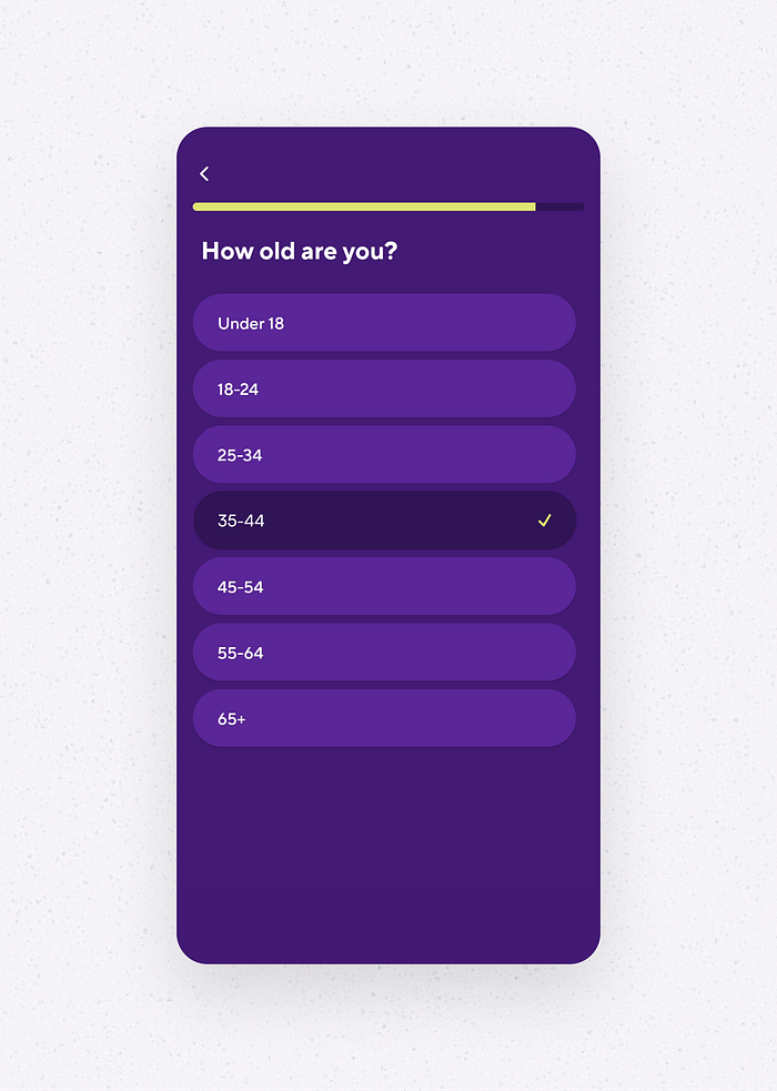
This is another step that can be entirely removed.
Step 9
Finally, the user can try the app, and this screen looks encouraging. However, a concern arises about why the app displays questions (which switch from one to another) below the progress bar when it’s not possible to answer them on this screen.
Looking ahead, users will access the course just a few steps ahead. Unfortunately, this gives the impression that this screen is added to fill space with something promising.

Step 10: Subscription
It feels like we’re one step away from actually trying the app, and the app is asking for a subscription. This is the 10th screen, and unfortunately, it gives the impression of providing zero value and bombarding users with too many requests.
There’s only one call-to-action without any alternatives. This is not user-friendly and doesn’t offer users any choices other than trying the premium subscription, and there’s not even a price.

Step 11
‘Try 1 week for free’ actually leads users to an explanation of how the trial works, and there’s a ‘Buy’ button and a cross icon at the top. The price is displayed in a too small font.
The call-to-action (CTA) to view other plans is not prominent enough, and the ‘Secured payment’ badge looks more like a button than ‘Other plans’.

It’s understandable that subscriptions are crucial for services, and the approach of asking users to subscribe at the beginning is quite common. However, it appears that this approach doesn’t prioritize users’ goals. I would remove this step from the onboarding process.
Step 12: Tutorial
The tutorial provides a clear and straightforward demonstration of how to use the application.

The information is also duplicated in the form of a small text note.

This step is useful, but I believe it can be seamlessly integrated into the first lesson.
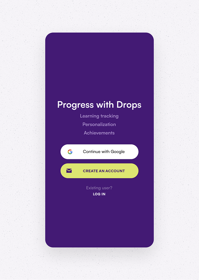
Step 13: Registration
Now, the app prompts users to authorize. Once again, the ‘Log in’ option at the top is not highlighted prominently. The phrase ‘Start learning with Drops’ is somewhat confusing, as users have already expressed their intent by downloading the app and progressing through these steps.

The title has been updated to encourage users to make the final effort. The benefits are now highlighted more prominently. ‘Sign in with Google’ has been replaced with ‘Continue with Google’ to avoid user confusion with two similar element, ‘Sign In’ and ‘Log In’. The ‘Log In’ action is now grouped with the other buttons, creating a more unified user interface.
Step 14
After authorization, another screen appears promoting ‘5 free minutes every day.’ On one hand, it seems like a setup for suggesting a subscription for additional learning time, but on the other hand, it describes 5 minutes as the optimal daily ‘workout.’ This screen can be confounding, especially after a lengthy onboarding process.
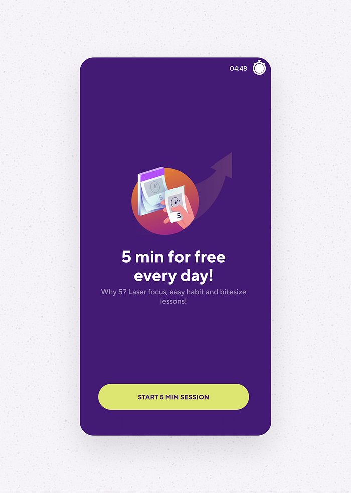
The app can simply prompt users to pay for extended usage beyond 5 minutes a day right after they’ve completed their initial 5 minutes.
And finally we made it! In summary users need to go through 14 steps until they are able to actually try the app.
As a conclusion, the app requires a lot from users during onboarding without offering immediate value. It can feel like filling out a questionnaire without clear benefits, all before users get to try the app. In my opinion, many of the activities and information requests in these steps should be integrated into the learning activities, prioritizing ‘value first, requests second’ as the main approach.
To be fair, the app is quite good (I continue using it), but there’s definitely room for improvement. I hope this feedback reaches the Drops team, and they can find it valuable for making enhancements.
Ask questions, share your comments and thoughts. Thanks!

