UX Case study: Redesigning Zara Website to improve its web presence and user experience
As part of a core module of my master’s program, Managing Businesses Web Presence, I teamed up with another student, Hala Al Daboubi, to review the usability and web presence of the Zara website, then redesigned it to improve that.
Background:
Global fashion brand Zara is one of the world’s largest retailers, online as well as offline. Inditex- the parent company suffered a significant loss in 2020 due to the current pandemic (Inditex, 2019). Consequently, they are trying to improve their online revenue to compensate for this loss.
Problem:
Zara’s website has been regularly criticised for its bad design and poor user experience.
Until the onset of the pandemic, Zara’s brick-and-mortar stores were the major source of revenue. But as coronavirus caused a 44% sales slump, Inditex had to boost online retailing and close up to 1200 stores worldwide.
That’s where a website with a strong business presence and a great user experience comes into play. Because an appealing website interface can increase a business’ income by converting visitors into buyers.
Some of the issues that the Zara website has been criticised for are:

*I am elaborating on them in the ‘usability review insights’ section.
Problem Statement:
How might we improve the user experience and web presence of the Zara website?
Solution:
Redesign the existing Zara website.
Any business must have a well-designed website with a user-friendly interface and navigation to establish a strong web presence and generate online revenue. Zara website violates many UX heuristics and WCAG guidelines, resulting in various usability issues. As a result, redesigning the site made more sense than fixing one or two problems.
Our solution includes:


Business goals:
The following were the business goals behind the redesign:

Design Process Walkthrough
Usability review insights:
After critically analysing the website, we found the following key issues:
1. Quirky aesthetic:
Zara has adopted a clever marketing tactic with their quirky way to display products to gain attention online. However, the truth is this bizarre campaign imagery has sent many shoppers into a state of confusion, despite the brand being quite successful in the endeavour to get people talking.
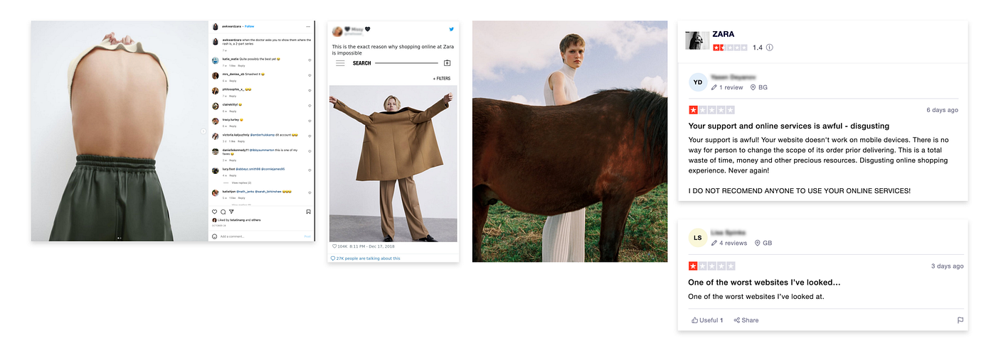
“E-commerce sites lose almost half of their potential sales because users cannot use the site. In other words, with better usability, the average site could increase its current sales by 79%.”- Jakob Nielsen
2. Poor Usability:
Zara’s website is a classic example of poor usability.
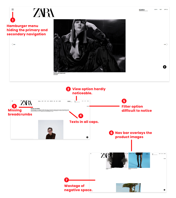
- Its hamburger menu hides the primary and secondary navigation.
- Same text labels as primary navigation for arrow buttons in its above the section’s carousel confuses users.
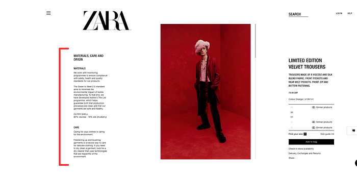
- Browsing products is not a straightforward experience on the Zara website.
3. Accessibility issues:
Violation of Jakob’s law, texts in all caps, low contrast colours for small-sized fonts are some of its accessibility issues.
Competitive analysis:
Compared to Zara’s main competitor, H&M, Zara’s website scored average and poor on usability.
Fast-fashion retailer H&M is the main competitor of Zara. We analysed both the websites based on usability and their web presence. We analysed and evaluated the efficiency and usability of Zara’s website with a specific focus on its desktop homepage, product page and individual product checkout page. Although Zara’s website violates many WCAG guidelines and usability heuristics, the following table highlights the major violations:
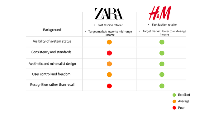
As a result, for online shopping, users prefer the H&M website over Zara as it is more user-friendly and offers a better user experience.
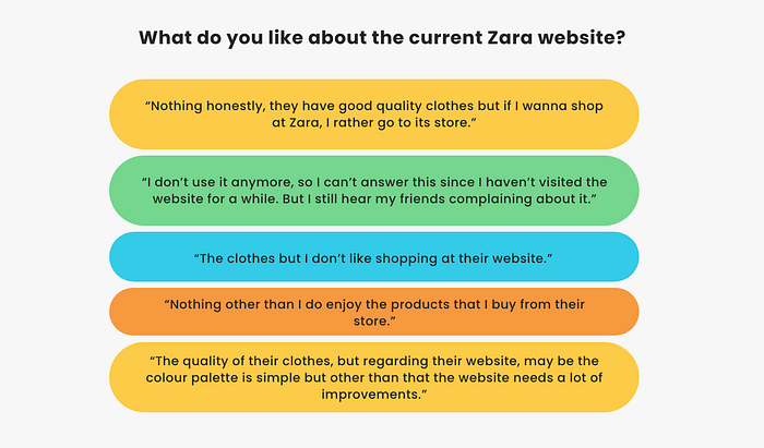
User Research:
Participants feel frustrated and irritated with the current website.
As the project had a limited timeframe, we created an online questionnaire to understand Zara’s existing customers’ opinions about its current website and better understand their shopping habits. Given the ongoing pandemic, an online questionnaire provided a larger sample size without affecting our research scope because of limitations imposed by social distancing.
Pain points:
- Difficulty navigating through the site.
- Confusing product images.
- Difficulty reading texts/information.
Target audience:
Young price-conscious audience with lower to mid-income levels.
Zara’s target demographic is a young price-conscious audience with lower to mid-income levels. They are highly responsive to trends. So, Zara’s strategy is to offer cutting edge fashion at an affordable price. As most of their customers have a clear set of interests and a shared taste for cheap yet high style designer clothes, their value proposition is fashionable and affordable clothes.
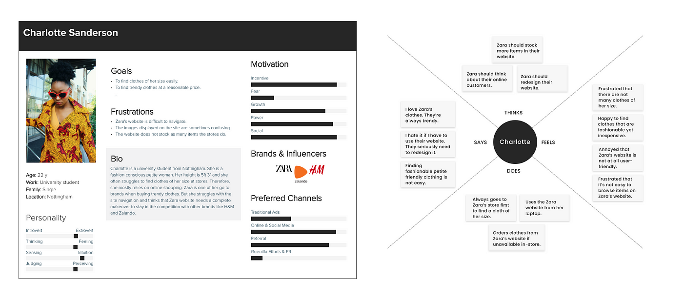
User persona and Empathy map:
Using the data we gathered from secondary and primary research, we created our user persona Charlotte and an empathy map to understand her needs and frustrations. This was our first ideation activity in response to the design challenge.
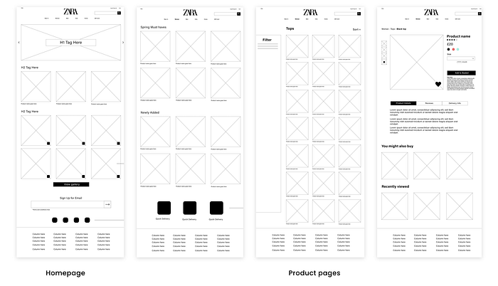
Initial wireframes:
We created low-fidelity wireframes to visualise the site’s flow and layout. Based on those low-fi wireframes, mid-fi wireframes were created digitally.

Things we considered while creating the wireframes:
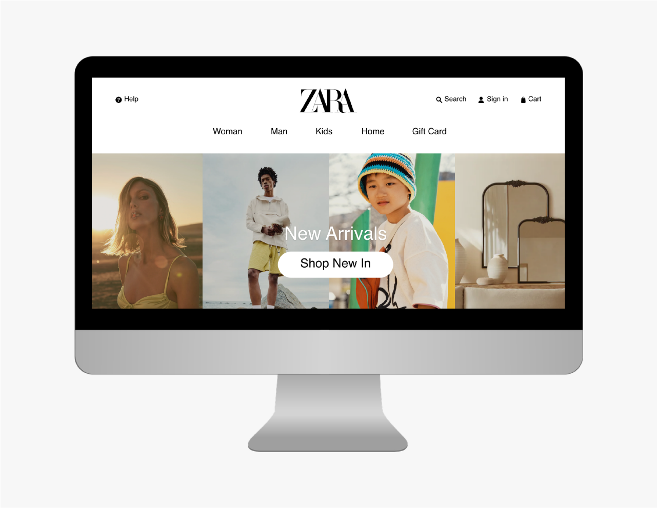
- As global navigation, we used a horizontal menu with dropdowns.
- We removed the text labels from the arrow buttons on its above the fold section.
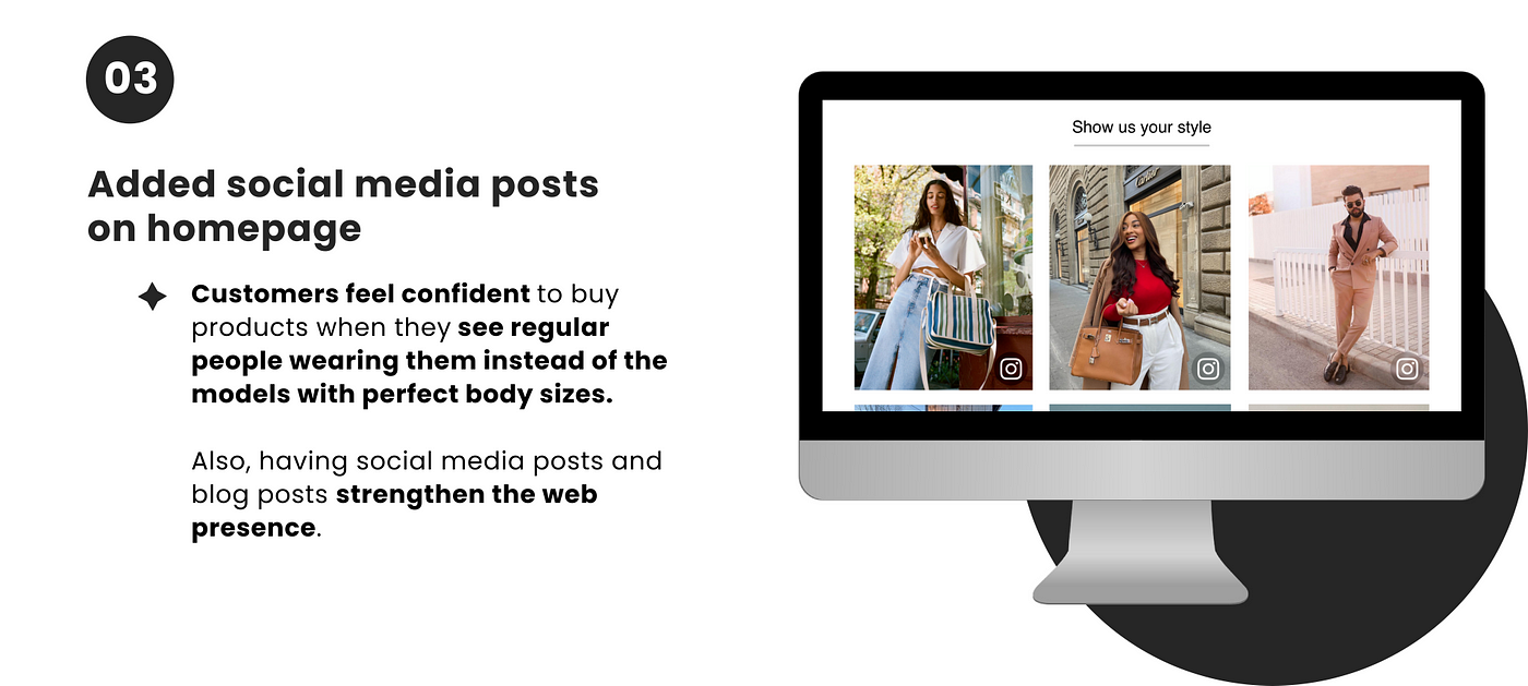
- We added Instagram stories to the homepage.
- We made the newsletter signup prominent.
- We added icons to the social media handles and redesigned the footer.
- We changed body copy and headings to sentence cases.
- We used a fixed grids view to display products.
- We added a hover option to quickly view product information like available sizes, price, colours, etc and a favourite button.
- On product pages, we also added an advanced filter option.
Mood board:

Once we had the wireframes ready, we created a mood board of design elements we wanted to include in our solution. The creation of this mood board helped us keep the style and aesthetic of the site consistent with our goals and expectations. It highlights the key design elements, styles, and trends used to refine the design style.
High-fidelity wireframes and Prototype:
With the moldboard ready, we then started creating high-fidelity wireframes to build the interactive prototype.

User testing:
We conducted moderated task-based usability testing to verify the prototype’s usability and functionality.
We asked the participants to compare the navigation and overall layout of Zara’s website and our prototype. Then they performed tasks such as finding an item, placing an order, etc.

Outcome:
- Participants completed all the tasks we asked them to perform on the prototype. The participants, however, had difficulty navigating the original Zara website and finding items.
- Participants were impressed with features such as the colour options for names, advanced filter options, and Instagram stories.
- One of our participants was colour blind. He said that such features would help him recognise colours.
Project reflections:
- I learned about web usability and managing a better web presence through this project. Further, working collaboratively with another student was a great learning experience. We both come from different backgrounds, yet we work proactively to complement each other’s skills.
- Zara’s current website violates many usability rules and UX laws. The information architecture, navigation, layout, and overall experience are not user-centric. Therefore, we decided to redesign the website to create an experience that provides an optimal user experience. From the user feedback we received during our first phase of user testing, it is evident that our prototype provides a better user experience.
- However, as mentioned in other projects, our user research was limited due to the ongoing lockdown. So if I had to work on this project again, I would like to conduct focus groups during the empathy phase to get more detailed insights about their experience and expectations on the Zara website.
Thank you for reading the case study. I will appreciate your valuable feedback so that I can improve. To discuss more on this project or about UX design, let’s connect on LinkedIn.

