Case study: Redefining product discovery at Razorpay
Using logic forms to simplify and personalize product discovery on Razorpay. Capstone project for the 10kdesigners Masterclass.
Definitions
Product: Solution that can be independently purchased by a user.
Feature: Product that is part of a collection of suitable products/ product suite.
High Intent users (HIU): Organic users, familiar with Razorpay, having a clear intent.
Low Intent users (LIU): Users converting from Ads, social media for exploration.
Problem statement
Project context: The problem statement was directly provided by Razorpay. Thus discovery and validation of problem weren’t conducted for the project.
To design a flow or solution for the Razorpay website that helps discoverability of their products and suggests most relevant products to the customer.
Currently there’s a ‘buffet of products’ wherein the customer has to find what they like. We want to develop a feature that helps you make that decision.
- Razorpay Design
Constraints
- The solution should cater to HIU and LIU.
- SEO is important.
Users
- Business owners/decision-makers
- Tech-familiarity: Average
- Developers, who come in to understand how they could integrate a product
Project Type

About Razorpay
Razorpay aims to revolutionize money management for online businesses by providing clean, developer-friendly APIs and hassle-free integration. It is the only payments solution in India that allows businesses to accept, process and disburse payments with its product suite.
Razorpay has somewhere around 20–25 solutions offered as features of a product suite or an individual product in itself.

Understanding the products
To pull off this project, a good understanding of all Razorpay products was a necessity. A good amount of time was devoted towards discovery and understanding of the products, their categorization and functionalities.
Creating a sitemap of the products on the website made it easier to discover all categories and products.
Most of the Razorpay products focus on 2 major applications — Payment gateways and Neo-banking; and branded into 3 categorizations
- Razorpay Payments (Payment gateways),
- RazorpayX (Neo-banking), and
- Razorpay Capital (Neo-banking)

An observation was made for few products with similar functions that fell into different categorizations/ branding.
Competitive Analysis
Before exploration for appropriate solutions, competitive analysis was conducted in order to understand product navigation (approach) on websites of companies offering a comprehensive line of products.
The attempt was also to recognize a pattern/ framework (if exists) out of the analysis as a basis to judge the quality of product navigation on the Razorpay website.
Three company websites were studied — Zendesk, Freshworks and Stripe

Zendesk
Zendesk is a SaaS, offering a line up of products to facilitate efficient customer service for businesses.
Zendesk offers —
- Specific products for customer support categorized based on application, accessible through the navigation bar or the landing page.
- Industry specific solutions along with solutions pertaining to the size of enterprise and special use cases, accessible through the navigation bar.
Users have access to individual products based on application or solutions tailored to relevant industry at the first touch point, separately, which then reveal features within each.

Additionally, Zendesk recognizes it’s elaborate product offerings and prompts users to subscribe to its newsletter.

Freshworks
Freshworks is a SaaS product for customer support helpdesk, expanding to IT, sales, marketing and more.
Freshworks offers —
- Business vertical specific solutions, accessible through the navigation bar or the landing page.
The users select business vertical of their interest on the 1st touchpoint, which redirects to relevant features.

Stripe
Stripe is a fintech company providing transactional solutions and features for B2B companies.
Stripe offers —
- Products categorized based on application, accessible only through the navigation bar.
Recently, Stripe also offers solutions tailored to specific use cases.

The analysis very obviously indicated similar product navigation approaches amongst the 3 websites.
At the first touchpoint, the user only interacts with high level categorizations which then redirect to multiple features/ products, indicating a top down approach.
This approach makes it intuitive for users to journey to products of their relevance despite offering a huge lineup of products/ features.

Razorpay
Razorpay’s website presents categorizations based on:
- Branding (payments, X, capital)
- Application (banking, payments, etc)
- New products
Apart from these, Razorpay also offers some use cases and industry specific solutions

Unlike others, Razorpay also showcases features/ products within a categorization upfront. Breaking down product navigation on the Razorpay website:

Moreover, the website gives emphasis to ‘New products’ and ‘Razorpay Payments’ on the landing page causing repetition of same products in different categorization.

Placement of solutions offered by Razorpay for Industry specific support might not seem intuitive enough to the users in the information architecture (IA).

Pain point
It is evident that the top-down approach isn’t applied on the website. Regardless, due to the non exclusive nature of categorizations, the product/ feature overlap makes information intake and navigation confusing.
The Ideal solution?
Another aspect of Razorpay products is that not all products cater to every user. Suitability of any product depends on: Size of business, Tech. familiarity, Industry or the problem they’re solving.
Since the website doesn’t offer any such filter, product navigation can turn out to be wasteful leading to high drop offs.
On hypothesizing, the ideal solution should:
- Work within constraints (for HIU and LIU users; SEO).
- Make product navigation intuitive and easy.
- Present users with relevant products only.
- Speed up discovery of products.
- Ease distinction between similar products.
Ideation
In order to finalize a solution for improved product discovery, four possible solutions were evaluated based on cost of operation and intuitiveness.

Explorations
The evaluation suggested ‘Logic forms’ or ‘Re-worked IA’ as proposed solutions.

Logic Forms:
Logic forms would function by suggesting products by user inputs based on pre-defined logic. The user selects their corresponding application, business size and requirements to land upon relevant products only. This can be executed without alterations to the existing website, catering to both HIU and LIU.
Re-working the IA:
Re-working the IA of the landing page and Navigation bar to simplify navigation works well for all cases only at the cost of adding a new learning curve for HIU, which might result in some drop off.
Thus Logic forms were finalized.
The explorations for logic forms entirely involved categorization of the products and it’s placement on the website.
Creating Form Logic
Creating a logic to lead users to relevant products only was carried out with a flow map. Categorizations were carried out based on applications of money that Razorpay products fulfill.
Disclaimer: The questionnaire/ logic and categorizations were created based on my understanding of each product and function.
Using the understanding of the products, the following criteria were created to form logic and lead users to relevant products.
- Size of business (Freelancer, Startup/ Corporate, Solo business/ shop/NGO)
- Service required (Make Payments, Accept Payments, Receive credit, Secure Transaction, Manage Cashflow, Get Virtual account)
- Type of transaction (Quick/ single, Automated/ Scheduled payment)
- Availability of application/ website
Placement
Two possibilities were explored for placement:
- Add as new section,
- Add as a Floating action button (FAB).

Final Solution
DISCLAIMER: The documentation below showcases the following case: Discover solutions making payments for small business/ shops.
Although a FAB is more accessible at any point of navigation, it could be perceived as a chatbot due to it’s placement. When users visits any website, their first instinct usually isn’t to access a chatbot and only turn to it incase of difficulties.
Since the goal for the solution is to prompt users to relevant products as fast as possible instead of having them navigate the website, the FAB placement might not be the best approach.
Razorpay Discovery
To make sure the solution fits well within the unique brand language of Razorpay, the solution was branded as ‘Razorpay Discovery’.

Identity of the concept of ‘Razorpay Discovery’ was inspired from discovery of an atom, which shaped everything we know about the universe today.

In order to facilitate access to Logic forms from anywhere on the website like the FAB, a CTA was added to the navigation.
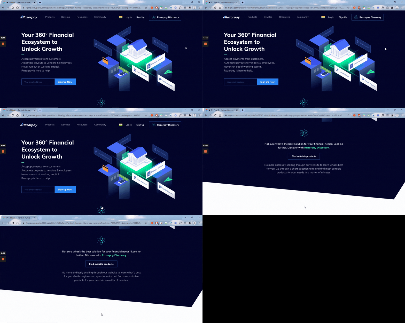
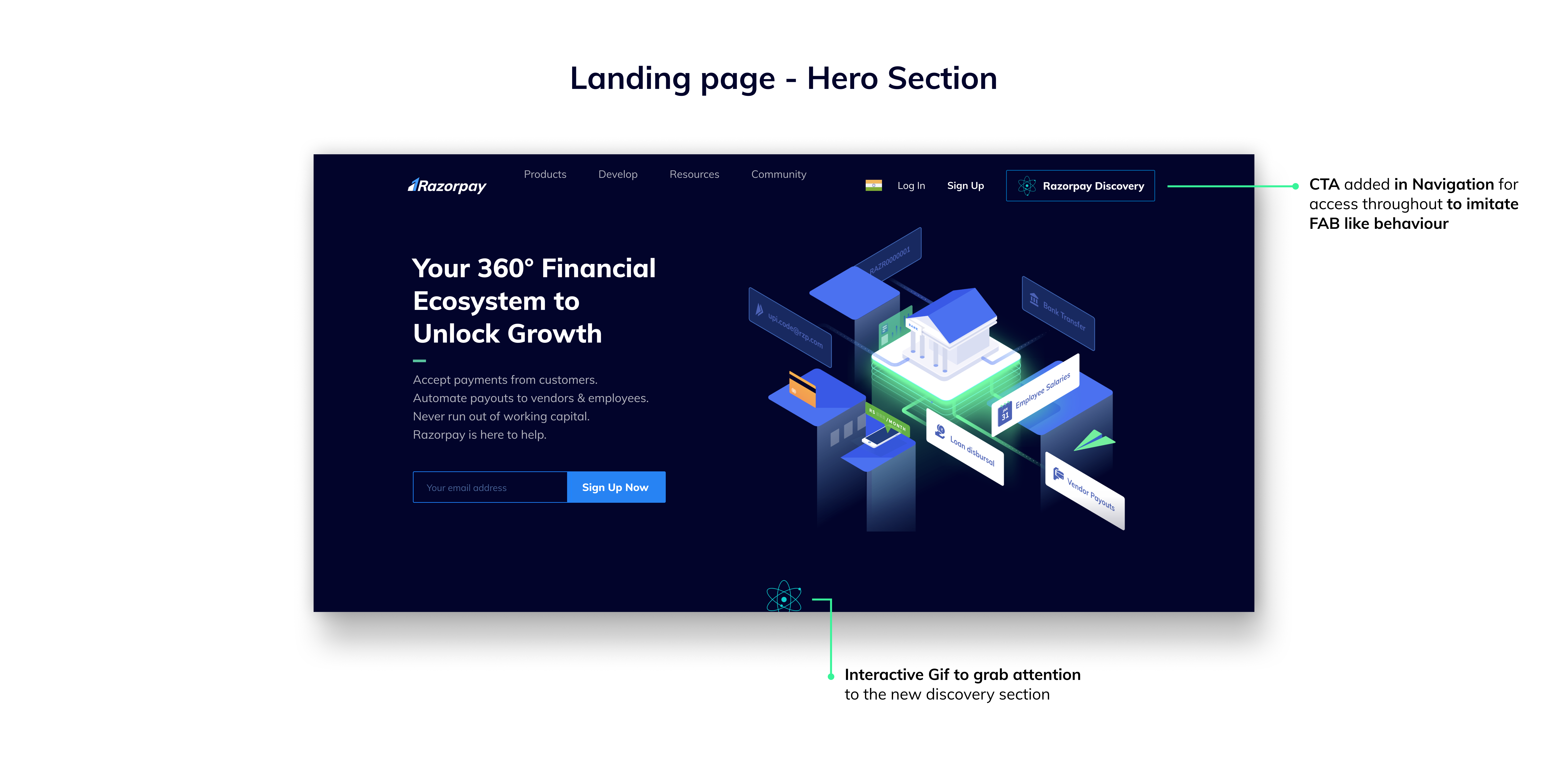
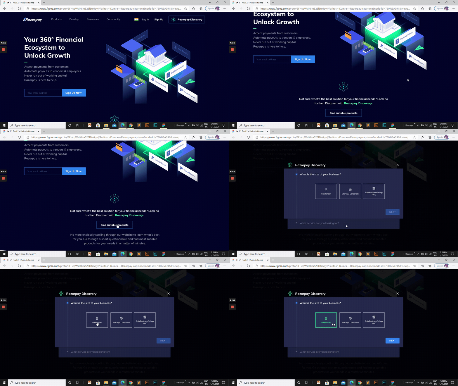
Discovery section added right below the Hero section to prompt users directly into the logic form. The section was higher in hierarchy on the landing page to facilitate early education of ‘Razorpay Discovery’ before product navigation as well.

The logic form visual design is a direct imitation of Razorpay’s Payout creation, along with additional augmentation for easier information intake.
The form opens as an overlay on the website. Choice chips were used for selecting options. The choice chips’ visuals focused on:
- Augmentation for easy intake of information.
- Obeying Fitts law to achieve good ergonomics.


Selecting the business size
Until the users select an option, they cannot continue and the ‘Next’ button remains disabled.


Selecting a service

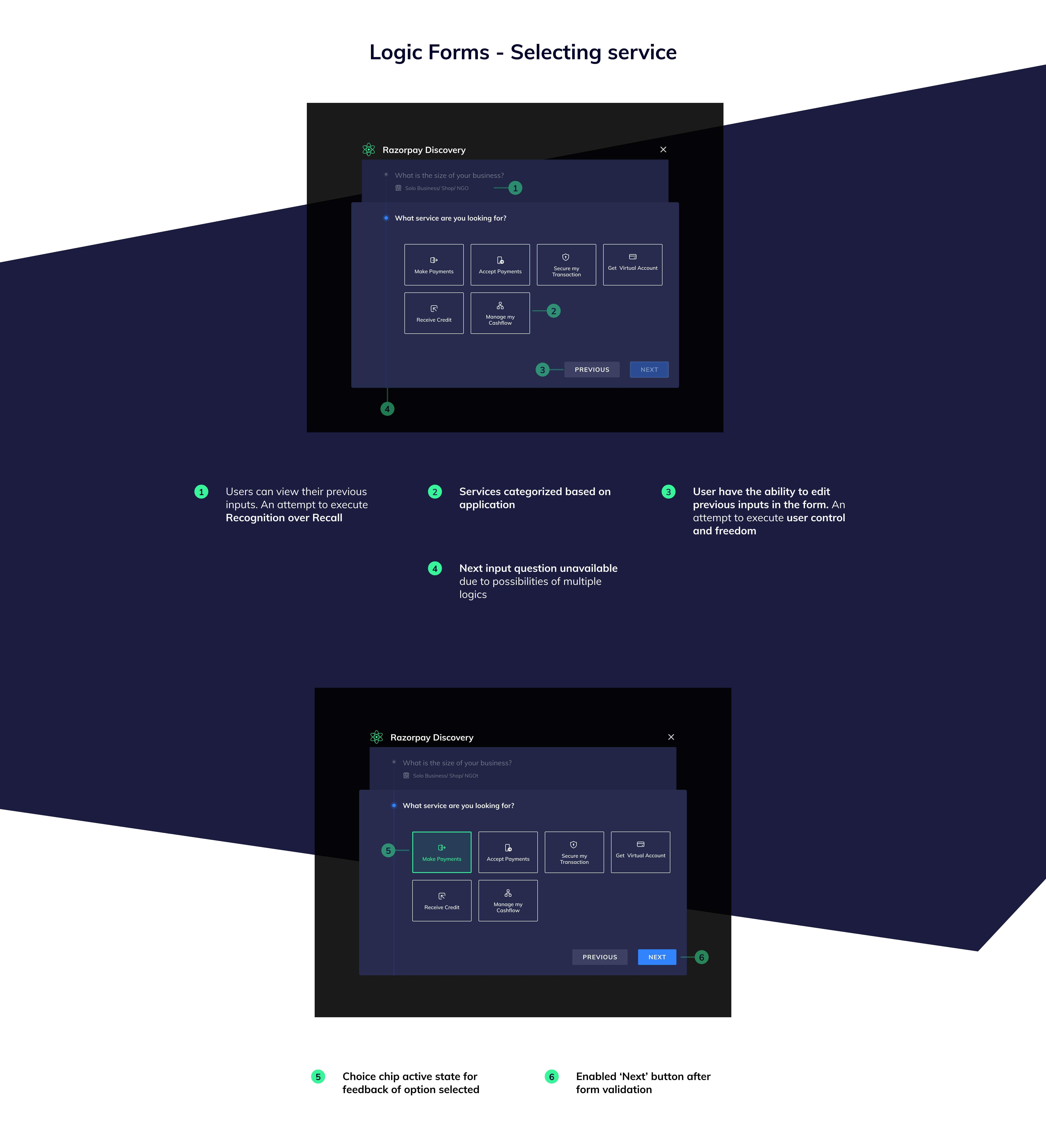
Service based logic input
On clicking ‘Next’, based on the logic (in the Discovery logic flowchart), the user will either
- be suggested relevant products, or
- input for another parameter to get narrower results.
For the current case (Discover solutions making payments for small business/ shops), the user is asked to chose between quick payments or automated/ scheduled payments.


Suggested Products
The UI for suggested products on the form doesn’t have a primary CTA, unlike the previous parts of the flow (‘Next’ & ‘Previous’), giving more emphasis to products and prompt users further in the sale funnel.
Product cards have hover states to distinguish from selecting inputs in the form in previous steps.


Some product cards and there hover states.

This approach of logic form covers narrowing down the product discovery on the website. But one key feedback received for the solution was to think of the sales funnel and what happens after the user clicks on a product.
Product Navigation
After discovery, when the user clicks on a product, the user is redirected to the corresponding product page (in Discovery mode) with the discovery form accessible as a standard side sheet. To facilitate the side sheet within the viewport, product page responsively adjusts.
From the side sheet, the user can either directly:
- switch between all the suggested products, or
- edit the inputs of the form.

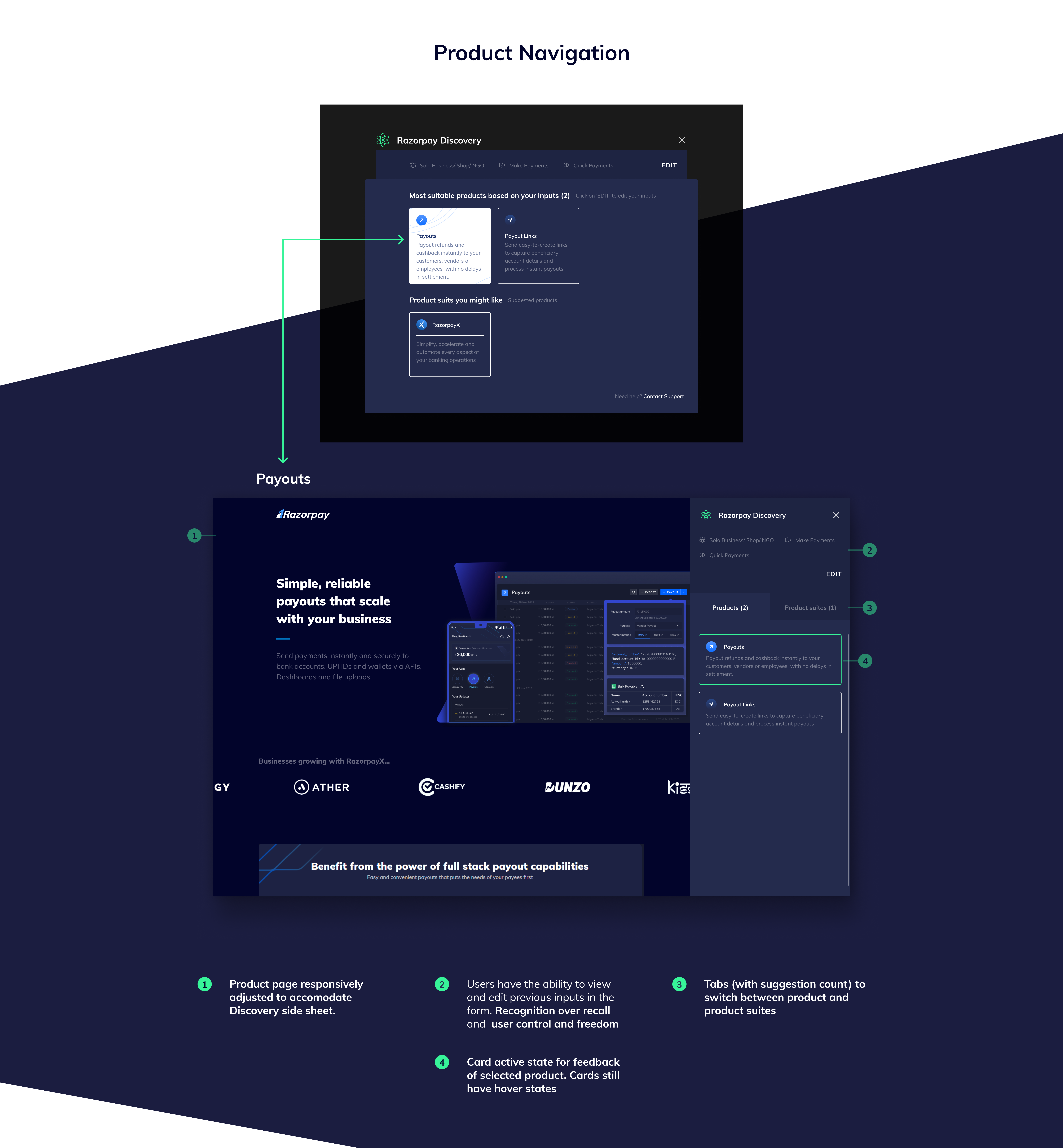
Users can switch between product and product suite tabs.
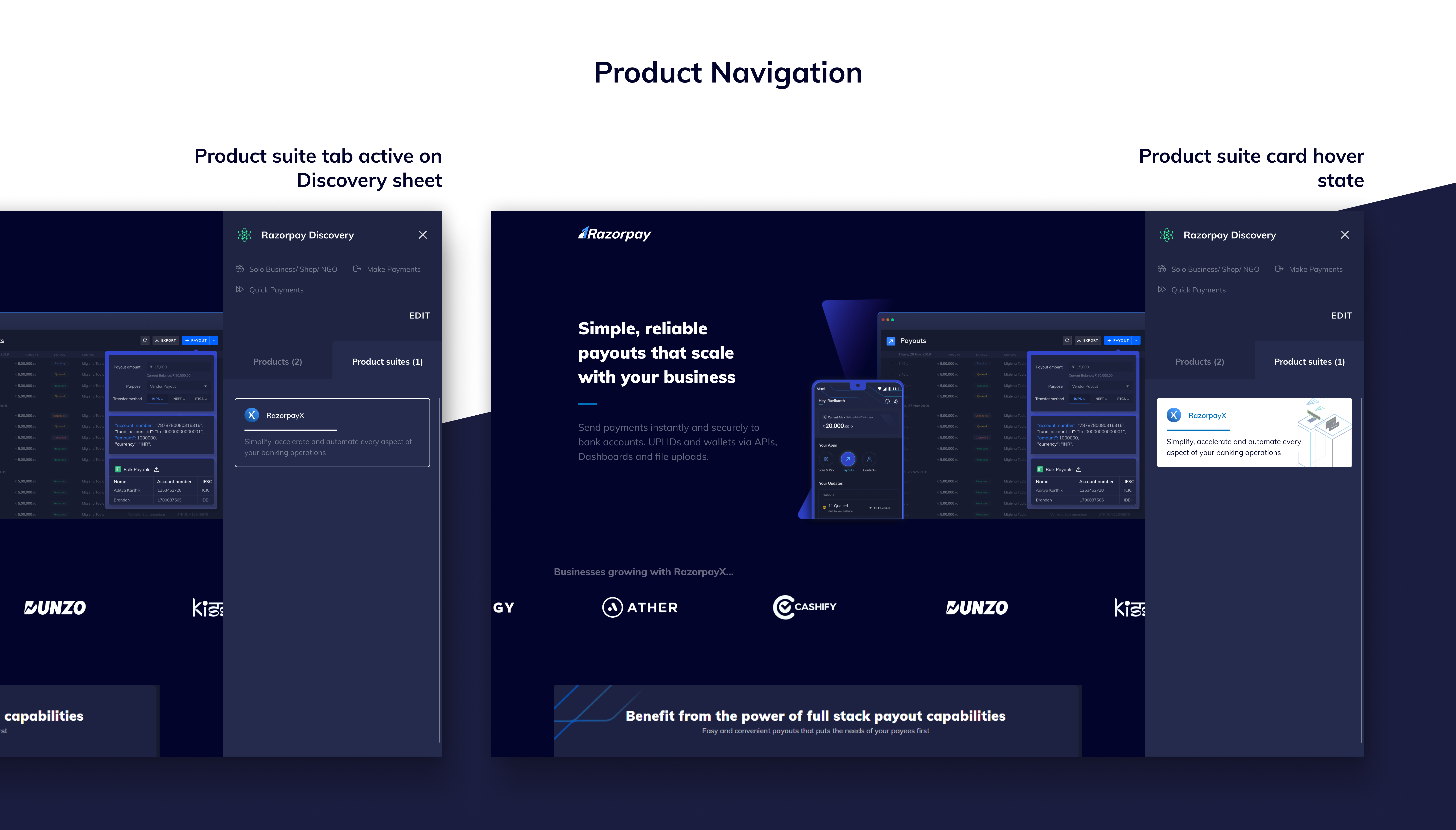
Since Discovery is basically static html pages connected via logic on the frontend, and all the cards link to their respective product pages, this internal link building in the Discovery forms might help achieve higher SEO rank.
SEO is also affected by the ability of a website to be mobile responsive and to provide a good experience overall, Discovery forms should be functional on mobile website.

Reflection
Measuring success
Reflecting upon the hypothesis made for the ideal solution, based on rationale judgement, the following could be inferred.
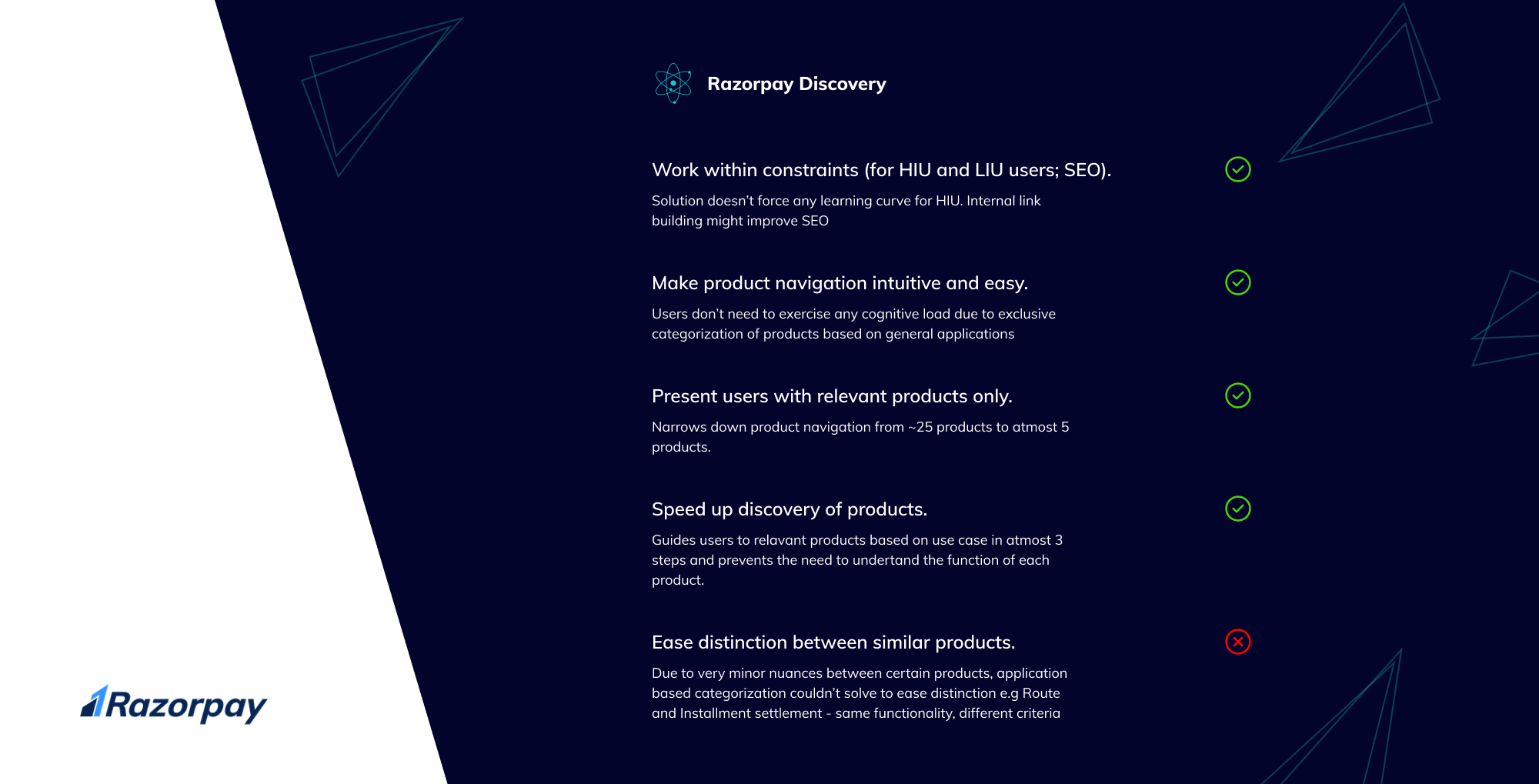
Qualitatively, Razorpay Discovery checks most boxes.
But to truly understand the success of the solution, analytics could be used to compare the performance by A/B testing between:
- The existing website;
- Razorpay Discovery; and
- Re-worked Navigation IA.
Few metrics that could be used to compare performance and determine the quality of the solution:
- Session time along with Click through Rate (CTR) towards the funnel could suggest which solution performs better.
- CTRs to the Discovery form CTA could be used to judge the placement of the CTA.
- Drop off rates within Discovery form could suggest the quality of logic and categorization of products.
Summary
To wrap up, the Razorpay website’s main pain point was the non exclusive categorizations. Categorizations based on application along with branding and the borderline difference between a feature and product lead to overlaps in product navigation.
To solve this, Razorpay Discovery used only application based categorizations and filtered the products based on parameters (size of business, tech. familiarity, etc) that defines specific user needs.
Going forward, the following improvements could be made:
- Research and attempt better categorizations to solve for distinction of products with similar functionality.
- Optimize Discovery form UI to better the mobile experience.
That’s it!
If you’ve reached this far, I appreciate your curiosity and thank you for your patience. Hope you got something to learn.

Currently looking for full-time Product design opportunities. I absolutely love talking UI/UX. If you have any feedback or just want to have a casual conversation, reach out to me on Twitter, LinkedIn or Instagram.
While I’m still building my portfolio website, here is a link to my notion portfolio.
This was my capstone project from the inaugural cohort of 10kdesigners Masterclass. Special thanks to Abhinav Chhikara and Razorpay Design for the problem statement and feedback.

