
UI/UX case study: Micro audio courses for learning on the go
Detailed documentation of my UI /UX process, reflections, and findings from the design of a Masterclass app for Mental health and growth; an assignment from the 10kdesigners Masterclass.
Learning by listening? I’ll take that!
In May 2021, I was given the assignment to create a masterclass app for the “X” niche, and it’s been 2 days since the assignment was given, and I was still looking for that “X”.
On the evening of that day I saw my brother trying to complete an online course from Jay Shetty that he has signed up 6 months ago and he was no way near to complete the course, when I asked why the response was :
“ I don’t have time to sit down and complete, I’m trying to listen to his podcast during my daily commute and gain some insight.”
But to my surprise, after some research, I had this crazy thought. What if I could change the traditional way of learning. That’s when this project was born.
Interesting? Curious?
Problem:
People aged 28–40 are at the peak of their lives, be it career or family, and people are not able to devote adequate time for personal learning, mental health, and growth to sit down and take a generalized online course.
Goal:
Design an Ed-tech masterclass app on mental growth that can enhance the experience of online course users and solve their pain points.
Timeline
2 Weeks
Role
UI/UX designer
Platform
iOS
Getting to know my audience and their needs:
During research I learned something that changed the course of my strategy.
I started by talking with people aged 28–40 who had taken or doing online courses.
I asked questions like?
- Tell me about your last experience in the online course?
- Was there anything that frustrated you during the course?
- Is there anything you would like to change in your online course?
👨🎤I don’t have time to sit down for an hour or two and take an online class. I sign up for the course thinking I’ll make time, but that never happens, it’s just better to listen to a podcast while I do my work, I learn something that way.
Answer from an Interviewee
💡After this, I had this thought what if I combine Podcast and Online courses, What if Online courses in the podcast format.
So I did some secondary research on how many people of the defined age group listen to the podcast and the results are
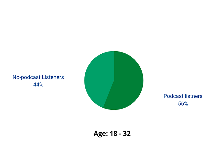
56% of 18 to 38 years old listen to podcasts on a monthly basis, while only 26% of 55+ listen at the same frequency. Source: Infinite Dial 2021
Now the task is to find what problems they are facing while listening to podcasts.
After some informal discussion with potential users the results are:
- The podcasts users listen to are long( Usually 2 hours )
- Users try to listen to the podcast in pauses when it is too long.
- Sometimes users get lost listening to long podcasts.
- Finding a specific section/sentence/quote is difficult, irritating, and time-consuming.
To validate some of the insights from the users

Secondary Research -
My secondary research revolved around
- Understanding how existing Ed-tech apps and podcast apps worked.
- Understanding common design patterns.
- An attempt to identify design patterns for product browsing, onboarding, registration, Payments
Competitive Analysis :
Before exploring a suitable solution, I conducted a competitive analysis to understand product offerings, features, and user flow on ed-tech and podcast apps.

Spotify
Spotify is a Swedish audio streaming and media service provider offering millions of songs and podcasts.
Business model
- Spotify is free but for an ad-free account, you have to buy Spotify premium.
- Spotify premium is Rs. 119 per month
Pain point
- Spotify doesn’t offer to browse podcasts that are in different languages.
Google Podcast
Google Podcast is Google’s standalone app for podcast integrated with both google assistant and googles home.
Business model
- Google podcast is free.
- Google podcast is also ad-free.
Pain points
- Bookmarking and playlist options are not available
Hubhopper
Hubhopper is India’s leading podcast hosting platform and free distribution of podcasts.
Business model
- It’s free for users.
Pain points
- No personalization
- The app looks cluttered and leads to cognitive overload
Mindvalley
MindValley is an educational technology company that publishes products focused on personal spiritual development and lifelong learning
Business model
- Subscription-based model and individual course buying options
- About $499 per year
Pain points
- Very expensive
- No offline learning option
Udemy
Udemy is an online learning and teaching marketplace with over 130000 courses and 35 million students.
Business model
- Marketplace business model
Pain points
- The app looks cluttered and leads to cognitive overload
- Sections misplaced
- Only one preview video available based on which decision to enroll has to be made.
Masterclass
Masterclass is an online education subscription platform on which students can access tutorials and lectures pre-recorded by experts in various fields.
Business model
- Subscription-based model
- About $18/month to access the entire collection of courses
Pain points
- No certification on Course Completion
- No supervision or help
- No User Retention and motivation to come back again (Based on online Research)
- No free trial
What exactly is the problem and who’s affected by it?
I went back to my interviews and research and gathered all the pain points and key takeaways,
Pain points
- Don’t have time to sit down and do an online course.
- Good podcasts are too long.
- Sometimes losing when listening to long podcasts.
- Finding a specific section/sentence/quote is difficult, irritating, and time-consuming.
Key takeaways
- Users want to learn daily
- Users have a high paying jobs
- Users are very busy in their daily lives
With this information in hand, I was able to create a persona that reflects what some of my real users go through in their life.
This helped me better sympathize with my user’s frustrations

Ideation🧠
- A feature to save a specific segment/quote from the podcast and save the timeline for later use.
- Adding timestamps for users who want quick access to what they want.
- Splitting long podcasts into many smaller podcasts for easy use.
- Converting video courses to audio format.
The Ideal Solution ✅
💡The ideal solution is to make a masterclass app that offers courses in podcast format that featuring smaller lessons from industry-leading experts.
This solution combines all the ideas I came up with during the Ideation phase, this can solve most pain points of users and can help them learn.
The future journey of Mr. Jane
Here I visualized what Mr. Jane’s journey might look like when he starts using my solution.


Research for Visual design
I browsed through different apps in this niche as well as others to research some particular elements and features.
In this process, I am trying to be as open as possible to collect more and more data so that I can expand my scope of exploration.
IA
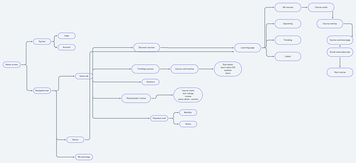
As a product designer, I don’t just have to design beautiful-looking screens but have to think heavily on logic and information flow for better usability.
After a lot of iterations and countless hours making sure the visuals are good
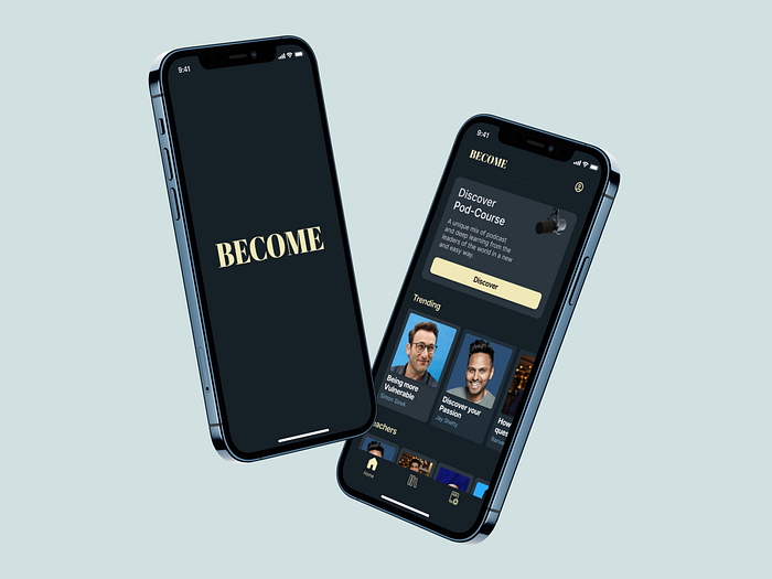
I present you the Ultimate learning app — Become
A revolutionary masterclass app that offers courses in podcast format, featuring smaller lessons from industry-leading experts to help people learn just by listening, even in their busy lives.

Home page experience :
- A brief description of the product in clear terms for clear understanding at the start.
- Course cards are neatly arranged to avoid cognitive overload.
- User reviews directly above the membership CTA to dispel doubts and build trust.


All courses and course overlay.
- Easy access between trending, upcoming, latest, trending courses.
- Course overlay helps reduce friction between screens.
- Added a quote for extra motivation.

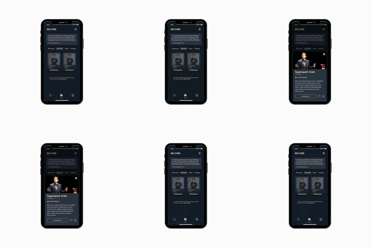
Upcoming course and overlay card.
- The number of people waiting gives social proof.
- Made the share button more accessible to increase reach.

Wishlist
- Discover CTA on the wishlist screen to help users explore more by reducing steps.
- Added a touch of humor to make the app not so serious.


Course detail screen
- Users can take a look at the course before signing up to get an idea if this is the right course to take.
- Users get an overview of the time and number of lessons right at the start.
- Users get a detailed overview of what they will learn, the reviews, and ratings.
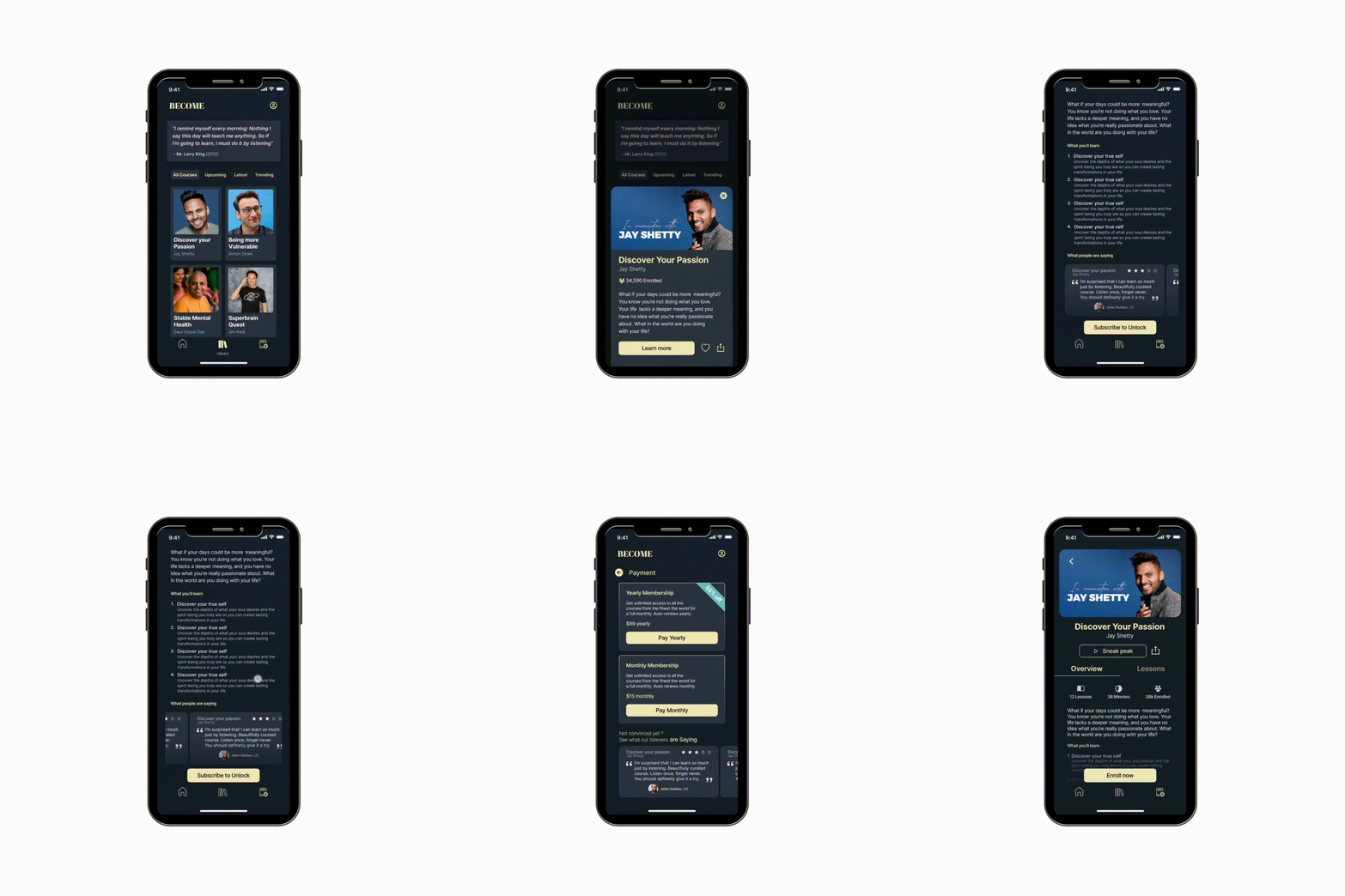

Resume Course
- Users can track their progress of the course and resume easily.

Lesson play screen
- Users get different speed options for their own preferences.
- Clear distinction of transcription into past, present, and future.
- Highlighting function for the selected sentence for later reference.
- Sharing function for the selected sentence to get more reach.
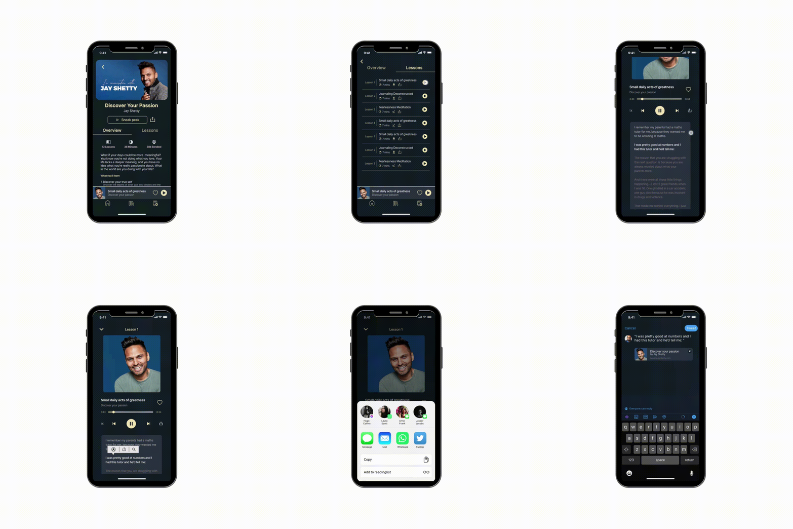

Twitter share screen
- Twitter share feature helps with organic reach and supports brand growth.

Payment Screen
- A clear distinction between monthly and annual membership makes it easier to choose.
- Added reviews of the courses on the payment page for more conversions

Course completion congratulation screen
- Added feel to the rating system to help users make the best decision.

Error Screen
- Stated the company’s belief and admitting mistakes to change the company’s view in a negative state.

Other edge cases
- Designed for notification bar play/pause lessons.
- Allow Notification will be asked after the user has explored the app to make a better decision.

Onboarding Experience:
- I wanted to provide insight into the services offered by the app and visually convey the value to the user, but at the same time I wanted to narrow the funnel and prevent users from bouncing and convert them quickly, so I added the signup flow in the onboarding itself.

Sign-up and Sign-in screen
- Focused on optimizing and reducing the number of steps required for the user to Sign Up and prevent drop-offs.
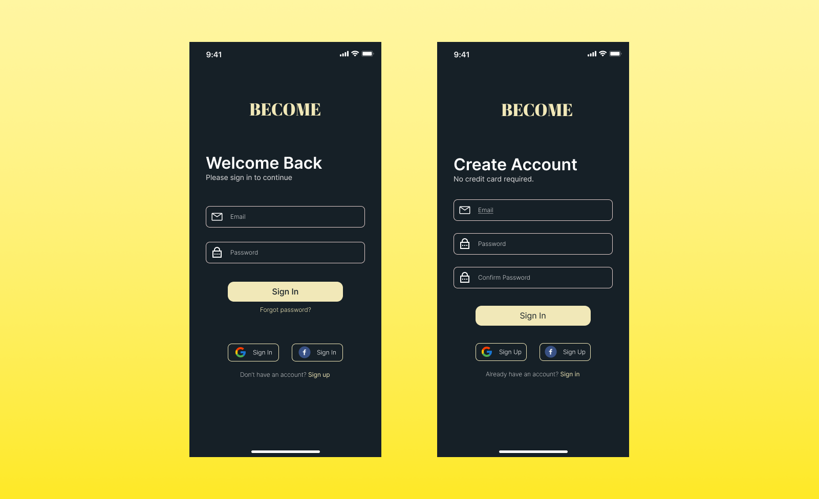
Forget Password
- User flow for the forget password
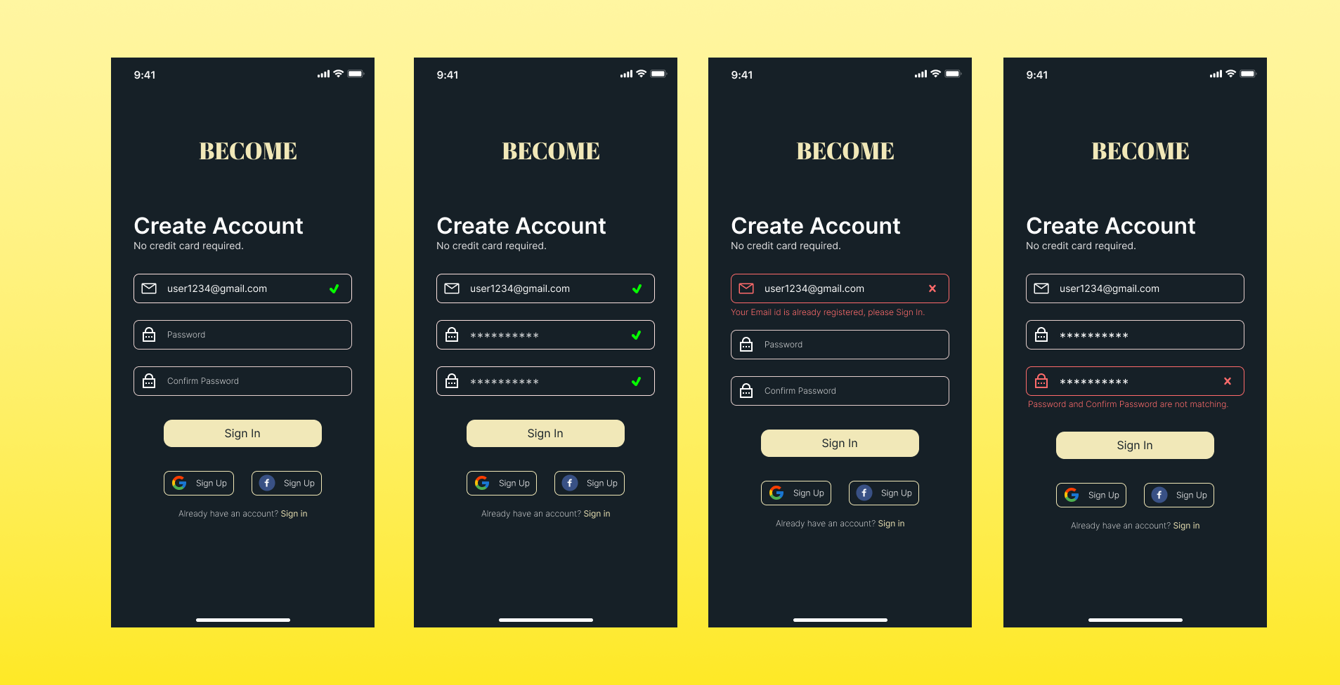
- Use of red color to indicate that incorrect information was entered
- Gave accurate information about what incorrect entry was made and how to make it correct.

Sign up edge cases
- Use of red color to indicate that incorrect information was entered.
- Gave accurate information about what incorrect entry was made and how to make it correct.
Learnings and Reflections
As my first full-fledged UX/UI project this has helped me strengthen my foundation and I’m surprised by how much I’ve learned.
Few things I would add/ improve/ replace that would result in better user experiences:
- Adding personalization to the app
- Making designs more accessible by use of appropriate colors to achieve acceptable contrast ratios as per WCAG.
- Make the language much easier and more comprehendible to improve the UX.
- More iteration in the onboarding experience.
Learnings:
- Iterate, Iterate, and Iterate
- Introducing a new feature is challenging and language plays an important role here.
- The design process is not linear.
That’s a wrap!
If you have gotten this far, I thank you for your patience.
Did you know? You can hold that clap button for a few seconds to give a maximum of 50 Claps. I would really appreciate it.
I’m open to opportunities to build some great products, you can connect me on LinkedIn, Twitter, Instagram, or chvishal2k@gmail.com.
Thank you for your time!
