Case study: Landing page for an AI-powered skincare recommendation app for the Indian demographic

I made this project as an assignment for 10kdesigners Cohort 7, where we were asked to design a landing page on a topic of our choice. The assignment’s goal was to practice visual design and better understand the design process.
I chose to go with the topic “AI-powered skincare recommendation app.” To add a personal touch, I adjusted the app's focus to cater to the needs of the Indian audience. This decision was influenced by the limited availability of similar apps in the market that adequately address my skincare concerns.
📌Problem Statement
Design a landing page for an AI-powered skincare recommendation app for the Indian demographic
📹 The Preview
If you prefer visual content over text, here’s a prototype video showcasing the final landing page design for this project. You can also explore the prototype on your own here.
(Note- The image used in the hero section is 4k, so might take a while to load, please restart the prototype if needed)
You can also check out the final landing page here.
🧠 The Process
Before I began, I divided the process into smaller steps to stay organized and on track. Here are the stages of the project that I followed throughout the assignment:

👨👩👧👦 Target Audience
- People of the age group 18 years and above
- People of different genders and backgrounds
- People who are trying out skincare for the first time and need assistance to make an informed decision
🔍 Research
I wanted to understand the needs of the users and the challenges they faced with using similar apps. So, I began my research process with the Secondary Research method because we were short on time to conduct user surveys.
My initial focus wasn’t solely on the Indian audience. But as I dove deep into the research, I came to a realization: despite India’s vast diversity and unique climate conditions compared to the rest of the world, there isn’t a dedicated app exclusively designed for Indian users. Most of the AI-based apps were trained on a specific demographic of users.
Through market research and reading skincare articles, I identified the unique pain points that Indian users face while doing skincare.
Then I started with competitive analysis and drew insights from similar apps, noting down all the missing features in these apps.
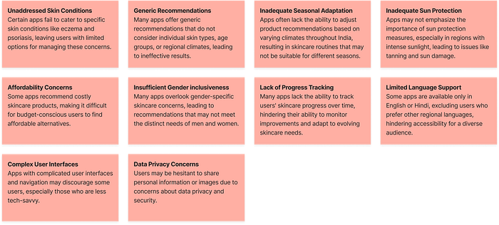
Later, I drew out the possible solutions for each of the pain points.
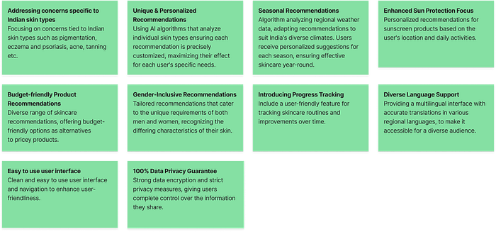
🧬 Information Architecture
Once I gathered all the research data, I began organizing the content for the page.
After many rounds of iterations, I came up with a sitemap that included all the key information I wanted the target audience to engage with.

📝 Wireframing
I like to jump directly into visual design after I have my IA in place, as I’m able to iterate faster. But, I learned that wireframes encourage extended and deeper product thinking.
Since I was short on time, I went with the pen-and-paper approach, as it is easier to make iterations. I made a few low-fidelity designs for the landing page and app screen mockups.

✨ Visual Design
This was my favorite part of the process. Before designing the webpage, I went through a lot of inspiration and created a moodboard that featured various color themes and design aesthetics. I labeled the color palettes and layouts that matched the tone I had in mind.

- I focused on finding ideas with light and pastel colors as I wanted the landing page to feel light and clean.
- To avoid creating a similar layout to what was already out there, I made a mindful choice to look beyond the typical AI websites and explore other genres as well.
- I organized the inspirations into different sections for better clarity and gathered pictures of people from different age groups and backgrounds in India.
🎨 Style Guides
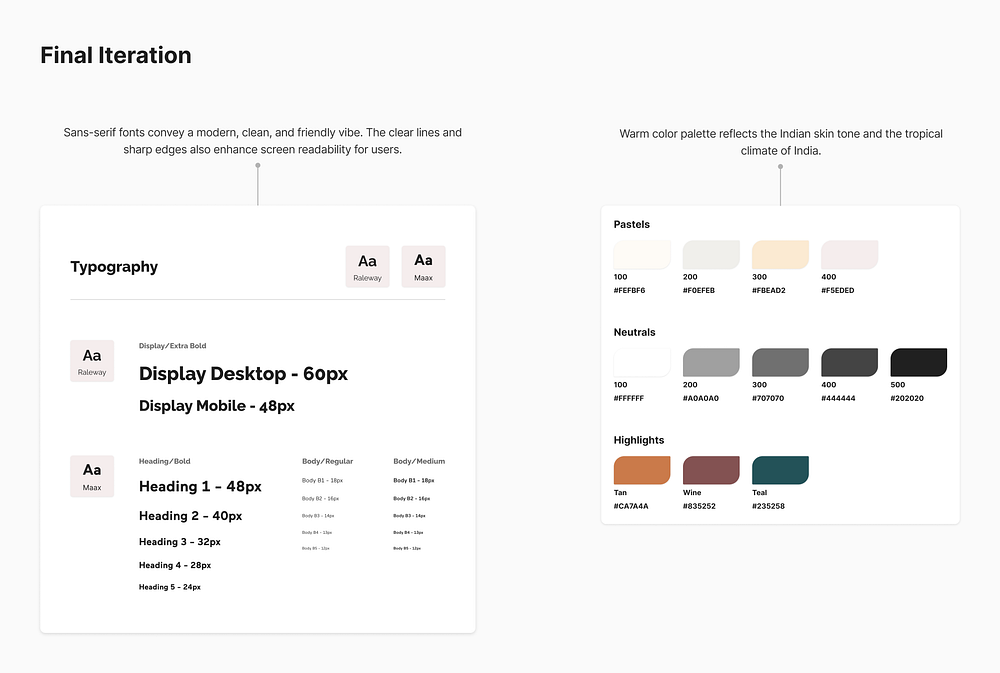
I was aiming for a clean and minimal look with a light and pastel theme because it helps users focus on the important information without distractions.
I initially went for a cool color theme, but it didn’t match the project’s vibe. So, I decided to discard this and experiment with more options.
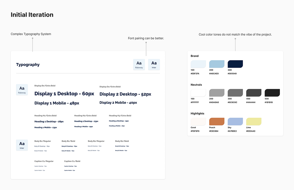
After a few rounds of iterations, this was the style guide I finalized:
👻 Figma Time!
For the visual design, I tried out different versions for each section of the page.

Here’s a walkthrough of some of the major iterations I did for each section:
1. Logo
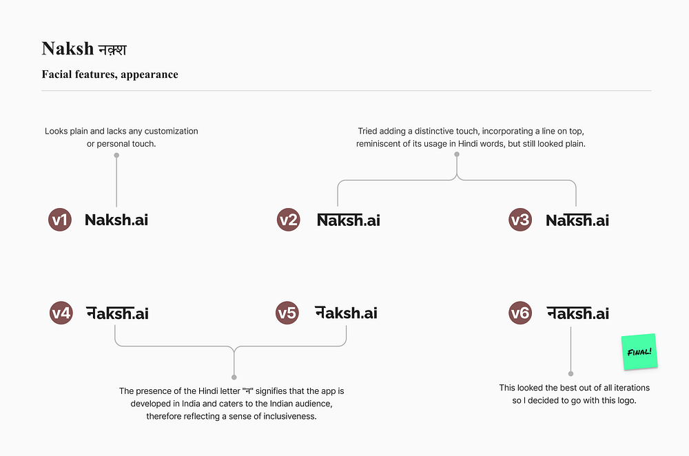
When choosing the app’s name, I wanted something that would resonate with my target audience and build a sense of inclusiveness and reliability. So I chose to go with the Hindi word “Naksh” which means facial features or appearance.
2. App Interfaces
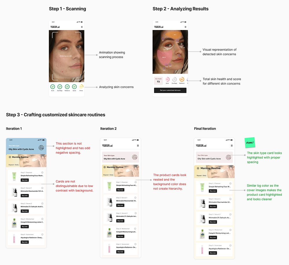
I began by designing the app screens to determine its core functions. I am using these screens as a demo in different sections of the landing page.
I focused on three key steps: Scanning, Analyzing Results, and Crafting Customized Skincare Routines. My goal was to maintain a clean and user-friendly interface for the app screens.
3. The Hero
The hero section is vital on a landing page because it’s the first thing users see, shaping their initial impressions of the brand. Therefore, it’s crucial to design it to convey information clearly and build user trust.
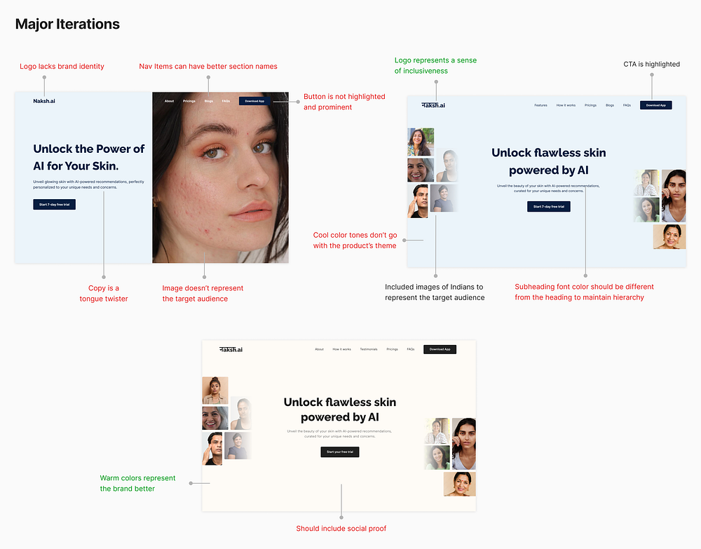
I went through many rounds of design to create an effective hero page with an engaging headline, a preview of the product, and strong social proof to build user trust.

4. The why
This section educates users about why the app is tailored for the Indian audience, explaining the differences between Indian and Caucasian skin and why global products and diagnoses may not always be suitable for Indian skin.
I came across numerous articles in magazines and online sources that highlighted the distinctiveness of Indian skin compared to the global norm.


5. Core features
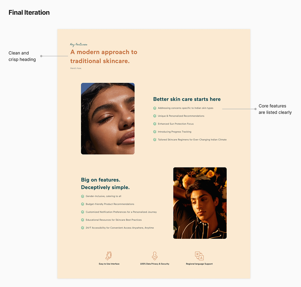
All the features offered by the app are carefully curated based on user pain points and needs.
Features are split into two parts: core features and additional ones like gender inclusivity, budget-friendly product recommendations, and 24/7 access. I’ve also noted extra benefits like data privacy, an easy interface, and regional language support.

6. How it works
Here I’m outlining the three user-friendly steps to create a personalized skincare routine, demonstrating the app’s ease of use.

After some iterations, I realized that animating this section with step-by-step visuals on adjacent screens is the most user-friendly way to explain the app’s workflow.

7. Testimonials
Testimonials serve as social proof and provide real-life evidence that the app works effectively, building trust and confidence in potential users.
I’ve also tried to show relevant information like age group and skin concerns to provide better context for potential users.


8. Pricings
Pricing plans help users understand how much the service costs, and what they’ll get for their money and allow them to choose the best option for their needs. This transparency builds trust with users and helps them make informed decisions about using the app.


9. Download app CTA
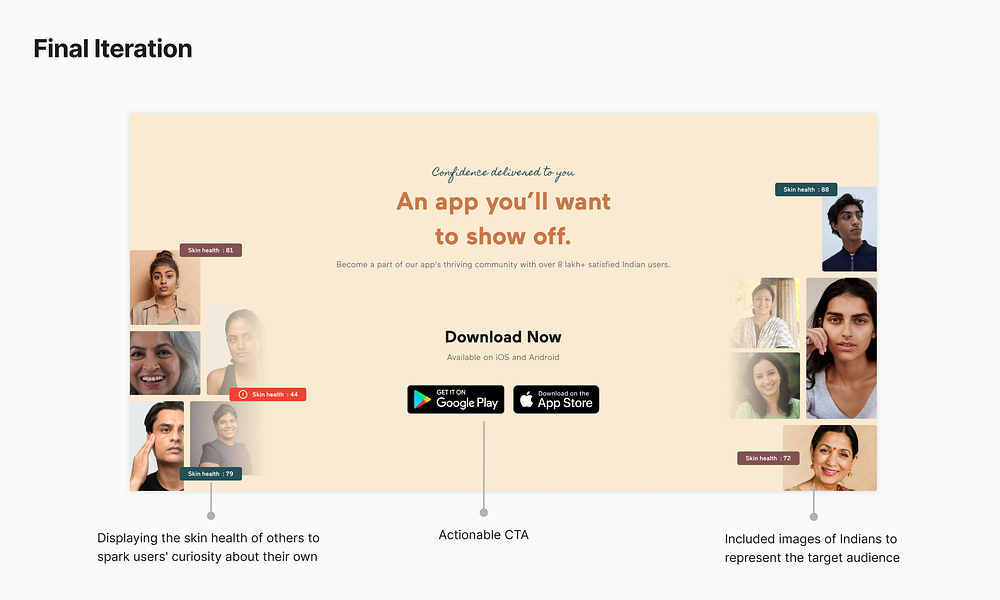
The “Download App” button takes users to the Play Store or App Store to download the app, simplifying the process and increasing downloads and user engagement.

I also reused the images from one of the hero section iterations over here because I liked the overall layout.
10. Blogs
I had a specific layout in mind for this section, so there weren’t many major iterations. Blogs are featured here to educate users on related topics covered by reputable authors and magazines.

11. FAQs
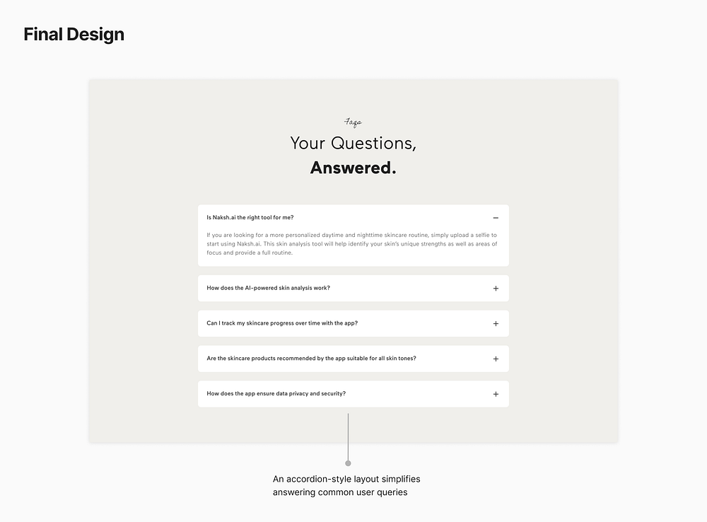
I opted for the traditional accordion layout for the FAQs since users are already familiar with it, ensuring ease of use. I included common queries users might have about the app and its underlying technology.
💁🏻♀️ Conclusion
I thoroughly enjoyed crafting this landing page and learned the power of iteration. I also realized the importance of active listening and learned to recognize valuable insights when receiving feedback.
Maintaining a well-organized workflow was key to completing this project on time. I also solidified my design process which I’ll keep on evolving.
I’m open to opportunities as a Product Designer. Do reach out if you’d like to work with me or collaborate on some projects.
