Case study: Kitchen Story
How can we improve the Kitchen Story’s website to make it more interactive and easy to navigate

Overview
Kitchen Story is Steven Choi’s 10th restaurant in San Francisco. Steven Choi is a well-known chef who owns a number of successful brunch spots and is always looking to expand. A combination of Californian and Korean food is served at the restaurant. It’s known for its thick, spicy bacon, dubbed “Millionaire’s Bacon.” There are a number of positive reviews for the restaurant, and people are willing to wait up to 40 minutes for their food which is insane! There are numerous good reviews on OpenTable, Yelp, and Google. So if everything is fabulous, what is the problem?
A good restaurant is like a vacation; it transports you, and it becomes a lot more than just about the food.
The Challenge
The problem is with their current website. It has a lot of Navigation issues, the elements are unorganized, the site lacks consistency, and the links and buttons are not prominent. The challenge is “How might we get the customers to stay longer on the website and encourage them to visit the restaurant”. Now that we have a challenge, we need to find a solution.
Current Website: http://www.kitchenstorysf.com/
The Solution
The solution is rather a simple one. The goal is to improve the customer experience by simplifying and arranging the elements to make it more intuitive and easy to use while making it faster for customers to get what they’re searching for and achieve their objectives and also maintaining the brands’ values.
In short, making the site more readable, navigable, and discoverable.
Design Process
The duration of this project was 8 weeks and my role was to -
- Understand and analyze the problem to create probable solutions,
- Enhance the overall User experience, and design effective and consistent visual elements.
- Giving the website a complete makeover by implementing proper colors, typography, and interaction while maintaining the overall aesthetic of the brand.
After getting an overview of the challenge and solution, it was time to dive deeper into the process of creating.
I divided my process into four Ds. Discover, Define, Develop, and Deliver. Due to time constraints, I deliberately did not touch upon testing.

Discover Phase
The first phase was the Discover phase. It is necessary to understand the business before jumping on creating any UX strategy.

Competitive Research
I started off with competitive research because I wanted to understand the threats that Kitchen Story has. I got to know that Kitchen Story has some strong competitors. Purple Rice, Frances, and Jamie’s Place are all restaurants that are a mile apart and serve similar Asian fusion cuisine. I checked their websites and reviews to get a better insight. Purple Rice has a lot of information on its website that saves users time by not redirecting them to external websites. Frances is a well-known restaurant among the locals and their online reservation is hassle-free. Jamie’s Place offers online ordering through their website.
Doing this research, I came across a lot of information that describes Kitchen Story’s strengths and weaknesses, and so I decided to create a SWOT analysis.
SWOT Analysis
Great cuisine is clearly the strength, as evidenced by the analysis. The website, on the other hand, is a flaw. The irregular spacing, inadequate content, and difficult-to-read fonts make it tough for consumers to navigate. Now is the time to take advantage of the flaws. The opportunity is to upgrade the site in order to boost engagement and revenue.
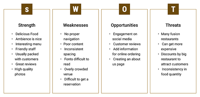
Key Information
- The biggest Strength is the delicious food
- The weakness is the poor website
User Personas
While making the SWOT analysis, I came across numerous reviews which helped me immensely to understand the type of visitors that Kitchen Story is getting and what their expectations and requirements are.
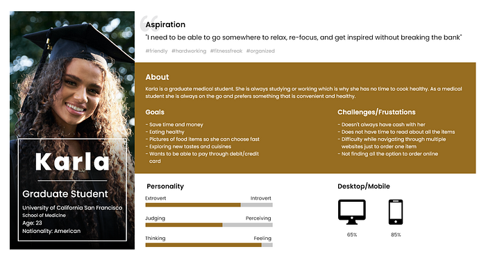
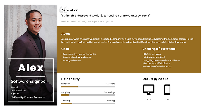
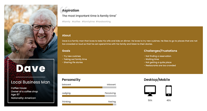
I narrowed it down to three users — Photo Addict Graduate Student, Work Oriented Software Engineer, and the Family Guy who is a Local Business Man.
1. Photo Addict Graduate student who loves to take Instagram-worthy photos for her food channel. She likes to go through the restaurant’s website first to understand what kind of food they serve and will it be helpful to her channel.
2. Work-oriented software engineer, who likes to take his meetings in a more comfortable environment. He is always on the lookout for something healthy and quick and would look at the menu before going as it helps him to concentrate more on the meeting.
3. The Family guy is a local businessman. He absolutely adores his grandkids and wants to spend more time with them. He likes to check out the review of the restaurant to ensure that the food served is healthy.
Understanding the strengths, weaknesses, threats, and users, it was now time to jump to the next phase which is -
Define Phase
Here I have focused more on understanding the current structure of the website. To do so, I started by creating a site map.
Site Map
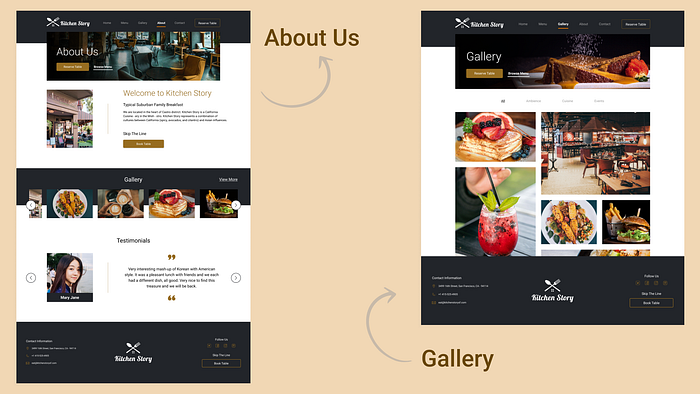
I created a site map. The current website is very simple with more external than internal links. There are four main pages — Menu, Contact, Gallery, and Reservations. The Menu is ill-structured and very hard to navigate. I decided to make a new site map that is more structured and simple.
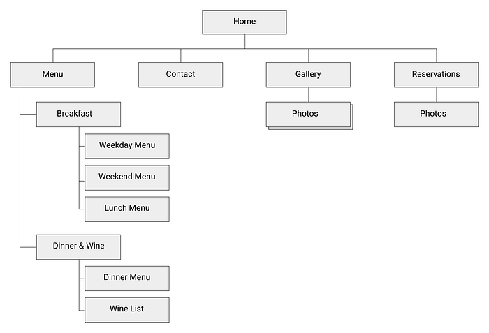
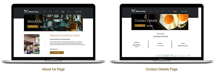
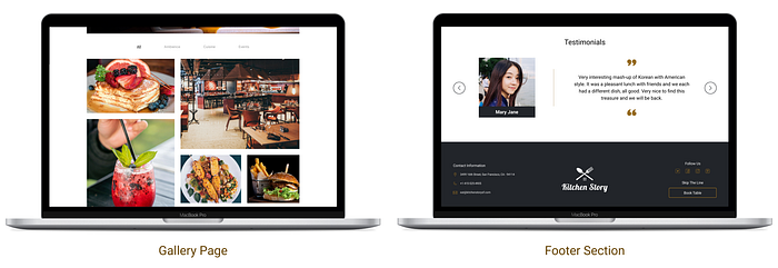
For the redesign, I went along with Menu, Contact, and Gallery, I added a new page — About us. About us is necessary as it is a way for users to learn and understand any service, product, or business. I didn’t forget to mention all the wonderful reviews under the About us page.
The menu page was restructured into Breakfast, Lunch, and Dinner.

With the help of all the research, I was able to make a brief problem statement.
Problem Statement
As more individuals went online during the pandemic, it became critical to keep your website up to current. With restaurants limiting capacity, it’s critical to have a website that encourages customers to reserve a seat and peruse a menu before visiting the restaurant.
The main goal was to completely redesign Kitchen Story so that customers have an easy and delightful experience in the digital space which may help increase sales.
Develop Phase
Now that we have a brief problem understanding, I started with developing the prototypes. For the first phase, I begin with paper prototypes.
Paper Prototypes
Paper prototypes helped to develop and narrow down different approaches. This was the quickest way to test my ideas and get feedback on.
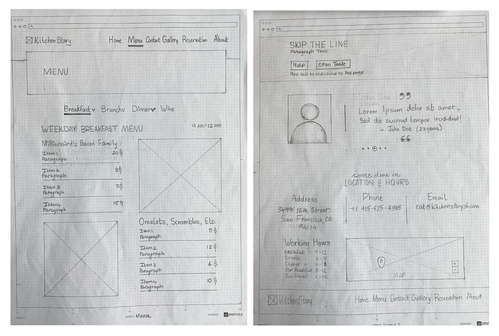
I asked my classmates and professor to provide me with feedback and suggestions. After collecting all the feedback, I made a list of all the common issues and changes and implemented them in new designs. After completing the paper prototypes, I shift to digital prototypes.
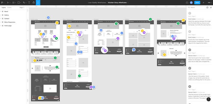
Low-Fidelity Prototypes
Digital sketches helped me understand the spacing and to get a basic idea of how the elements would fit in the layout. I again asked my peers and professors to share their thoughts with me and got about 44 reviews. I narrowed it down and grouped all the similar comments.
Based on the feedback and personal insights, I began to design my first wireframes using Figma.
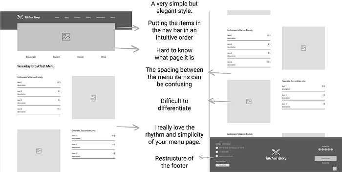
I chose the Menu page as it is one of the most hit pages for any restaurant website. Some of the major comments were -
- The layout is simple yet elegant.
- It is difficult to navigate around without a proper title.
- Challenging to differentiate between the menu sections.
- The footer looks a bit cluttered.
Going back and forth with a lot of iterations and feedback and comments, I moved to the next phase which is Deliver.
Deliver Phase
Here I transformed my low-fidelity to high-fidelity and this is how it turned out.
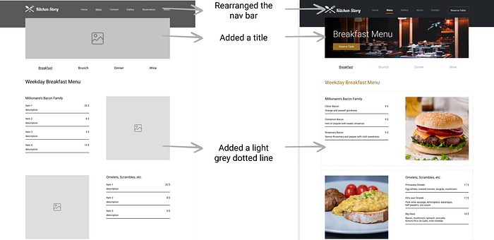
I am taking the same Menu page to show the changes.
- I rearranged the navigation bar to a more intuitive order.
- Added a title so it is easy to understand.
- Added a light gray dotted line with works as a visual separator between the sections without disturbing the overall structure and aesthetic of the page.
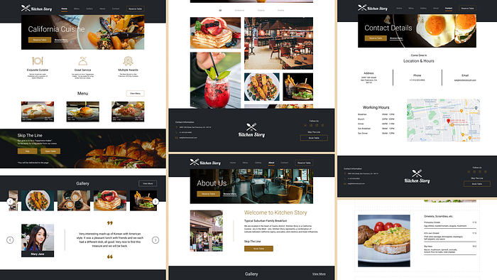
I have kept a consistent theme across all the pages and have used high-definition images to make the page more engaging and delightful for users.
Design decisions that I took -
- I have made sure to leave adequate white spacing to balance the overall design.
- Reduced the information in the footer to make it less cluttered.
- Have used orange color only at the parts which should be highlighted.
- Images used are in a similar feeling tone to maintain the overall aesthetic.
I decided to make mockups as it gives a visual understanding of how the site will look like when it’ll become live.
Branding
Mood board
For mood board I used all my previous research and started collecting images, posters, patterns, and logos that somewhat represent San Francisco.
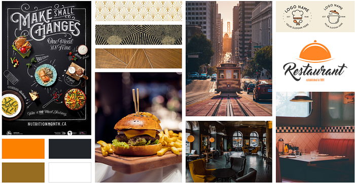
With this mood board, I am trying to present my ideas and thoughts visually. Mood boarding helped me set a tone for my layout.
If I can describe the mood board in words, it would be : Elegance, Realistic, and Fun.
The process while creating the mood board was to just type the words that I discovered through word dump and scroll through the images, gifs, typography, and pattern that comes up, and select the ones that were most appealing to me.
Color
Moodboard helped me decide on colors for the website. I kept the current Orange as I felt it was very fun and represents health. To tone the Orange down a bit I used Bistre Brown which also signifies reliability.
So I decided to keep pure White but changed the pure Black to Raisin Black. This helped me make the layout look sophisticated without straining the user’s eyes.
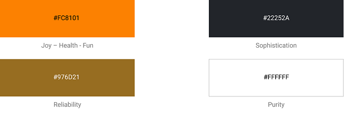
My goal was to make the layout look sophisticated as well as fun. These colors helped me perfectly to achieve that goal.
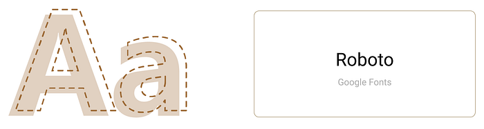
Typography
For typography, I choose Roboto as it has a dual nature. It has a mechanical skeleton and the forms are largely geometric. At the same time, the font features friendly and open curves.
Logo
Kitchen Story is a family-owned restaurant. To represent that, I used a spoon and fork to form a roof and four little squares to represent windows. The logo is based on the Closure property to give a perception of a house.
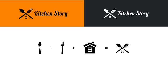
The aim was to give the logo a classy and sophisticated look that goes with the layout and overall branding.
The typeface I used is Berkshire Swash. It is in my understanding, an alluring semi-sweet typestyle with a bold yet feminine flair to it which sets perfectly for my logo goal.
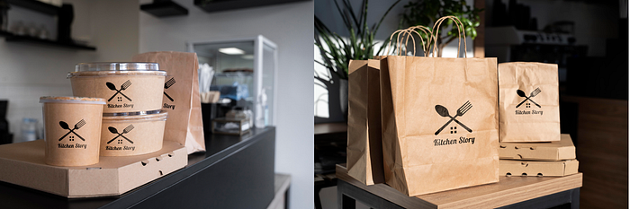
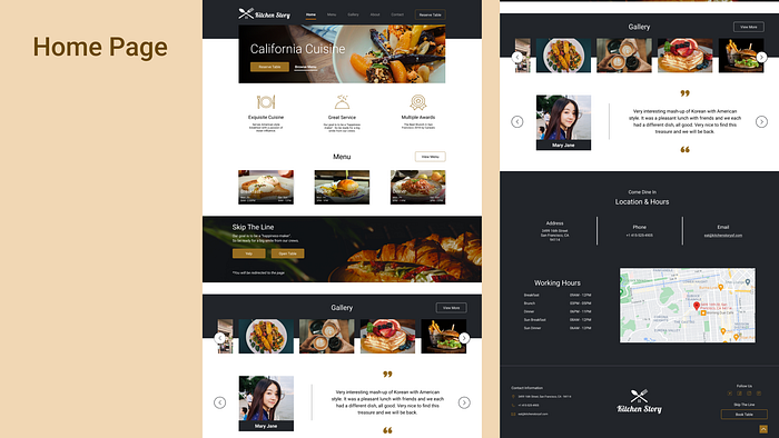
These are mockups I created to give an idea of what design can look like in a real-world context.
Project Takeaway
- The facts and needs of users and clients should be the foundation of design efforts.
- Being efficient with any tool, such as Figma, will allow you to spend more time on ideas and research.
Thank you so much for your time! Any feedback is welcomed :) Feel free to check out my portfolio!
LinkedIn: https://www.linkedin.com/in/priyal-shah-29a38715b/
Portfolio: https://priyalshah.me/
References:
- Nick Babich (2017), Adobe Blog, Prototyping 101 | https://blog.adobe.com/en/publish/2017/11/29/prototyping-difference-low-fidelity-high-fidelity-prototypes-use
- Ellen Lupton, Type | https://ellenlupton.com/Thinking-with-Type
- Images | https://unsplash.com/
- Icons | https://www.flaticon.com/
- Kelley Gordon (2020), NNg | https://www.nngroup.com/articles/principles-visual-design/
- Jordan Bowman (2021), Fixing User Personas, Published by UX Collective, Medium | https://medium.com/user-experience-design-1/fixing-user-personas-6da3f00e75b3