Case study: Kakao mobile network app
10 hours take home assignment

Imagine if Kakao expands its market into network operator and offers mobile network application for you to check balance and usage, choose your desired package, and pay the bills.
How would the app look like?
I received this assignment from the company I applied as UX / UI designer in order to present my design process. The deliverables are 1–2 screen mockups with a limited time to complete.
Disclaimer: This project aims to submit for the specific company for UX / UI designer position only. Kakao mobile network application does not exist during this time of writing. In addition, all competitive companies I refered to were used for assessment and comparison purposes only.
Design process
Below is the design process I followed,

Understanding
The assignment gave me a brief introduction and requirements which I identified the goal and requirements as below,
Goal: Kakao wants to bring the store to user’s phone, provide users with a friendly but reliable experience. The transparent and straight forward packages allow users to make well-informed decisions that fit their lifestyle.
Feature requirements
- Balance — View their outstanding balance of their current package plan
- Usage — Check their current data / call usage of their current package plan
- Speed Control — Toggle between “Free Unlimited Data at 256 Kbps” and “Full Speed”
- Billing — Pay their pending / overdue invoices and see billing history
Competitive analysis
The first research method that came in mind was competitive analysis. It seemed like a fast and effective way to gather ideas with the limited time.
Here in Thailand we have 3 mobile network apps from 3 different companies. I would like to see how those required features are placed and any functions or details that would be useful for my Kakao app.

Observations from competitive analysis
- ‘Type of package (prepaid / postpaid)’ and ‘add number button’ that are shown in DTAC and AIS app are useful because people around me use more than 1 phone number with different packages depend on their preferences
- Tab bar from every app starts from ‘home’ on the left side
- Kakao’s required features are placed in different places and tabs in competitors’ apps — Well, so where do users think these features should be placed?
User interview
With the question remained from competitive analysis, I interviewed 3 users that using different types of package and companies with the assumption that user’s behavior is different depends on the type of packages.
- User 1 — AIS (prepaid), TRUE (postpaid)
- User 2 — AIS (prepaid), DTAC (prepaid)
- User 3 — AIS (postpaid), TRUE (postpaid)
With the following questions,
- What are the functions, features, or details that you remember from the apps?
- What do you like or dislike about the apps?
- If there are the following features, please arrange which one would you want to see in order — 1. Balance / 2. Usage / 3. Speed Control / 4. Billing
Results
- Users mentioned that they remembered 3 feature requirements (except speed control). These are additional features or details they mentioned — current plan, package, rewards, points, recurring payment function, and credit card for payment
- What users like: ‘bill and usage’ tab shown in-details payment and usage / able to see current usage information / interface is user-friendly / words in the apps are easily understood
- What users dislike: A lot of unnecessary functions and menus which make them feel overwhelmed / delayed app
- All users thought that feature 3. Speed Control is the least important
Disclaimer: Due to time constraints I was able to interview limited people. The results might be different based on the numbers of interviewees.
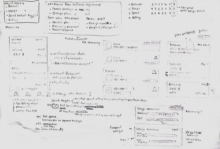
Wireframe
I gathered the results from research and combined with the feature requirements to ensure that everything was not missed out. Here was what my paper wireframe look like.
Pretty messy. I know.
Mockup
Colors and tone
- Font: I found Roboto font is quite similar to Kakao’s font so I decided to give it a go
- Colors: I used the color palettes as shown below
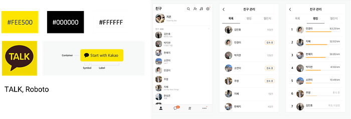
- I also noticed that if using Kakao’s yellow (#FEE500) with white (#FFFFFF) the contrast might not be enough for color-blindness person but it is okay with black. So my design was ensured that every clickable yellow contains black
- Tone: I have never used Kakao app. so I checked to see how is the mood and tone there and found out that they used very limited yellow, most of the app are black and white
Design
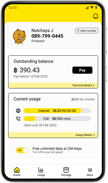
- Header: From the top right, the notification button aimed for billing alert, usage reached limits, or new promotions. For profile picture, I used Kakao character to represent user’s profile to make it appears cute and friendly
- Features: I arranged and grouped 4 feature requirements — Balance / Usage / Speed Control / Billing. First, I placed speed control in the lowest part. Then, I grouped balance and billing in the same place so the user can check their outstanding and pay. And the last one was usage which, apart from current internet and voice call usage, also shown valid date of the usage and the amount of current plan per month
- Tab bars: Home was placed on the left side in the same position just like other competitive apps because I assumed that users are already familiar with this structure. Following by usage, package, and more tab.
Further thoughts
- User can also choose their own photo or their preference Kakao character
- If the package is prepaid, there might be some changes in terms of writing i.e., from outstanding balance to remaining balance, from pay now button to top up
- More tab is for settings and additional features i.e., pay for other number, support
Quick check before submission
I would like to see how people think of the app at first glance and whether it can cover the pain point of competitive apps that users found overwhelming. So I asked my friends to give me 3 adjectives to describe this screen.
Here were the answers,
- “ Simple, cute, neat ”
- “ Cute, bight, easily-understood ”
- “ User-friendly, informative, clean ”
Well, I think it works?
This is my first take-home assignment for UX / UI design. I was stressful at first but it turned out to be a great fun to challenge myself with time constraint.
PS. As always, feel free to leave any comments or feedbacks.
