Case Study: Introducing Netflix shop to Netflix mobile

Disclaimer: This is a personal project, there is no affiliation with Netflix whatsoever.
Let's begin by understanding the problem statement
So as we know, Netflix introduced its shop on the web some time ago where it is showcasing its collection of various series/movie titles in the form of posters collectibles, merchandise, and many more but it was observed that the shop is not available for mobile version yet.
So here we are trying to introduce the app version of Netflix shop, which will enable the users to shop on the go and also help Netflix to increase their revenues as well as engagement via the shop business.
While doing this we need to keep in mind that Netflix is mainly a streaming platform and the shop should not hinder the user experience of viewing their favorite shows and movies.
Before we proceed we shall also try to understand how the current Netflix shop website is working, Netflix shop has a different website completely separate from the stream version, and to my surprise, it has separate login credentials too (Kind of a bummer, right ?)
So I had to make some assumptions before going forward.
A separate mobile app for the Netflix shop could be one thing to do but as we are trying to introduce the app to its existing users having the shop inside the current stream version looks like the right thing to do. It will allow the users to avoid the installation of a new app on their mobile devices and explore the shop from the streaming app itself.
Assumptions before getting into the process
- The Netflix shop should be added to its current streaming app.
- As the shop is inside the stream version, It allows us to remove the separate login functionality automatically.
The Process
Let us have a look at the process followed during this project. I would say it is a very basic process that I have followed yet it is very efficient at the same time.

And as every good thing in life takes iterations, these steps were iterated throughout the designing process.
After gaining an understanding of the problem statement, making some assumptions, and thinking through the ways to make it work as a feasible solution I moved to the next step which was research.
Research
I started by looking at various other apps that currently exist and checked on how they have currently showcased shops in their existing app.

Most of the apps were showing the shop option inside a more tab in the bottom nav bar which seemed odd because you would want to make it easier for the user by giving a minimum number of taps to complete their targetted task and a more menu surely doesn't help with it.

So that was surely not the approach I was going to follow but how can we make it easy and efficient for the users and at the same time stay aligned with the business motives. which takes us to the next step which was ideation.
Ideation
I ideated upon various touchpoints where we can introduce our shop.
Like in the bottom nav bar or in the profile menu or to add a hamburger menu to help our case and after so many if’s and no’s. It was finalized to have our shop at the bottom navbar.
But there are already too many tabs in the bottom nav bar are you going to introduce another one just like that?

That's what I was thinking and as Netflix already has 5 tabs in the bottom navbar. Having the 6th tab could look a bit messy and confusing for some users.
To avoid that we had to remove something but which one?
Let me take you through the reasons which I went through for this decision-making.
So, as already said Netflix streaming app currently has 5 options in the bottom nav, and if we start with simply adding the store that will make the navbar very congested, and if we have to remove something then what it should be.
So removing any tab from the existing app should be a very conscious decision, keeping in mind that the designers at Netflix must have had their reasons backed by the date to have those tabs there in the first place.
I pondered around with various tabs like Games, New and Hot, or Fast Laughs for that case but all had their own reasons that made them be the best contenders for the bottom nav
For instance Games, You might think why is it required on a streaming app but on researching further you would find that Netflix is heavily investing in its gaming division for the very purpose of driving the user engagement for the app. It has also bought two very famous design studios to make it even bigger and better.

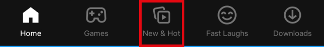
Then there is New and Hot, which tells the user what is upcoming on the app which in turn can make the user thrilled for titles to come, user can even put on the notification for particular titles which will notify them when they arrive. so it was a no-no to remove this tab. (Also, It can be a booster for our shop too, I will tell you in a while.)
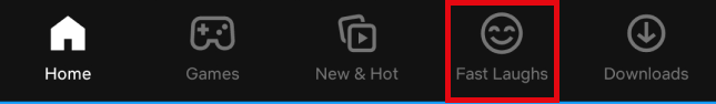
The Fast laughs, who doesn’t like a quick laugh but its not just the laughs, Fast laughs allow users to get into the show/title which enables them to watch it fully and hence the longer engagement timing and you can’t take that away from the streaming app, can you? I would certainly not.
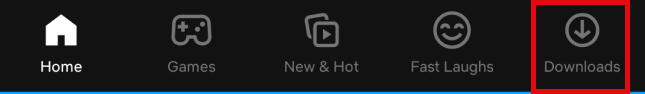
The Downloads, although Netflix has done a tremendous job with download by introducing smart download as well as landing the users directly to the download tab when there is no internet connection (Oh! you didn’t notice ?)
but at the same time, it doesn’t really contain a huge number of user actions so it looked like I have found the right tab to make way for our shop tab.
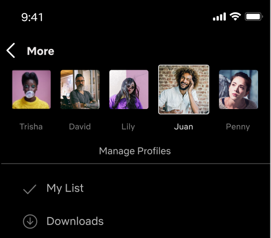
You might be like. Wait! you have removed the downloads? where are my downloads now?
Right below your wishlist. Yes, in the profile menu there is a “My list” option which showcases the user's wishlist of titles that they want to watch sometime later in the future, and right beneath that, you have the downloads a user can check the list or the downloads to continue watching at any point of time.
I also checked and ideated for various home screens for the shop along with the product details and some other screen views, I will show you those during the wireframing process.
Now that we have our spot to introduce the shop and have the idea of how the shop home and other screens are presented in other apps. I moved now to the designer’s best friend i.e. pen and paper for wireframing and then to the final Visuals.
Moving from wireframes to visual designs I had to make various changes to the original wireframes and the initial ideas in between and this is how things turned up.
Visual Design
Let me take you through each screen on how I started with each screen and how I reached the finalized one. (“Started from the bottom, Now we here” vibe? Anyone? )
Stream App Home Screen
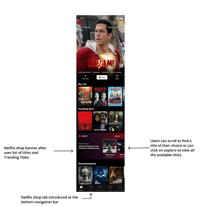
Here I have added the shop tab in the bottom nav bar and added a banner to introduce the shop from where users can scroll through various titles or tap on exploring to visit the whole shop.
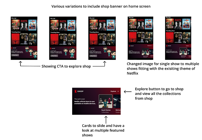
In the finalized home screen we can see that shop has been introduced the same way as the games are introduced, not messing around with the NetFlix design language.
Profile Screen
The shop was initially planned to be placed inside the profile screen but that didn't make much sense as the purpose here was to emphasize and introduce the shop.

Below is the final screen with Downloads placed right below my list. The users can access their list of favorited titles or can choose to view any title from the downloads.

Search screen
When the user searches for any title, the collection for that title will show up right below in a separate row from which the user can choose to explore the collection.
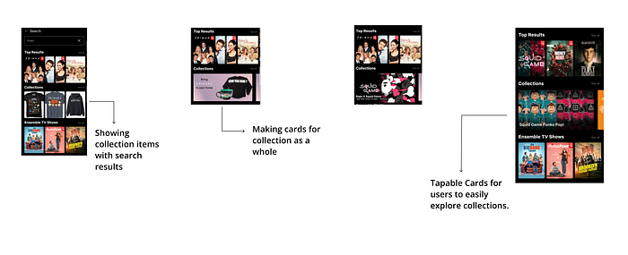
In the final search, the screen users see the collection according to their search then they can side scroll to find more collections or can tap on it to explore.

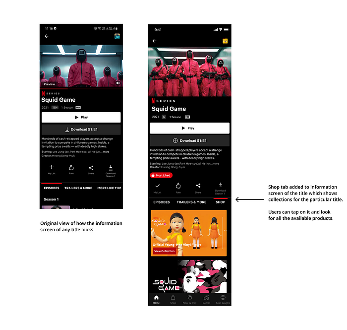
Show Information Screen
On the show information screen, the user is mainly here to watch the show/movie so without distracting them we subtly add the shop tab. The user can tap on it, check out the available collections, and explore it.
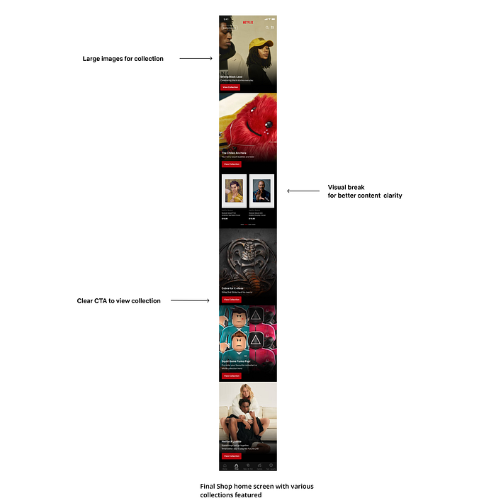
Shop Home
The shop home screen is kept in sync with the theme of the Netflix shop web. Large collection displays, big and clear CTAs, and a crisp description.
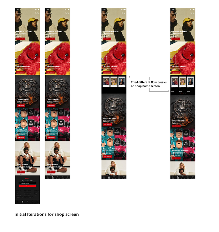
In the finalized shop home screen, the collections are shown with large images along with big CTA buttons. It also features the search and cart icon from which the user can easily access their favorite products.
In the finalized shop home screen, the collections are shown with large images along with big CTA buttons. It also features the search and cart icon from which the user can easily access their favorite products.
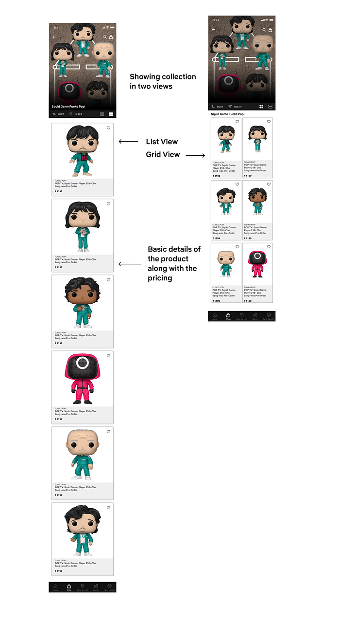
Collection Screen
The collection screen showcases all the available products under a single collection with a short description for the individual product.

The final collection screen has the sort and filter options so that users can trim through the available products. It also showcases the product in two views i.e. Grid view and the List view.
The cards have the favorite option so that users can tap on those for future references.
Product Detail screen
This screen will come up when a user taps on a particular product. It will have the details of the particular product with its pricing and ratings.
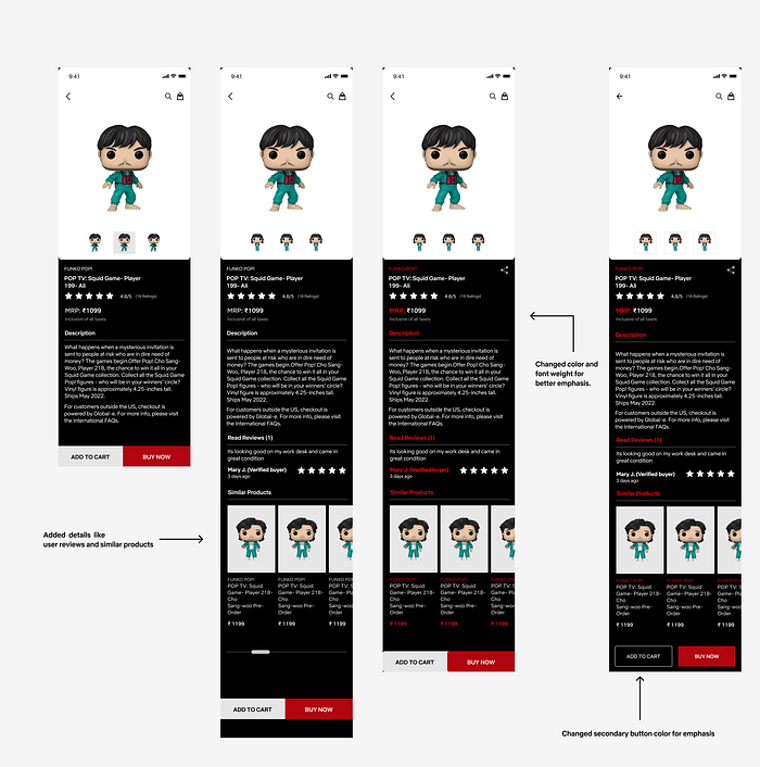
The Final product detail screen has the product description along with the ratings and user reviews. It also showcases similar products to select from various options.
It has two CTAs with which the user can add the product to the cart for later review or can tap on buy now for instant ordering.

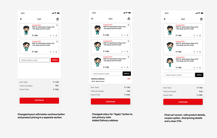
Cart Screen
When the user will add a product to the cart or when the user will click on “Buy Now” the user will land on this screen and can look at the details before finally placing the order.
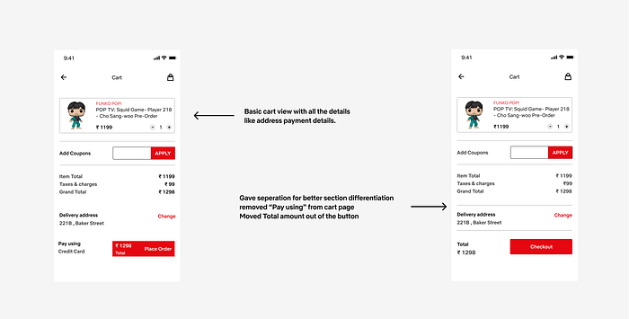
On the final screen, we can see the product card with product details along with the quantity and the pricing. This screen also has the option to apply coupon codes.
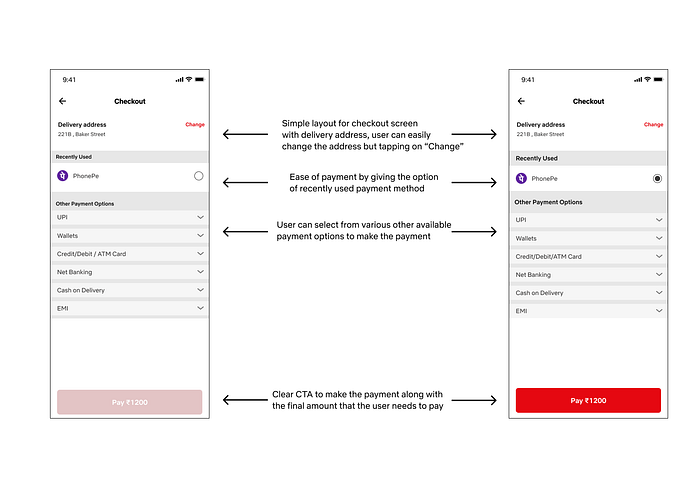
Checkout page
Here the user can select/change their address and they can choose from various payment methods to make the payment and confirm their orders.
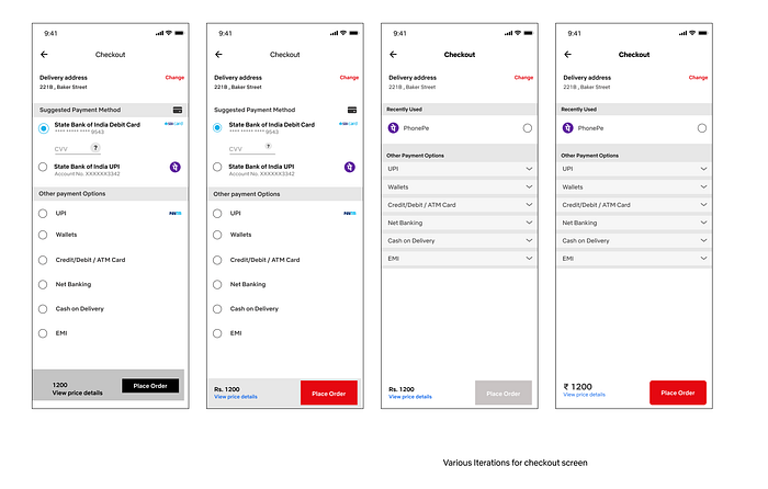
Below we can see the final screens for checkout with the address option along with the recently used payment method so that users can quickly make the payment and confirm their order.
There are some other touchpoints where we have a pinch of the introduction to the shop.
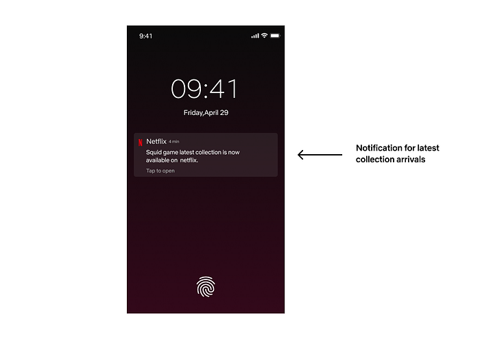
Notifications
This is an additional touchpoint, the users will be notified about the latest arrivals for collections. Users can tap on it and explore the collections.
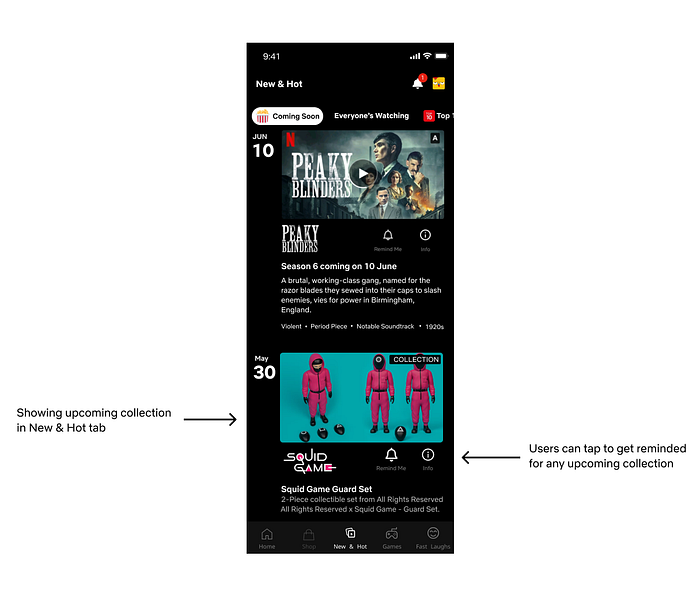
New and hot
Remember I told you we will get back to this?
So in the new and hot, we have showcased the upcoming show merchandise or collection so that users can put in a notification/alert for the same.
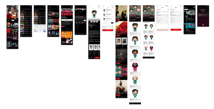
Here is the final look for all the screens. You can click here to check out the prototype.
Learnings:
Research thoroughly but don't take too much time to implement
Netflix shop being live on the web must have these decisions backed by data so we should research thoroughly before making any changes but at the same time, we should implement these changes early as the original site keeps on updating itself as well.
Understand the decision making of the current Website/App
Before making any changes one should try to understand why the current website/app looks like that, what could be the possible reasoning behind it, and try to get some data to back your decision.
Acknowledgments and regards
I would like to thank Aishvarya Gupta for guiding me throughout this project. Without his feedback & guidance, this case study would have gone on forever.
Also, I would like to thank Paritosh Kumra for guiding me with the research and making me realize how much in-depth the research part goes while making even the slightest of changes to any platform.
This section would be incomplete without mentioning Gagan Kardam, Sipra Das, and Milan Verma who kept pushing me now and then to complete this case study and helped me stay focused on the same.
Would also like to thank Chetan KVS for helping out me and many others who are struggling to find a good problem statement to showcase their work.
If you are in the same boat do check out his Instagram: design_pilot
Sources :
Netflix Shop
https://www.netflix.shop/
Fastlaughs
https://www.kimho.design/fastlaughs
New and Hot
https://www.kimho.design/netflix
Games
https://www.bloomberg.com/opinion/articles/2022-03-22/netflix-s-brightest-future-lies-with-apps-not-ads
https://www.gamedeveloper.com/business/netflix-buys-finnish-studio-next-games-for-72-million
Who am I?
Well for starters I am a system engineer turning into a product designer, A Travel Fanatic, Music Enthusiast, Cricket Lover, Overthinker, Nature Seeker, and a lot more…
You can also find me on
Instagram | Twitter | Linkedin
Also, I am currently open to opportunities as a product designer. Let’s connect.
That's it, Fellas! Thank you for staying with me till the end and being an amazing individual.

