Case Study: Increasing cult.fit's subscription conversion rate in 48 hours

A 48-hour Designathon (design + hackathon) project.
👀Overview
I recently participated in a designathon where my team and I had to come up with better solutions for a given problem statement. This is an evaluative project. We were tasked as a team with picking a problem statement from the given list. We had to confront the statement by reasoning our unfair advantages over it
💥Meet my amazing team — Team NONADS

Individual contribution and teamwork
I was thrilled to meet my team, and everyone was good at their own respective skills, which enabled us to learn from one another and collaborate effectively.
I mainly contributed to secondary research and designing the user interface. I took the lead while designing the UI and also taught my team members how to build UI elements. I was actively involved in the following aspects of the project and worked closely with my team on each of them
Understanding the problem statement
Conducting heuristics and intuitive evaluation
Building hypothesis statements, validating hypothesis
Ideating solutions for the validated problems
Designing the User Interface
🎯Problem Statement
To evaluate the purchase flow of the Cultpass package in the cult.fit app and to improve the user experience and increase conversion metrics
How and why did we choose this as our problem statement?
Initially, we had to select three topics and prioritize them. We had to compete with other teams for the prioritized topic by providing strong reasons for why we wanted to work on it.
Our primary reasons for choosing this problem statement are:
- We wanted to approach the app in the freshest and most unbiased way and wanted to have a significant impact on our learning and the business
- None of my teammates had worked with a subscription model and working with this would make us more knowledgeable in the area
- The unfair advantage on cult.fit app was one of our team members was acquainted with the trainer at Cult .fit. So we could get users for interviews and usability testing
Before we get into the app's flow, let's first understand what is cult.fit and cultpass
Cult.fit make fitness fun and easy. They have best-in-class trainers & offer group workouts ranging from yoga to Boxing. Their workouts can be done both at a cult center and at home with the help of do it yourself (DIY) workout videos. Cult.fit uses the best in technology to give you a world-class experience. One can book classes, follow workout videos — all with the click of a button from the cult.fit app
Now let’s understand what cultpass is
- It is the membership program for all the fitness needs
- Cultpass plans include- Cultpass Elite, Pro and Live
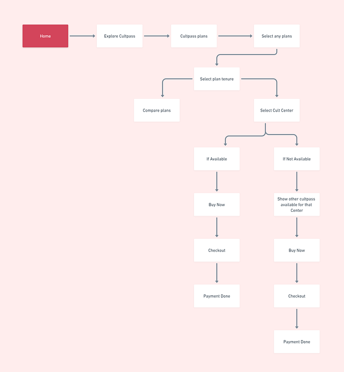
Let’s understand the flow of the app
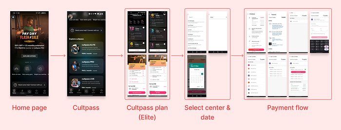
- In the existing flow, from the home page you need to scroll down to reach to cultpass plans page
- Here you will find three cultpass plans along with the price
- Depending on which plan you select, you can find the option to try the plan for free or monthly/ quarterly/ yearly plans
- After you click on buy, you need to select the center and date and then proceed to checkout
- From here, you can pay via different payment methods
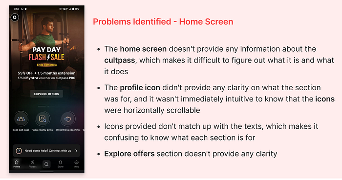
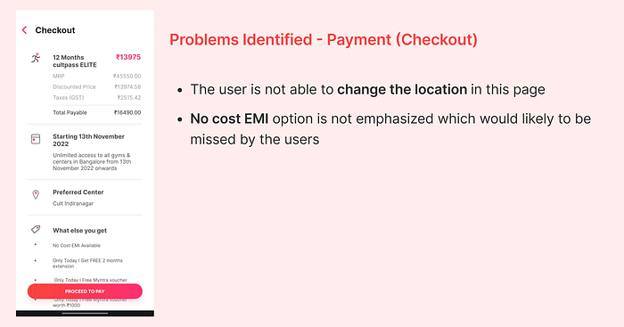
Major problems identified with the flow
We evaluated all the steps in the flow to find parts that could be problematic for users and detrimental to the business goals
I will now highlight the major problems we found in each step of the flow
Let’s compare this with our redesigned screens
Solutions (before Usability testing)
This section will give you detailed information about the initial solutions we came up with as well as the reasoning. After the assumption of the problems the user would face, we validated it by conducting competitor analysis, secondary research, primary research by conducting user interviews and understanding usability testing of the existing flow
Let’s understand why we did these changes
Redesigning of the home screen
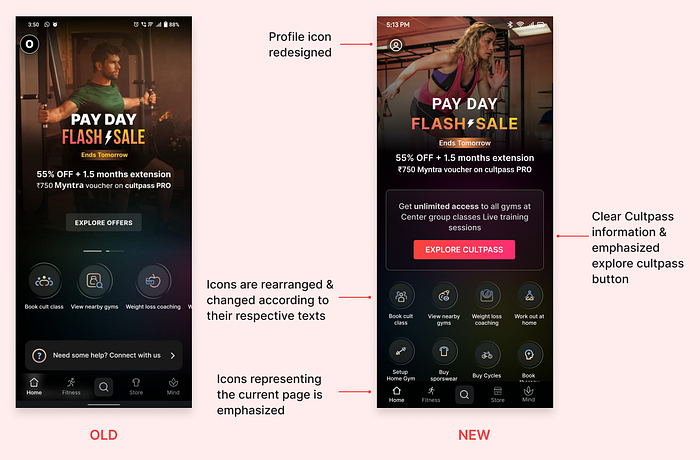
Providing clear information about cultpass and emphasizing Explore Cultpass button
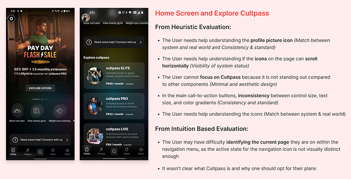
- So when we conducted the usability test it was concluded that users were unable to comprehend about the cultpass program and reason for opting that. So educating about cultpass was essential
- Users were finding it difficult to find cultpass plans. So we emphasized Explore Cultpass button
Rearranging icons for the better understanding and visibility
- Users were not able to comprehend few icons and weren’t aware the icons were meant to scroll horizontally. So were changed the icons layout to show the features available on the app and eliminated horizontal scroll
- We redesigned the profile icon as we found users weren’t sure if it was profile
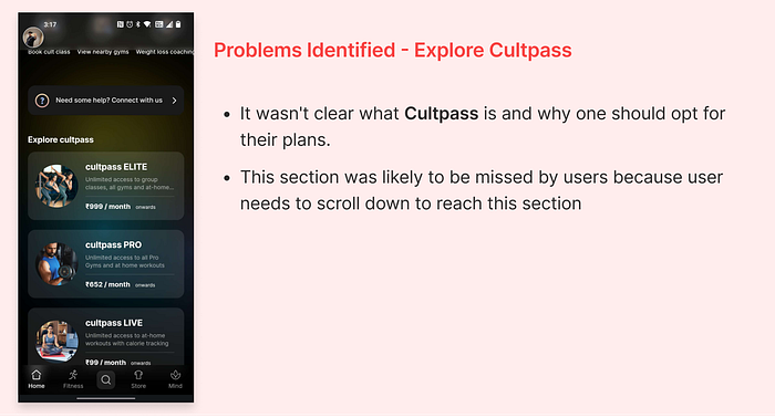
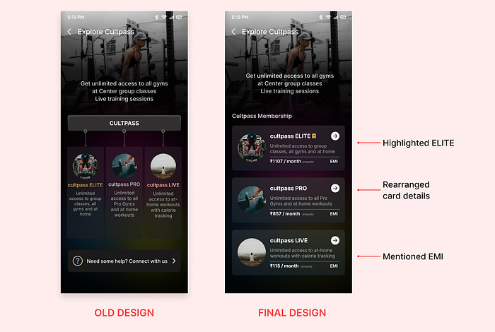
Redesigning of the Explore cultpass

- We aim to educate users what cultpass was as it wasn’t reciprocated elsewhere in the app
- Our goal is to make plan cards simpler and to provide the benefits of each particular plan
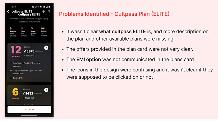
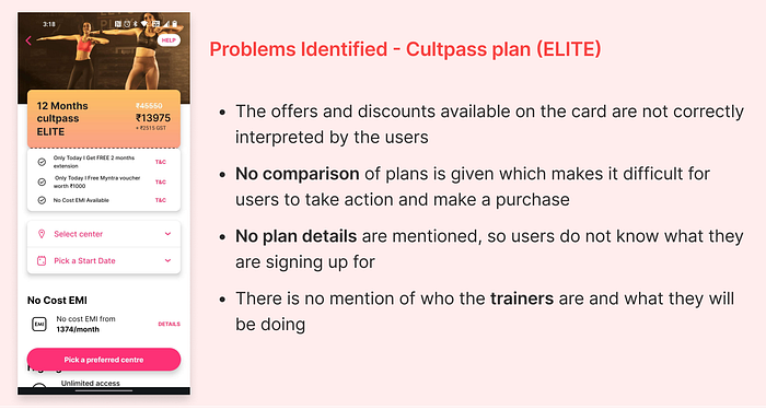
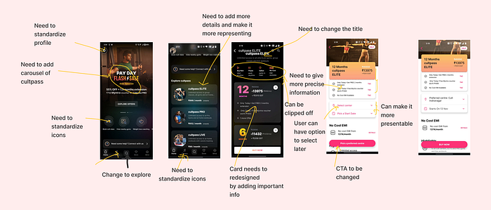
Changes in the Cultpass plans (ELITE) Screen
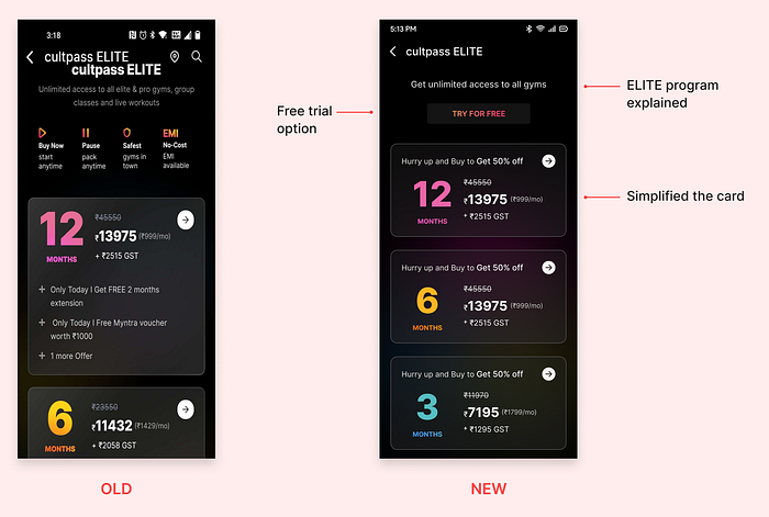
- Try for free was added if any user was skeptical about choosing plans
- We noticed during user interviews that users weren’t going through the offers labeled on the card or the icons placed at the top. So we removed icons that weren’t adding value and other blockheads (offers) and designed the card in a more minimal way, so that users could perceive the information better
Redesign of cultpass ELITE
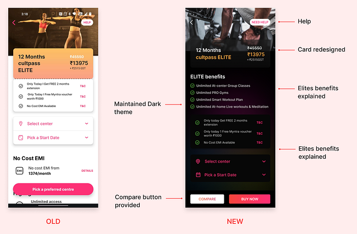
- After conducting user interviews, we realized that users were skeptical about choosing plans because they didn’t understand the benefits of each plan. So, we took this feedback into account and added a benefits section for each plan
- We also noticed how users couldn’t differentiate the three plans so we added compare button which would enable users to compare all the plans and helps them to opt for their interested plans
- We tried to maintain consistency by following the dark theme and glass morphism
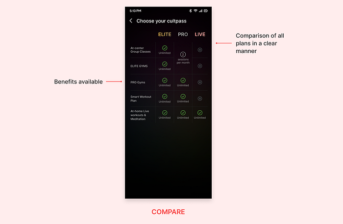
Compare button which aims to provide a clear comparison of all plans
Final solutions after Usability testing
After completing first solution, we prototyped it and went ahead for the usability testing with the new flow and design to see if users were able to purchase the cultpass and also to know if we were able to improve the user experience
Now let me go through the final designs and the decisions behind that

Why did we make these changes?
During the usability testing, when we asked users to purchase a cultpass, they weren’t sure if they had to press "Explore Cultpass," as the information on the card didn’t mention the same. So we added “by our cultpass program” to avoid the confusions
Why did we make these changes?
The old solution had created a lot of confusion regarding plans, and users weren’t sure if the card was clickable. So we rearranged the card information, added the amount, and mentioned it was for the EMI option, then gave more emphasis to ELITE as it was the main plan of the cult.fit
Why did we make these changes?
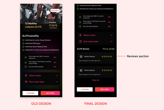
Users were skeptical during usability testing because no feedback on the plan was provided. So we added the review section to build trust among the users. So when users land on any of the Cultpass plans, they can check all the reviews and be confident in purchasing the plan. Initially we also thought on mentioning their trainer details, due to time constraints we couldn’t complete the design
Why did we make these changes?
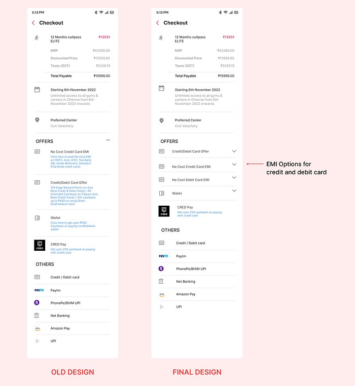
During usability testing, users were looking for an EMI option, which took some time to find. After feedback was received, we decided to provide two separate EMI options for debit and credit cards
🕵🏿️️️ Detailed Work Process and Insights
So let me explain the process we did, why we did and the insights we got and how we got our results all during this 48hrs hackathon
Finding Problems through Heuristics and Intuition
We started by observing the current flow and pointing out any pain points that users might face. After spending time understanding our problem statement, we began evaluating screens using existing heuristic principles to help identify any potential problems

Building hypothesis from the problems and how we validated them
After finding problems through heuristics and intuition, now we have to come up with ‘Hypothesis statements’ or in other words statements or questions that would require our research to be validated or answered
My hypothesis is that having cultpass option on home screen defined more clearly, and differentiating it from other elements will help users to take actions quickly according to Hick’s Law (Validated by primary research/competitive research)
My hypothesis is that user are not provided with enough details and services mentioned for the different Cultpass and their differentiation . So user is not motivated to take action (Aesthetic and Minimalistic)
My hypothesis is that having external consistency and standard in buy icon so that user can use it and take required action (Jacob’s law)
My hypothesis is that some user need more help in understanding about cultpass and how it works (Validated by primary research & competitor research)
My hypothesis is that adding information about service offered for cultpass in “Cultpass Elite page” will help user to take decision of buying cultpass more effectively (Validated by Competitive research)
My hypothesis is that users need to recalled about for how many months they need to pay EMI. Giving more details about EMI will help users in error prevention (Validated by primary research)
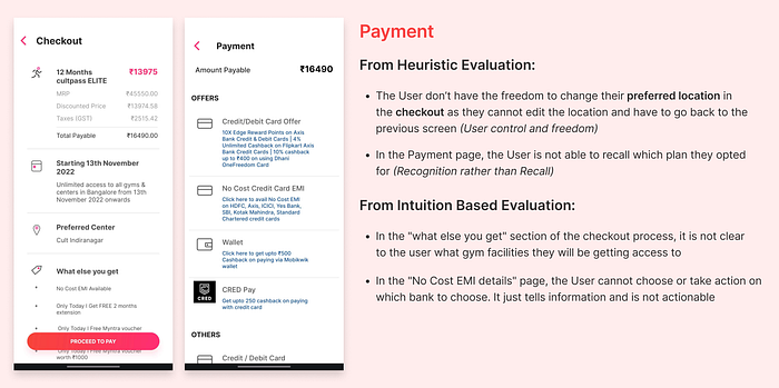
My hypothesis is that having option to select the preferred center in the checkout page will help user to have more control and freedom and user will not have to go back to change location (Validated by Secondary research, primary research)
My Hypothesis is that minimizing and making information in bullet points about card offers in checkout page will help user to scan card offers easily (Validated by Competitive research)
My hypothesis is that users need to be recalled about the cultpass plan they are opting for in Final Checkout Page (Validated by Competitive research)
Validating our hypothesis
It was time for us to go ahead and conduct research to understand the users and gain insights
1. Validating through Secondary research
For our secondary research, we started to look at the app reviews from the Play Store and also went through articles that could help us validate your hypotheses. Secondary research helped us to understand the user’s pain points and also gave us a clear understanding of the issues faced by the user
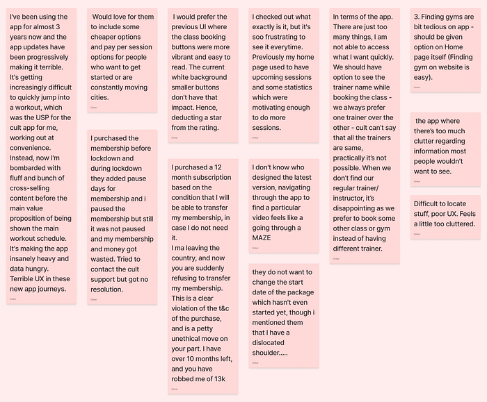
Key learnings from Secondary Research
People find hard to navigate through an app when the information and services is not prioritized and customize
User needs simple and clear way to complete a task with clear options provided how to proceed
The app should give the feel of the sector, like fitness app should give the motivation and feel of fitness app
User requires help and personal support when they are feeling stuck
User is not able to have strong trust while purchasing cultpass because of the less information about cultpass
2. Validating through Competitor Research
We found My Fitness Pal, Healthify Me, and Fittr to be close competitors to the cult.fit app. As a result, we began to evaluate the app and gained insights into various aspects such as their product, features, target market, design, and flow. We used these insights and tried to see what worked and did not and took a note of the same so that we can eliminate or add that feature to our new flow
The insights we gained from competitor research assisted us in determining which aspects of our flow could be improved. Here are the few insights we got from three apps
1. Customizing the experience according to user needs and fitness goals (From My Fitness Pal )
2. Having a cancel option in payment flow to avoid users from making errors (From Healthify me)
3. Providing clear details of the plans and emphasizing the most popular plans which helps users to understand the programs they are getting from the plans and hence conversion (From Healthify me and Fittr)
4. Providing details on the coaches available for the selected plans helps users know more about their coaches(From Healthify me)
3. Validating through Primary Research
During primary research, we aimed to understand the user’s behavior and mindset because it allows us to deliver a seamless experience by having a thorough understanding of how users interact with the products. A few members of my team took the lead and conducted user interviews. We started to go to gyms, streets, and parks and started to conduct our primary research in person with the users. Six user interviews with various personas were conducted to gather insights and test our hypotheses (We were also able to find the user who was the active user of cult.fit)
So during this time we prepare our questionnaire and also defined our target audience
🎯Defining our target users
- Product / industry — Fitness app
- Ratio — Male:Female — 1:1
- Age group — 25 to 55 yrs
- Occupation — Working professional
- Demography — People from Tier 1 and Tier 2 city.
- Type of Users — People from tier 1 tier 2 cities age between 25 to 55 years old, who are concerned about their fitness & who are trying to get fit.
- Since our business metric is to increase conversions, so we focused on user groups that have a constant income and are interested in fitness. We kept Cultpass price in mind when making decisions about our conversion metrics. But it wasn’t just restricted to that. We also considered housewives, corporate population experiencing stress, and older people with health issues who were all seeking fitness. So we thought these users would have more influence in cult.fit (Cultpass) & match our problem statement.
When conducting usability testing, we decided to start by talking about general things related to the user’s workout and gym routine. We then showed them the app and asked them to use it. We also gave them tasks related to exploring and purchasing the cult pass. But we wanted to give them enough room to explore the app on their own
The following are tasks given to users to help us understand their behavior and how they interact with the application
- Ask the user to explore the application on their own. Giving them the task to find the Cult Fit Elite pass and describing the plan you discover
- Ask the user to explore the payment flow
- Inquire about the user’s ability to comprehend the contents and offers
Points we decided to observe
Did the users navigate in the correct direction, or did they encounter any difficulties?
Are they having trouble reading the contents and offers/reward points?
How efficiently they are identifying the components, CTA , recognizing the icons, and where they are on the page
Will they have any problems with the payment flow?
Is it simple for the user to select this flow?
Where do they stop to think and what confuses them
Where they were able to understand the plans?
Questions we posed to invoke more information about user behavior
What did this app make you feel? why is that?
If you are a working women and can’t able to go directly to gym, then how will choose a plan which is appropriate to you?
If you want to change your profile details where will you go and change?
Are you able to understand what the icons are describing?
How would you opt for No Cost EMI option while purchasing cultpass?
If you want avail other extra classes on specific activities where will you find?
How would you feel when exploring the app , specially cultpass?
User insights we got during the usability testing
- The user is unable to identify icons or navigate to specific services such as cultpass
- The user is overwhelmed by too much information and cluttered navigation
- User is struggling to find the cult.fit elite pass from the home screen itself
- Because of the lack of information about cultpass, the user was unable to have strong trust when purchasing it
- The user was not aware of the other services available on cult.fit
- The user cannot select multiple types of free trial activities, such as: Yoga and Zumba dancing
- The user became confused between cultpass and cult class and ended up booking cult class instead
- The user is having difficulty selecting the No Cost EMI option and determining where to click to select that tenure plan
- One user mentioned that the multiple navigation pages and clicks for purchasing cult.fit made the process difficult for them
📌Time for the Ideation and how we Validated our Assumptions & Hypotheses
After analyzing the data, we now have a lot of insights on what problems users are really facing. Based on our research, we validated our hypothesis and prioritized the user problems based on how they would affect the conversion rate business metrics

We started to generate ideas for the problems we mentioned and asked, “How Might We” questions and tried to come up with solutions. After framing HMW questions, we used the Crazy 8 technique to brainstorm solutions for each problem. We used this technique to collect all of the ideas from all team members before prioritizing which solution to implement. Here are a few How might We’s
How might we make users understand what a "cult pass" is?
- Action figure added
- Choice of words
- Demo video
- Images representing what are the activities
- Popup when user opens the application
- Having single card on home screen stating what cult pass explore option
How might we make the information available on the home screen more understandable to the user?
- By having containers created for information
- Combining content in groups depending upon their importance and what it is relating to
- By changing the card design for cultpass from screen
How might we provide more information about cult pass
- Giving details about the cult pas
- Can have video on what cultpass is
- What kind of cult passes are available
- We can have carousel giving more information
Our new user flow includes:
- Adding an Explore Cultpass CTA to the home page with brief information on what Cultpass is
- Compare button on the buy now page so users can see all the available plans and benefits
- If a cult center can’t be found during selection, we’ll provide an option showing other cult passes available for that location. This will help prevent users from dropping out of the selection process and increase conversions
- Adding no cost EMI options separately for debit and credit cards. This will reduce the number of steps and also will be intuitive to the user
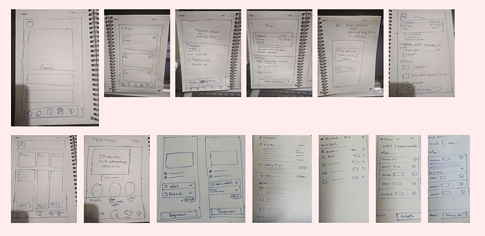
Once we had brainstormed some solutions, we began searching for design inspiration. We started with low-fidelity wireframes, but since everyone has their own perspective on how to approach the solution, we ended up missing some key points and creating chaos. So we each did our own wireframes, presented and discussed them, and then moved ahead with the high-fidelity wireframes
Finally Building Final UI and Prototype
We decided to use glass morphism in our design because the Cult.fit app did. We looked at their design system and went ahead and followed it. I took the lead in creating UI and taught my team members how to build UI elements and screens
Feedbacks we received during Usability testing
A few members of my team went to obtain usability testing for the new solutions. Since it was Sunday evening, it was difficult to find users and conduct usability testing. After getting the feedback from the users, my teammates who went to do usability testing shared their feedback, and we started to brainstorm solutions and implement the changes. Below are the problems faced by the users
The user was finding difficult to click on the view more option for cultpass
The user wanted a video presentation of what cultpass is
For the user to select any cultpass, there must be reviews from earlier users who bought those passes (feedback system for cultpass available)
The user stated not able to get the EMI option easily
Scope for future improvements
- There are several changes that could be made to improve the overall flow of the application, based on our findings from research
- A community could be built as competitors already have this feature
- Users should have the freedom to select trainers based on their ratings/experience
My learnings from the project
- Time management is very important and having consistency and sticking to set timelines is important to reach the final goal
- We can’t solve every problem, so it’s important to learn how to prioritize and time manage.
- Delegating tasks to people based on their strengths can save a lot of time in the long run.
- Discussion and debate can be helpful at times because it allows your team to think critically and give a broader perspective.
Thank you for sticking with me until the end🙏
You can find our prototype and figma documents here
Connect with me on LinkedIn😊

