Case study: Improving an online banking application

- Methodology: User Research, Wireframing, UX/UI Design, Prototyping
- Tools: Figma, Illustrator, After Effects, Miro
- Process: Review existing product and analyze community reviews on Google Play and the Apple App Store, then sketch and wireframe ideas, and finally design and prototype
- Results: Improved user experience, gamified card request
Overview
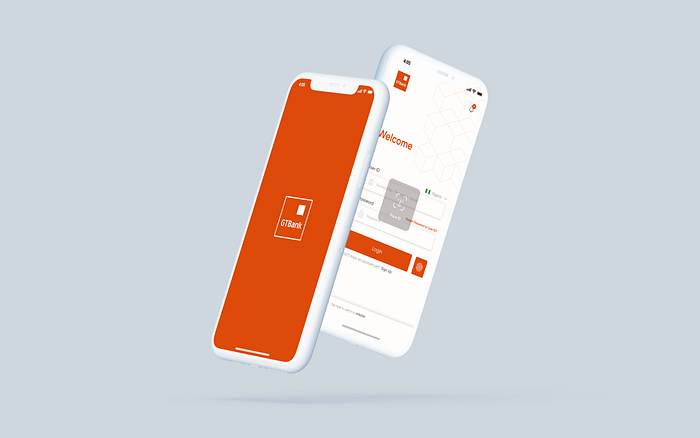
With its head office in Victoria Island, Lagos, Guarantee Trust Holding Co PLC, also known as GTBank or simply GTCO, is a Nigerian multinational financial institution offering online banking, retail banking, corporate banking, investment banking, and asset management services.
In 2019 they received awards for being the Bank with the best CSR & Mobile Application, this is an amazing achievement when you take into consideration that the bank’s market strategy makes them the bank with the most Millenial and Gen Z as customers. And one of the platforms in which they use to serve this techy generation is its mobile banking application.
Demography

GTCO’s market strategy for breaking into the bank industry of Nigeria was also to target GenZ and the Millenials since they represent the largest mobile banking users. During high school and colleague environments, they used aggressive marketing to attract students. The app is used by all of these users to make transactions or to use services like bill payment and airtime/data recharge. Customers are expected to keep coming back if they catch them.
Identifying The Problem
We all know that we all hate visiting the banking hall and would prefer fixing issues ourselves from the comfort of our homes, and from my personal experience using the application, i find it uncomfortable that;
- For every login, I need to re-enter my password.
- The UI/UX is Bad
- The application lacks adequate Self Service
It should not be an issue, since a simple fix that could be applied to the mobile application would ensure a good user experience.


Problem 1: For every login, I need to re-enter my password

This screen shows that the existing application offers you only the ability to enter your password in order to access your account, and you are automatically logged out of your account after five minutes of inactivity. In this case, one would need to log in more than once per session, and it’s not ideal to have to use my password every time, especially when other improved methods are already in practice.
Problem 2: The UI/UX is Bad

The app’s user interface is difficult for some users to navigate, and as a result, some basic functions that are expected to be seamless are not. There is a messaging icon at the top right of the screen that is badly placed, causing difficulty for users to click, and the icon that was used indicates messages instead of a notification. This I assume to be an error from the design team.
Most banks let their customers know when they are about to perform scheduled maintenance, but since they don’t tell users if they have unread messages, how would they know?
Problem 3: The application lacks adequate Self Service

Most banking applications (Banks in Nigeria as an example) allow users to save and send receipts at a single time, immediately after completing the transaction. Users who forgot to save a receipt cannot revisit and save previously completed transactions once they forget to save it.
Until now, neither card requests nor card issuance takes place outside of the banking halls, nor are BVNs associated with accounts. An optimized mobile application could easily resolve issues like this.
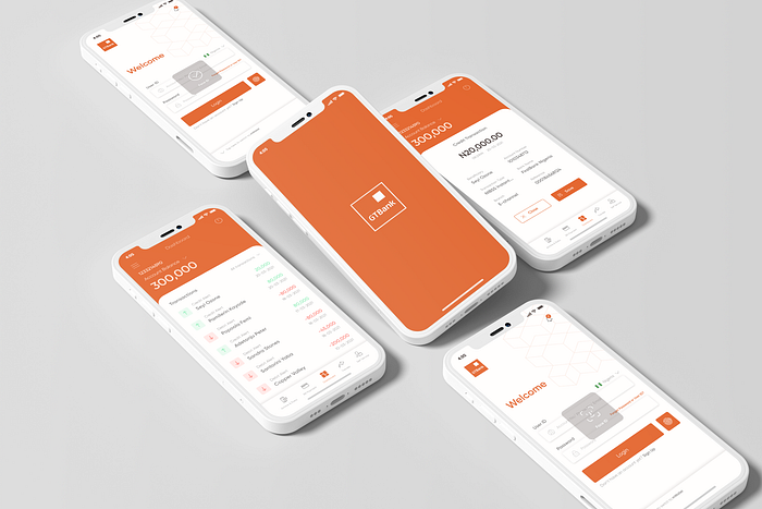
My Design Process

As a result of carefully conducting research based on the problem that I identified as a user and from the reviews, I had noted on Google Play and the Apple App Store, the issues were resolved.
In order to redesign the application, I started by sketching out the ideas then creating a wireframe and a visual design, then creating a prototype of the revised application.
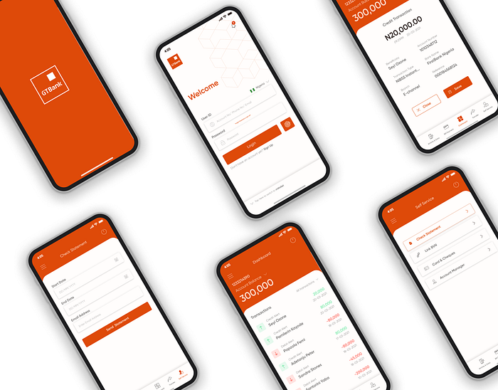
Wireframe
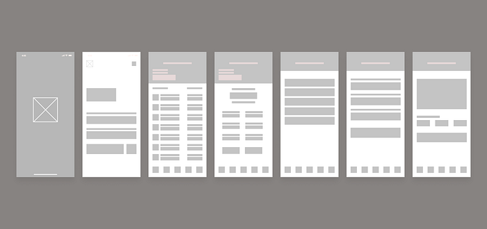
The process of visual design began with the creation of wireframes. Wireframes are then provided in high fidelity.
Solving Problem 1: For every login, I need to re-enter my password
Introducing Biometric logins improves the user experience upon login, and even users get logged out at the end of every session as a result of inactivity, they can easily get back to it within seconds, saves time, saves stress.
Solving Problem 2: The UI/UX is Bad
You notice as soon as you open the application how odd the placement of the logo on the splash screen is, as well as how close the notification bar is to the edge of the screen that it is almost impossible to click on. Furthermore, the dashboard had no quick links, and quick links make the user experience better. There is no reason why one needs to click on more buttons to locate such features for frequent activities such as transfer, bill payment, airtime recharge, and self-service.
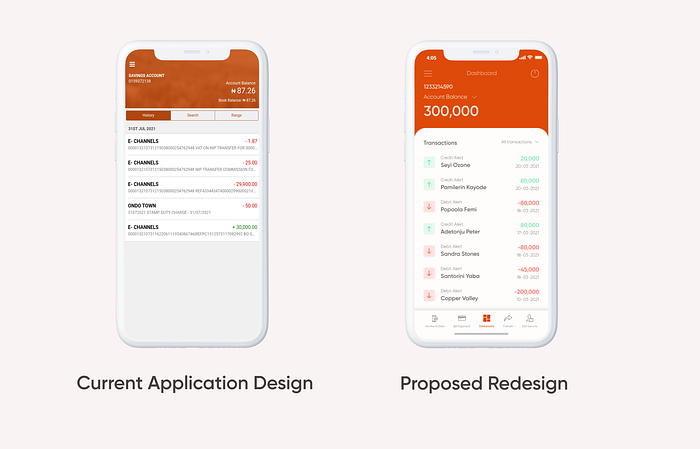
As a result of the redesign, existing issues were resolved. This ranges from better placement and layout to the introduction of quick links to the ability to revisit previous transactions and generate receipts for them. An improved overall user experience.
Solving Problem 2: The application lacks adequate Self Service

During research and customer reviews online, users reported they were not able to link their BVNs to their accounts from self-service and requested the ability to request debit cards through the banking applications. The problem was solved once and for all.
By checking the requirements for connecting BVN online, I have found that it could easily be implemented within the banking application instead of telling users to visit some other platforms outside the banking application, which is the most secure method.
View Screens
Thank you.
I would appreciate feedback in the comment section if there are ways we can improve on this existing case study.

