Case study: Improving the empty state copy of RCTI+

This UX writing case study is part of a challenge for the “UX Writing: How to Build a Better Experience for Your Product” course by Pixel Ninja, and has no affiliation with RCTI+.
📱 About RCTI+ Superapp
RCTI+ Superapp is a mobile app that provides TV streaming, watching and downloading TV series and trending videos, listening to the radio, audio series, podcasts, and music, reading the latest news, and participating in talent search auditions.
😕 Background
When users who have never used the download feature or who do not currently have any videos downloaded open the download page, the empty state copy has a tone that indicates something is wrong because there is nothing to display. It may confuse them about why this page is empty. The empty state should convey the purpose of the screen and provide users with instructions on how to enjoy the feature.
📍 Page Target
The account page is accessible from the bottom navigation on the home page. To access the download page, select “Download” from the account page’s list menu. The download page includes all videos downloaded by users and a button to sort the videos.

1️⃣ Research
Understanding the Context
This empty state is displayed because no video has been downloaded. It is unclear and redundant because the title and description use the same copy. The empty state also has a tone that suggests something is wrong, as they can’t find the videos that should be displayed. As a result, users who visit this page for the first time may be confused and unaware of its purpose.
Benchmarking
- Objective: To understand what solutions competitors deliver to their users.
- Method: Observe and analyze the empty state copy of the download page on other OTT apps.
- Result: Disney+ Hotstar’s copy explains the download feature’s function. Viu’s copy explains why the download page is empty in the title, and the description explains how to use the download feature, which is useful for new users who haven’t used it yet. Netflix's copy mentions the purpose of the download page and includes a CTA to help users find more episodes to download.

2️⃣ Define
Problem
- The empty state copy is redundant because the title and description have the same copy.
- The empty state copy does not explain why the page is empty or provide any useful information.
- The empty state copy may give new users who haven’t downloaded any videos the impression that there is a problem.
Goal
- Inform users about what is the purpose of the download page and why it is empty.
- Provide users with instructions to use the download feature and understand its function.
3️⃣ Recommendation
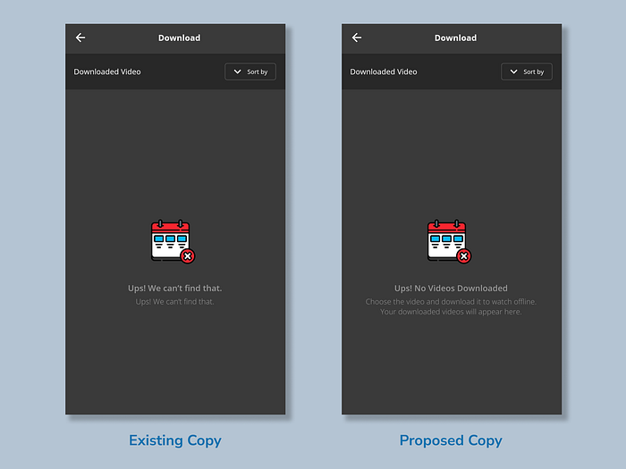
- Title: Ups! No Videos Downloaded
- Description: Choose the video and download it to watch offline. Your downloaded videos will appear here.
- Voice and Tone: Friendly and to the point
Reasoning
I reuse the phrase “Ups!” to keep the friendly tone. The heading makes it clear that this page is empty because no video has been downloaded. The description directs users to use the feature while mentioning the benefit of being able to watch videos offline at any time, as well as explaining the purpose of the download page, where users can access their downloaded videos.
4️⃣ Copy Testing
Objective
Evaluate the proposed copy to ensure that it meets users’ expectations for the empty state copy.
Method
The in-depth interview was conducted via WhatsApp chat. Participants were asked about their opinions and preference about both empty state copies.
Result
“When I first read the existing copy, it wasn’t very helpful. I believe it would be better to mention why this page is empty as in the proposed copy.” — Ami (26, Employee)
“As an avid user of OTT services, I didn’t pay much attention to the empty state, particularly for this page, because I already used it on another app. However, I believe the proposed copy is preferable because it will guide new users who are unfamiliar with the OTT service.” — Sari (23, HR Staff)
“I prefer the proposed copy because the existing one was more like an error message than an empty state. Also, the illustration needs to be changed to be more suitable for the context because the x symbol makes it appear to be an illustration for an error message.” — Devi (24, Designer)
📝 Lesson Learned
This UX writing case study taught me the importance of distinguishing between an empty state and an error message. While an empty state is rarely noticed, an unclear empty state may prevent users from making the most of the app because they are unaware of a feature.
Thanks for reading! For any feedback, opportunities, or chat about UX writing, kindly contact me through Linkedin 😄

