Case study: Hotel booking app
In this case study, I’ll share the process in designing my hotel booking application.

About
HotelArc is a hotel booking application where users can search and book hotel room on the go. This application is designed to improve the user experience required to book a hotel or a resort.
The project is based on an implementation intention strategy; it is a simple way to follow through with my intentions and do what is necessary to attain my desired results and includes UX and UI design.
Team: Piyush Kulkarni
Role: UX/UI
Duration: 4 weeks
Challenge
Develop a digital product for the wellness of travel industry, that makes a user’s relationship with booking, ordering and travelling better. The app should help the user search and pushes them to commit to a healthier lifestyle.
• Problem
Travelers who want to try new experiences have trouble finding their preferred hotel/room and end up getting the least desired place.
• Solution
Create an app and improve upon user experience to allow easier navigation for searching and booking a hotel room.
- Give availability infomation
- Give detailed pricing information
Now I’ll take you through how I completed the project using my Design Process
Design Process

• User Research
As to understand my users, I conducted user interviews and generated some pain points. This survey helped in determining issues users had with existing booking applications. I found that most app provides the same flow of hotel bookings with approximately same data and users unable to see the hotel combination on a glimpse/view in search listing.
I read reports about stress factors and how people were dealing with them, and conducted a competitor analysis to have a better idea of what the market looked like.
This showed gaps in the market, as well as crowded areas, but they were not often tailored to users, and none addressed clarity on booking — which was a need our users had.
• Definition

Their typical process for booking a hotel room involves issues such as: bad interface, unclear information, availability and missing accessibility features.
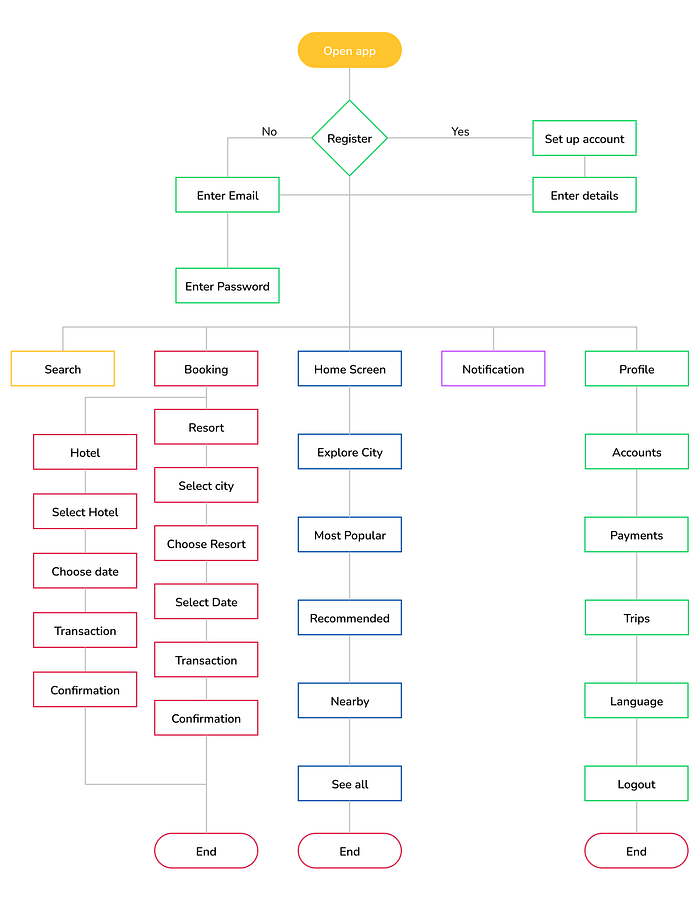
• Userflow
The user flow I designed is:
Open app > Register > Go to Home Screen > Choose Booking > Choose Location > Select Date & Room > Complete Payment> Close app
Detailed User Flow:
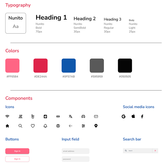
• Style guide
The main UI colors are: pink and white. I tried to create a cheerful atmosphere, while staying minimalistic and suitable for everyone.
• Wireframing
One of my favorite parts of the process. Wireframes help me visualize the skeleton form of the interface.
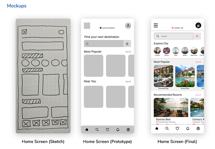
Visual Design
This is where I bring life to a wireframe. I start by defining the grids, columns and gutter settings in my artboard and the software I use is Figma.
Post setting, I start crafting the UI. Keeping in mind the interface requirements and adhering to the guidelines, I finished designing the product and this is what it looks like:

Testing
I tested my concept and prototype throughout the project and got valuable feedback at each stage that allowed for incremental enhancements. Each test helped me improve my concept and design, and ensure that it was answering user needs and goals.
I also conducted a desirability test with my high fidelity prototype, and the main attributes user chose were accessible, friendly, and easy to use, which described accurately what I was trying to achieve.
Here is a figma prototype you can interact with:
Outcomes & Lessons
This was a great challenge to tackle, which allowed me to go through all the design steps of UX and UI.
As with my other projects, I learnt a lot through all the steps. Testing my prototypes was hugely impactful, and helped me to make it better with every iteration. I am open to any feedback and improvements.
Thank you for reading!
Check out my other case studies here️ and my portfolio.
Let’s connect on LinkedIn.

