Case study: Evolution of Canva
As a part of Day 003 of 100 days of UX, I studied the evolution of Canva over the years from UX Timeline & Canva Team. I will present my findings in this blog.
About
Launched in 2013, Canva is an online design and publishing tool with a mission to empower everyone in the world to design anything and publish anywhere.
What are some noticeable changes throughout the years?
- Canva’s logo changed in 2021, after 9 years of its inception. It refined its logo to make it more playful, flexible and scalable. Click here to understand its design process.

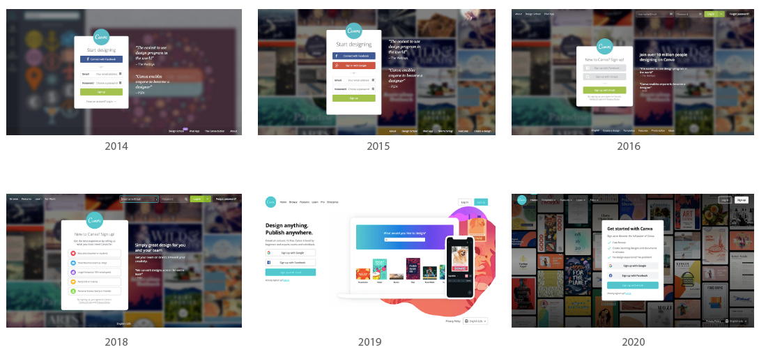
2. Canva’s approach to user-centered design & accessibility: They iterated & re-iterated its onboarding experience almost every year by getting feedback from the users & spent a lot of time refining every detail & paying particular attention to users’ emotional journey.
3. Canva’s homepage hasn’t changed much over the years. It provides very little information around the product. It suggests that the user needs to have context around the product before they get to this page. (otherwise no one will sign up)
They make it super easy to sign up:
- 1-click options with Google and Facebook or your email address.
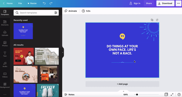
4. Video format always works. Canva launched Video suite in 2019. Re-iterated & re-launched in 2021 combining intuitive editing, recording, and collaboration features, thousands of customisable video templates, and an extensive media library, in one easy-to-use platform.

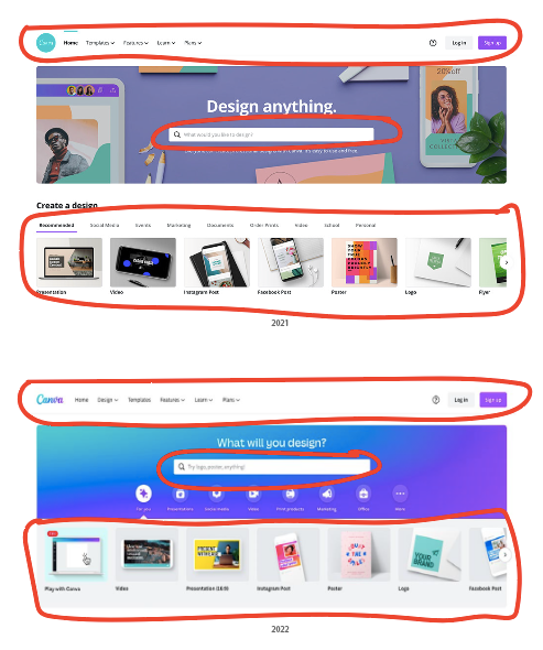
5. In 2022, Canva removed the non-essentials & cluttered the essentials into groups to make more space visually, so there’s less strain on users’ cognition.

6. And to encourage product usage, they show a row of design ideas based on user jobs:
- Step 1: Design
- Step 2: Sign up to publish
- Step 3: Success

Heuristic Evaluation
One of the pioneers who tried to objectively evaluate the user experience on digital platforms is Jakob Nielsen with his heuristic evaluation. Though they date back to the 90’s, these general rules of thumb are still valid and are used today.
I attempt to explain the rules, I could find on Canva website with examples:
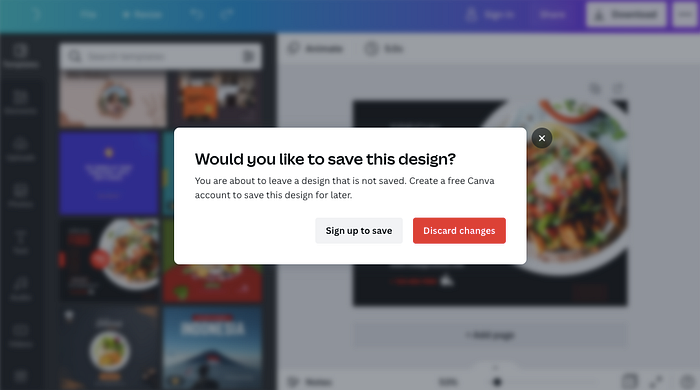
- Visibility of System Status: It keeps users informed about the status of their action through timely feedback when a document is being uploaded in Canva.

2. User Control and Freedom: This principle talks about giving the user the freedom to navigate and perform actions. The freedom to undo any accidental actions.
3. Consistency and Standards: is key to creating applications that make sense for users. Canva maintained consistency within its products through 2021 & 2022.
4. Error Prevention: There are two types of errors that users make: slips and mistakes.
- Slips occur when users intend to perform one action, but end up doing another (often similar) action.
- Mistakes are made when users have goals that are inappropriate for the current problem or task; even if they take the right steps to complete their goals, the steps will result in an error. Example- Confirm before destructive actions & support Undo as shown in User Control and Freedom rule.
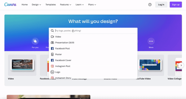
5. Recognition Rather Than Recall: Offering search suggestions is always a good idea.
6. Flexibility and Efficiency of Use: Shortcuts — hidden from novice users — may speed up the interaction for the expert users such that the design can cater to both inexperienced and experienced users. Allow users to tailor frequent actions.
Example- Pressing Delete on the keyboard to delete something & pressing Command + Z to bring it back allows users to perform tasks faster.
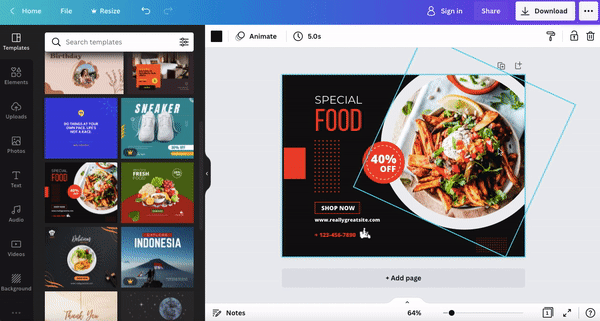
7. Aesthetic and Minimalist Design: An aesthetic and minimalist design is about keeping the content and visual design focused on what’s essential for users. Every item in an interface — every label, icon, button, and data point — is competing for attention and straining users’ cognition. So, in updated version, Canva removed the non essentials & cluttered the essentials into groups to make more space visually.
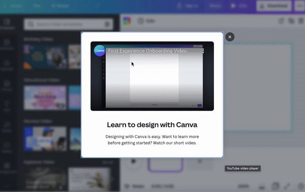
8. Help and Documentation: Websites and applications can offer two types of help: proactive and reactive.
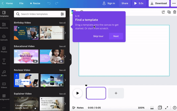
- Proactive help is provided before the user has encountered a problem, in order to prevent issues. It includes onboarding tutorials and contextual tips. For example- as you open a video feature, a tutorial would show up & then it would guide you with each steps.
- Reactive help includes materials such as documentation, videos, or even tutorials for those situations when users have an issue and they seek out advice to address it.
So that’s all for today. Check out the official website of Canva: https://www.canva.com/en_gb/
Thank You for reading this article. I hope you liked it and found it helpful. Support me by following me and showing some love by hitting that clap button.
Reference Links:
Kritika is a multi-disciplinary designer who graduated from NIFT Delhi with a degree in Knitwear Design & now focused on Product & UX Design. Her products are created from a place of intent, empathy, and passion. Feel free to reach out to her via LinkedIn or just say hey on Instagram! 😊
Portfolio- bit.ly/kritikaghangas

