Case study: Enabling meal plan subscribers to buy and manage their meal plans effortlessly
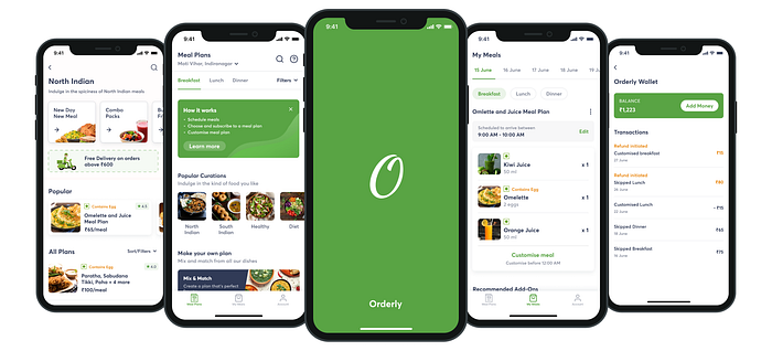
Overview
People who subscribe to meal plans do it for the sole reason of avoiding the effort and time required in ordering food daily. While that problem is solved by meal plan subscription services, there are a few issues that should be addressed for a good user experience.
In this case study, I’ll be sharing what those issues were and how I went about solving them with design.
📝 Understanding the user
A typical user of a meal subscription app would come to the app to quickly select a meal plan based on their liking, learn more about the details of that plan, and lastly, pay and subscribe for it.
USER PAIN POINTS
Some of the most common problems that a user of a meal subscription app faces are:
- Difficulty in finding and deciding on a meal plan that suits their food preferences
- Concerned about committing to a fixed menu of meals that cannot be changed later
- Rigid delivery schedules — No way to cancel a meal for a day and inflexible delivery timings
- No clear information regarding refunds for a cancelled meal/plan, in case there is a way to cancel
- No option to select specific days and duration for the subscription. Feel forced to subscribe for a long duration for fixed delivery days.
🚩 Business Goal
“Good design is good business” — Thomas J. Watson
The main business goal that I’ll try to achieve with this app is to increase revenue
Ways I used to increase revenue and why I used them:
- Offers & Discounts — Users love offers and take advantage of it whenever possible
- Recommended Add-ons — These help in making user’s journey effortless at times
Note: I’ll talk about their implementation in design wherever applicable.
✏️ Userflow, IA, and Wireframes
I sketched some ideas to solve for the user’s problems and created userflow and IA for the most appropriate one.


Before we dive into screen designs, let me take a second to explain my assumption around what “Orderly” is.
I assumed “Orderly” as a company that prepares and provides meal plans to its users, all on its own.
Now, with that out of the way, let get into screen designs.
🎨 Screen Designs
📱 Splash Screen
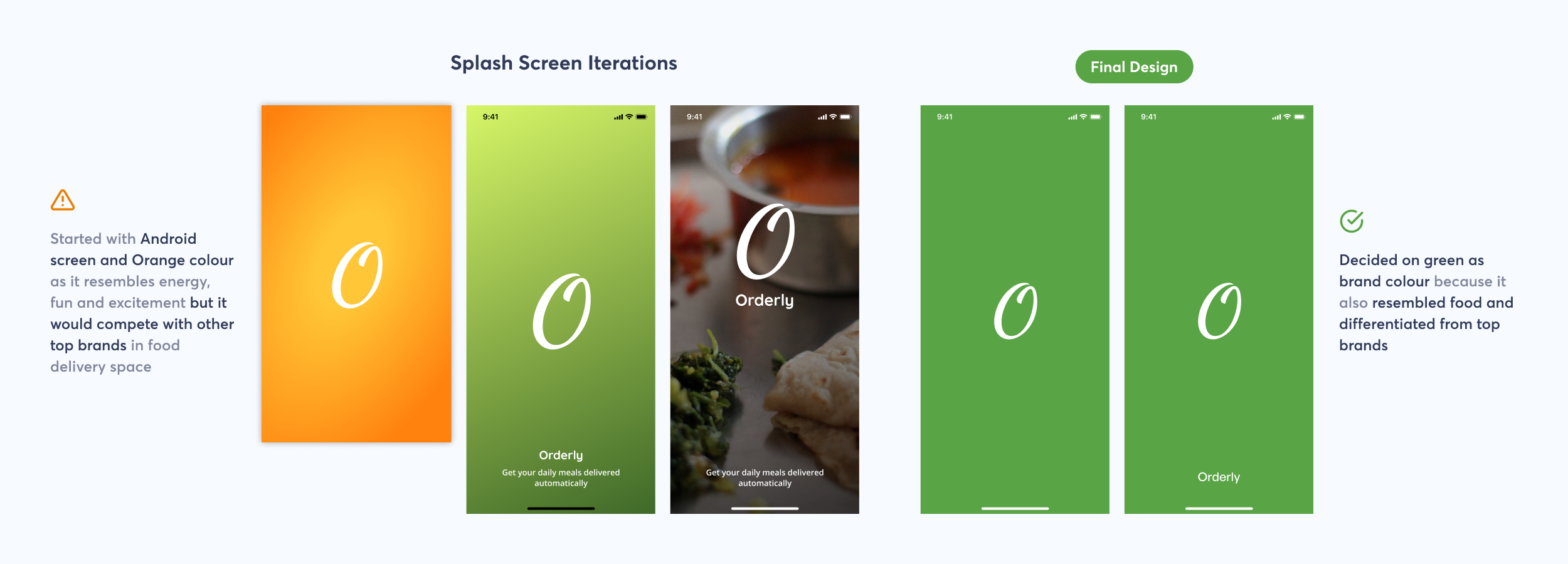
The screen that is designed first, generally, decides the visual language of the rest of the app. So it was important to make a decision around that.
I tried solid colours, gradients, images and different copy for text before finalising the final design.
The final design was simple and had no long text to read which felt appropriate for a splash screen, that disappears within seconds.
📱 Onboarding
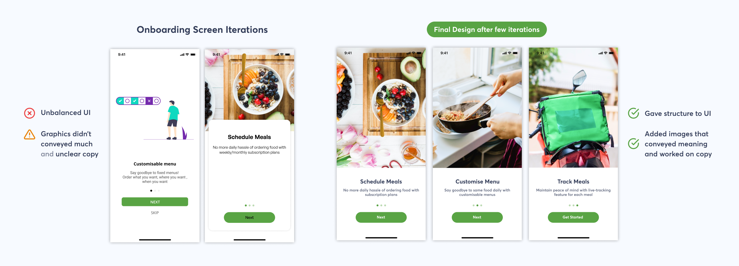
Onboarding screens are common but it took a bit of thought from my end to come up with the correct onboarding flow.
I was getting confused about what all should be asked before the user reaches the home screen.
Below, I have shown one flow that I tried.

I iterated on the above flow for some time, adding and removing screens until I noticed that:
- All the information that I was asking wasn’t affecting what will be displayed on the home screen in anyway
- Was increasing the time and effort required by user
The aim should be to get users into the app as quickly as possible.
I analysed all questions that I was asking to the user but none were required in the onboarding flow.
This app was different when compared to other meal subscription services. So, I decided to use the onboarding flow to educate users about the app.
📱 Sharing Location
For location screens, it was necessary to pay attention to details for a good user experience.


I had fixed all major issues by now but there is always room for making the experience better for user.
In above flow, user would need to do a lot of back and forth between the screens. So, I decided to club both the ways and use a bottom sheet to reduce navigation. thus reducing the number of screens required.

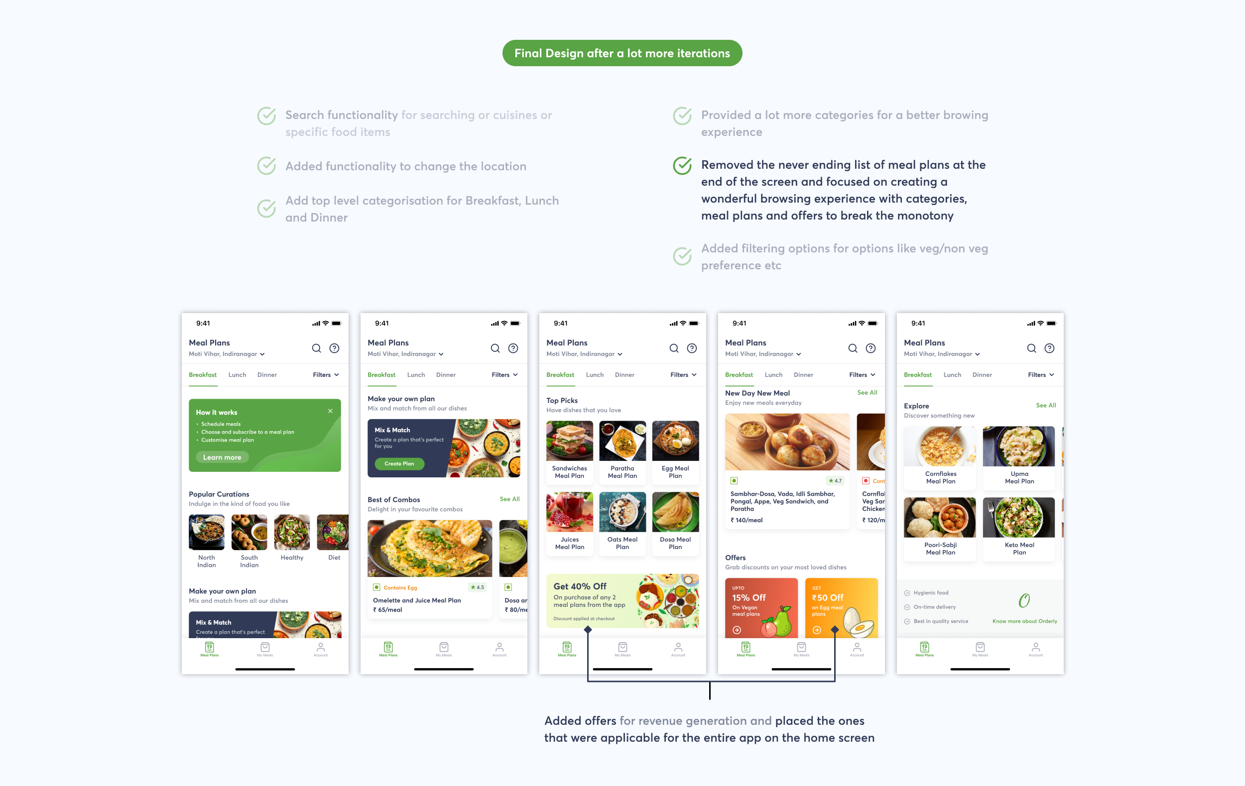
📱 Home Screen
Presenting a plethora of food options in way that helps users make an informed and effective decision based on their food preferences
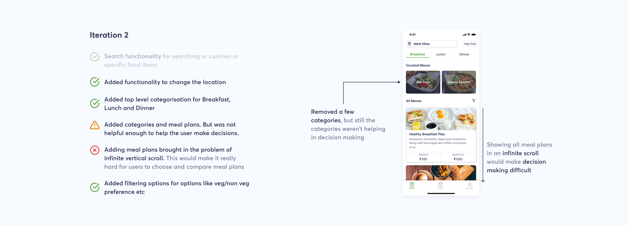
There are a lot of meal plans to choose from cause decision fatigue. Thus, showing meal plans in categories would help them in making a better decision.
Process
I decided to show a few categories and provide a way for user to search. This made sense to solve the problem of finding a meal plan.
Note: I’ll talk about the meal plan card designs separately.

I was facing a lot of difficulty in coming up with categories. So, I studied other apps to find patterns on how these apps created categories. I found that the categories were build upon how users chose different things in real life
( For eg: Try something new — Swiggy, Popular Funds — Groww, Recently played— Spotify)
I also ran a short survey to understand people’s eating habits for breakfast, lunch and dinner.

Remember, I told that I’ll talk about meal plan cards separately? Here’s why.
Meal plan cards carry the main information that the user would be looking for. Thus, a lot of attention was required to decide on what information will go on those cards. It took me a lot of iterations to come up with a design that presents the right information in a consumable manner.
Here are few major iterations of the same:


For a long time, I struggled in deciding the meal plan names. I tried a few more iterations, working on the copy and layout of the cards but was going in circles.
Later, I decided to use food item names as the primary information on the cards.

In my final design below, I removed the weekly/monthly plans and replaced it with price/meal because:
- Users would buy for whatever duration they want to buy. Showing weekly/monthly price would not change user’s decision in anyway.
- Presenting weekly/monthly prices side by side made them look like two kinds of plan but this wasn’t true.
- Price/meal conveyed on what basis the total payable amount will be calculated. According to price/meal users could get a rough idea about how much they would need to pay for their meals.

📱 Meal Plan Details Screen
Simplifying the checkout experience for a meal plan
There are few things that a user will be concerned about before checking out— fixed menus and rigid delivery schedules. So, let me explain how I addressed those concerns.
I came up with the idea of a customisable meal plan to tackle user’s concern about fixed menus. A customisable meal plan would allow users to manage their meal after subscribing to a meal plan.
Process
Initially, I decided to allow users to customise their menu completely before subscribing. This made sense as it gave users total control over what they will have for their each meal.


I did a few more iterations but a lot of confusion was happening in calculating the bill. This happened because I didn’t had the days and the plan selected already. So, I did competitive analysis. I analysed other similar products to understand their user flow.
Few websites that I looked at:
I reached to a conclusion of asking to choose a plan for which they want the meals before showing the menu.

Above layout didn’t worked. So, I tried asking users to select dates on the home screen itself. However, that brought in the problem of presenting empty state to the user (in case the dates weren’t selected).
Clearly things were not working out. So, I took some time to re-analyse the problem that I was trying to solve and realised that:
- Customisation before subscribing didn’t solved user’s problem completely. It was resulting in a fixed plan at the end ( just a highly customised one)
- A lot of user’s time and effort would go in deciding what they want to have in their meals for the next whole month. This would have resulted in more users leaving the app than subscribing to a meal plan.
Thus, I decided to let users customise after checkout and designed the screen for the same.

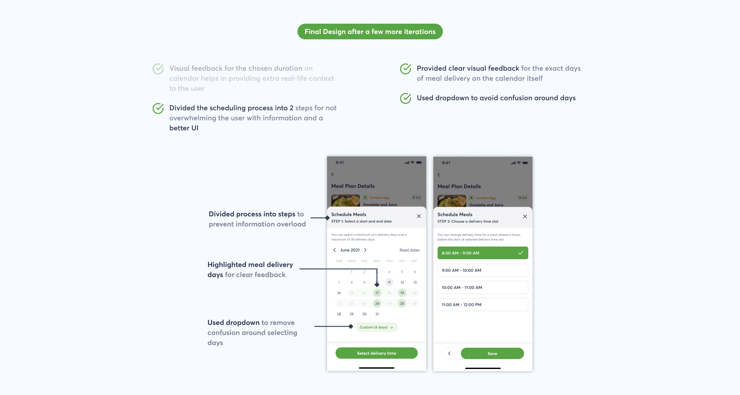
Now, that I have mentioned about “Select Dates”, let me take this opportunity to share the screen that would appear on clicking it. I decided to let users choose their own duration in addition to custom days selection to tackle the concern of rigid delivery schedule. I did this because weekly/monthly duration won’t fit every users need.

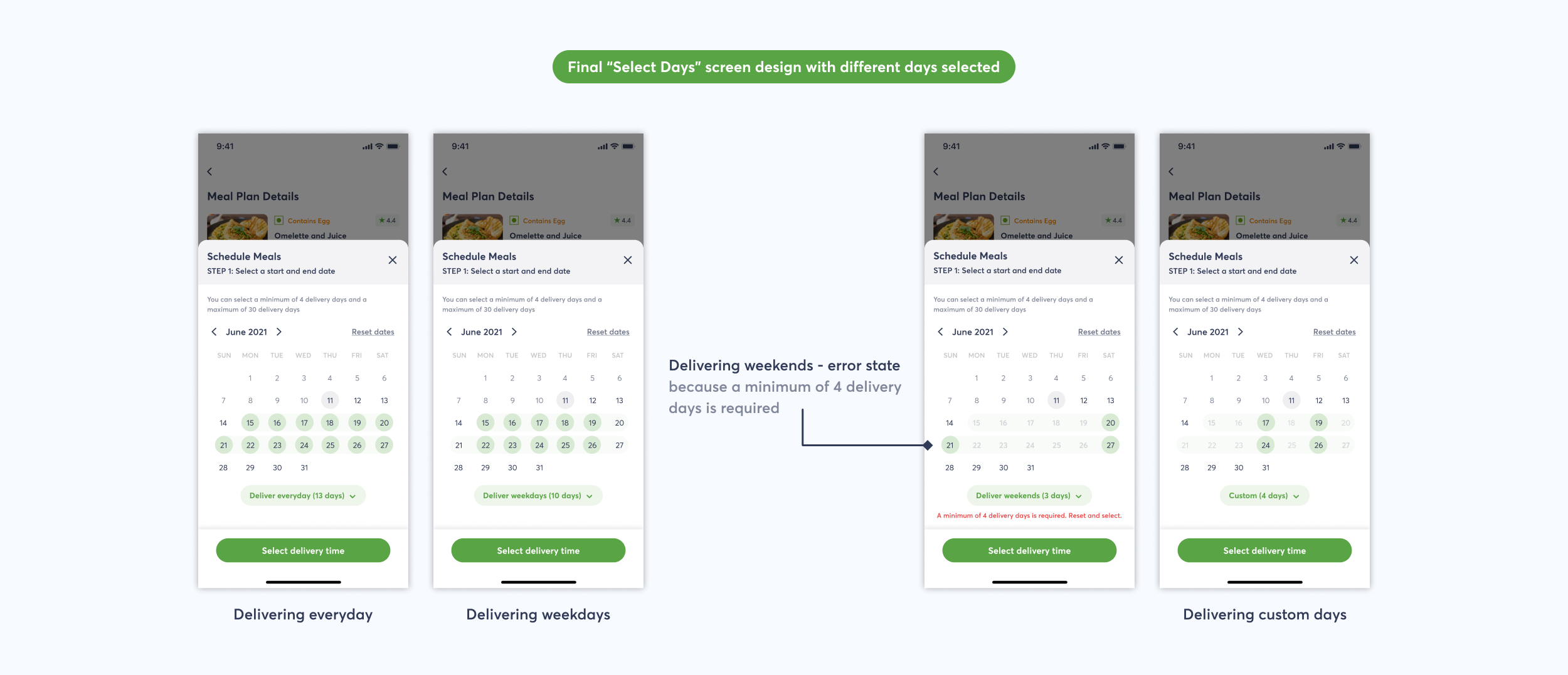
Let me also share how the above screen looks when different types of days are selected.
📱 My Meals Screen
Simplifying the complex meal plan customisation functionality
Earlier, I have mentioned about customising meal plans after checkout to help users manage their meals. Let me explain how I designed it in the app.
Process
My initial idea was to allow users to change time and location for meal delivery, skip a meal, pause meals for a particular duration, and cancel plan. This made sense as it made everything very flexible but I wasn’t considering some major concerns from business’s point of view and also not deciding on what features to provide properly ( which I’ll talk about in sometime)
Note: “My Meals” screen exists to let users view, manage and edit their upcoming meals after subscription


In both above iterations, I wasn’t able to get a single thing right in my design, so before doing anymore iterations, I documented
- Actions that the user will perform on this screen
- Data points needed for those actions
- Priority of each action

Now, using the document as a guide, I was able to come up with a design that was somewhat right.
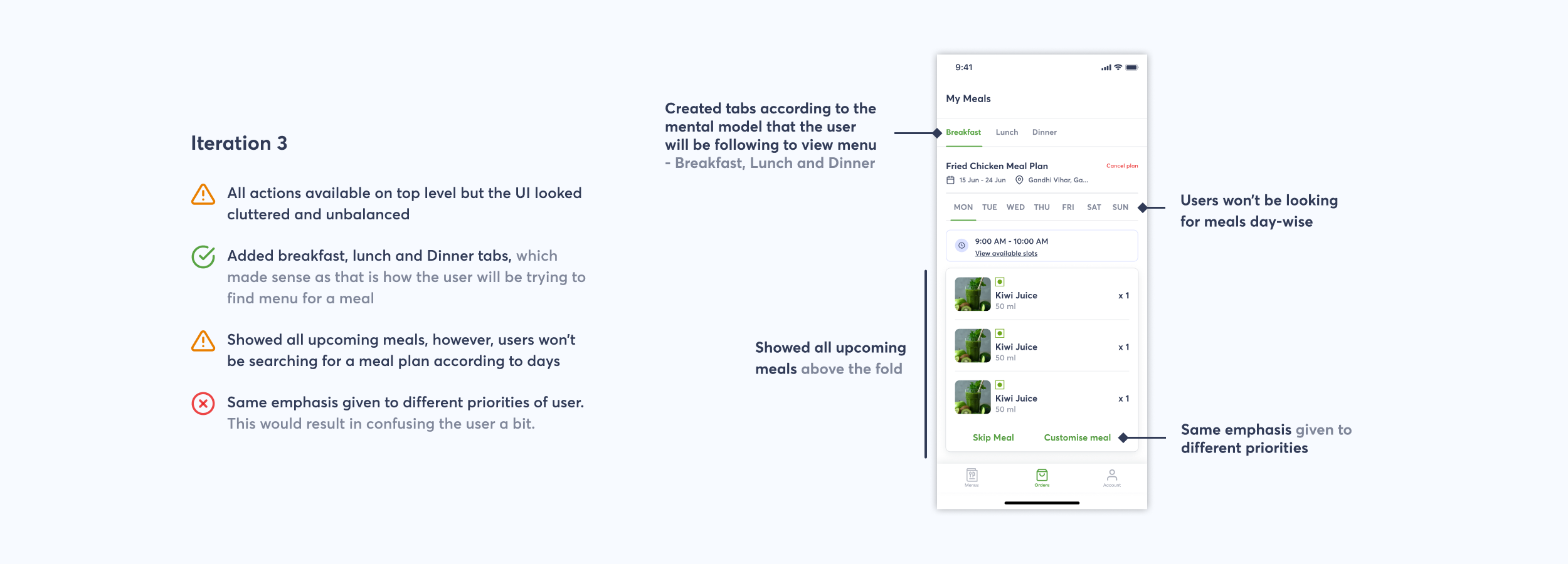
I did a few more iterations, where I:
- Worked on the layout
- Removed irrelevant information, like the duration of the meal plan,
- Decided to discard the functionality of changing location as it would be a very infrequent action
- Came up with the idea of having dates, as a user would think in a similar way when finding meals — What am I going to have for breakfast today?, not, What am I going to have for breakfast on Monday?
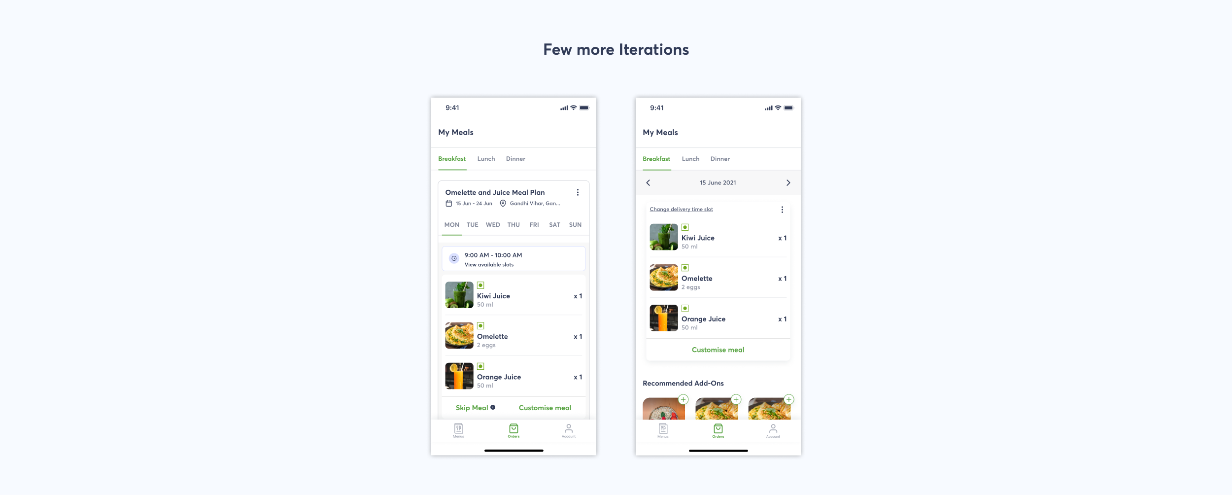
In all above iterations, I was allowing users to make any kind of changes to their meals anytime before the delivery time. This was wrong as this would have resulted in loss for the business. So, I decided to add a time limit before which the users could make the changes.
Now, the app allows users to could make changes only
- Till midnight before the day of delivery for Breakfast and Lunch and
- Till noon of the day of delivery for Dinner
Came up with those timing, thinking about when do our mothers decide what to prepare for each meal of the day 😉

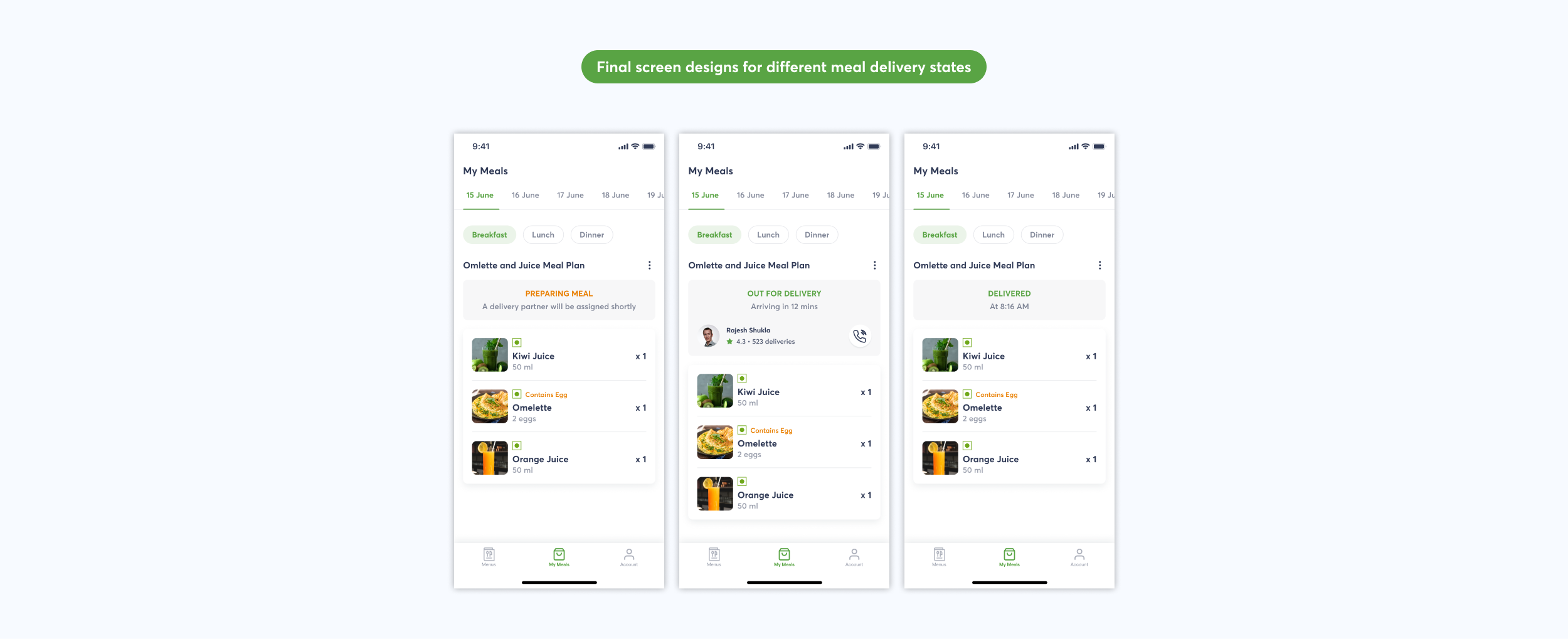
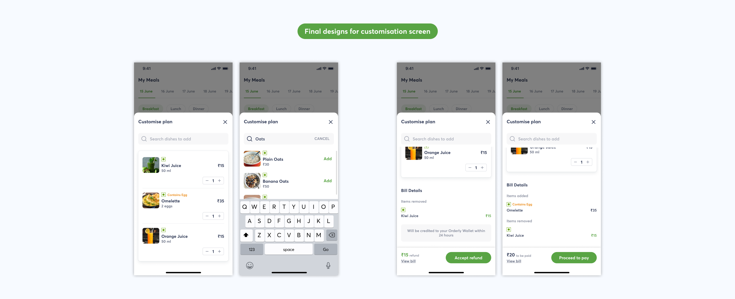
Next, I’ll be sharing the screens for different states involved in meal delivery process and the screens that would appear when user clicks on “Customise meal”.
As is the case with any screen/element, I iterated on these as well, fixing the copy and layout. Here are the final screens.
📱 Wallet Screen
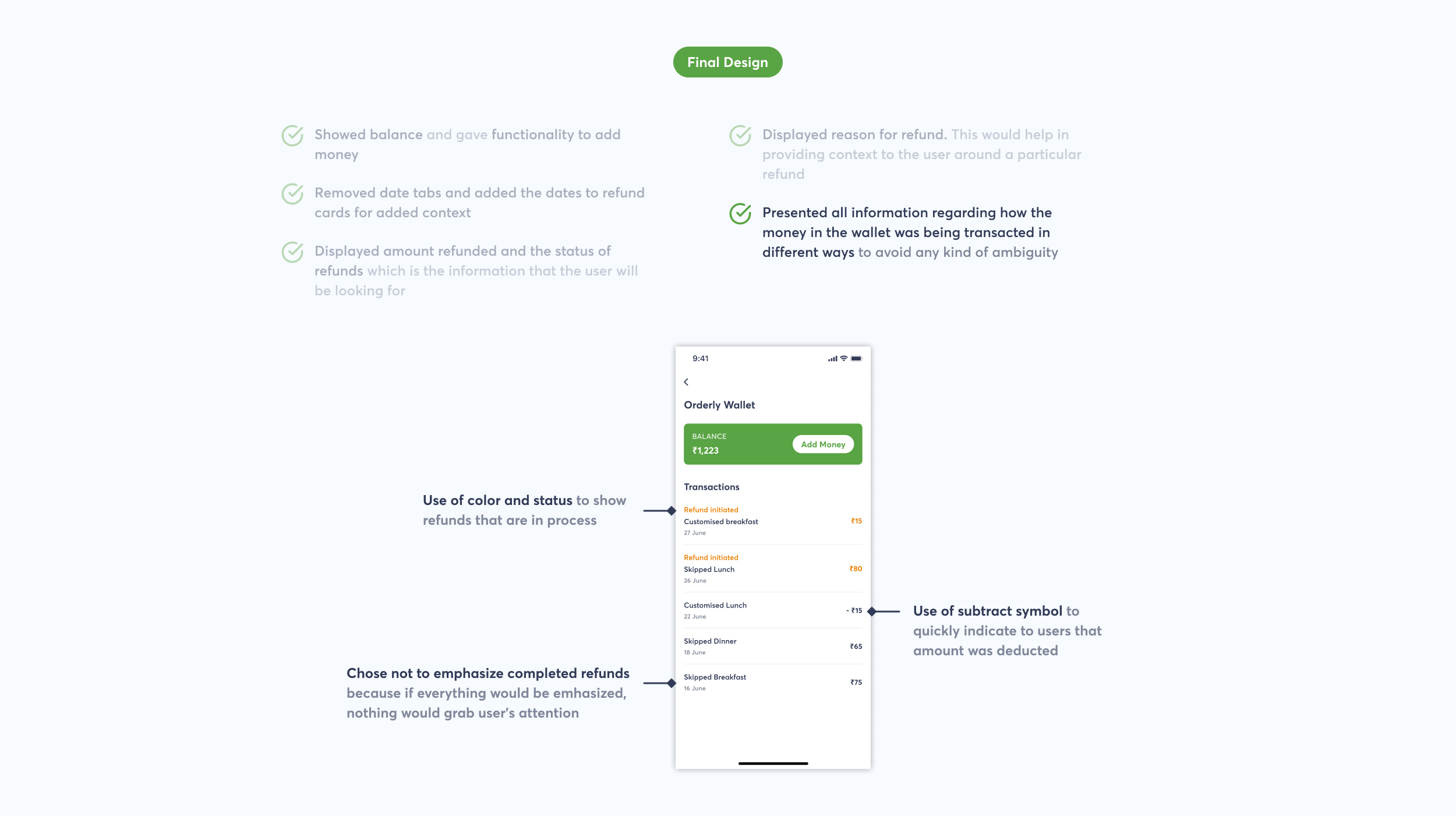
Designing the right refund experience
Users lose trust when they can’t find some crucial information they’ve been looking for and may end up not buying. So, it was necessary to present important information in a consumable manner at appropriate places.
Process
Coming up with refund policy was easy. The idea that I had was very simple — Amount will be refunded to user’s bank account.
In the back of my mind, I had this concept of “Orderly Wallet” which users could use to pay for the customisations they make to their meals. All that user would need to do was add money to the wallet.
I thought that a lot of time will be wasted in payment flow each time the user chooses to customise their meal. So, if the payment happened within the app itself, it would make user’s experience delightful.
After giving a little more thought, I decided to refund the amount to the users in “Orderly Wallet” itself. This would give a fair picture all transactions in relation to “Orderly”.

I thought of refunding the amount as coins but realised that there was no need of introducing another token of exchange. It would make things difficult to understand for users. Thus, I stuck to refunding as money only as users are familiar with it.
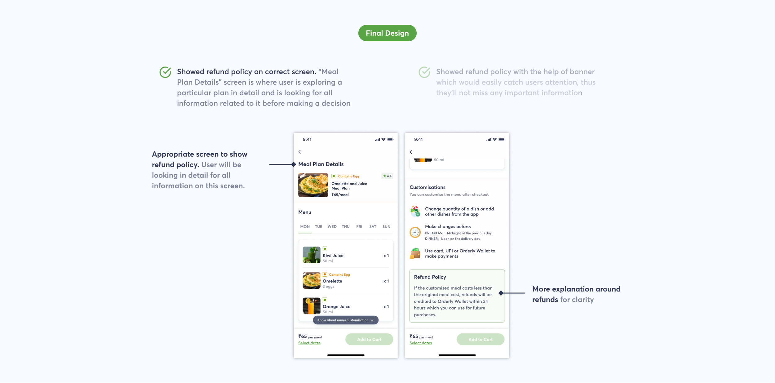
Now, I’ll talk about how the final design of “Orderly Wallet” evolved.


📱Other Screens of the app
In category screen(North Indian) below, I have added free delivery offer. By then, the user has already decided what kind of meal plan they want. Thus an offer of free delivery would be a good prompt to make them buy more.

🔔 Notifications
In the end, I also decided to design notifications. There were many things that the user would want to be notified for.

💯 Learnings
- Visual design — how to choose colours, how to spot an unbalanced UI, how to choose graphics (images & icons) used
- Writing better and well-thought copy. Copy can really make or break a design.
- There’s a popular saying among designers — “Think like a user”. This project taught me exactly that. I’ve learned how to approach designing with the questions that the user will have in mind and then design with the mental model that the user will be using to finding things on screen.
- Power of documentation — I used to just think about various solutions to the problems and needs of the user, assuming that I’ll remember everything but how did I miss the fact that the human brain comes up with thousands of thoughts per second. Forgetting ideas and data was inevitable.
- The importance of being self aware. When one is clear about what they are thinking, articulation becomes easier.
- How to keep both, the business and the user, in mind before finalising any decision and to know the “why” behind those decisions.
🙌 Wrapping up
I hope you enjoyed reading the case study and appreciate you for putting in the effort of reading it to the end.
Also, a huge shout out to Chethan KVS for mentoring, guiding and encouraging me throughout this project.
🤝 Also, I’m currently open to opportunities as a Product Designer. Feel free to drop me a message on Twitter or LinkedIn. I’m always up for some constructive feedback, advice and discussions.
Thank you.

