Case study: How I designed a landing page for an artist’s upcoming workshop

I. Introduction
This is a walkthrough of how I designed a landing page to drive payment and registrations for an upcoming in-person workshop conducted by a digital artist (Nori Norbhu).
I worked on this project as part of the Product and UX design cohort of 10kdesigners.
Problem Statement 📝
Nori has thousands of followers on her social media handles. She needs a landing page to make them aware of her upcoming workshop, and register for it.
II. My Process
On the surface, my process for designing this landing page can be broken down into:
- Defining the landing page’s goal
- Researching the problem space
- Understanding the user journey
- Information Architecture
- Wireframing
- Visual design
The process was hardly linear owing to various levels of feedback I received through out my process.
Goal🎯
Showcase Nori’s digital art workshop to convert landing page viewers to workshop attendees
Research
Before jumping on to Figma, I wanted to gain some insight into the following:
- What are the types of users visiting my landing page?
After some internet sleuthing, I learnt that Nori is most active on Instagram and majority of her (active) target audience lies there.
So most of the users that visit the web page will be her Instagram & Facebook followers and small portion of users driven to the website organically through SEO. - Who is the user I am solving for?
An assumption I am taking into consideration is that most of the traffic to the landing page is directed from her Instagram & Facebook followers list.
Through out my design process, I have solved for this particular user persona in mind to ensure effective UX. - Who are the competitors?
Skillshare, Domestika, Udemy are examples of platforms that would be the competitors of the product/workshop that is being sold.
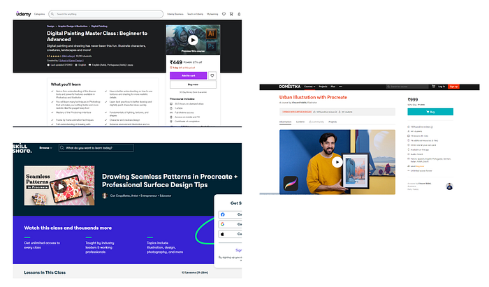
On the other hand, the competitors of the webpage would be platforms like Instagram handles and Facebook pages.
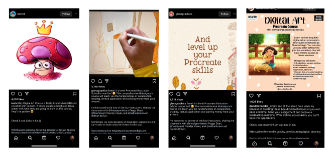
Most people want direct, to-the-point information that will lead them straight to a solution for their problem. And since a landing page combines both of these factors into one easy-to-read format, it sets up the perfect user experience for conversion success.
Understanding the user’s journey
The landing page enables the last two stages in a user’s journey to attend Nori’s workshop.

Information Architecture
I created a flat structure IA to gain insight into the following questions:
- How do you organize the information?
- How do you present information to represent visual hierarchy?
- How will the user navigate through the app?

Wireframing
After organizing the information and sections that go into my landing page, I began wireframing to get an idea of how I wanted the data to be presented. I began with rough sketches in a notebook but quickly moved on to making low-medium fidelity wireframes on Figma as it helped me visualize the final look of the landing page with more clarity.

Visual Design
To come up with the visual style of my landing page, I wanted to understand Nori’s art, brand and design language.
Nori Norbhu is an independent illustrator and digital artist. Her works are usually bright, colorful and playful. Her artwork often includes nature and women of color.

I went through a bunch of websites and landing pages for visual inspiration.
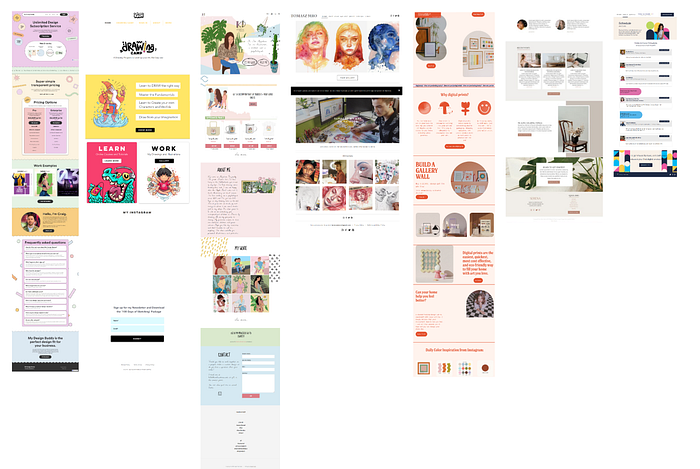
I decided to keep the typography simple and I used Poppins for both the Header text and Body text.
I dabbled in a lot of palettes and concluded with the following:


I also wanted to include a subtle element of foliage as it is commonly observed in Nori’s art. I added a light vector leaf background through out my landing page.
III. The Landing Page Design
Making users aware about the workshop
This section talks about how the landing page achieves this
Hero Section
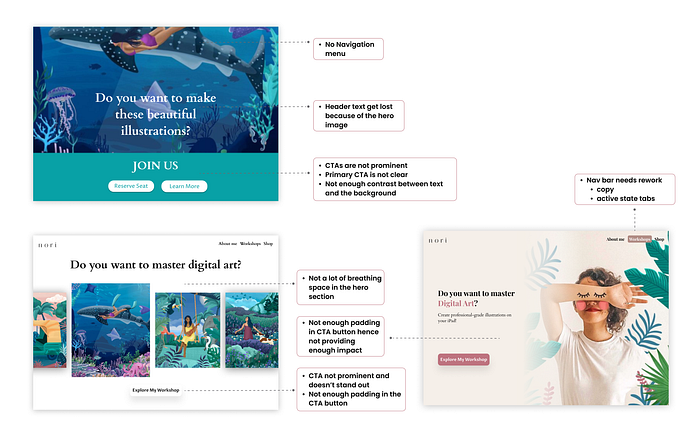
The aim of the hero section is to inform the users about the workshop and allowing them to quickly register.
- I used Clear Call To Actions, and descriptive header and sub text to achieve the same. I added an oversized banner image that shows you the artist with leaf-y doodles to reflect her personal brand.
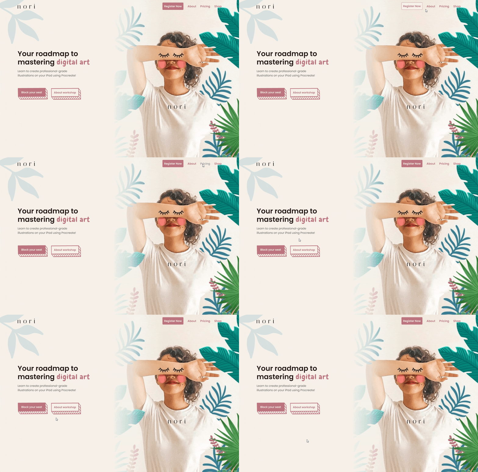
- I also added a navigation bar with tabs like ‘Register Now’, ‘About’, ‘Pricing’ and ‘Shop’ to help users navigate through different sections of the landing page quickly and effortlessly.
- “Register Now” is in active state for users who directly want to purchase the workshop.
Here are some of my initial iterations:
Making users want to attend the workshop
This section talks about how the landing page achieves this.
As a user, I would typically want to know what value the workshop can add to me, and whether it is worth their time and money.
Workshop Roadmap
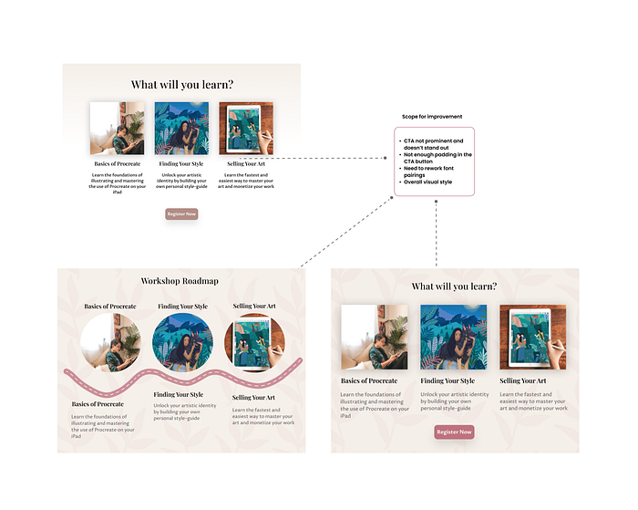
As a user who didn’t already register from the Hero section, one of the first things I need to know about the workshop is what I can learn from it. Conveying that is the primary objective of this section.
This section includes:
- Syllabus of the workshop
- Primary CTA
- Other relevant workshop details such as date, time, venue and price

Here are some of my initial iterations:
About The Artist
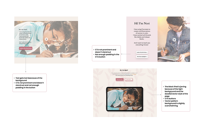
If a user lands on the web page and is unfamiliar with the artist, this section is meant to introduce the artist and convince the user about the artist’s expertise.
- I have included a short introduction, clear Primary & Secondary CTAs, and a video description.

- I used an iPad vector illustration to subtly reinforce the fact that it is a digital art workshop.
- Also, I want the video in this section to auto play a short introduction about the artist, her art, and snippets from her past workshops. Such a video in the landing page will help users absorb information better, build brand association and in turn, improve conversion rates.
Here are some of my initial iterations:
Social Proof
The objective of this section is enable the user to trust the claims the landing page has made so far.
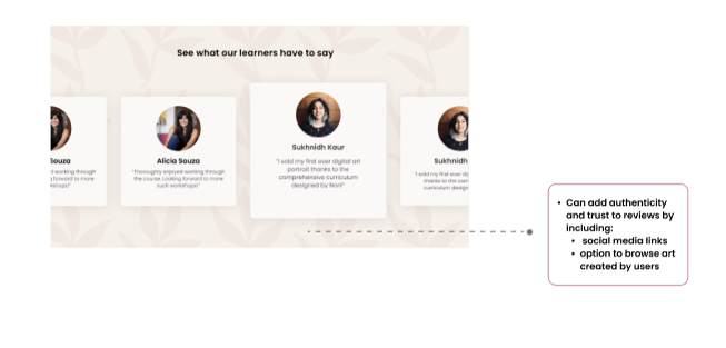
Social proof allows us to prove satisfactory customer experience and adds credibility to the workshop through the reviews of past learners.

I have added profile pictures, social media handles to add authenticity and trust to customer reviews.
I have also added a hyperlink that lets users browse through art work created by past learners. This will help users make informed choices and improve their overall experience.
My initial iteration:
Workshop Pricing
The objective of the pricing section is to convince a spectrum of potential users that the workshop is worth paying for.
I have included a 2 tier pricing system to effectively capture the following segments
- Price conscious customers
- Highly-engaged followers who aren’t price conscious
To better convey the value proposition in each of the tiers, I have:
- Used simple copy and design
- Displayed discounted prices and main offerings of the workshop
- Clear and visible CTA
However, I have mindfully not included any FOMO, time-based or scarcity inducing language in my copy as it does not align with the artist’s brand image.
Instead, I have focused on the offerings of the workshop and mildly nudged the users towards the premium pricing plan that happens to be more popular amongst learners.

In addition, as a way to allay concern, ensure trust and reduce drop-off of users across the funnel, I’m providing a money back guarantee. I have mindfully written the copy to give users the peace of mind of a money back guarantee while reducing the chance that they will actually use it.
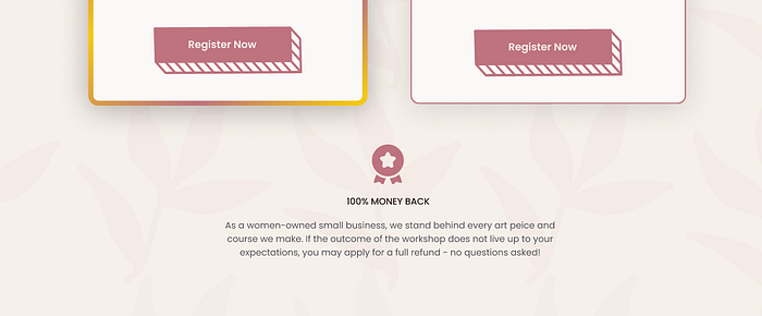
Some of my iterations on the pricing cards:

FAQs
I have also included an FAQs section just beneath the pricing cards to address any doubts or uncertainties users may have, and included contact details in case users have further queries.

Last section and Footer
I used to last section of the landing page to act as a “last straw” of sorts. A final attempt to bring a user around to perform an action.
I did this by adding a collage of art pieces created by the artist and including copy that nudges the user to follow the artist for updates and discounts.

While navigation bar acts as the road map for the most important sections of the web page, the footer acts as a safety net for other such navigation options.
I have included the following details in the footer:
- Sharing event details via social media websites
- T&C, Privacy Policy, Refund Policy, Support and Pricing
- Copyright claims
- A newsletter subscription that acts as a CTA

If you’ve reached this point, thank you for your time!
Here’s the link to my design:
IV. Reflections💡
Here are some of my learnings while working on my first design project:
- Being mindful of your goal and the user group you are solving for is critical to designing a meaningful experience.
- Convincing people to pay is a hard problem to solve. I have looked at both offline and online examples of how products convince customers to ‘pay’ for them. While I have adopted many standard techniques like giving social proof, offering differential pricing, I believe there is more which can be done- especially in learning from new paradigms which have emerged in the recent past in the online world. For instance, can we allow potential users to ‘try before they buy’ in this offline/hybrid experience?
- Taking feedback on your wireframes instead of visual design helps you iterate faster; and I wish I had implemented this sooner. 🥲

- Creating medium-fidelity wireframes on Figma after pen paper wireframes helped me visualize the final look of my designs more clearly.
And finally,
A big thank you to my mentors and peers at 10kdesigners for all their feedback and support!
I’m currently open to product and UX design roles. Reach out to me on Twitter or LinkedIn!

