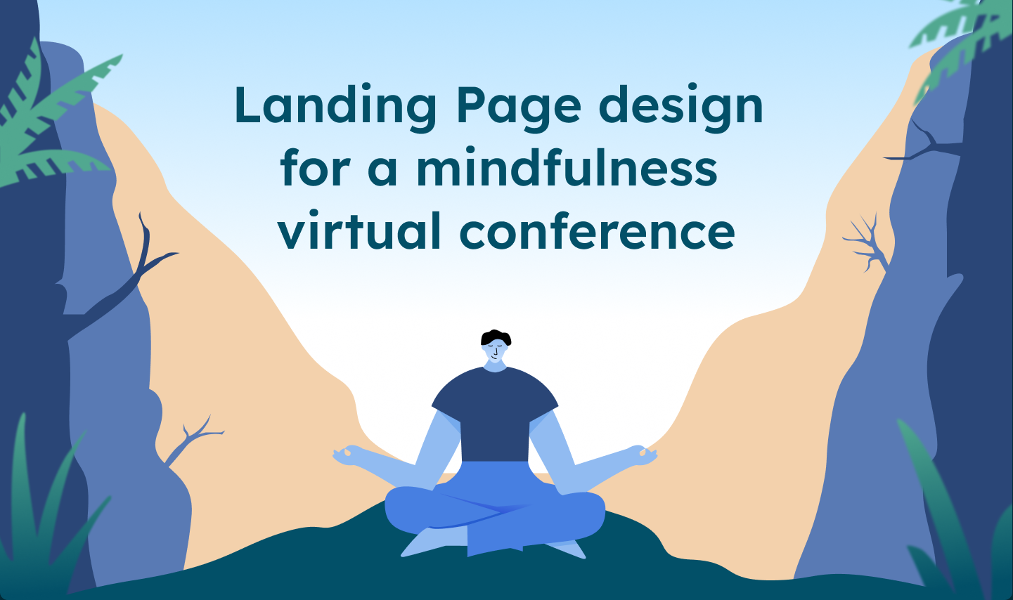
Case Study: Designing a Landing page for a Virtual Event on Mindfulness
This Case Study was done as a cohort assignment for 10kdesigners. It’ll walk you through my process, experience and learnings from the project
Introduction
Our assignment was to design a landing page for an upcoming event. i.e., a conference, workshop, webinar, etc., for a startup in the assigned niche or a brand new identity. The niche assigned to me was beauty & wellness.
The goal of the assignment was to practice visual design and get hands on experience of going through the design process. Initially, I found the niche to be challenging, and I almost decided to change it, but then I realized that if I choose the easy way out I won't learn anything significant tout of it.
Idea Exploration
I started by jotting down a few possible ideas on which I can work in this niche, such as beauty, cosmetic products, tattoos, salons, meditation, mindfulness etc. Well meditation and mindfulness was something that resonated with me and it's something I intend to explore personally. “A virtual workshop on mindfulness & meditation…” as an idea, it seemed simple. All I had to do now was to find or come up with a brand that matched this theme and add a creative flare to it.
Well-known apps like Calm, Headspace, Unplug and Waking Up fell into the category of wellness and mindfulness. I chose Waking Up as the platform since I use this app and find it very useful. Waking up is a well-known app that helps to track mindfulness habits through guided meditation. The sessions teach mindfulness techniques that take listeners beyond calming and relaxing. Apart from frequently updated sessions, Waking Up is also a wonderful resource for understanding philosophy and neuroscience, mental health, stoicism and much more.
Research & finding inspiration
Now this being my first ever landing page design, I started by looking for references and inspirations to get more ideas in terms of general structure and layouts of a landing page, visual design, pricing and elements to include for an event landing page.

Reading about mindfulness on internet plus talking to a few people who use meditation apps & who might be interested in attending a virtual event helped me to optimize and curate the landing page sections better for the target audience.

Information Architecture
Once I gathered some references & inspiration and had a direction to move in, I started to roughly lay-out all the information that needed to be shown on the page. While tools like whimsical and Fig-Jam provide great features to edit, iterate, collaborate and organize information visually, sometimes one can get the urge to make things perfect all in one go and therefore, I preferred using pen & paper plus a whiteboard initially for this so that I could quickly change things around and iterate on ideas.

The idea was to lay out all the information clearly according to priority so that the target audience can understand:
- What is the event about
- When is the event taking place
- Who should attend
- Overview of the speakers
- Schedule/Agenda of the event
- What's the pricing
Wireframes
Now that I got some momentum, it was time to work on the wireframes. I started by making paper wireframes to explore ideas quickly and later converted them to low fidelity variations in Figma and I carried out extensive iteration in Figma at this stage.


While working on wireframes, my motive was to explore multiple ways to arrange blocks of information and make them cohesive and balanced. I classified my wireframing process in to color coded stages to depict the progress from Reds to Yellows to Greens, red being early/low-fidelity, yellow represented mid stage wireframes and green being high-fidelity wireframes.
Visual Design
Once the wireframing was done, I jumped to the visual design of the landing page. Since this website was meant to be designed for a mindfulness event to be conducted by Waking Up, I initially derived colors from their brand identity. While working on it, I realised going with a monochromatic color scheme is not a good idea and hence I started exploring different color schemes and typography.
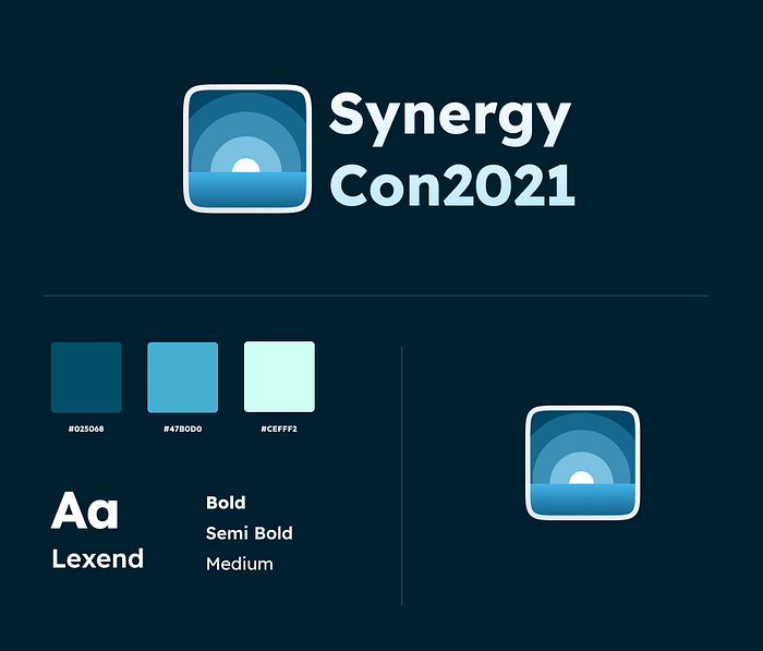
Once the style guide was in place, I started with the overall visual design of the landing page and tried some variations in the process.

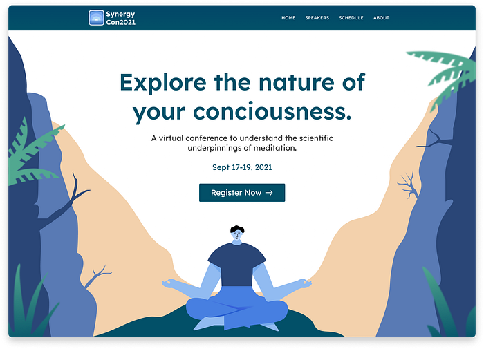
Hero Section
The objective of the hero image is to hook the audience, give context about the event and to encourage them to scroll and read further. I decided to mention the following information in the hero section:
- Headline and subtext that describes about the event.
- Date of the event.
- A prominent Call to action for registration.
- Supporting Image/Illustration.
I tried a couple of variations for this as well and went with an illustration for this section.
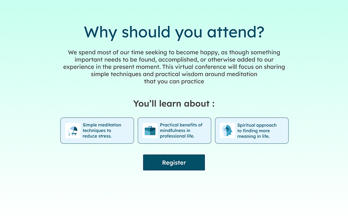
Why to attend the event
Once the hero section gains the attention of the audience, this section need to build some interest and emphasize on the reasons one should attend the event:
- What value does the event provide?
- Who should attend this event?
- What to expect from the event?
- What activities will be held during the event?
Speakers & Agenda
Once the interest gets built, now it's time for the audience to know about the speakers and the schedule of the event. This section can further solidify the desire of the audience to register for the event. I decided to keep these sections simple and minimal so that users can navigate through the sections easily.
Some design decisions I kept in mind while designing these sections:
- Speakers coming for the event and their background.
- Number of days, details and timings of the sessions.
- Ability to navigate through each section easily.

Pricing
I found designing this section to be the most challenging part of the landing page (yea, tougher than the illustration!). This section puts action in the AIDA framework that I followed throughout. The goal was to design pricing plans for the audience to take action and register for the event. Ideally, it is recommended to have 3 pricing plans, but I decided to go ahead with 2 plans since I wanted the audience to not get confused in choosing the right plan for them and the value each plan had wasn’t very distinct because of the nature of the event. I wanted the all-access pack to stand out and hence came up with the following design:

FAQs
This section is meant to have the answers to the questions that might arise in th audience's mind while navigating through the page of after registering for the event.
Key factors I kept in mind while designing the FAQs Page:
- A toggle arrow or drop-down action on the question can save the user’s time.
- Comprehensive information can help in earning a user’s trust.
- Users don’t have to go through the trouble of contacting customer support to get answers to simple questions.
Landing Page
After working on each section based on my insights and final wireframe layout I followed the style guide, worked on rest of the sections (Speakers, Agenda and Pricing) and came up with the following design:

Learnings & Takeways
- Taking up the challenge of designing a landing page in a niche that I found very difficult in the beginning and overcoming it was a great experience.
- Design Process need not to be fixed and linear. This project helped me understand my process better and pushed me to refine it further.
- Iterating and trying out ideas repeatedly is a great way to explore solutions to a problem creatively.
Thanks for giving it a read. If you wish to connect or have any feedback, please reach out to me on LinkedIn

