Case study: Blinkist app- concept feature
The product:
Launched in 2012, Blinkist is a microlearning and nonfiction book summary app. As well as holding a library of informative and educational podcasts, the app is predominantly known for it’s ‘Blinks’; short 10–30 minute audio summaries outlining the key points of the non-fiction books, that aim to help users learn more in less time.
Whilst I wasn’t familiar with the app prior to being challenged with this sprint, I soon came to see how cool of an app it is. I love podcasts, and to me the book summaries act as a (kind-of) podcast version of books that I have been meaning to read for ages. For example, Sapiens by Yuval Noah Harar has been on my reading list for yonks, and I loved listening to the Blinks of the key themes.
The brief:
Blinkist have recognised an exciting opportunity for users to further their commitment to building a product which changes people’s lives for the better; they have noticed there is potential to create a feature in which users could continue their learning after completing Blinks, by engaging with others within the Blinkist community.
Who?
Amanda Thompson, Natasha Driver, Zsofi Gschwendtner and me, Hermione (obviously!) We are all students of the General Assembly UX Design immersive course.
What?
Our team worked collaboratively, each taking part in most steps of the design process however, roles in which I took the lead in were the competitive analysis, conducting interviews and the prototyping.
How long?
We had 4 weeks in which to complete this sprint (alongside working full-time!)
The solution so far…
How did we get here?
- Competitive & comparator analysis
- Desk Research
- Screener Survey & Interviews
- Persona’s, How Might We’s and a Problem statement.
- Sketching and Low-fidelity Prototypes
- Usability Testing
- High Fidelity Prototypes
- More Testing!
Competitive & comparator analysis
To kick off the research, I conducted a competitor analysis.
This consisted of a feature inventory of similar apps, and a task analysis. The feature inventory highlighted the real gap in the market for a more social, interactive aspect of reading or listening to audio books. The task analysis was with GetAbstract and Audible, as they were the two competitors which had a review feature (something that Blinkist currently doesn’t have) By analysing this feature within the two respective apps, I was able to fully understand their process.
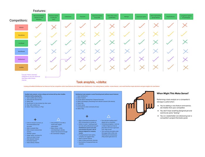
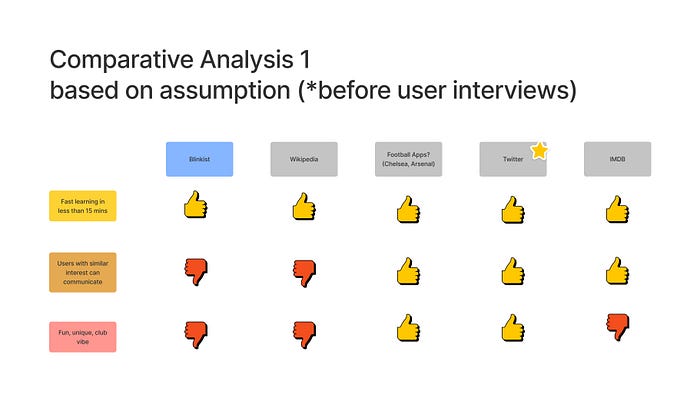
Zsofi’s comparative analysis was particularly inspiring for us all, as surprisingly we found Twitter really sparked our interest. This is because it has facilitated a space in which users connect into ‘communities’ whilst also learning and sharing with each other (the term ‘learning’ taken lightly here with regards to some discussions on Twitter 🫣)
We discussed that it is successful in creating these spaces subliminally because of the casual nature of the app itself.
Survey
By conducting a screener survey, we were able to find potential interviewees, whilst also understanding some basic initial reading habits of Blinkist and non Blinkist users. The main insights we gained from our survey was that:
- A staggering majority of users (57/61) admitted to not being able to read as much as they’d like.
- However, interestingly over 70% of the users confirmed that reading is extremely important to them.
- Only 11.5% were or are part of a book club.
Interviews
The screener survey was a start, but the good stuff really came from our interviews.
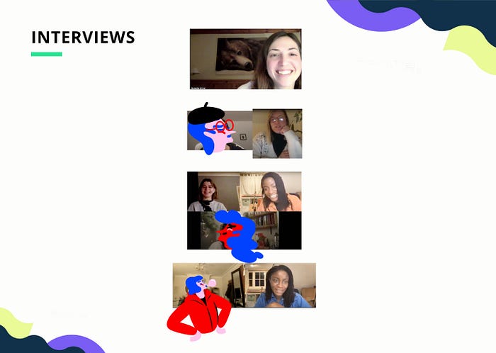
We interviewed 10 book loving people in total, 8 of which were not Blinkist users (not ideal- but I’ll get to that later) and 2 of which were. I conducted 3 of the interviews and took the notes for another 3 of them.
In order to synthesise the findings from our interviews, we each created an affinity map then came together to discuss and collaborate. This was a great exercise as we were able to quickly identify the most prominent trends and patterns of our users, as well as highlight areas which may need more research.
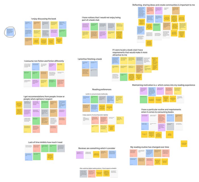
These key findings are as follows:
- People interviewed thoroughly disliked the idea of a book club, yet are passionate about sharing and discussing books with friends or family.
‘I respect my friends views and opinions on a book- I like to hear what they’ve read as I’ll probably like it’
- People interviewed read via recommendation
‘I’ve got quite a few friends who read similar things to me so I get a lot of recommendations in that kind of way’
- People interviewed are short on time.
‘Books are an investment, I don’t have time to be giving them a long try’
And finally a summary of all the interviews, that we found important to remember:
- Reading is emotional, and users tap into that when considering what to read.
Persona
To summarise our interview findings and highlight key desires and pain points of our users we then created our Persona’s.
Allow me to introduce to you Alex:

We also formulated a secondary Persona of a Blinkist user, Amy.

As we had more data on non Blinkist users, ie Alex, we focused on him as our primary Persona. As mentioned above, we would have preferred to have spoken with more Blinkist users, but due to time constraints we had no choice but to take on this challenge from this angle, keeping in mind that we could interview and test with Blinkist users later down the line, and kept the survey open for this reason.
From a business sense we considered that this feature could be an attraction for new users, that would also benefit current users, so we moved forward tackling it from that angle.
Problem Statement
We summarised Alex’s needs and goals into our Problem Statement:
‘Alex needs a relaxed environment in which to share ideas, discuss books and gain recommendations from friends and people he admires in order to create meaningful communities to inspire his self development’
How Might We Statements
We also created a How Might We statement in order to better direct our process and reinforce our motivations:
‘How might we deepen the emotional aspect of reading, by creating a space within the Blinkist app, where users can share and discuss books in relevant communities?’
Design Studio
With our problem and How Might We statement at the forefront of all our minds, we were feeling ready to get right into sketching some solutions. To kick us off, we completed a super fun design studio session consisting of a bad idea party, good idea party & crazy 8s. As each exercise is under a time limit, we sketched a lot of idea’s really quickly, which meant we could cherry pick the good ones- yum.
Some of the best ideas generated from this dynamic session that we considered were as follows:
- ‘Community’ page where users can start discussions relating to Blinks, privately or to the whole platform
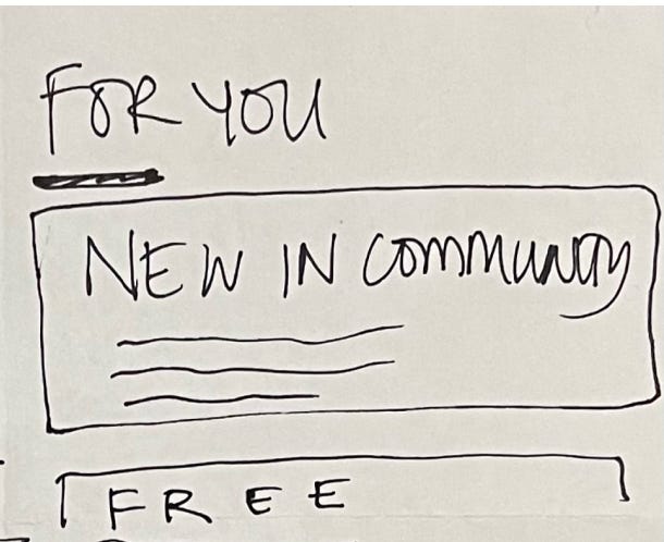
- Profile page, option to share currently reading/reading next lists.
- Reading recommendations from well known figures.
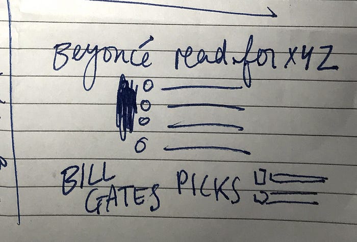
- Option to recommend titles to friends/people on platform.

- Option to leave reviews or rate Blinks after completing them.
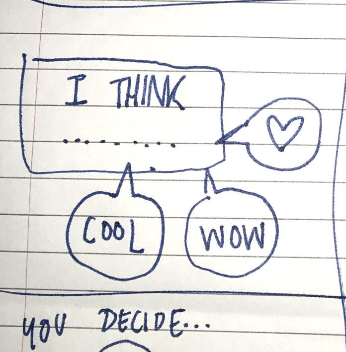
- Gamification of completing blinks to help user stay motivated.
Reflecting on our research thus far, we unanimously voted to prioritise the first idea, as it most aligned with the business interest and what Alex’s needs and goals are.
Wireframes
Zsofi took the lead in the sketches for the wireframes which Natasha tested 5 users with. Initial testing of these wireframes highlighted a key finding that was necessary to change before jumping into any prototyping- the name. Users found the name ‘Communities’ of this feature misleading, as it didn’t suggest a space for discussions of non-fiction themes, and therefore had trouble navigating to it.
Therefore we brainstormed the name ‘Blinkubator’, inspired by the word incubator; a place for growth.
Being honest: we definitely weren’t 100% on this name, but we knew we would be testing what users thought of it going forward.
Prototyping, testing and more testing
We conducted usability testing on the wireframes below in a via Maze, with 32 testers. We also conducted 2 moderated usability tests with Blinkist users.
Results from these usability tests resulted in the following changes:
- Naming the icons in the main navigation bar as this was the reason for the majority of mis-clicks and therefore was causing confusion for the users.
‘Is this a chat feature? I’m not sure I would use Blinkist for messaging people.’
‘I’m assuming this is Home page?’
- Developing an icon for the Blinkubator feature including the logo, as the current speech bubble used was misleading for the users because it suggested a chat/messaging function.
High Fidelity Prototype
After discovering these test findings we then went onto develop a high fidelity prototype using the current design as a style guide, shown below:
We completed 2 moderated usability tests with Blinkist users and 56 unmoderated tests on Maze with this prototype.
In terms of functionality people found the feature:
‘Clear, easy to use.’
‘Love this idea, it feels like it just makes sense in this kind of app.’
‘Easy to navigate’
However these tests presented critical accessibility issues including:
- Lack of colour contrast within the buttons/dark back generally.
- The size of font, both of which hindered legibility.
As well as this, we gained some increasingly insightful feedback on the name:

Considering this was one of the more tame responses to the name, this led us to change the name once again to ‘Blinkate’.
As well as changing the name we adjusted the contrast and font size into the final high fidelity prototype, which you’ve seen before at the start but I’m put below again to give you a lil recap!
Speaking with the Blinkist users gave us some ideas to take the feature and app further which I will touch on in the next steps.
Next steps/iterations:
- Both users mentioned a desire to share their Blinkate discussions & Blinks outside of the app, onto Twitter or Medium. Although a share feature already exists within the app, this finding perhaps suggests the need for a development of it.
- 1/2 Blinkist users suggested the necessity of setting a time or reminders within the app, in order to achieve learning goals.
- More moderated usability testing on the latest prototype.
Learnings
This project was really interesting to work on, and it really improved my interviewing skills and experience conducting usability tests. I think we made the right choice by testing often, as it allowed for multiple iterations. However, I feel this did slow us down, and because of this pace I feel we did not develop the feature to its full potential. In order to avoid this in the future I will be utilising a user flow more specifically, to make sure we have a clear goal and scope of what needs to be designed.
Furthermore, another key learning from this project for me was the practise of not letting our personal biases affect our design decisions. We had a really interesting debate on the ethics of letting someone join the Blinkate anonymously. We solved this roadblock by gaining further data from users through a survey on this question specifically, which reminded us all to put aside our personal feelings toward the subject moving forward.

