Case Study: Bill Splitting Feature in Bank App

If you’ve ever split bills with friends or family members, you know that it can be a hassle to keep track of who owes what. It can be especially difficult if you’re trying to split the cost of a large expense, like a vacation rental or a group gift. That’s where a shared account can come in handy.
Project
Bank App’s splitting feature is a game-changing addition to the app’s functionality, designed to simplify the process of dividing expenses with friends and family. The feature is aimed at digital natives, bank app users, Gen Z, and millennials, who often go out together and want a hassle-free way to split expenses.
The Goal: The goal of this feature is to design a user-friendly and efficient in-app experience that allows users to divide and pay for shared expenses, with the added ability to display a list of purchases from the shared account. The splitting feature provides users with a hassle-free way to split expenses, eliminating the need for cash transactions and making the process much simpler.
User Story: Imagine a group of friends went to a restaurant together, and one of the friends offered to close the account. With the Bank app’s new bill splitting feature, this process becomes much simpler. The user can easily divide the expenses equally among their group and pay their share of the bill, directly from the app. The app will also display a list of purchases made from the shared account, ensuring everyone is aware of the expenses.
Target User: The Bank app’s bill splitting feature is aimed at digital natives, bank app users, Gen Z, and millennials who often go out with friends and family and want a hassle-free way to split expenses.
Features: Splitting feature includes the following features:
- Split Expenses: Users can easily split expenses with their friends and family by adding them to the app and dividing the expenses equally. The app will automatically calculate the share of each person.
- Pay Directly: Once the expenses are divided, the user can pay their share directly from the app. This eliminates the need for cash transactions and makes the process much simpler.
- List of Purchases: The app displays a list of purchases made from the shared account, making it easier for users to keep track of expenses.
- Personalized Experience: The app allows users to customize their experience by selecting their preferred payment method, adding or removing friends, and editing expenses.
- Delete transaction history: Provides the ability to delete their transaction history, ensuring privacy and security for users.
- Works offline: Allowing users to split expenses even in areas with poor or no internet connectivity.
Needs:
- To split the bill equally among all participants
- To divide the bill based on specific items or services consumed.
- Pay for their portion of the bill immediately
- Pay later
Additional features:
- Ability to add and edit items in list
- To split the bill by percentage or currency
- Ability to add a tip or service charge
- Ability to split the bill among a large group of people
- Apple watch support
- Expense statistics
- Ability to create groups (e.g. trip group)
Moodboard/Visual
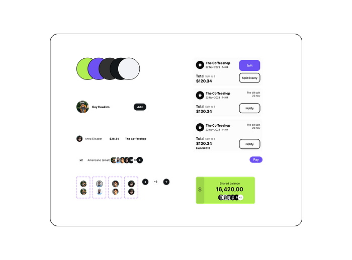
The UI style of the app should be simple, clean, and easy to navigate. It should provide users with a seamless and enjoyable experience. The design should be visually appealing and easy on the eyes, with a color scheme that is easy to read and not too overwhelming.
For this project, I have selected two colors:
Inchworm
Bright and vibrant green color. Creates a lively and energetic feel in UI, it’s conveys renewal, freshness.
Additionally, green is often associated with money.

Violets Are Blue
Deep and rich purple color. Convey a sense of exclusivity. Purple is associated with creativity and innovation, making it a good for an app designed to distribute finances in an non-habitual way.

Together, these colors create a harmonious and vibrant color scheme that is both visually appealing and functional. They create a sense of energy and excitement while still maintaining a professional and sophisticated feel, making them the perfect choice for a banking app’s bill splitting feature.
Hypotheses
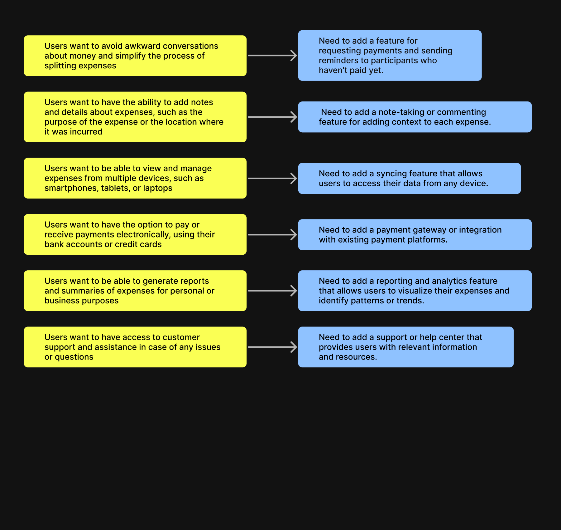
Hypotheses propose assumptions about user needs or pain points that required addressing. Based on research and analysis these hypotheses served as a starting point for designing a solution.
By addressing these points, I aimed to improve the user experience and achieve business goals.


Information Architecture
The next step are creating a site map and defining navigation paths. This involves organizing the app future’s content and functionality into a hierarchical structure. As well us this involves creating clear and intuitive navigation paths for users to follow as they move through the app.

Lo-Fi Wireframes
To create the basic layout and content of each screen in the app, I used LO-FI wireframes. These sketches or diagrams provide a clear visual representation of the app’s structure and content. By using lo-fi wireframes, I was able to quickly and flexibly explore different design ideas and iterate on the app’s layout and content until I arrived at a final design that met the project goals. Overall, the lo-fi wireframes were an essential tool in the design process and helped to ensure that the app’s design met the needs of its users.


Hi-Fi wireframes and finalizing UI elements
Once the lo-fi wireframes were finalized, I moved on to creating hi-fi wireframes. Hi-fi wireframes are more detailed than lo-fi wireframes and include specific UI elements such as buttons, text boxes, and images. They provide a more realistic representation of the app’s final design and functionality.

To finalize the UI elements of the app, I worked on refining the design and ensuring that the interface was both visually appealing and easy to use.
I aimed to create a clean and intuitive interface that would allow users to easily navigate the app and complete their desired tasks.

These steps helped to ensure that the app’s design was polished and user-friendly, and that it met the needs of its target audience.
Overall
The Bill Splitting Feature integrated into the Bank App provides a simple and convenient solution for users to split bills among participants. The feature eliminates manual calculations and complicated spreadsheets, allowing users to split bills easily and accurately. The bill splitting feature makes easier for users to keep track of their expenses. This valuable addition to the Bank App will greatly benefit users in their daily financial management.
Thanks for taking the time to read my article! I hope you found it informative and enjoyable. If you have any questions or comments, feel free to reach out to me. Thanks again for your time! 🫶

