Captivate Your Users: Strategies for Managing Attention in UX Design
Basic approaches to keep in mind — visual hierarchy, popular patterns, colour, scale, contrast, and avatar.

Beautiful, conceptual and friendly design is not enough to make the user want to stay on the site or “stare” at the application. His attention must still be attracted and held to give him what he came for.
Proper UX design helps to focus and quickly find helpful, necessary and exciting information on the web page. To create such a design, you need to know how to manage the user’s attention, what is a visual hierarchy and which elements help to make it. Let’s explore.
Why is it essential to manage attention?

According to studies, users need only 50 milliseconds to form an opinion about the site. Views about the design form even in 17 milliseconds. At the same time, eyes need only 2.6 seconds to linger on a web page’s critical elements (areas). After 20 seconds, the user will close the page if they do not find what they want.
The site has to do more than make the user like it. It should make him want to stay on the page as long as possible. Everything should work for this result — design, loading speed, quality of content, but first of all — convenience and value of the digital product (site, app).
We like using a site or an application if all the interface elements are organized, structured, and thoughtful, and the content is readable without any problems. Indeed a clear visual hierarchy of the page. What is needed to do this?
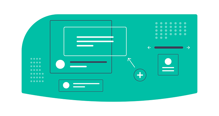
What is a visual hierarchy?

In UX design, by visual hierarchy, we mean the proper organization of interface design elements, which helps to clearly and consistently determine the level of importance of each piece on the page. In other words, by looking at the page, the user immediately understands which information is the most important and which is secondary.
To create a visual hierarchy, you can use different elements of design: size, colour, font, space, contrast, animation, scale, a grouping of elements, depth, sound, etc.
Details closer to the top of the page are often perceived as more important than those at the bottom. For example, more extensive or brighter elements may attract more attention than small or dim elements. Pieces clustered together in a group (such as top-level navigation) attract more attention than single elements.
This is all dictated by the way attention works.
User attention and page-scanning patterns
Put essential things our vision captures on the screen are dots. Then the brain combines them into a line. The image scans the bar and sets the attention vector. The attention vector trajectory is the critical line of the user’s gaze as they watch the application screen or web page.
In web design, there are several popular patterns of users scanning web pages and applications — the Gutenberg diagram, the “F”, “Z”, “G”, “L”, and “Spiral” patterns.
Gutenberg Diagram

Gutenberg Diagram represents four zones that describe how the user perceives the information on the page:
- The attention-getting zone is the top part of the page that first catches the user’s attention. This is where headlines, banners, and logos are located. They should be informative and attractive enough to attract the user’s attention.
- Scanning Area: This is the area immediately after the attention-grabbing site. Large headings, subheadings, lists and other elements are located here to help users quickly navigate the page and find the necessary information.
- The attentive reading area is the area below the scanning area. This is where the content that requires close reading is located. Smaller fonts and thinner lines can be used in this area to make reading the text easier for the user.
- The action area is at the bottom of the page and is designed for the user to take action, such as filling out a form, clicking a button, or clicking a link.
The “F” pattern
The “F” pattern is the most common web page scanning pattern.
The user first scans the top of the page horizontally, then looks at the vertical line that runs through the centre of the page, and finally flips the bottom horizontally.
This pattern is often used with a lot of text and few graphics.
The “Z” pattern
Another typical web page scanning pattern involves the user moving from top to bottom along the left side of the page, then diagonally to the right and down along the centre of the page, and finally, horizontally along the right side of the page.
The pattern is suitable for sites with little content.
The “Г” pattern
The user’s gaze starts at the top of the page and then moves down the left side of the page to the middle of the page. Then it goes horizontally to the right and again scans the top of the page for exciting content. The exit point is at the bottom of the page.
This pattern is often used for pages with a lot of information (blogs, news sites, product and service pages).
The pattern “L”
The pattern is often used on the pages of websites and mobile applications, where the essential element is the navigation and the display of the primary information. It is considered most effective for the homepage, category, and product pages.
The “Spiral” pattern
The user begins scanning in the upper left corner of the page, then moves right and down in a spiral until he reaches the centre of the page.
This pattern is suitable for pages with a lot of information and different blocks, as it allows you to scan the page content quickly.
Knowing how the user scans the information, you can pick up the pattern and make the right accents. Then — engage other attention management mechanisms.
6 Ways to Manage User Attention
So, there are four main ways to organize visual hierarchy: colour, contrast, scale and grouping. There are also secondary ones — font, depth, negative space, animation, etc.
Colour
Colour is the easiest way to draw attention to the most critical elements on a page, such as buttons and headers. In addition, colour can be used for the following purposes:
- Separating content: different colours for different blocks of content on a page can help you navigate and understand the page’s structure faster.
- Emphasizing links: colour can link elements that belong to the same group or correspond to the same concept.
- Creating the illusion of space to improve readability and overall perception.
- Highlighting content: Color can highlight keywords, essential links or a call to action.
Contrast
The contrast makes all the main elements of the interface more noticeable. Often UX designers achieve distinction by light, but I will give you other effective ways:
- Font contrast: using different fonts or font styles for other elements on a page, such as headings and main text, helps structure content and highlight important things.
- Size: elements of different sizes signal that more significant factors are more important than smaller ones.
- Spacing: the distance between elements on the page helps determine which features are related and most important.
- Texture: Using different textures helps create visual contrast and highlight elements or blocks on the page.
It’s important to use contrast in a way that makes sense and helps highlight essential elements.
Scale
Scale — allows you to control attention depending on the element size: users will notice the more significant elements first, then the smaller ones.
By the way, design is an excellent way to tell stories to users, not for nothing. It is used in comics and graphic novels to emphasize the importance of a particular scene.
To avoid overloading the page, it’s best to use up to three gradations of elements.
Grouping
Group elements on the page together to show that they are related and equally important.
There are these ways of grouping:
- Colour to highlight different sections or categories.
- By shape: elements of similar conditions can be grouped to create a clear visual hierarchy on the page.
- By location to make the structure of the page clearer.
- I use containers like frames or areas with a specific background colour.
- By type of content, create a logical page structure.
Depth
Depth is another essential aspect of visual hierarchy in UX design, which determines how “deep” or “high” an element is on the page about others.
Depth can be used to determine the order of elements’ importance and create a spatial sense of the page.
How do you create the illusion of depth and three-dimensional space on a page?
- Place more significant elements in the foreground to indicate their importance.
- Place more essential elements higher up on the page.
- Use transparency to indicate whether an element is important or unimportant.
- Experiment with lighting and shadows to create a depth effect.
- Use perspective, in which elements farther down the page will be placed lower on the page.
Negative space
Negative space (or “negative space”) is the space surrounding elements on the page. It can be used to improve the feel of the page as a whole, as well as to:
- They separated elements to make navigating the page easier for the user.
- Creating a balance between the elements on the page makes reading more enjoyable and more accessible to explore the content.
- You are reinforcing the importance of elements such as headers, photos and buttons.
- We are reducing the visual noise and orderliness of content on the page.
- We are improving the readability of text blocks.
By the way, if you use too much negative space on the page, it will look dull and empty. That’s why balance and a sense of proportion are essential here.
What else plays a role?

Animations, sounds, faces, and looks help attract users’ attention.
If there is a portrait or avatar on the page, they are virtually impossible to ignore. The user will pay attention to them. Moreover, he will move his gaze to where the person’s gaze in the illustration or avatar is directed. Use this to control the user’s eye to the call to action or the information you want to convey.
A person’s face in an interface also evokes emotion and empathy. Keep this in mind when making a product aimed at a specific (narrow) audience.

