Can you unravel the magic of graphic design?
Graphic design is so much more than another medium to express yourself. I love its simplicity. I am used to watercolor. But, I would have to do a lot of hard work. Graphic design software is much better when you only want to convey an idea or emotion.

I have made a simple tree. There is a triangle for the trunk. The idea is simple here. I want to draw a tree and some background scenery. But, I want to experiment with a concept.
The first concept: ‘In visual arts, you can make some parts of the picture more prominent than others’. My motive was to make the green crown of the tree stand out. I wanted to put the clouds in the background.
The second concept: Simple shapes can depict a lot of meaning. How we interpret a shape also depends on what shapes lie around it.
A simple triangle in brown color can give the appearance of a standing tree trunk. But, you have to make a green crown.
It can also look like a mountain. But, you have to show the ice-covered peaks.

Take out a microscope because we are going to analyze every aspect of this picture.
The triangular trunk
Triangles show stability when they stand on their bases. So, the trunk shows stability.
A triangle is not as stable as a rectangle. A tree grows tall and mountains have landslides. Many mountains are still growing tall. So, a triangle is the best way to show this eternal transience and stability in a tree trunk.

The brown color helps to depict how reliable the tree trunk is. This brown has red and warm undertones. It is because warm colors attract attention. I did not want to make a sad and forlorn tree so I did not use the brown that you find in deserts.
The trunk is youthful and matches the youthful theme of the entire picture.
The green crown

As green gets wizened, the tree looks older in general. This is an excellent backdrop to show young leaves peeking out of this crown.

The light green leaves are triangles. Here, I have chosen gradients instead of solid colors. This gradient shows that younger leaves are peeking out of the wizened crown. The effect is the eternal youthfulness of an old tree.
Blue is a cool color that contrasts with the youthful warm green. The blue fruits are circular with gradients.
The effect is to show that the tree is laden with fruits. Some of them show with their glossy surfaces out of the green crowns.
The bushes
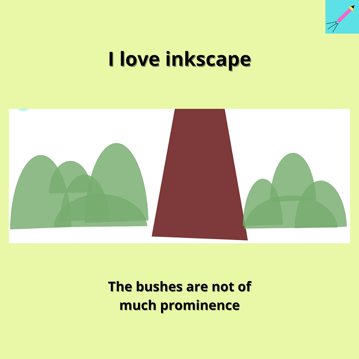
I do not mean to show the bushes with much prominence. So, I have only relied on semi-circles and semi-ovals in dark shades of cool green.
Darker shades of colors are a great way to make them seem mysterious. It is because black is a mysterious color. Then cool colors tend to recede to the background. So, the bushes appear far away from the warm brown tree trunk.
Read more: Here is the complete color theory cheat sheet for artists.
Clouds
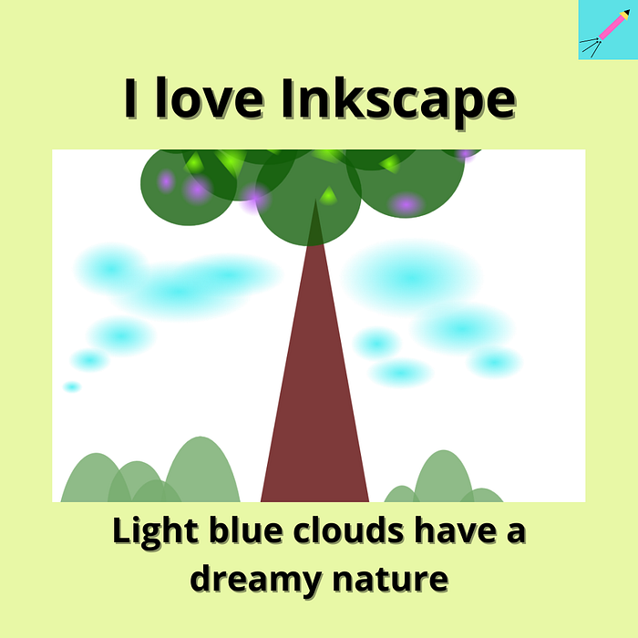
The clouds are but ovals. These blue clouds stand out in a crystal clear sky. This is the entire fact about this picture. While the blue sky is as clear as daylight the greenery is lush and deep. There is the fair complexioned daylight of the sky. And coupled with it is the dark complexioned greenery of the trees and bushes.
Avoid 100% opacity
100% opacity is not my favorite. An opacity between 90% to 100% is my favorite. This image can help to trick the eyes. You will not understand that the colors you see are not opaque. But, these translucent colors overlap each other to form a deep feeling.
Conclusion
Love you guys for being with me. I am a graphic design student and will be so forever. Follow me for more.
Email me: subarnacreative@gmail.com

