Product design best practices for delivering complex data to non-experts
--
UX/UI principles for creating intuitive data-driven products for non-experts. Based on my experience building a mobile-first tool that helps amateur investors analyze stocks and trade based on facts and data, rather than hype or FOMO.

My name is Viacheslav Derzhaev. Friends call me Slava. I’m a product strategist and UX/UI designer based in the US. My background is deeply rooted in strategy. I crafted marketing strategies for global brands at BBDO and Leo Burnett, created business strategies for Fortune 500 companies at Bain, and launched a fintech startup as a co-founder and operator.
I am a co-founder of the app described in the case study and I’ve been on the project since day one, helping shape the idea into a reality and seeing it through to launch and beyond. We didn’t have a development team for the most part of research and testing phases, so the initial MVP — including front-end and a simple back end — was also done by me.

Here are some important points that other UX/UI and product designers might find helpful when creating complex data-driven products for non-experts. If you want a closer look at the app interface, you can check out the complete case study.
Robinhood, the app that made commission-free stock trading possible for everyone, has caused an unprecedented rise in the number of amateur investors in the stock market. In 2020 alone, 10 million individuals joined the stock market. By 2021, there were 100 million user accounts at top online brokerages in the US. Although amateur investors enjoyed impressive initial gains during the covid pandemic, by 2022 they lost all the money they made.
Problem: amateur investors lack specific knowledge to interpret the stock market data and are confused by conflicting expert opinions, which leads to attention-induced trading and a “herd mentality”
During my initial research into the stock market, I found two things that surprised me:
- US brokerage firms reported that more than 20% of all trades by individual investors were executed using mobile devices, which is completely different from the “classic” image of a trader sitting at his desk with six monitors covered in graphs and charts. “Classic” stock traders have several monitors for a reason — to look at lots of indicators simultaneously and synthesize all this data. Mobile users who do their initial stock research on smartphones, where screen space is limited, can’t do this.
- 35% of Robinhood users’ net buying was concentrated in just 10 stocks, which meant they were severely influenced by attention-induced trading and “herd mentality”. Instead of doing their own analysis and having a strategy and principles to follow, they were following the hype and trading by analogy.
I conducted 20 user interviews, followed by a quantitative study involving 700 potential users. The findings were crystal clear: it was not about having access to the stock market data. The real challenge was being able to interpret it in a consistent and disciplined manner.
Existing stock analysis tools required a lot of time for tedious data interpretation and forced users to make decisions without the necessary knowledge
When choosing stocks for your portfolio, you usually have to use a stock screener. A typical stock screener forces you to make decisions on which metrics to filter the thousands of stocks available on the market. But how do you know which metrics are the most important? No wonder so many people were choosing to buy the same 10 stocks that their friends were buying.

Besides knowing which metrics are important, you also need to be able to interpret their values. For example, is a 12% profit margin good or bad? Well, it’s definitely better than zero. But how much better? It’s almost impossible to answer without a frame of reference. For a software business that wouldn’t be impressive at all, but a 12% profit margin at an airline would be absolutely fantastic!
Even the users who knew what to look for and how to interpret the numbers found this process tedious and time-consuming, limiting the number of stocks they could examine in a given day.
Goal: to build a mobile-first tool that would allow anyone — not just those with financial knowledge — to analyze stocks and trade based on facts, not FOMO or hype
When working with amateur traders, we quickly realized that instead of asking for their stock selection criteria, they needed more guidance and suggestions from us during the stock discovery process. This also had to be based on the hard data, not popularity, FOMO or peer influence.
I decided to build on the patterns of successful apps like Netflix and Spotify that our audience was already using. It would have been great to be able to choose stocks like we choose TV shows on Netflix. However, there was one small problem: we had to figure out which stocks were worth looking at, and do it in a transparent and fact-based manner.
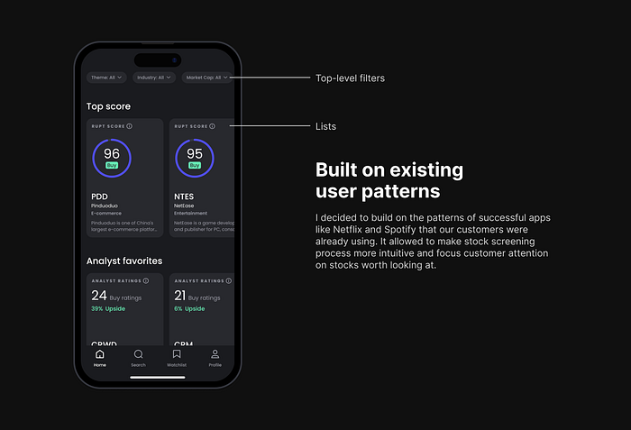
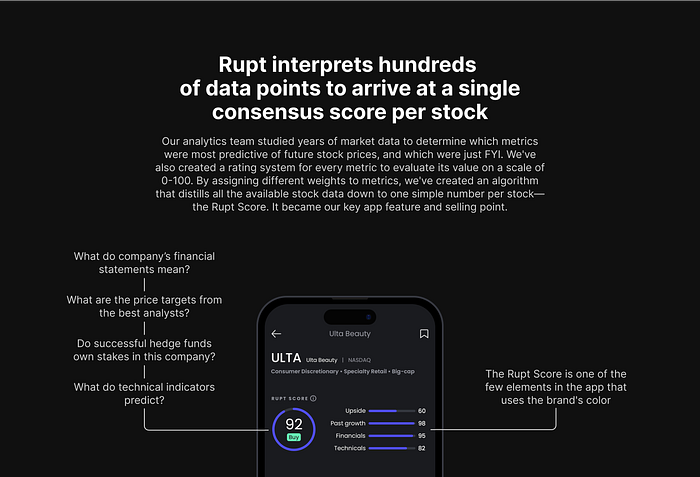
Solution: our team created an algorithm that interpreted hundreds of data points to arrive at a single consensus score per stock. It used hard data to drive user attention, not popularity, FOMO or peer influence.
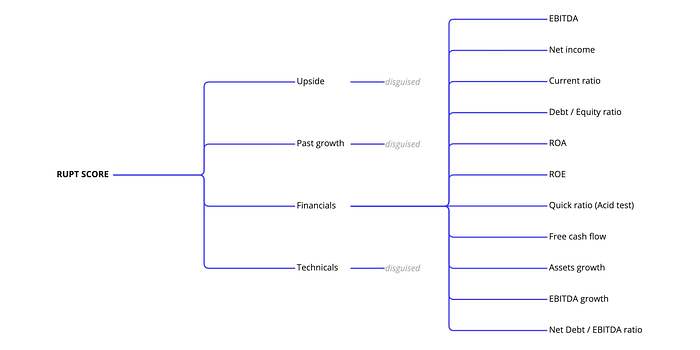
Our analytics team studied years of market data to determine which metrics had a strong correlation with future stock prices, and which metrics were just FYI.
We’ve also created a rating system for every metric to determine what its absolute value meant on a scale of 0–100 (0 meaning terrible and 100 being great). These detailed ratings worked for us on the background, allowing us to assign them weights and create an algorithm that would distill all the available stock data down to one simple number per stock — the consensus score (which we called the Rupt Score — by the name of the app). It became our key app feature and selling point. The consensus score was recalculated with every new data point, which meant users always had a fresh snapshot of the market and stock standings.
One of the most challenging parts of the UX and UI was creating the data hierarchy. I worked with the analytics team from the start to create several levels of data, making it easier for users to discover it step by step. This decision was mainly driven by the user experience, and influenced the app architecture. As analytics team worked in parallel with me, constant coordination was very important to avoid rework on both ends.
Having data hierarchy was also vital due to the mobile-first nature of the tool: screen space is limited, and you can’t look at lots of indicators simultaneously and synthesize all the data; several pieces of data should be able to tell more or less complete story at any given moment.
Key principles for creating an intuitive user experience and user interface for non-experts
As I was working on the app, I came up with a set of principles that guided my decisions on the user experiences and interfaces. Some of these rules might seem obvious, but they’re important and are still worth stating.
Start with the user’s needs, not your app’s architecture. This one is kind of obvious, and it’s even not that hard to follow when you’re starting from scratch. But when you’re iterating on an existing app, it’s easy to make only small changes that don’t require changes in your architecture, and end up with subpar user experiences. Needles to say, app architecture needs to be flexible and should be the consequence of the needed user experience, not the driver.
Data hierarchy. Having data hierarchy is absolutely vital for the mobile apps, where the screen space is limited. This means that you can look at only a few pieces of data at any one time, but they should be enough to tell a consistent story.
Data interpretation. When possible, data should be accompanied by an interpretation. We used a simple system to explain financial metrics by adding a label next to each value: very low, low, moderate, high or very high, and we color coded these labels for ease of comprehension. This made it easy to understand what was going on at a glance without having to carefully examine each metric in detail.
Frame of reference. It’s almost impossible to interprets most of data points without a frame of reference. In the app, I provide users with a frame of reference for each metric, so they can compare the metric to its historical values, company’s peers’ performance or analysts’ expectations.
Consistent color coding. Color coding can be tricky and is easily overdone. It’s important to use the right colors for the right data and to stick with a few colors throughout the app. As an example, I’ve purposefully used gray for neutral data in the app: it looks better and is better interpreted by users, who tend to put yellow in the same bucket with red — in other words, seeing it as a warning. I also used the brand’s color sparingly, keeping it only for the central features of the app and a few highlights.
Simpler is better, but not always shorter. It’s easy to compromise clarity for the sake of simplicity in the user interface. Our audience lacked specific knowledge about the complex data being presented, so I deliberately made some of my UX copy longer to make it very clear what was going on there.
