Build better habits with Habitify: A UI/UX case study
Welcome to Habitify — the habit tracker app that helps you achieve your goals, one habit at a time. With flexible habit-setting parameters, you can customize your habits to fit your unique lifestyle.
This case study is a walkthrough of how I approached the design of this app.

Context
This app was designed as an assignment during my time at 10kdesigners. While it is not a real-life product, I did find it to be challenging as I had to really push myself to learn more about design and the best practices to follow when designing an app.
Problem Statement
Design a mobile app for tracking for managing daily habits and goals related to personal growth or self-improvement, including features for setting goals, monitoring progress, and finding helpful resources.
Why Did I Choose Habit Tracking?
Music, writing, fitness, and design are some of my many interests and passions that I follow. While I love the fact that I have so many different interests, it’s hard to progress in all of them unless I practice them constantly. But to practice them all consistently over the long term requires me to make them a habit.
My wide range of interests coupled with my struggle to handle them all is what made me pick this particular problem statement regarding a habit tracker.
Solution Peek-A-Boo
Here’s the interactable prototype of the app to give you a sense of what the app is about.
Interested to know how I approached the design of this app? Scroll down to learn more!

Research 🔍
While it would’ve been nice(and fun!) to get straight into Figma and start designing, I wanted to find some answers surrounding habits and what people’s opinions of it were. Thus I started my research.
- What Part Of Our Lives Do Habits Play?
“Life is habit. Or rather life is a succession of habits”-Samuel Beckett
Dr. Wendy Wood, Ph.D., a psychologist at the University of Southern California (USC) says, “We think we do most things because we make decisions or we’re asserting willpower, but instead our research shows that a lot of human behavior is repeated often enough in the same context to form habits”.
According to research, it was discovered that 43% of everyday actions are enacted habitually while people are thinking about something else
2. A Look At New Year’s Resolution Statistics
According to a 2020 study by New Plate/Ipsos conduced in the U.S
- For three consecutive years, polls indicated that 44% of respondents were either likely or very likely to make a resolution for the upcoming year.
- 18% of the respondents reported to have multiple resolutions for the new year.
- Younger adults(aged 18–34) were 54% more likely to have a new years resolution than older people(older than 55), who was at 19%
- 52% plan on using a resource, such as an app, online platform or membership, for assistance in sticking to their resolutions.
3. How do we form habits?
Habits are formed through a process called habituation, which involves repeating a behavior in response to a specific cue or stimulus, until it becomes automatic.
There are typically three components involved in building a habit:
- Cue: A cue is a trigger that prompts the habit behavior. This could be something like a specific time of day, a certain location, an emotion, or an action that precedes the habit.
- Routine: The routine is the behavior that follows the cue. It’s the action that you take in response to the cue, and it’s what you want to become a habit.
- Reward: The reward is the positive reinforcement that follows the routine. It’s the outcome that you receive as a result of performing the habit behavior, and it’s what reinforces the behavior and encourages you to do it again in the future.
By consistently repeating the same routine in response to a specific cue and receiving a reward, the behavior becomes more automatic and eventually becomes a habit.
4. Understanding pain points of users of competitor apps
To get a better idea of what the pain points are of users of other apps in this space, I did some review hunting.

Here is a summary of pain points stated by the users of competitors:
- Most apps have a cluttered and heavy UI, especially when users take a look at all of their habits together/all habits view.
- Some apps do not have reminders when tasks are incomplete.
- Not being able to set recurring habits on the same day, and during multiple days of the week/month.
- Inability to view statistics of habits(streaks, calendar view, weekly view etc)
Research Insights 🧠
To sum up my research, here’s all the important information that would benefit the rest of the design.

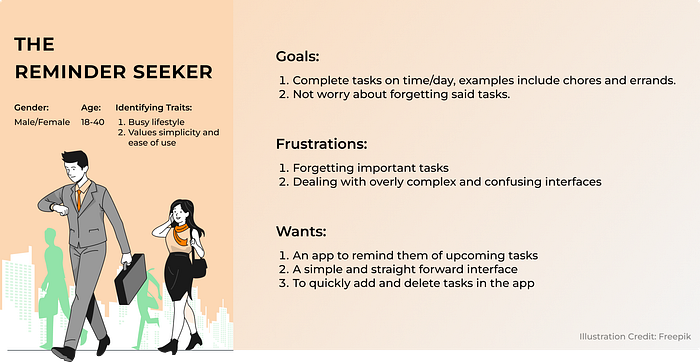
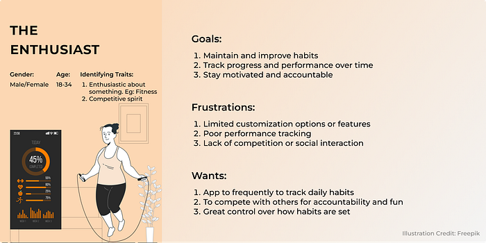
User Base 👥
On the basis of my understanding, primarily through secondary research, I built my personas around 2 different kinds of people.
Information Architecture 📐
Since my goal was to create an MVP version of the app, I wanted the app to be as simple and intuitive as possible. Here’s a visual representation of the IA that I came up with:
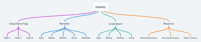
The reasoning behind having frequency based view on “My Habits” page, was informed by research that I had done prior to working on the information architecture of the app.
Wireframing ✏️
After information architecture came wireframing. After going through a lot of iterations, I finally came up with something that was satisfactory.
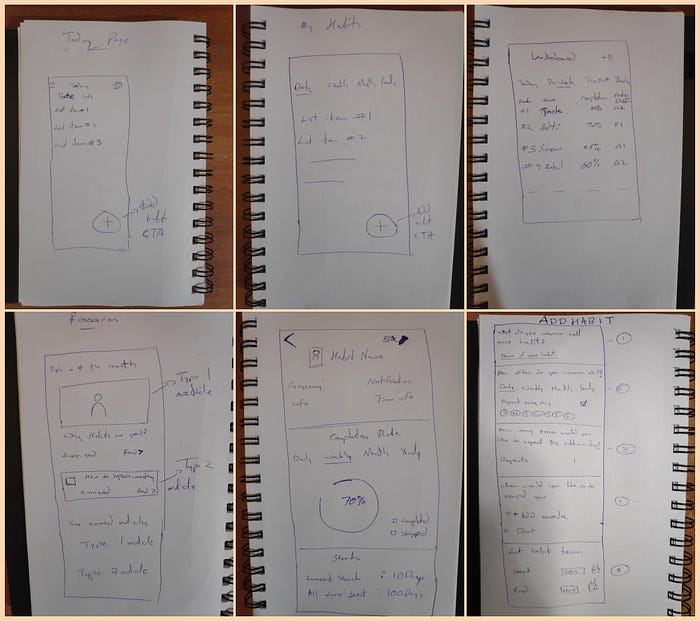
While I did end up doing a lot if iterations during this stage, it was done fairly quickly because I had the structure of the information decided upon with my IA.
Visual Design 📱
Visual design is something that I struggled with at the beginning of this project. I iterated a lot with colors, typography, layout, component states etc. Scroll down to take a look!
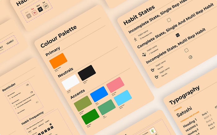
Before beginning visual design, I knew 2 things that I wanted the app to be like:
- Something minimal and not too loud for the most part
- Little hints of playfulness to make it less muted and boring
These ideas set the direction and now it was time for me to figure out the specifics of the UI.
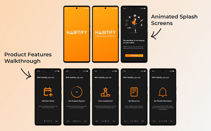
1. Onboarding
I decided to keep the onboarding section of the app very simple and straight to the point.
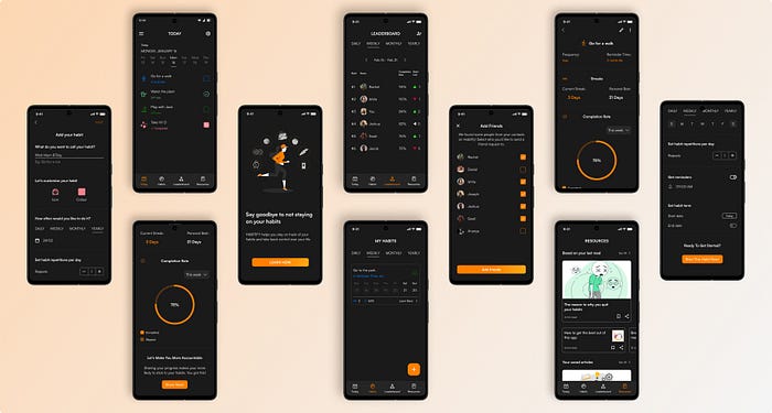
2. Today/Home Tab
This is the tab that users first see on arrival. The purpose of this screen is to give the users an overview of the things that they have to do for the day without much complexity to it.

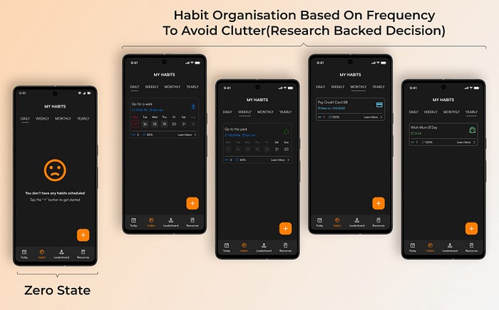
3. Habits Tab
This tab gives users an overview of all the habits that they have tracked using the app. To prevent clutter in the event that a user may have a lot of habits, the organisation in this tab is based on the frequency of the habit as decided by the user.
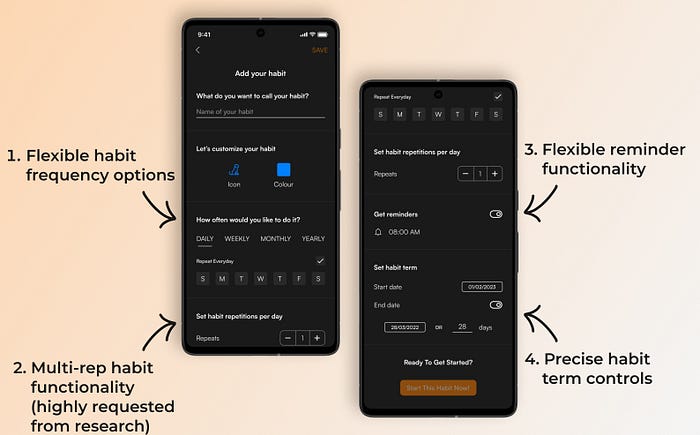
4. Add Habit Page
This page allows the user to add a habit, and offers great control on how they would their habit to be set. Additional customization options such as icons and colors, were introduced to keep the app more fun and playful in nature.
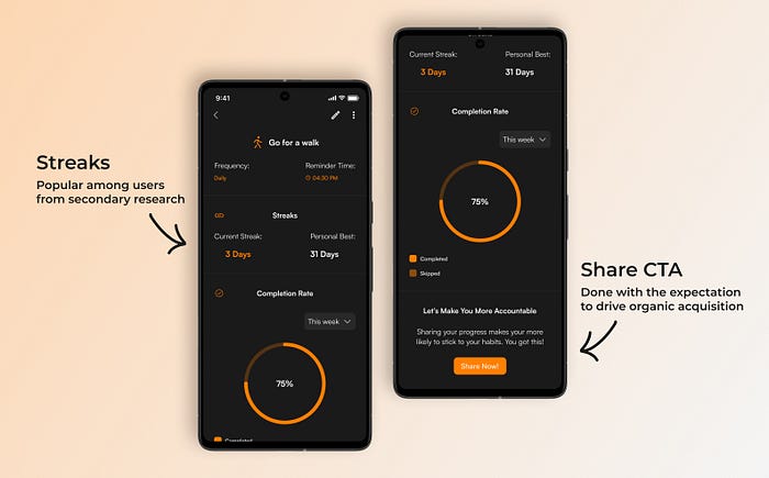
5. Habit Statistics Page
Tracking the data of a habit is one of the primary offerings of this app. Since I was aiming for an MVP product, I decided to keep the habit information simple and minimum for now.
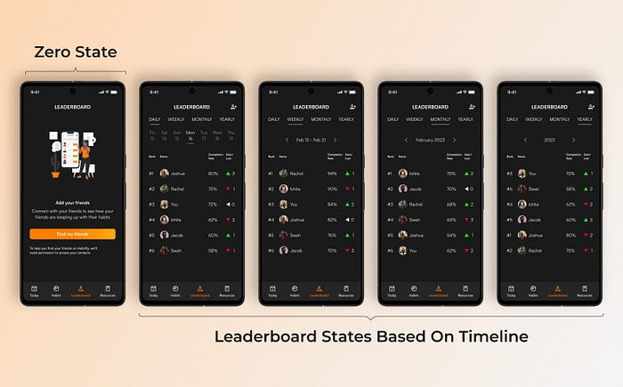
6. Leaderboard
To encourage some friendly competition, I decided to add a leaderboard where users compete with their friends. Leaderboard positioning is based on habit completion percentage, which gives newer users a chance to be at the top of the leaderboard when competing against long term users of the app.
7. Resources Tab
The resources tab gives users small articles/blogs to read that are related to the subject of habit building. The recommendations are based on what the users have read and/or saved, and therefore keeps changing. While this can’t really be considered as a primary feature of the app, my assumption is that it should have a net positive impact, simply because they strictly stick to the subject of habit building.

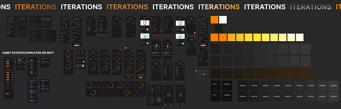
Visual Design Iterations
Here’s a snippet of the iterations I had went through with everything regarding visual design
Conclusion And Takeaways 🎓
What did I learn?
I had a huge learning curve at the beginning of this project. I read articles, guidelines, asked a 100 different questions to my mentors and binge watched tutorials on YouTube.
Here are my biggest learnings from this project:
- At the beginning of this project, I read google material design guidelines and it made me realise the level of thought and detail that goes into designing interfaces. I used to think designing interfaces were easy and simple, but this project really changed my perspective on it.
- I learned the importance of research, and why decisions should be made on research insights and not intuition or personal preferences.
- I learned the importance of picking the right colours. At the beginning of my project, I made the rookie mistake of using a red button for confirmation. I also used highly saturated colours over a dark background to make the UI “pop”, without realising the strain it was causing in my eyes.
- I learned what design systems are and how to make one. I was blown away by the level of attention that goes into making one, which inspired me to make a design system for this project.
What could I have done better?
While this app pushed me in terms of my general problem solving skills, I genuinely believe there is significant scope for improvement.
Here are some things that I omitted to narrow down the scope of the app, that I should not have:
- Ranking and reward system: Habit psychology strongly suggests to have a reward for the behaviour that one would like to turn into a habit. While I knew this while I started designing the app, I had to omit this to ensure a timely submission. I did not act upon the information that I gathered from habit psychology research.
- Detailed habit statistics: The statistics shown currently are pretty basic. I had ideas for much more detailed infographics with calendar view, graphs and milestone badges.
- Visual Design: While the visual design I had done is not entirely bad, I don’t find it to be fantastic either. I was focused more on making the visuals more muted and “in the background”, but I genuinely believe more can be done while keeping the same aesthetic.
- Notifications: I wanted to design notifications for the app for various scenarios, since that would hypothetically help with retention, but I couldn’t do it as planned.
- Add Habit Page: While I don’t think the current add habit page is bad, I do think I could have split the page into 2 pages to make it less complicated, or use some sort of progressive disclosure as the user sets the different habit properties.
Aaannd That’s A Wrap🙌
Thank you for taking the time to read this through. I am just starting out my journey in design, so I know that there is a lot of room for improvement. Feedbacks are much welcome!