So what are we talking about here?
Last week, I finally got the chance to play Baldur’s Gate 3 upon its launch on Xbox. The initial hours were nothing short of captivating, and I found myself glued to the controllers for an extended gaming session. Undoubtedly, the game is a masterpiece. However, as I invested more hours into the campaign, some frustrations with the user experience, particularly concerning action selection, began to surface.
In an attempt to address these concerns, I switched to playing BG3 on my PC using a keyboard and mouse. To my delight, the game, especially the combat encounters, became even more enjoyable. However, I couldn’t help but miss the fluidity of movement offered on consoles. This sparked a desire for an experience that seamlessly combined the best aspects of both platforms without compromising too much.
So, that brings me to the point I wanted to discuss here. I believe I’ve come up with a variation in the interaction and design of the user interface for consoles that could alleviate frustrations and enhance the overall gaming experience. Let’s roll a die and delve into it!
Let’s break down the existing User Interface
PC
Baldur’s Gate 3 presents an initially overwhelming user interface, featuring numerous buttons and functions for players to familiarise themselves with, particularly if they are new to the genre. On PC, these diverse interfaces are exceptionally well-designed and seamlessly compatible with keyboard and mouse inputs. Contextual tooltips enhance user interaction, providing information for desired actions with a simple hover over the relevant interface. The visual components of these interfaces are also skilfully executed, consistently embodying the fantastical theme throughout the gaming experience.
Consoles
Baldur’s Gate 3 on consoles follows a design approach similar to other games in its genre, streamlining the interface for enhanced accessibility with controllers. Unlike the PC version, the initial impression is not overwhelming for players, because of the omission of the main actions bar, which is replaced by radial menus. While this modification contributes to a cleaner aesthetic, offering a visually appealing game, there are some downsides that will be explored later. Despite this, there are no complaints about functionality; the controls operate as intended, delivering a highly responsive gaming experience.

How is the existing user experience for the player?
Specifically the actions menu
PC:
The combination of CRPGs and PCs proves to be an ideal match, substantially enhancing the overall gaming experience. Playing the game on a PC (acknowledging subjectivity) immediately results in improvement. The constant visibility of the main action bar, equipped with everything essential for your adventures and combat encounters, simplifies understanding the available actions for your character. The accompanying tooltips that appear upon hovering over an action contribute significantly to user clarity. Notably, the ingenious categorisation options within the action bar further elevate the user experience, making it notably more efficient and enjoyable.
Consoles:
Much like many other CRPG ports to consoles, Baldur’s Gate 3 incorporates multiple radial menus to execute various in-game actions, replacing the traditional action bar. These radial menus, accessible through the RB on Xbox and the R1 button on PlayStation, come with a radial customisation option, allowing users to tailor their menu to their preferences. Although, the colour coding provided for these actions and spells based on the resource is greatly appreciated. However, after a few hours of gameplay, the plethora of actions and spells leads to increased time spent navigating through these menus and making selections. The complexity is heightened by the layered structure of these radial menus, each requiring its unique navigation.
Additionally, during menu navigation, the camera is entirely locked, and with the radial menus occupying a substantial portion of the screen, the immersion is often diminished. This intricate system introduces an additional layer of complexity to the overall gameplay experience.

Problem with the current experience on consoles :
Having established a comparison between the user interface and experience on PC versus consoles, let’s delve into the specific issues plaguing the current console user experience. Unsurprisingly, the primary concern revolves around the proliferation of radial menus that players must navigate and select from throughout the game.
One notable drawback is the impact on combat encounters. In contrast to the PC version where essential information for decision-making is readily available, on consoles, this crucial data is often nested under numerous radial wheels. While the first two radial menus house common character actions and significant spells/abilities, other actions like push, dash, or jump are buried deeper, sometimes 3–4 radial menus down. This navigation complexity can prove frustrating, leading to missed opportunities during encounters.
The absence of effective categorisation compounds the problem. This lack of organisation becomes particularly pronounced when controlling characters with extensive ability pools, such as wizards or clerics ( Shadowheart main here). For melee or martial classes like fighters and rogues, these issues may be less pronounced, but for characters with a rich repertoire of abilities, it becomes all too easy to overlook valuable spells in the heat of the moment.
To sum it up,
- Radial Wheels Navigation
- Lack of core information
- Lack of categorisation
- Less immersive
- Locked Camera
How do we fix it? Can we?
Having pinpointed the primary problem in the user experience, my focus shifted to brainstorming potential solutions, particularly in two key areas: the navigation to choose an action and the accessibility of critical information crucial to decision-making.
After identifying the issues, I began listing out all the pertinent information, categorising it based on the players’ needs. A standout idea that resonated with me was the concept of having access to an actions bar akin to the BG3 PC interface. Implementing this would provide players with comprehensive information about the possible actions their characters can undertake. Other games like Divinity Original Sin have already had this in a different aspect but I wanted to match the experience closer to what we get in the PC version of Baldur’s Gate 3.
Bringing in the Action Bar from PC to Console :
In the process of devising a way to incorporate the action bar from BG3 PC into the console version, I began conceptualising by breaking down various components and clubbing them together into what I term as “clusters.” Setting expectations and requirements, I initiated the wireframing of several potential ideas on how this interaction could seamlessly function. While it wouldn’t be practical to showcase all 50 wireframes here, I’ve provided a glimpse of a couple below for your consideration:
Wireframe #1:


Idea :
I had a simplified action bar which showcases certain clusters including,
- Player Character Portrait with Health
- Common/Weapon Actions
- Resources
- Action Information
The idea was to make common and weapon actions easily visible for quick decisions. Next to these, there’s another section showing the resources needed for each action, making it easy to find. The selected action’s details are then displayed in a separate panel, providing all the necessary information.
Learnings:
After creating a high-fidelity wireframe for the initial design, I quickly mocked up an actions bar closely resembling the PC version while maintaining the interface aesthetics. However, I soon realised that the visual clarity was not as strong as the current radial menus in the game. To address this, I swapped the aesthetics of these slots with the respective colours matching the respective resources (similar to the existing design), and the clarity significantly improved.
Drawbacks:
When I presented the action bar design, I noticed several problems, and it made me feel like I missed the mark significantly. One of the key problems I noticed was that this actually removed more information which should be given to the players about the possible actions and spells ( which was actually the goal here, *facepalm*). So, back to the drawing board.
Wireframe #2:


Idea:
With the learnings from the previous designs I made another wireframe including other clusters such as
- Spells/Other Actions
- Items & Consumables
By adding these additional clusters, the players would be free to navigate between either of them and choose a particular cluster they want to engage with.
Learnings:
- The clusters organisation were much better and easy to understand
- Visual clarity is enhanced
Drawbacks:
I decided to simplify the interface by removing the resources cluster, aiming for a cleaner look. However, this choice limited how I could organise actions based on resources, which was a drawback. Also, I felt that the character portrait took up too much space without serving a clear purpose.
Wireframe #3:

Idea :
With the learnings from the initial designs, I updated the wireframe by restructuring the action bar. I had also added the resource cluster back on the action bar but this time in a much minimised format.
Advantages:
- The navigation between these clusters were really easy and intuitive. I also get an immediate understanding of all the actions and spells I have under my belt which I felt was extremely helpful.
- With Resources also being a cluster, It was really useful for me to categorise the actions I could perform based on a particular resource
Drawbacks:
The visual clarity of the resources were quite lacking. With the existing design in Consoles, this information is well readable thanks to how clear it’s illustrated.
Learnings from the wireframes:
- Visual Clarity to be highly prioritised
- Navigation between clusters can be made much more intuitive with the help of the analogue stick
- Resource cluster and categorisation is highly helpful
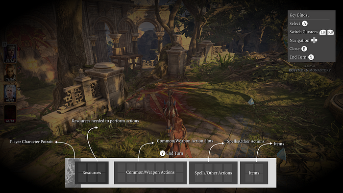
Final Proposal :
After testing out various different designs and interactions, I had come up with a final version where I believe most of the pain points have been addressed. Here are the wireframes and the prototypes showcasing the final design,


Similar to the other designs showcased above, I have made the primary action bar holding multiple clusters including,
- Player Character Portrait
- Resources
- Common/Weapon Actions
- Spells
- Items
- Resources Display Panel
How does the interaction work?
Showcasing Action Bar:
- Similar to the Radial Wheels, players would press “RB/R1” to showcase the action bar
- Players would press “B/Circle” to close the action bar
Navigating between different clusters:
The players would be using their “Left Analogue Stick” to navigate between different clusters in the action bar
Selecting and Closing a Cluster:
- The players would use “A/X” to select a particular cluster
- The players would use “B/Circle” to close a cluster
Navigating inside a Cluster:
The players would be using their “Left Analogue Stick” to navigate between different actions/items inside a cluster
Selecting an Action/Item:
- The players would use “A/X” to select a particular cluster
Other benefits with this design includes,
Categorisation by Resources:
The players could navigate to the resources cluster and select a particular resource to categorise all the actions which use that particular resource
Unlocked Camera
With the existing design, the camera is locked when going through the radial menus. This design would unlock the camera and the players could look around while using the action bar.
Next Steps:
- Cluster Customisation : Similar to how radial customisation works, I am also working on solutions to offer customisation for these clusters.
- More Easy Categorisation options
I hope this detailed breakdown of the design helped you to understand about the interaction and the possibilities this unlocks by seamlessly combining the best aspects of both platforms.I’d love to hear your thoughts on it! Thanks for reading