Bottom Tab Bar Design Best Practices: Navigating User Experience with Finesse

The bottom tab bar, a popular navigation pattern, has gained significant traction due to its ease of use and visual appeal. To create a truly engaging user experience, designers must follow a set of best practices that optimize the effectiveness and usability of the bottom tab bar. In this comprehensive guide, we delve into the world of bottom tab bar design, uncovering the reasons behind its success and exploring key facts to elevate your app or website to new heights of user engagement.
Embrace Simplicity: Less is More
Limit the number of tabs to essential items that represent the core functionalities of your app or website. The most effective setup for the Tab bar involves 3–5 primary navigation destinations. Exceeding this limit, with more than five options, will result in closely positioned targets, which can negatively impact usability.
In situations where the number of navigation options exceeds five, it’s highly likely that not all of them hold equal priority. To address this, it’s recommended to evaluate the navigation choices carefully. If, even after evaluation, more than five destinations remain, you can opt for controls like the hamburger menu.

Prioritize User Goals: Intuitive Organization
According to the Gestalt principles of design, users tend to organize information based on their inherent mental models. Organizing the bottom tab bar in a logical order that aligns with users’ expectations enhances the overall user experience.

Consistency is King: Uniform Icons and Labels
Recognition and recall are crucial cognitive factors in UX design. Using consistent iconography and labeling in the bottom tab bar aids users in quickly identifying the functions they need.
Points to be Noted :
- The icons employed in a tab bar must be easily understandable to your target audience. In case you have any uncertainty about the clarity of the icons’ meanings, it is advisable to complement them with accompanying labels.

- Avoid truncating labels, as it can lead to unclear meanings for users. Instead, focus on crafting concise labels that effectively communicate the intended option.

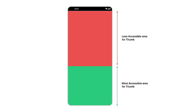
Mind the Thumb Zone: Design for Reachability
The “Thumb Zone” is a concept that acknowledges how users primarily interact with mobile devices using their thumbs. Designing the bottom tab bar with this in mind ensures effortless and comfortable navigation for users.
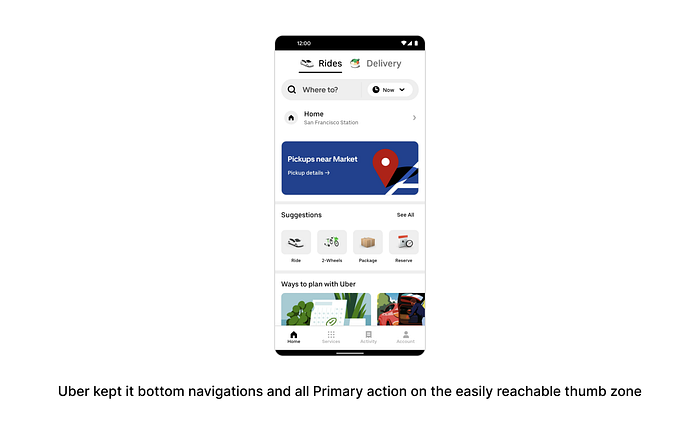
The most accessible areas for mobile interaction are the bottom one-third of the screen, making the bottom tab bar placement ideal for enhancing reachability and reducing hand strain.
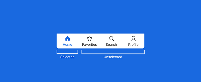
Visual Cues for Active State: Instant Feedback
Offer users immediate feedback by incorporating visual cues to indicate the active state of a tab. Whether through color changes, icon highlights, or subtle animations, these cues enhance user confidence and inform them of their current location within the app or website. The active state should be distinctive enough to prevent confusion while maintaining visual harmony.
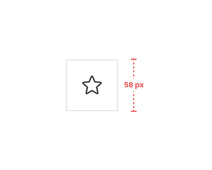
Accessibility Matters: Size and Spacing
Accessibility should be a top priority in bottom tab bar design. Design tabs with a size that accommodates various screen sizes and finger sizes. Provide adequate spacing between tabs to prevent accidental taps and enhance touch accuracy.
Android Tab Bar preferred size is 58px when the device is portrait as well as landscape, for better usability.


