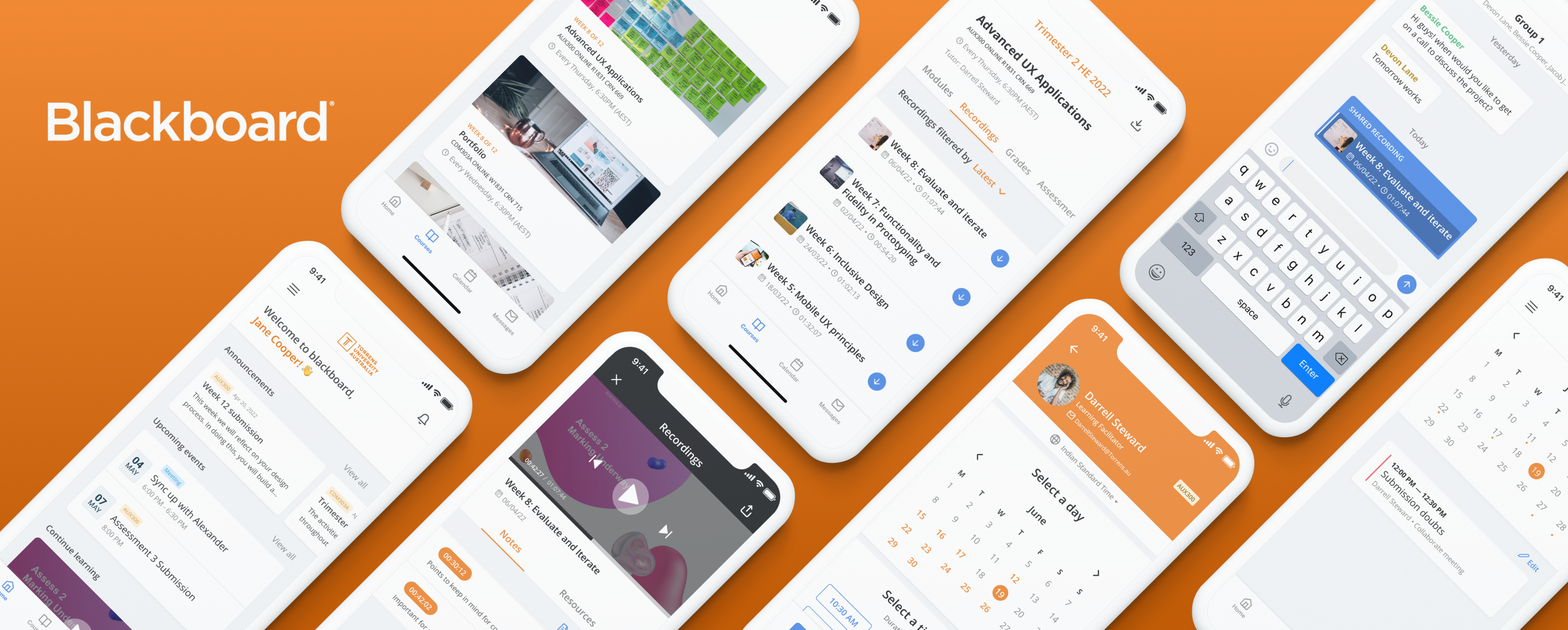
Blackboard: Redesigning the way we learn online
For my Advanced UX Applications class at Torrens University, I redesigned Blackboard Learn for mobile learning. Here’s how it went👇
What is a Learning Management System?
A learning management system is a software used to manage learning processes by providing a framework for planning, implementing, tracking, assessing, and delivering content.
What is Blackboard Learn?
Blackboard Learn is a learning management system that facilitates online teaching and learning for institutes. It offers institutes the ability to manage content, maintain records, and analyse student assessments for their courses. This system can be used to manage offline classrooms, and online as well as hybrid classroom models.
Timeline
This project was done over the span of 12 weeks and was one of the 3 projects I worked on during the entire duration.

Competitive Analysis
To understand the market standing of Blackboard, I started by doing a competitive analysis. This helped me get a better understanding of the ongoing problems with blackboard and how it is that alternative LMS applications were handling similar features.

User Archetypes
In order to study the kind of users on Blackboard, I decided to interview a few of my classmates and observe the behaviours of a few others through our online classes. I would take notes of the kinds of interactions we had if they ever ran into any kind of problems with the applications or even through just general conversations. After synthesising my observations and user research, I identified 3 particular user archetypes.

What is the problem?
- The application is not so handy
While blackboard offers an app to its customers, it is not the most user-friendly one. Some college logins don’t work within the app and redirect the user to a webpage instead - Confusing navigation
Some of the important pages are placed too deep within the Information Architecture and take unnecessary steps for the user to find the relevant content. Some features offered by Blackboard are often unused because of the complicated flows, number of clicks, and overload of information. - Inconsistent visuals
Customisation with Blackboard is available for individual colleges but ends up creating a lot of cognitive overload — especially on mobile. - Non-responsive design for mobile
The desktop version of Blackboard Learn does not work well on mobiles. Problems here arise with broken visuals, unsuitable button sizes, as well as the functionality of features.
After listing down the problems, I generated a ‘how might we’ statement to define the design direction.

Feature Prioritisation
Based on the gathered insights from research and interviews, I listed down some possible solutions and decided on their feasibility based on the Kano Model
What is the Kano model?
The Kano model is a framework used to assess the requirements of customers for products and services. The Kano model has five categories — attractive, performance, must-be, indifferent, and reverse. These categories are mapped to the replies of a survey asking two pairs of questions: functional (How would users feel if they had the feature?) and dysfunctional (How would users feel if they did not have the feature?).

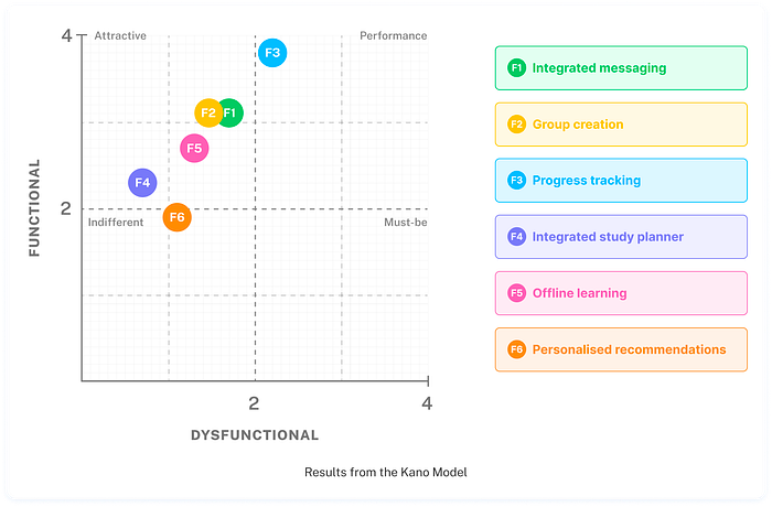
Based on responses from 11 users, I gained insight into the priorities based on their requirements. Following are the features I decided to design and test -
- Progress tracking was a performance feature and stood at the topmost priority.
- Group creation and integrated messaging stood close to each other, this made me realise that I could perhaps interchange a few things within the features.
- Lastly, offline learning stood at the next best. As a whole, I decided to go ahead and design the first drafts of these features.
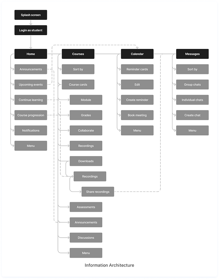
Information Architecture
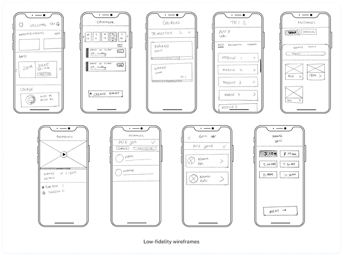
Wireframes
Design system
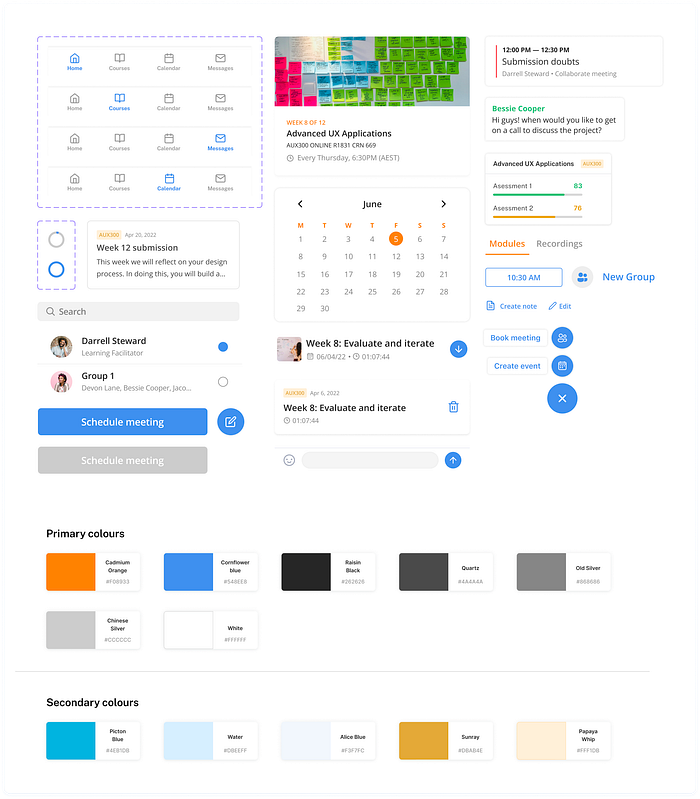
First cut of the design
With the timeline considered and the number of features, it was only possible to implement the first few bits of the features to see how they would be used by the learners.
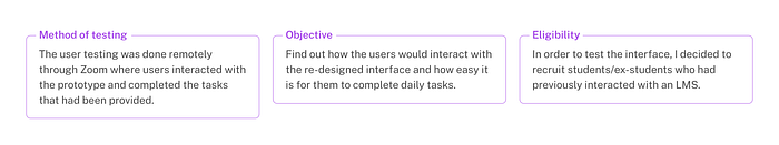
The next step was to start testing the application with the users and see how they would respond to the same.
For user testing, I created a script and a set of tasks to be performed by the users. After the tasks had been completed, users were asked to give their thoughts on the application and talk about their experience with the interactions.
User testing responses
Background
You are a student at Torrens University Australia and you are required to use Blackboard Learn in order to access all course-related material. As a part of this interview, you will perform the below-listed tasks.
Scenarios
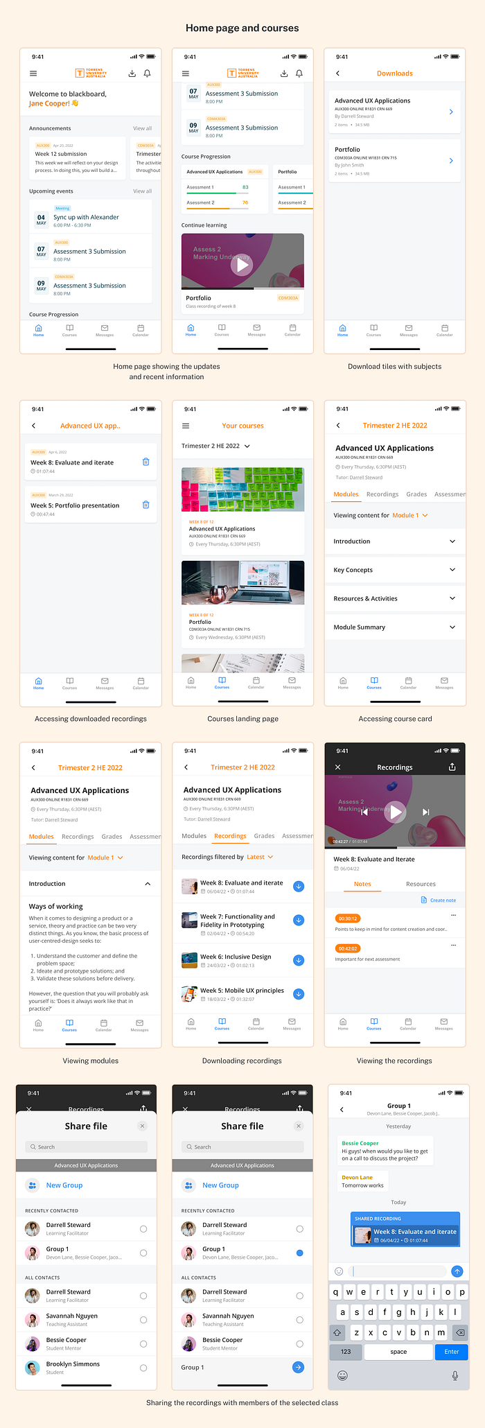
- You ended up missing your Advanced UX Applications class in week 8, you need to download and access the recorded session for the same. How would you do this?
- You watched only part of the downloaded recording and now must complete watching it. How would you continue watching this recording?
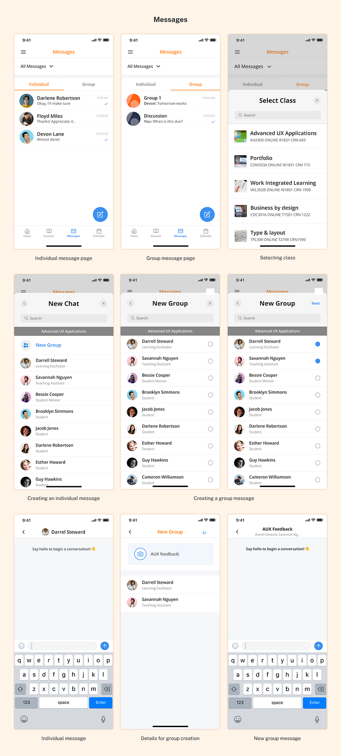
- You wish to send a message to your learning facilitator for Advanced UX applications. How would you create a chat with him? After this, create a group with Darrell and Savannah.
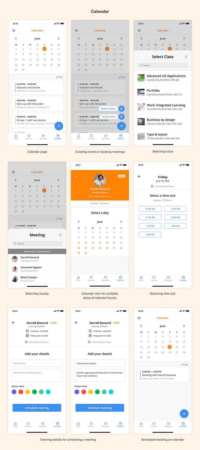
- Book a meeting with Darrell Steward, the learning facilitator for Advanced UX applications. The booking should be made for June 19th at 12:00 PM.
Analysis
From the first round of user testing, it was analyzed that users found it reasonably easy to navigate through the application. Users also felt that the visuals were clean and made them feel more in control as opposed to the original Blackboard application which had a lot of cognitive overload.
It was observed that all users were able to complete the tasks, however, there were still a few things that needed to be worked upon.
- The download icon on the home page led a few users astray as they expected to access and download recordings from there.
- The entry point for ‘continue watching’ was confusing. A few users weren’t able to find it on the homepage
- Booking flow could be optimised further, there were too many steps happening which could be reduced.
- Visual changes in regard to the placements of icons, text sizes, and contrast were required.
Final cut
The user testing response helped me identify where the application lacked. Based on that, various changes had been made to the final prototype. These changes included visual changes to components, adjusting spacing, and optimising a few interactions.
User Feedback
After the final designs were ready, I decided to let the same set of users interact with the prototype and gather their feedback on the improvements.
“Its already so much cleaner and easier to use”
“I like how simple and intuitive it is”
“I think as a first draft of an app, it does the job quite well and I particularly like the book meetings feature”
“This is so much simpler than the web version, everything is outright there”
What did I learn?
In a short span of 3 months, I learned about a whole new side of designing ranging from studying different methodologies to user testing and implementing the feedback.
- User testing requires a lot about being patience, communication and observation.
- Setting timelines and prioritising tasks is an important skill to have.
- Iteration is a constant process: you’ll keep finding new ways to solve a problem and question your own thought process.
- There’s always scope for improvement, you’re going to have to unlearn a lot to learn something new.
Hello! I’m Devika Kohli and I like to design experiences and interfaces. I am currently looking for a full-time role, you can view more of my work on my website. Feel free to reach out to me at devikakohli@hotmail.com

