Beyond the Surface: Activating Your Design Sense in UI Design

The Power of Curiosity
Remembering my childhood is like revisiting a time of discovery and adventure. And one thing was constant in all of my favorite playtimes: curiosity. I always wondered:
How does this work? What’s inside that toy car? Can I take it apart and put it back together?
The fun wasn’t just in imaginative play or controlling the toy car with a remote. The real entertainment was in exploring and understanding how things worked. And, of course, my favorite toy was Lego. I remember my father getting upset because right after putting together the pieces according to the manual, I took them apart to create something new.
Another episode I remember well was when I was ten years old in the mid-2000s, and I noticed that my father’s Pentium 4 cabinet was very dirty.
I decided to disassemble it and clean it piece by piece.
I took out the RAM, video card, flat cables, processor, and everything I could. My father walked into the room and was very, very upset, to say the least. He told me that I should put it all back together but not plug it into the wall. He was going out, and in 30 minutes, he would return to turn on the computer. If it didn’t work, there would be consequences. I managed to put it all back together, and thankfully, the computer turned on. 😅
At that time, Apple products were not that common. At least not in Brazil. I rarely saw someone using a Mac, except in movies or advertising agencies. Even so, I could tell that there was something different about those products. They didn’t seem like a simple beige square box, but rather pieces of art from modern art museums. It didn’t seem like my father’s square Ford Del Rey, it seemed like a Porsche.
What makes an Apple product so interesting? How do the people who design them think?

When I first used an iPod or explored a Mac OS, I was blown away by its user interface. It was a completely different experience from what I was used to. There were details in the interaction that seemed to have been thought out for me. Obviously, nothing was really just for me, and nothing was by chance. It was simply a great work of user-centered experience design focused on evoking a certain feeling or emotion.

My curiosity led me to wonder: could I also create something that can evoke this effect on people?
Curiosity and a desire for knowledge are invaluable values in anyone’s life, but they are even more critical for a designer like me. I have always been drawn to things that impacted me, and I was fascinated to find out how that was possible. This constant interest in the “how” has helped me immensely in my career as a designer.
But what if you’re not naturally curious? Don’t worry! I believe that with the proper training, anyone can develop the ability to perceive details and become a little more curious.
The Aesthetic Sense
Taste is relative. I’m not here to say looks good or not. Of course, I can give my opinion and try to explain as best I can the reasons why something is aesthetically pleasing to me. But in the end, it’s completely relative. That being said, there are indeed some things around us that can be considered beautiful by an overwhelming majority. It’s pure science.
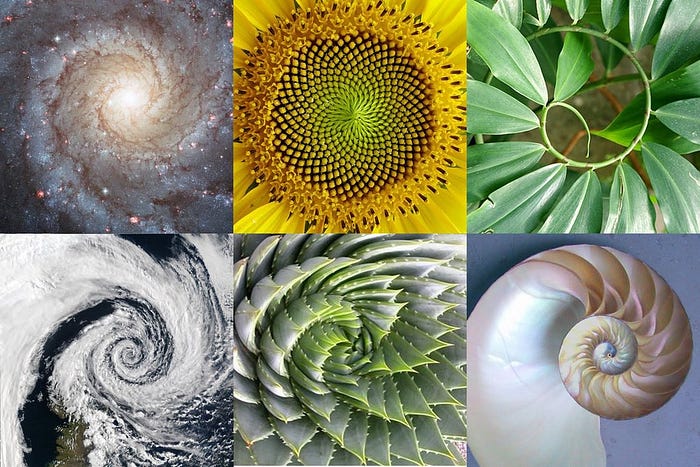
The universe is full of coincidences and, simultaneously, logical and mathematical. Our eyes tend to appreciate certain geometric shapes, combinations of colors, sounds, and other sensory experiences. A good classical example is the Golden Ratio.
We can find it in tree branches, flowers, fruits, bones, animals, galaxies, DNA molecules, etc. There are practically infinite relationships that can be made between the golden ratio and the universe. It’s as if our eyes were genetically programmed to appreciate certain combinations of elements that we visually interact with.
Those who have a well-developed aesthetic and design sense are able to look at an object with these characteristics and understand why it is pleasing to the eyes or not. Proportion, symmetry, colors, light reflection, texture, visual balance, and many other variables affect our perception of things.
Those who have not developed this sensory ability may not be able to understand in detail, but they can feel. To some extent, they unconsciously know if something is or is not pleasing.
I believe that it is indeed possible, with enough training and practice, to make this ability more intentional and go beyond the perception of unconscious aesthetics. Knowing how to deconstruct an element and try to rationalize the reasons that make it pleasing to the eyes.
Activating your Design Sense
1. Stay Curious
Curiosity is the power that drives us to ask questions, investigate and discover new worlds and possibilities. It allows us to explore our creativity and imagination and turn ideas into reality. Curiosity is undoubtedly the driving force behind many innovations and advancements in humanity.

Whenever you come across something that sparks your interest, besides appreciating it, try to ask yourself how it was made. It doesn’t matter if you’ll find an answer or not. The important thing is to stay curious.
2. Build your Repertoire
Another vital piece of advice is to surround yourself with great design inspiration. And great design is not restricted to the digital world. It may be hidden in unexpected places, like a stunning landscape, a striking photograph, a hyped pair of sneakers, a stunning interior decoration, or even in an otherwise trivial moment where the sun hits the window in a unique way, turning the ordinary into something incredible.
It’s easier to talk about it than to internalize that everything that impacts us is added to our sensorial repertoire. That’s why it’s important to start noticing things with intention.
To help you remember, take a photo or screenshot and begin maintaining a database of things that inspire you on Pinterest, Mind, or any other tool you choose. If you want to go even further, make folders, categories, and notes on why it’s interesting. If that sounds like too much, that’s cool. The important thing is to notice it and remember it.
Regarding UI Design sources of inspiration, I usually use Godly, LandBook, Awwwards, Abduzeedo, and Muzli or follow great designers on Twitter.
3. Learn by Copying
After years of experience doing it myself and training other great designers, trying to reproduce good designs can be super helpful during the learning process. People often associate the idea with plagiarism when they hear about this technique. However, it’s important to clarify that we’re not talking about stealing someone else’s work but instead using the process of copying as a form of learning.
You’ll need to observe details such as colors, typography, spacing, shadow, and lighting during the reproduction process. At this point, your brain will start to figure out how you would do something similar. You may not succeed at first, and that’s okay. That’s the purpose of the exercise. Through this process and repeated practice, you’ll identify which skills you need to work on to get closer to a similar result.
Remember that curiosity I was talking about? Now is the time to seek tutorials, learn techniques, and find resources that help you improve. Along the way, you’ll discover things by accident and may even create your own ways of working.
It’s important to note that there’s not always one way to reach a result. Sometimes there are several alternatives, and it’s necessary to understand the technical limitations and best practices to choose the most appropriate option.
In summary, don’t be afraid to copy to learn. Use this technique to develop your skills and combine it with your inspirations to create truly unique and compelling.
4. Learn the rules so that you can break them
The world of art is full of limitless creativity. Still, in the digital product universe, you might think twice before thinking outside the box every single time. It’s not a good idea to just go around doing whatever you feel like without considering the consequences.
Some argue that UI and UX are distinct concepts, but I see them as complementary. A good user interface can only exist by considering usability, focusing on the user, and following the overall business strategy. Therefore, it’s essential to consider all aspects of design.
Fortunately, we have standards, known methods, and mental models to help create functional interfaces. Companies like Apple, Google, Microsoft, and others have spent years testing a range of best practices you can use. You can check out Apple’s Human Interface Guidelines, Google’s Material Design, and Microsoft’s Fluent Design System for a solid foundation in interface design.
Even the simplest button on a website can vary in color, size, volume, and state, depending on the interaction. The user expects a specific behavior from a button, so it’s essential to maintain those expectations.

Of course, every project has its own quirks, but following proven basic interface principles can significantly increase the chance of success.
To start, it’s fundamental to know the rules of the game. Once you understand the general guidelines, you’ll be ready to go beyond and break the rules with intention.
Let's say you want to design a cool Call to Action button that, when the user hovers over it, turns into a rocket full of animations.
Sounds awesome, but in most cases, that would undoubtedly be over the top, to say the least. However, if you already understand this and consider the context of the project, that idea might work perfectly.
The Design Craft
Lately, I’ve noticed that the Design craft has been set aside in favor of things like the scale of some design teams, rigid interface standards, or even because it just doesn’t make sense to spend time creating a visually appealing product.
Hey, I get it. I’m not here to argue that it’s always worth investing in this effort. In some projects, it makes more sense to optimize resources to get the maximum conversion possible, which will bring more value to the business.
However, it’s important to remember that even though it’s not recommended to depend solely on aesthetics to develop a digital project, the Aesthetics-Usability effect is undeniable. In other words, a well-designed interface with an attractive appearance can be perceived as easier to use.
But the real magic happens when we combine aesthetics with usability: the attractive appearance of an interface can evoke a specific emotion in the user, and, depending on the business, this emotion can positively affect and contribute to an unforgettable experience.
As a designer, enhancing your aesthetic and design sense is essential. You need to be curious, build a repertoire, and be skilled enough to understand and, who knows, even create products that evoke emotions as intense as those I experienced when I first saw an iPod.
In the end, design can also be art, and art is emotion. It may be worth putting Design craft a little higher on our priority list.

