Best Visual Styles For Developing Your Game…
Games have a visual style. Your player could be a toon-shaded dwarf or a realistic humanoid… In this article, we’ll go through styles, which best fit your games, and games made with them.
Important Notice
This article is a part of a series. I could not cover all the visual styles in just one article, so I’ll be covering them in several articles starting from this. Stay tuned for future articles and videos on Medium and YouTube(yeah, I’ll be making videos on this as well).
We have to accept they do NOT depend on the effort you put in. YES… I mean it. You could have a very good looking game in a day & and at the same time have a bad looking game in a year and the same style might not work for every game by every developer. Well, you probably realize that this is complicated. Let’s dig deeper into this.
What Do I Mean By A “Visual Style”
Everything you see in a game influences the user in some way or another other either consciously or subconsciously. It could be positive or negative. To influence a player in general, you need a game feel… and it’s not rocket science, but it’s the competition with other games which makes it harder for you to influence the player. The reason I mentioned this, is because this is stuck with what we will talking about, which is visual style.
Visual Style is probably the best way you could distinguish your game from any other game since what the player sees would stay in him/her for a long time(for both awesome and terrible looks btw). It’s the most observed aspect of the game feel and the game itself in general. Also, it’s just marketing. You get better thumbnails, trailers, and so on…
Factors of Good Visuals For a Game?
Before we go into the actual types of them we need to know what makes a good visual.
The Colours

You don’t want to have dark colors with spooky shadows and scary voices, in a happy, joyful, and positive-themed game. It’s the color theme that decides the mood of the game. No, I’m not only talking about the colors themselves, I’m talking about the gradients, exposure, saturation, etc. You could use red for both romantic-themed and blood(terror) themed games.
I’m currently working on a mini-game(which I’ll publish into asset store and itch.io for free), which literally consists of cubes, and… that’s really it. Everything there from the ground to the obstacles is filled with simple geometric shapes and nothing special. I still know that it would do pretty well as a mini-game cause it just looks cool(of course along with some other factors).
Choose a fairly well-thought color theme.
The Lighting
Again, something which makes a lot of difference in the game. You don’t want a glare of epic light and sharp shadows with the player’s glowing eyes… in a fantasy game or something. That would of course not set the vibe you want(unless your brain is from the future).
Lighting is a major way you show or bring attention to something in your game. It could be a character or the background. The whole purpose of the game could be changed using lights. Combine that with colors, and you get to create the vibe you want in your game.
Many More…
Of course, there are more factors, animations, graphics, etc. So many that I cannot include all of them in an article. These are just the important ones. These are stuff that a person sees in the trailer and thumbnails. Something which leads the player to play the game.
Do NOT Mix Anything
I’ve seen enough games which could have pleased me visually if it had not mixed up everything. Literally. Why do many games do this?
You need to stick to one type of visual style mentioned below and not go away from it. Of course, you have to choose it correctly.
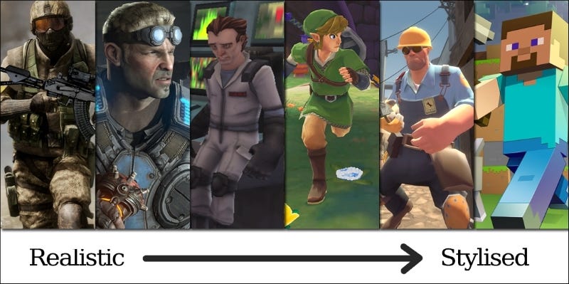
Types Of Visual Styles
Now, comes the part you were waiting for… Here are basic types of styles which when used with good colors and lights, could achieve wonders and make your game look better than any other game.
Also, I will be mentioning who should use this and what this is the best for, since it does not work for everyone.
Photorealism: For Group Of Large Numbers

This is where many “hardcore”, fps, gamers, claim to be (although you’ll find them everywhere). Photorealism is when you have your game visuals to be as close as possible to the real world(which you see around). It’s used for of course giving real-world-like experience.
This kind of visual is usually used for action. It requires the player to have a high-performance computer since photorealism involves more polygons to form well-defined objects to make them look as real as possible. Using this, you can easily convert the game world into the real world and make it look. If you are making games for VR, Xbox, PSP, etc, you could literally hypnotize the player with your game.
This brings us to who should and should not use it. If you are a huge group trying to build a game, you would want to use this. But… If you are a lone wolf, and you develop alone, unless you could bend time, it is very difficult to develop photorealistic graphics in your game. It requires high precision, and a lot of time which could be done as a group collectively but not alone(maybe if you are a superhuman or something like that).
Some Examples : -
- Death Stranding
- Half-Life: Alyx
- Call of Duty: Modern Warfare
Greyscale
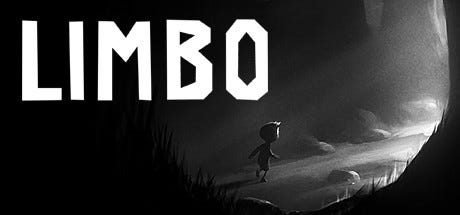
Games using greyscaled color schemes depend purely on lighting and shapes for emphasis. These are games that do not use any color, except black, white, grey, and all the tones of grey.
Something which I personally do is greyscale with one extra color(the signature color of the game). I have tried this and it looks awesome! Let’s say you have a character and maybe want to emphasize their eyes. Coloring the eyes with a different color simply makes your game more epic. This is something that many games have done and it works pretty well.
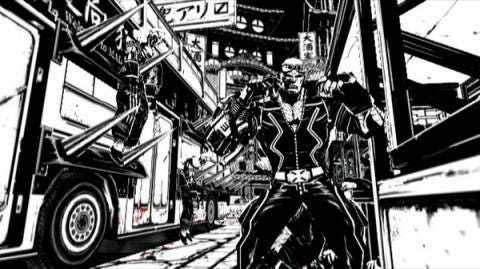
This kind of visual effect is the best for horror-themed games or games with dark insights or emotional backgrounds. Maybe a game with a zombie apocalypse and you want the story to drive into darkness and emotional.
This… is really not that difficult to make. It could be done by any game developer and depends completely on imagination(which you have by default if you are a game developer/designer). Especially for indie game developers, this lets you handle with lesser colors making it easy to remember for a player and easier for you to develop.
Some Examples:-
- Limbo
- World of Horror
- Unworthy
Toon Shades
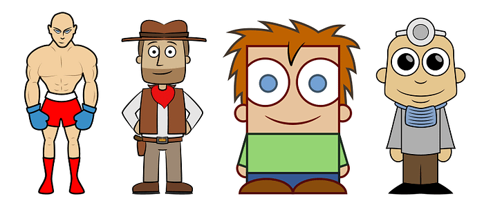
Well, this is the second most popular after photorealism. It’s basically shaded to look, unlike the real world we are in. It follows a different approach when compared to photorealism, like making the character’s head, eyes, etc noticeably out of proportion(if you know what I mean) to give it more emphasis or make it look better.
As said, this does not aim to look like the real world but rather aimed to look very different from photorealism. Apart from this, they are also made to look closer to 2d(when compared to photorealism).
This type is used for… Well… Anything. These kinds of games are not that difficult to create, so they could be used by anyone. Apart from this, it’s also adjustable to create any themed game. From action-filled games to kid’s games.
I really don’t know a lot of examples for this. Even in google, all I could find was games like Talking Tom, Ben 10 Rivals, etc…
Minimal: The Mix of Toon and Photorealism
Now Toon Shades are very different from Minimal style as you can see in the images. Minimal games are not filled with out-of-proportion-looking cartoon figures or simple animations.
If you take Toon and Photorealism, crush them together, and create a bi-product, the bi-product you created is Minimal visual style. They have fairly realistic characters and animations with a resemblance to the real world you see now. BUT, they are not made to mimic the real world completely.
A game with minimal visual style is very good for making games with real human behavior and of course even action. It is not as easy as Toon for creation, but it is relatively simpler than photorealism. If you are wanting to create something with this alone, it highly depends on the skills, software, effort, etc.
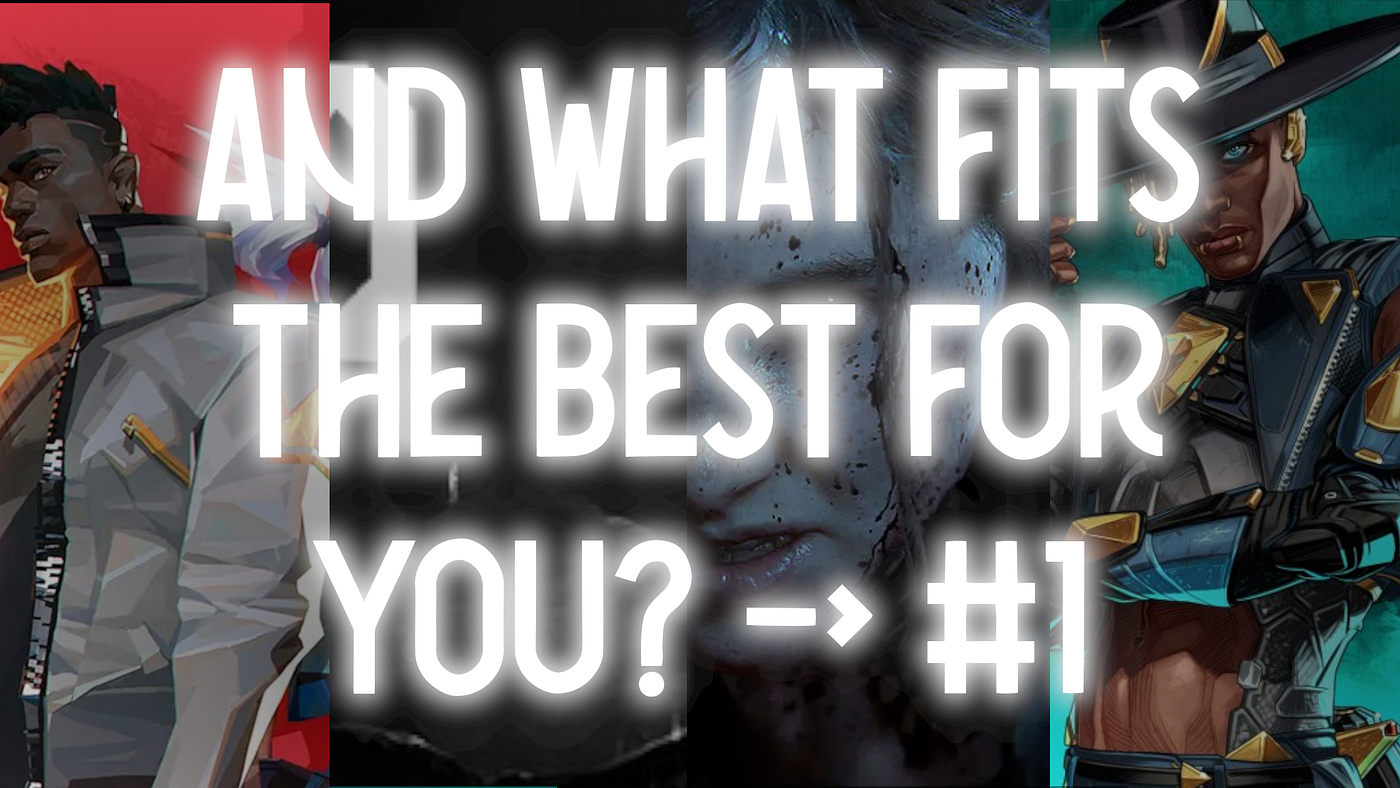
Some Examples:-
- Apex Legends
- Paladins(kind of minimal)
And More…
As said, then this is a series of articles. So I will post on more visual styles which are pretty important and helpful to know about(at least whatever I know). I will be posting more videos on this on YouTube as well and they are gonna cover more on this(even with tutorials). So if you found this interesting, you probably will find my YouTube channel, “FadinGeek” interesting as well. Stay tuned to get more :)
And that’s about it in this first article of the series. I hope you enjoyed it(of course you did assume you have read it till the end) and… I’ll meet you in the next article or video.
You’re Awesome :)
FadinGeek

