A Beginner’s Guide To Web Accessibility

Web accessibility has been on my mind lately. After talking to an experienced software engineer and attending a React.js Girls event featuring Sophie Koonin as a speaker, both stressed the importance of web accessibility. It surprises me that many US companies do not require web accessibility features.
When web accessibility comes to mind most people think of just adding an alt text to an image, but there is much more to it! This article is a beginner's guide to web accessibility and lists some simple ways to make your website more accessible.
What Is Web Accessibility?
Technology and the web are supposed to make people’s lives easier. Accessibility means creating a website that anyone (no matter what the person’s physical, cognitive, or current ability is) can navigate, interact, and contribute to that website.
Sophie had a great quote from Microsoft Inclusive Design Toolkit that stresses the importance of web accessibility when creating a website.
‘’If we use our own abilities and biases as a starting point, we end up with products designed for people of a specific gender, age, language ability, tech literacy, and physical ability. Those with specific access to money, time, and a social network.”
Often developers do not put web accessibility at the forefront of their minds when developing. But one should! After all, the web was invented to be used for all, so shouldn’t we ensure all websites can be used by everyone?
Where To Even Begin?!

There is much to consider when making your website more accessible since there are many types of disabilities to account for. The Web Content Accessibility Guidelines understands this and has broken down the core concepts into 4 principles.
- Perceivable: Users must be able to perceive it in some way, using one or more of their senses.
- Operable: Users must be able to control UI elements (e.g. buttons must be clickable in some way — mouse, keyboard, voice command, etc.).
- Understandable: The content must be understandable to its users.
- Robust: The content must be developed using well-adopted web standards that will work across different browsers, now and in the future.
Ways To Make Your Website More Accessible!
Below is a brief list of what you can do to make your website more accessible. Please note there are a lot of things and disabilities to account for, this outline is the minimum of what you can do. Please read the WC3 docs for a complete guideline.
1. Color
Do not use color as the only way to tell your user some information. This helps users who are unable to tell one color from another. This is really important for error messages, especially user input. This can help people who are color blind(1 in 12 men and 1 in 200 women), low vision (1 in 30 people), or the blind(1 in 188 people). Instead of relying on color, you can use text or an icon to indicate to the user a field is required or there is an error.

2. Alternative Text
Use the alt attribute when using images. This is what is displayed when a user cannot load the image or they rely on screen-readers. Alt text is supported in most browsers and the text should best describe what the image is.
<img src=”baby_elephants.png” alt=”A group of two baby elephants walking behind their mom in a open field.”> 
3. ARIA Landmarks and HTML Semantics
The W3C’s Authoring Practices for Design Patterns has a guideline on how to build accessible menus, modals, forms, and much more. Each of these has expected HTML semantic elements to use, like for example <p>,<main>, and <nav>.
ARIA landmarks are attributes you can add to an element to define their roles on a webpage. Html semantic elements and ARIA landmarks let screen readers know where they are going and allow them to easily jump from one section to another.
You can add a landmark by using the role attribute. Some examples of landmarks are banner, form, and search. Something to note is that you should only place the role attribute on elements like <div> and <span>, do not place on elements that have semantic meaning like a <ul> or <p>.
<div id="nav" role="navigation">
  <ul>
    <li>Home</li>
    <li>Shop</li>
    <li>Contact Us</li>
  </ul>
</div>
4. Keep the Focus Feature
Without the focus feature, it is almost impossible for a user using just their keyboard to access your website. Developers often dislike the appearance of the focus feature (I have to admit initially I did too). However, once learning the importance of it I have come to appreciate its aesthetic. But if you must remove it make sure to create some visible indication.
5. Forms
Borders and labels are important on forms and should not be omitted. An accessible form is one that has a defined border and a visible label describing the input needed. Placeholder text is not a sufficient replacement for a label.
Defined borders for a form input are essential for users with mobility impairments and cognitive disabilities. Borders make it easier for a user to know the location and size of the input so the user knows where to click.

6.Rem/Em vs Px
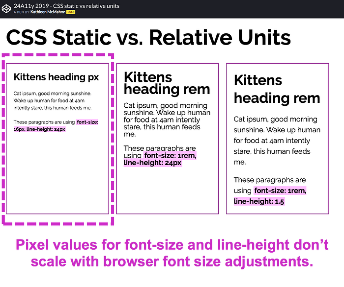
We want users with low vision the ability to enlarge the text size, this can be difficult if you are coding in px or pixels. If you use px the text size and line spacing will not respond. This is why it is best practice to use rem or em for your text, they are responsive. See the example below!

The first example shows us what happens when px is used, not good! In the second example, the spacing does not scale up with the text size. This is because line-height was set using px. The last example is what we want to see! Line-height and font-size were set using rem or em so our font will scale accordingly.
I hope this helped you learn more about web accessibility. I was recommended to take this free accessibility course by Google from Udacity. So if you want to learn more I highly recommend it, I plan on taking it 😊 . Also below are articles I heavily relied on when writing this. Hope you enjoy them!

