Welcome to learn the Basics of CSS✨
If you have read the previous ‘Beginners Guide to HTML’ article you know that I have promised since we have done the blueprint of the house by walking through the knowledge transfer in Fundamentals of HTML, today we are going to do the interior decorating scheme for the house by learning about Fundamentals Of CSS.
If this is your first time and confuse about what was included in the previous ‘Beginners Guide to HTML’ do not worry at all, this will be an article that will walk you through the Fundamentals of CSS.
With that introduction, let me walk you through what will be included in this article. First and foremost, we’ll start it with an introduction to CSS by explaining What is CSS, then we should know how should we include CSS into our HTML files, with that knowledge we’ll move to the CSS elements. And finally, we’ll end this with the knowledge transfer in Media queries.
I hope you are ready now with your pen and paper to walk through the knowledge transfer in the Fundamentals of CSS😉
LET US BEGIN WITH THE INTRODUCTION💎
What is CSS? 🤔
CSS stands for ‘Cascading Style Sheet’. It describes how HTML elements are to be displayed on the screen, on paper, or in other media. Moreover, it’ll control the layout of multiple web pages all at once.
In other words,CSS is a language for specifying how documents are presented to users on how they are styled, laid out, etc.
Basic Syntax of CSS? 🤔
h1 {
    color: red;
    font-size: 5em;
}
Check follow for the elaborative version of Basic Syntax 🧐👇
- h1 is the selector in CSS -> This selects the HTML element that we are going to style
- Then come {} (set of curly brackets) -> Inside those will be one or more declarations, which take the form of property and value pairs.
- Inside curly bracket we have two properties and two property values. Eg:- color is the property & red is the property value
Now you may have the idea about what is CSS means with that, let’s move to how to include CSS into the file
How to include CSS in HTML Documents? 🤔
CSS can include in the HTML Document in three separate ways. It can either be attached as a separate document or embedded in the HTML document itself.
Following are the methods to include CSS in an HTML Document
- Inline styles (Inline CSS)— Using the style attribute in the HTML start tag.
- Embedded styles (Internal CSS ) — Using the <style> element in the head section of a document.
- External style sheets (External CSS)— Using the <link> element, pointing to an external CSS file.
Let us get into more detail about each way👇
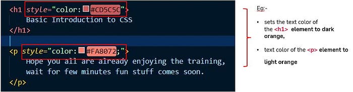
🟡Inline CSS
In the inline CSS, the style attribute will be placed inside the opening tag of an HTML element. Here’s the syntax:
<p style="color:green; font-size:22px;">
  This is a paragraph.
</p> <div style="color:blue; font-size:14px;">
  This is some text content.
</div>
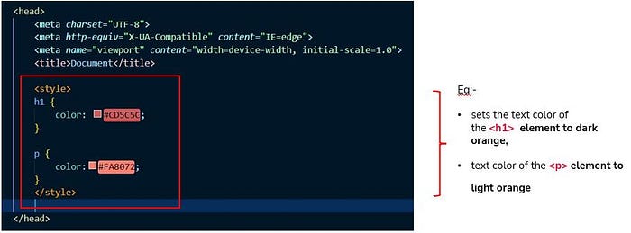
🟡Internal CSS
Internal CSS looks different from inline CSS. A CSS property and value is still set, but instead of being placed inside a style attribute, it is placed inside brackets and defined by a CSS selector.
Which means the <style> element would be found in the <head> section of the HTML file. Here’s the syntax:
<!DOCTYPE html>
  <html lang="en">     <head>
      <title>My HTML Document</title>
        <style>
         body {
           background-color: YellowGreen;
         }
         p {
           color: #fff;
         }
        </style>
     </head>

     <body>
       <h1>This is a heading</h1>
        <p>This is a paragraph of text.</p>
     </body> </html>
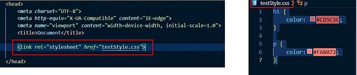
🟡External CSS
An external style sheet holds all the style rules in a separate document that you can link from any HTML file on your site.
For that we have to create a separate CSS file in the folder where the file format would be .css. For instance -> style.css
Check follow to learn how to include external sheet
01) Linking External Style Sheets
follow code snippet is for the style.css file ( Styles sheet )
body {
  background: lightyellow;
  font: 18px Arial, sans-serif;
}
h1 {
  color: orange;
}
follow code snippet is for the index.html file ( HTML Document)
<!DOCTYPE html>
  <html lang="en">
    <head>
      <title>My HTML Document</title>
         <link rel="stylesheet" href="css/style.css">
    </head>     <body>
      <h1>This is a heading</h1>
      <p>This is a paragraph of text.</p>
    </body>   </html>
02) Importing External Style Sheets
Importing one stylesheet in another stylesheet
@import url("css/layout.css");
@import url("css/color.css");
  body {
    color: blue;
    font-size: 14px;
  }
LET MOVE TO CSS Styling💎
What are the Basic Selectors? 🤔
Now you have met selectors already. A CSS selector is the first part of a CSS Rule. It is a pattern of elements and other terms that tell the browser which HTML elements should be selected to have the CSS property values inside the rule applied to them.
Moreover, the element or elements which are selected by the selector are referred to as the subject of the selector.
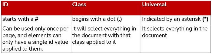
When coming to the type of selectors there few different types of selectors, but in this article, I would be walking you through the main three types that use often. (class, ID & universal selectors)
01) Class selector
We use a class when you want to consistently style multiple elements throughout the page/site.
The .class selector selects elements with a specific class attribute.To select elements with a specific class, write a period (.) character, followed by the name of the class.
Here is the syntax for HTML Document👇
<p class="center"> This paragraph refers to two classes. </p>Here is the syntax for Stylesheet👇
p.center {
  text-align: center;
  color: red;
}
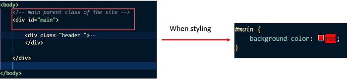
02) ID selector
We use an ID selector when you have a single element on the page that will take the style.
Here is the syntax for HTML Document👇
<div class="intro">
  <p id="firstname">My name is Donald.</p>
</div>
Here is the syntax for Stylesheet👇
#firstname {
  background-color: yellow;
}
03) Universal selector
The asterisk (*) is known as the CSS universal selectors. It can be used to select any and all types of elements in an HTML page.
The asterisk can also be followed by a selector while using to select a child object. This selector is useful when we want to select all the elements on the page.
* {
  background-color: yellow;
}
For better understanding, let us distuguish the difference between class, Id and Universal selector.
What are the Basic Styles of CSS?
🟠Adding Fonts
There are two ways that we would be able to add fonts to the CSS
01) Importing fonts to the style sheet👇
@import url('https://fonts.googleapis.com/css2?family=Open+Sans:ital,wght@0,300;0,400;1,300&display=swap');02) Linking fonts to the style sheet👇
<link href="https://fonts.googleapis.com/css2?family=Open+Sans:ital,wght@0,300;0,400;1,300&display=swap" rel="stylesheet">Tiny tip for you to easily link or import fonts to the styles sheet
- go to google fonts -> search the font family you want -> then select the necessary font weights and you will get the l<link> url as well as the @import link for the fonts.
🟠Adding Colors to the fonts
Following are the three types that would able to add the colors to the font
- Using hex code
h2 {
  color: #FA4A0C;
}- Using rgb value
h2 {
  color: rgb(255, 0, 0);
}- Using name of the color
h2 {
  color: red;
}
🟠Adding Background Color
We use these properties for the background only
.hero{
  background-color: #ffffff;
  background-image: url('./images/hero image.svg');
  background-repeat: no-repeat;
  background-position: center;
  background-size:cover;
  height: 618px;
  margin: auto;
  width: 100%;
}- Background-repeat -> if/how a background image will be repeated.
- Background-position -> property sets the starting position of a background image.
- Background-size -> size of the background. (cover, contain, initial, inherit,)
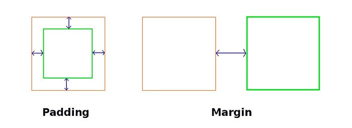
🟠Padding and margin
Padding is used to create space around an element’s content, inside of any defined borders. As well as Use padding to move the contents away from the edges of the block.
Margins are used to create space around elements, outside of any defined borders. As well as use margin to separate the block from things outside it
There are three type of ways to define the side of margin and padding
Type One :- ( mention top, right, bottom and left of the margin and padding in a one single line )
padding: 10px 20px 10px 20px;Type Two :- ( give one single value for top and bottom and another single value for right and left)
padding: 10px 20px;Type Three :- ( Mentioning the sides with the value)
padding-top: 10px;
padding-right: 20px;
padding-bottom: 10px;
padding-left: 20px;
Even though defining the values for each side is similar in both margin and padding. There is one specific thing in the margin which says the browser to center the items to the page.👇
margin-left: auto;
margin-right: auto;
🟠CSS positioning
The CSS positioning sets how an element is positioned in a document. And note that the element are positioned using the top, bottom, left, and right properties.
There are five types of CSS positioning as follow
- relative
- absolute
- static
- fixed
- sticky
01) Type One :- relative
When use position as ‘relative’ the element is positioned according to the normal flow of the document, and then offset relative to itself based on the values of top, right, bottom, and left.
position:- relative;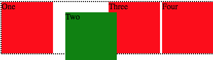
02) Type Two :- absolute
The element is removed from the normal document flow, and no space is created for the element in the page layout. It is positioned relative to its closest positioned ancestor.
The final position is determined by the values of top, right, bottom, and left.
position:- absolute;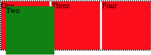
03) Type Three :- static
The element is positioned according to the normal flow of the document.
Note:- The top, right, bottom, left, and z-index properties have no effect. This is the default value.
position:- static;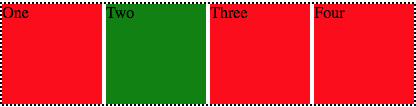
04) Type Four :- fixed
The element is positioned relative to the viewport, which means it always stays in the same place even if the page is scrolled.
position: fixed;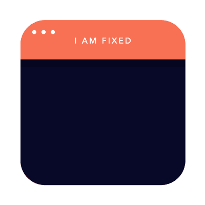
04) Type Five :- sticky
An element with position: sticky; is positioned based on the user’s scroll position.
position: sticky;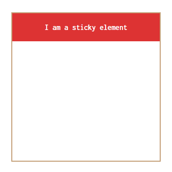
🟠CSS display properties
The Display property in CSS defines how the components(div, hyperlink, heading, etc) are going to be placed on the web page.
There are six types of CSS display as follow
- block
- inline
- inline-block
- none
- flex
- grid
Let me define this using a default example
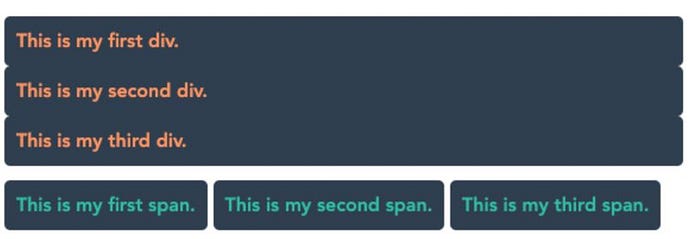
01) Type One :- block
It is used to displays an element as a block element. Which means the element generates a block element box, generating line breaks both before and after the element when in the normal flow.
display: block;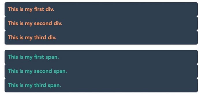
02) Type Two :- inline
It is used to displays an element as an inline element. Which means the element generates one or more inline element boxes that do not generate line breaks before or after themselves. In normal flow, the next element will be on the same line if there is space
display: inline;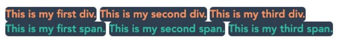
03) Type Three :- inline-block
It is used to displays an element as an inline-level block container. which means Which means the element generates a block element box that will be flowed with surrounding content as if it were a single inline box
display: inline-block;
Now you might be thinking whats the main difference between inline and inline block am I right? If so let me tell you what are they.
- Inline:- Any height and width properties have no effect
- Inline-block:- CAN set height and width values
04) Type Four :- none
It is used to remove the element. Which means Turns off the display of an element so that it has no effect on layout.
display: none;05) Type Five :- flex
The element behaves like a block element and lays out its content according to the flexbox model.
display: flex;06) Type Six :- grid
CSS Grid Layout Module offers a grid-based layout system, with rows and columns, making it easier to design.
display: gridLast but least there is anoth important property call Visibility.
07) Visibility: hidden
It is same as display none, but the only difference is when you put display none the element and the space both will be removed. But when you put visibility as hidden only the element will be hidden and it’ll take the same space.
visibility: hidden;MEDIA QUERY💎
As for the last topic of this article let me walk you through media queries.
What is Media Query? 🤔
A media query is an HTML/CSS functionality that allows the content of a Web page to adapt to the type of media that the page is being rendered in, it can be a computer screen or phone or tablet etc..
Therefore, media queries are useful when you want to modify your site or app depending on a device’s general type.
/* MOBILE  */
@media screen and (min-width: 300px) and (max-width: 760px){}/* TABLET PORTRAIT */
@media screen and (min-width: 768px) and (max-width: 992px){}/* TABLET LANDSCAPE */
@media screen and (min-width: 992px) and (max-width: 1024px){}/* LAPTOP */
@media screen and (min-width: 1024px) and (max-width: 1280px){}/* DESKTOP */
@media screen and (min-width: 1024px){}/* MIDDLE DESKTOP */
@media screen and (min-width: 1280px){}/* LARGE DESKTOP */
@media screen and (min-width: 1366px){}/* EXTRA LARGE DESKTOP */
@media screen and (min-width: 1600px){}
Mobile-first approach👇
- This involves designing a website for the smallest device possible and then allowing yourself to adapt to desktop computers by scaling upwards.
Responsive web design👇
- You might have heard this term a lot, responsive web design means the design will be respond to change according to the device display size.
- For instance when you display a website on a smartphone, you’ll be looking at different dimensions than if you were viewing it on your tablet, laptop, or desktop.
Difference between max-width and min-width
Max-width and min-width can be used together to target a specific range of screen sizes.
- min-width:- if you are developing in mobile first approach
@media screen and (min-width: 300px){}/*Here it mention that the styles inside this query would apply to all the devices which are GREATER than or EQUAL to 300px*/
- max-width:- if you are developing in desktop first approach
@media screen and (man-width: 992px){}/*Here it mention that the styles inside this query would apply to all the devices which are LESS than or EQUAL to 992px*/
- using both min-width & max-width
@media screen and (min-width: 768px) and (max-width: 992px){}/*Here it mention that the styles inside this query would apply to all the devices which are BETWEEN & EQUAL to 768px – 992px*/
SUMMARY
As I hope you all would have agreed, this article is contained a brief knowledge transfer for the fundamentals of CSS. This starts off with an introduction to CSS, CSS Elements, Positioning, display properties and last but not least media queries.
Let me end this by hoping this article has been helpful to you. If you are interested feel free to check out my previous article about ‘Beginners guide to HTML’.

Hit a clap if you like this, and feel free to leave your thoughts and feedback in the comment section.
Thank you for checking this out, feel free to checkout my other articles by clicking the following link 👇

