Member-only story
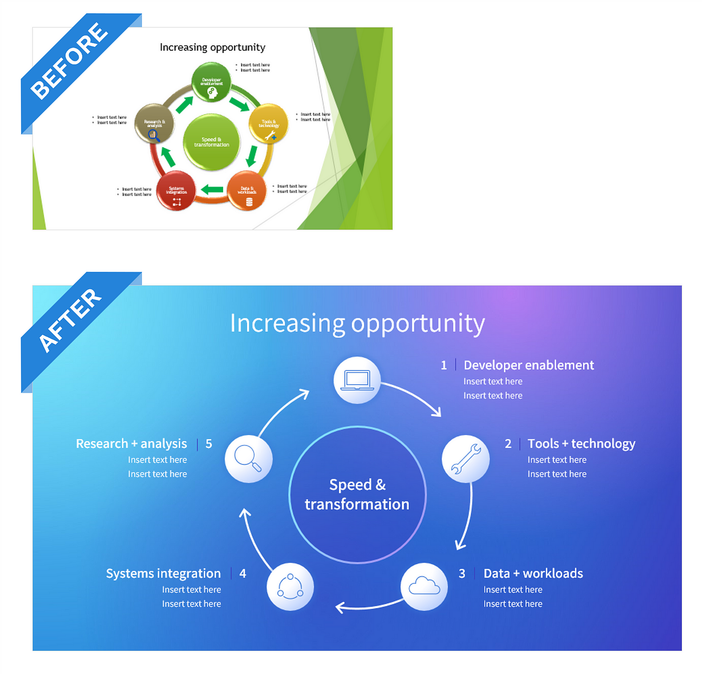
Before & after: Improving a circular diagram in PowerPoint
Proven, repeatable techniques to uplevel your slide visuals
Hello! My upcoming tutorials here on Medium will focus on real-life presentation slide design scenarios using mockup content with before-and-after slide examples. I’ll walk you through the design process step by step, so please feel free to follow along if you like.
Free download: Both the original slide and the finished version.
Note: Some of the steps have been slightly abbreviated for length, so please comment below if you need additional guidance. This tutorial is intended for an intermediate-level user and assumes you are already familiar with most of the common tools and functionality in PowerPoint.
Overview
At first glance, the first takeaway is that this visual can be simplified by changing the diagram itself. We’ll eliminate the outer ring and promote the arrows to change it to a cycle. There are other issues we will also want to address in this 5-part tutorial:
- Part 1: Create a custom “Aurora” background. The original slide is using a light background with green elements from a previous presentation, but the decorative elements in the template distract focus from the content. We’ll apply a new basic template and then create a custom background.
- Part 2: Create the new five-part arrow cycle and reduce the number of colors used in the diagram. The original color palette feels uninspired and outdated.
- Part 3. Update and align the icons with a more modern, consistent feel so they feel cohesive.
- Part 4: Format content and create visual structure to improve the alignment of text, bullet points, and icons.
- Part 5: Add animation to aid in storytelling and helping the concept come to life.

Part 1: Create a custom “Aurora” background.
Fluid gradient backgrounds like these are showing up everywhere. An upgrade from a basic radial or linear gradient…

