Basic type of screens for mobile UI design.

Our daily dose of smartphone usage is never enough. It has become a part of our lives, and we can barely do without them or should I say “smartphones has invaded a larger percentage of every activity of our lives”. It is what it is.
As designer’s, it is our job to create not just beautiful aesthetically pleasing user interface that meets users’ needs, but also to make one that brings about a pleasant and satisfying user experience.
These common screens are usually found in most mobile UI designs:
1. Splash Screen:

A splash screen is an introductory screen or the first screen that users see when they launch your mobile app. It is a chance to showcase your brand identity and it helps keep users occupied, while your mobile app loads in the background. This screen can either be an image, graphics, logo, or animation which often comes with a progress bar.
2. Onboarding Tutorial Screen:

An onboarding screen appears to users who launches an app for the first time. It provides a walkthrough, aimed to introduce what an app does, and of course help the user understand if the application can be useful for them or not.
3. Home Screen:
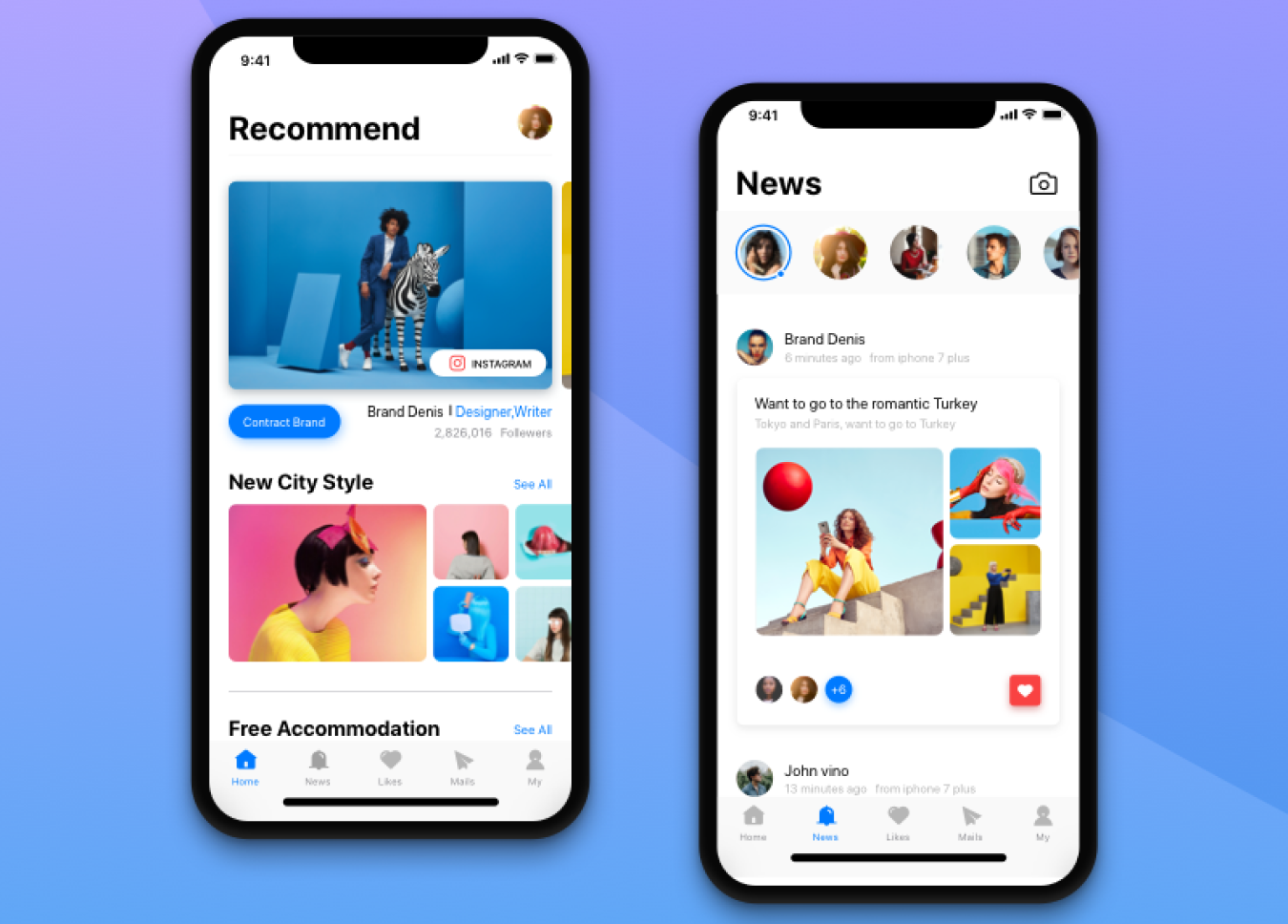
Home screen also known as the main screen is an essential part of any application, be it mobile app, web app or even a website. In a context of mobile apps, it’s the main screen from which users interact with most options of the application. Home screens usually includes search fields or button so that users could easily search for the content they need. Also, since home screen is a start point for user journey on the app, it often contains navigation elements providing access to the various sections on the app.
4. Log-in / Sign-in Screen:
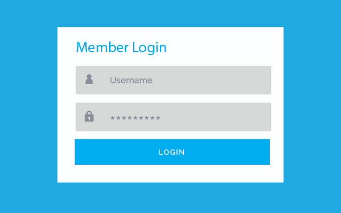
A log-in or sign-in screen is a web page or an entry page to a web/mobile application that requires user credentials, it is regularly done by entering a username and password combination. You might have seen it when logging into facebook, twitter e.t.c. For people using the app for the first time, there always must be the sign-up option.
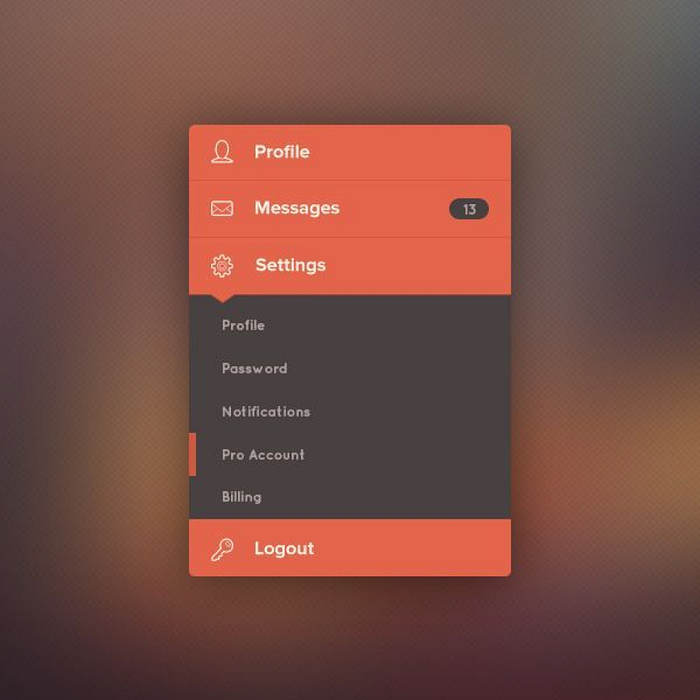
5. Stats Screen:
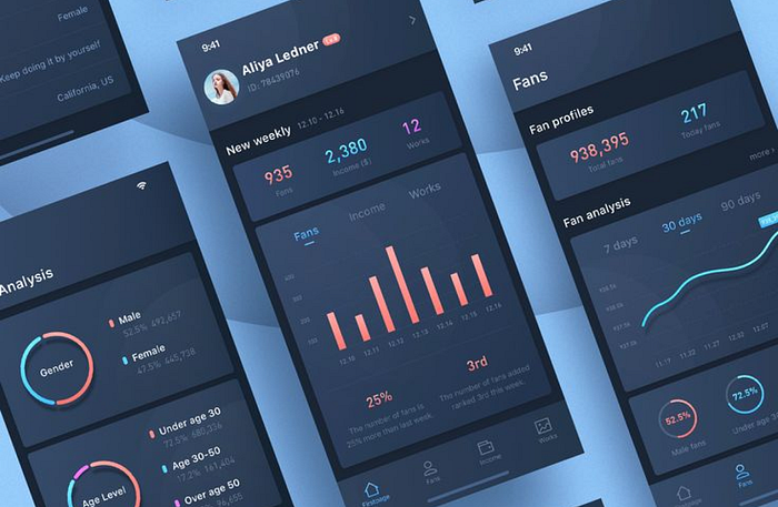
Various applications contains stats on that monitors users activities. Stats screen has to be clear and usable. Most of the users activities are narrated using Graph curves, scales and original icons on a mobile app. Moreover, stats screens require distinct typography so that users could easily read the data. Example of stats screen can be a dashboard of a car.
6. Calender Screen:
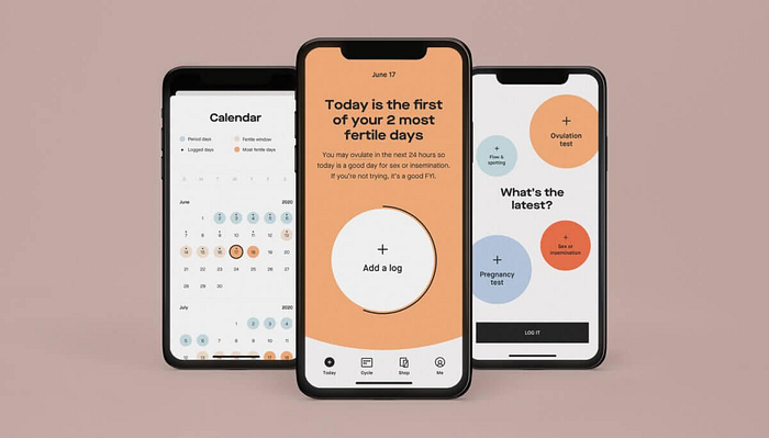
This screen is usually designed for an Event apps, to-do list apps, fitness apps, e.t.c, and many other apps that provide users with the personal calendar. Depending on the type of the application, calendar accomplishes certain functions such as reminding, goal setting or schedules. The visual style should match the mood and goals/objectives of the mobile app.
7. Category Screen:
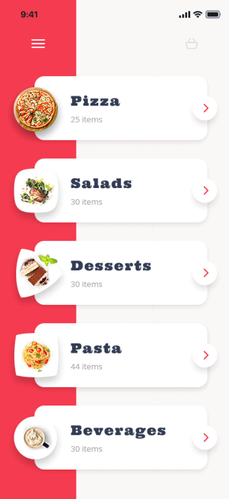
This is the home page for a top-level category, such as Women or Electronics, that gives a quick summary of what’s available rather than listing all of the products. If there are more than two tiers, such as Women’s > Tops > Sweaters, multiple Category Overview pages can be used.
8. Product Screen:
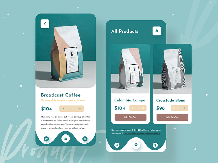
This is the individual view of a product containing all of the product details and pricing, also known as the Product Detail Page. The add-to-cart button is the primary call to action. Including customer reviews, relevant items, and user-generated content from social media on this page can assist lead customers to the checkout.
9. Payment Screen:
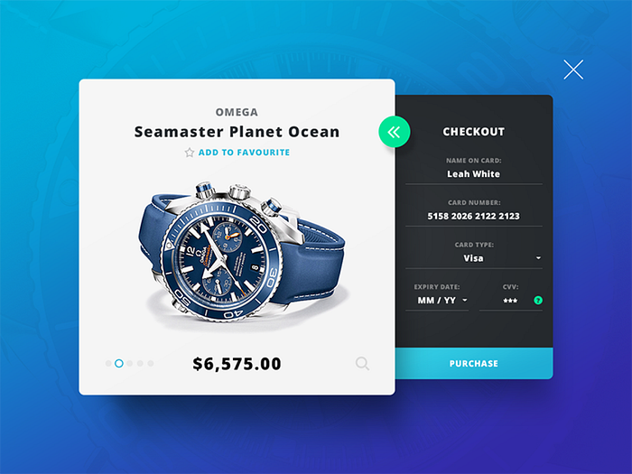
Form fields are for entering payment information that should be included in the payment stage. In this area, fields to a billing address, especially if it differs from the shipping address, may be included. Here there should be a feature that allows user to enter gift cards, points, or promo codes, as well as the ability to pay with points or shop credit.
10. Checkout Screen:
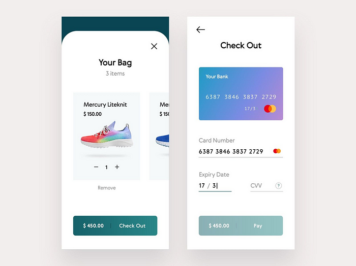
This is a vital step in the process, since it allows you to double-check all of the things you want to buy, alongside the delivery information, payment method, discounts, and any additional fees such as taxes or express shipping. Make it clear that this is a review stage and that the primary ‘call to action’ is to place an order.
11. Contact Us Screen:
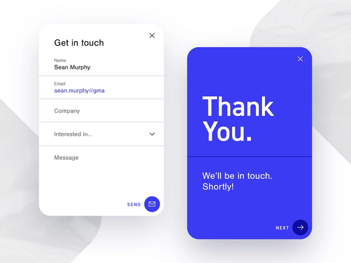
With a Help or Contact Us page, give your users a consolidated location to locate ways to contact customer service, whether it’s through an email address, phone number, form, or live chat. Many websites combine FAQs with Contact Us to provide answers to questions that have been asked often in the past (and also to save time).
12. Shipping Screen:
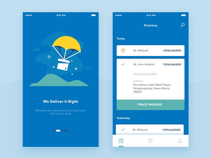
If your site is compliant, you should include an accessibility statement, which serves as a recognition and dedication to accessibility, informs customers about the company’s content’s accessibility, and shows clients that your business cards are about them.
13. Cart/Checkout Screen:
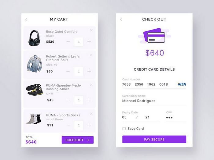
The shopping cart should keep track of everything the user has added and allow the user to make changes. It’s a good idea to display the projected shipping cost and the promo code field at this stage so that the user can get a decent idea of their final cost before proceeding too far through the checkout process (for shipping estimates to work, the user may have to input their zip code in advance).
14. Order Confirmation Screen:
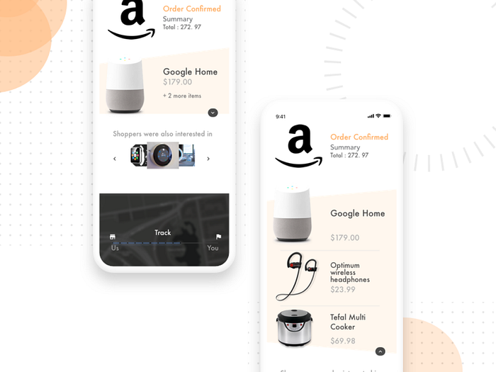
Once the buyer submits the order, thank them and confirm it. Displaying order data and how to alter it after submission is beneficial. During a guest checkout, prompt the user to register an account to save their information. Confirmation pages can display different messages beyond thanks. As the system processes the order, something may go wrong, and the site must return an error page instead of a confirmation to explain that an item sold out.
15. Profile Screen:
This page includes all the important account information, such as name, email, and password change. Users specific data are often included. Customers can access their Wishlist goods from their account. Most organizations encourage account sign-ups by requiring customers to have an account to store items to a wish-list. Customers may see their rewards balance, learn how to earn, and apply rewards to their order on their personal page.
In Conclusion:
There’s a lot of mobile applications available, and more screens are created for fresh needs that users points out.
Designers should get their creativity up and take on the challenge to follow up with new trends.
So remember that every app screen is equally important, to enable users enjoy the experience of an app.
I hope you enjoyed reading this, cuz I enjoyed putting this piece together for a bounce back. Cheers!!

