The basic elements of design are fundamental principles that form the foundation of visual composition. These elements are essential tools that graphic designers use to create visually appealing and well-balanced designs. By understanding and utilizing these elements effectively, designers can craft visuals that are cohesive, harmonious, and aesthetically pleasing.

Understanding the basic elements of design
- The basic elements of design are fundamental principles that help in creating visuals with cohesiveness and harmony.
- There are some basic elements of design that can improve design skills and finesse design sensibility.
Some introduction to some common elements that are widely recognized in the field of design:
Line
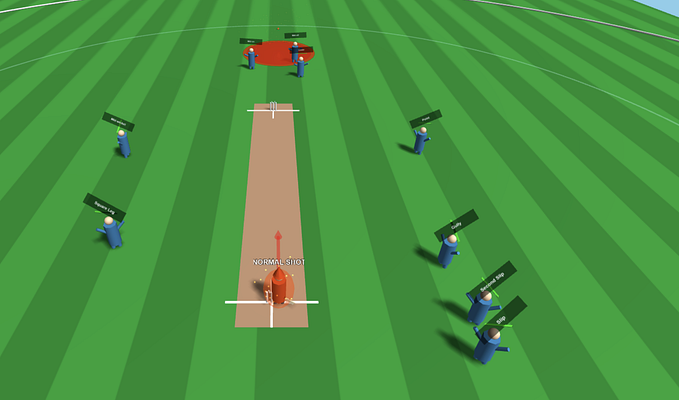
Lines are one of the most fundamental elements in design. They can be straight or curved, thick or thin, and can be used to guide the viewer’s eye and create visual flow. Lines can add structure, movement, and emphasis to a design.

Design elements include wavy lines and shapes
- Wavy lines: They add chaos and relaxation to grids.
- Straight lines: They indicate order and can be used to create a sense of structure.
- The direction of lines: They can cut through an image and add visual interest.
- Lines and grids: Lines can be seen as grids, providing a structure to the design.
- Shapes: They can be geometric (communicating structure and rigidity), organic (communicating naturalness and fluidity), or abstract (minimalist representations of reality).
Shapes
Shapes are two-dimensional and can be geometric, organic, or abstract. Geometric shapes, such as squares, circles, and triangles, communicate structure and rigidity. Organic shapes, like those found in nature, communicate naturalness and fluidity. Abstract shapes are simplified representations of objects or concepts


Understanding design concepts: Fluid, Abstract, and Form
- Fluid shapes: They give the notion of natural movement and depth.
- Abstract shapes: They are minimalist representations of reality.
- Form and positive space: Form and positive space are mutually dependent and can be used to add 3D qualities to designs, create tension, and engage users.
Color
Color is a powerful tool in design. It can evoke emotions, communicate messages, and create visual impact. Colors have various attributes, including hue (the purest form of a color), saturation (the intensity or purity of a color), and value (the darkness or lightness of a color). Understanding the psychology of color and how colors interact with each other is key to effective design.


Understanding Color in Design
- Color: Color can add emphasis and mood to a design.
- Hue: It is the purest form of a color.
- Saturation: It refers to the purity of color and can affect its intensity.
- Tint: It refers to a lighter version of a color.
- Tone: It refers to a more muted version of a color.
- Value: It refers to the darkness or lightness of a specific hue and is important for contrast and depth in design.
- Shade: It refers to a darker version of a color.
- RGB: It stands for Red, Green, and Blue and is commonly used in digital design.
- CMYK: It stands for Cyan, Magenta, Yellow, and Key (Black) and is commonly used for printed pieces.
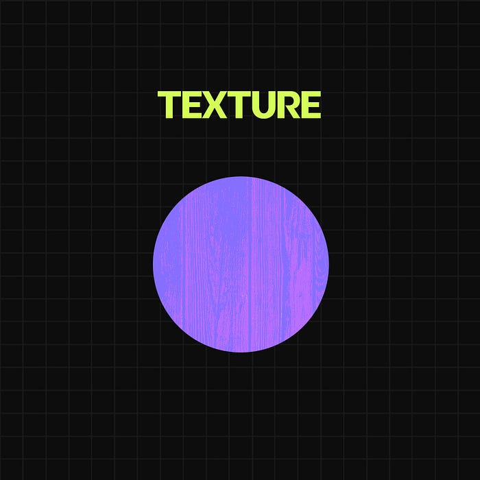
Texture
Texture refers to the tactile quality or visual appearance of a surface. It adds depth, visual interest, and a sense of realism or tactility to a design. Texture can be both visual, created through patterns or simulated surfaces, and physical, by using materials or finishes with different textures.
Textures can enhance the design
- Textures can be visual or physical, adding visual interest and depth to a design.
- Using textures can elevate design and make it more memorable.
Using tonal values and texture can add depth and movement to designs
- Contrasting tonal values: They can create movement and depth in a design.
- Texture: It adds a tactile appearance and can create a three-dimensional quality to designs.
Space
Space refers to the area within and around the design elements. It includes both positive space (occupied by the design elements) and negative space (the empty or white areas). The balance between positive and negative space is crucial for creating visual harmony, emphasizing important elements, and establishing a sense of organization.

Understanding positive and negative space in design
- Positive space: It refers to the occupied areas in an image, where the design elements are present.
- Negative space: It refers to unoccupied areas, creating empty or white spaces.
- Negative space can be used to create balance and organization in a design.
- In minimalist designs, negative space is particularly important to create a sense of airiness and simplicity.
- The relationship between elements and negative space can be compared to musical notes and silence.
In this we explored different design elements such as lines, shapes, color, texture, and space, and how they can be used to enhance design aesthetics.
Lines play a crucial role in creating structure, movement, and emphasis in a design, while shapes communicate different qualities based on whether they are geometric, organic, or abstract. Colors have the power to evoke emotions, communicate messages, and create visual impact, and understanding the attributes of color such as hue, saturation, and value is essential for effective design. Texture adds depth, visual interest, and a sense of realism or tactility to a design, and space, including positive and negative space, helps establish visual harmony and organization.
By understanding and utilizing these basic elements of design effectively, designers can create cohesive, harmonious, and aesthetically pleasing visuals.