Arc for iOS gets the Student Redesign it deserves… in 30 days

- 05/11/2024: Groq makes instant AI-generated answers technologically feasible for my proposed “Quick Results” feature.
- 01/28/2024: BCNY releases Arc Search, their AI-powered replacement for Arc for iOS, addressing several but not all suggestions from this article.
- 01/13/2024: I switch my default search engine from DuckDuckGo to Perplexity.
Foreword
As a heads-up before diving into my redesign, I want to set expectations. The first half of this article deals exclusively with UX research. If you only care about the UI, feel free to scroll ahead to Section 7.
My entire formal UI/UX education consists of two online UC San Diego courses. As a result, the overwhelming majority of my learnings in UI/UX design are from my own personal feedback loops, ever since I started sketching wireframes for a to-do list app at age 13. This essentially means I improved by continuously comparing my design output with that of respectable software products.
No one requested this redesign effort. I have no affiliation with any company or person mentioned by name in this article. I’ve not previously documented my thinking at every waypoint of the design process, so consider this article a spontaneous idea that can absolutely go either way. Enjoy!
Introduction
The web browser is the single most versatile portal for internet experiences. As a consequence, browser companies hold great power over people’s interfacing with the internet, where power is proverbially synonymous with great responsibility. Importantly, browser companies must understand exactly what power they hold in ensuring that users experience the web in perfect alignment with their individual needs.
However, web browsers from the past (Chrome and Safari included) are not very aware of specific user needs beyond the fundamental need of web browsing. Getting closer to first principles thinking, the fundamental need of web browsing is to find desired tools, sources, and pieces, which each happen to be embodied by ‘webpages’ on the internet.
Further, as an early Arc user, I really started wondering if the web browsing experience could do more to address the full spectrum of individual user needs.

So, I decided to use Arc as a springboard for my UI/UX design ideas. For those in the unknown, Arc is a new web browser released in April 2022 that “doesn’t just meet your needs [but] anticipates them”, as accurately expressed on the browser’s landing page. Arc is already a user-centric web browser, so building upon it should amount to one step further on the path to addressing all addressable user needs.
I gave myself a 30-day deadline for this project (whatever it would become) so that I wouldn’t be distracted from my Computer Science and Economics studies for too many days on my return to the University of Chicago.

Arc currently has its app on two platforms: Mac and iOS. The mobile app is disappointingly limited, created as a mere ‘companion’ app that shadows the sidebar of Arc for Mac.
For this reason, I will be redesigning Arc for iOS.
Above all, my aim is to address as many smartphone user needs as possible. Naturally, this will result in greater feature parity with its Mac counterpart while also bringing some new ideas to the table.
I devised a plan for designing a more fully-featured, user-centric Arc for iOS:
- Consider web browsing as a step-by-step process
- Extract user needs from this process
- Decide how to represent users, spanning and grouping these needs
- Accordingly, building up an initial user hypothesis
- Conduct interviews to evaluate my user representations and gain new insight
- Finalize my web-browsing user hypothesis, with corrections and additions to my original user hypothesis
- Look at the Arc for iOS design language as a strong reference point for my redesign
- Execute redesign
1. Web Browsing as a Step-by-Step Process
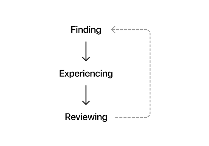
Let’s step back and think about the journey of browsing the web:
i. Finding
In the first step, the user must somehow find their way to the specific webpage they land on. This is either through:
- Online search via search engine of choice (Google, DuckDuckGo, Ecosia)
- Known people sharing an online destination (DMs, group chats, email, verbal communication)
- Link from a webpage (on the same or different domain)
- Physical source (QR code, TV, radio, flyer)
- Saved page (favorited, reading list)
ii. Experiencing
As soon as the user decides to pursue a webpage, their webpage experience begins. This is the second and most notable step. Page loading time is an often overlooked but critical component of the webpage experience; just 4 seconds longer page loading can raise bounce probability (users visiting only one page on a site) by 90%.
Once loaded, the page can evoke the visual or audial senses, either separately or in combination. Some example use cases are: reading, watching, admiring, listening, playing, communicating, writing, and learning.
iii. Reviewing
Finally, the often-overlooked step: reviewing. Even if a blink-of-the-eye decision, reviewing is the key moment when the user decides if the page they just experienced is worthy of holding on to for themselves, or sharing with someone, or both.
2. Extracting User Needs
From the web browsing process, we can uncover the needs of web browser users.
The Most Notable Step: Experiencing
If we consult the webpage use cases listed under the experiencing step, we find that people can achieve a massively broad set of tasks by browsing the web:
- combine watching, admiring, and playing to get entertainment;
- combine reading and communicating to get networking;
- combine reading with writing to get documenting.
These experience-based tasks are the centerpiece of web browsing needs. But let’s not ignore the other two steps of web browsing.
Entering the Experience: Finding
The user crucially needs to find a webpage to experience it. The longer it takes the user to find what they’re looking for, the more friction there is in their web browsing session. Additionally, if the user doesn’t feel safe when searching (for example, due to privacy concerns), they will also be hindered.
Resparking the Experience: Reviewing
Reviewing always feeds into finding, whether the user is landing on the page for a second time or a friend is newly discovering a page the user just shared with them.
In case the user:
- thinks or knows a webpage may be useful later → they’ll want to save it for later consideration;
- knows they’ll come back to a webpage → they’ll want to mark it for reuse;
- wants to share a webpage → they’ll want to share the page URL with the right people.
These user scenarios present reviewing as a simple triaging problem.
3. Deciding User Representations
At this stage, we’ve gathered a broad-based mix of user needs. However, UX designers like to deal with problems linked to specific people rather than problems floating in isolation.
Therefore, I set out to group all user needs with an exhaustive user hypothesis. We have several user representation tools at our disposal:
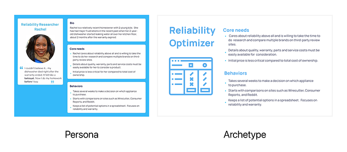
a) User Personas. Most commonly, UX designers opt for user personas, which are fictional users with varying preferences, personalities, circumstances, and needs — accompanied by a fictional name and avatar to help remember all associated characteristics and needs.
b) Archetypes. Like personas but without the fictional name and avatar.
c) User Traits. The individual psychographic components of archetypes.
To circumvent the negative halo effect, which often arises from using personas, I quickly dropped personas as a viable user representation.
So, let’s compare the two remaining options:
Archetypes
- Simplicity. Simplify user understanding and make it easier to communicate across teams.
- Potential Exclusion. Some users may not neatly fit into any single archetype, excluding their user representation.
User Traits
- Complexity. Managing user traits can be more complex, especially if you have a wide range of traits to consider.
- Inclusivity. This approach is more inclusive, as it accommodates users who don’t neatly fit into archetypes — acknowledging that individuals are complex and can exhibit multiple traits.
As of 2020, the internet reached 4.7bn people worldwide, and targets the whole world. So, in the interest of user inclusivity, I’m opting to represent users by their traits.
Then, to address the issue of unnecessary complexity and why I’m not following the Pareto principle (also known as the 80/20 rule):
I foresee that a more nuanced user representation behind the scenes will translate to more complete web browsing UX. Today’s major browsers are each the result of 20% effort. But I want more than 80% results from this redesign. After all, UX is about the user first and foremost.
4. Hypothesizing the User Traits
Based on the user needs I extracted from the web browsing process, I came up with the following six traits to represent users:
Loyalist
Looking to consult known internet resources.
Explorer
Looking to discover new things and learn from internet resources.
Worker
Looking to work individually or collaboratively using internet-first resources.
Spectator
Looking to be entertained with personally relevant media.
Documenter
Looking to capture and annotate internet resources for later use.
Networker
Looking to connect with others online — when in-person connecting is not viable, fast, or relevant enough.
As is the nature of user traits, I expect each user to have some combination of these traits with unique weightings. For example, I would be represented by the following 6-dimensional radar chart:

5. Conducting the Interviews
At this stage, all I had was a user hypothesis. To evaluate my hypothesis, I decided to pursue qualitative research. Therefore, I conducted three in-depth interviews. I will refer to my interviewees as [A], [B], and [C]. Here are my findings:
Validation: Each user is a different weighted combination of all six traits
- [A] and [B] are both self-proclaimed loyalists.
- [A] didn’t associate himself with the explorer, documenter, or networker traits. But as a loyalist, he prioritizes StackOverflow search results for programming questions.
- As predominantly a loyalist, though also a worker-documenter-networker, [B] opens most webpages from her bookmarks. However, she uses only about 5% of bookmarks because she’s too lazy to clean out the unused ones.
- [C] is an explorer-spectator who falls down Wikipedia link rabbit holes. As a loyalist, he prioritizes Google’s featured snippets and Investopedia results for finance-related topics.
Correction: User needs vary with mental state, too
What I got wrong in my original user hypothesis was to assume that each user’s needs depend solely on their unique combination of traits (loyalist, explorer, worker, spectator, documenter, networker). During my interviews, I found that the user’s mindset determines their scope of web browsing tasks.
Mental state is the missing modifier for user traits, as adjectives are to nouns.
For example, directly after running a sprint triathlon, [A] would be heavily fatigued. In this case, [A] tends towards mentally straightforward tasks, such as watching entertainment-focused YouTube videos (spectator & loyalist traits).
Alternatively, directly after my morning shower, I might feel efficient. In this case, I might read through tech-related posts on HackerNews (explorer & loyalist traits) before sharing interesting finds with close friends (explorer & networker traits).
6. Finalizing the User Hypothesis
Let’s take on my lessons from the interviews. If all goes to plan, we’ll ultimately settle on a bulletproof user hypothesis.
The user traits were good as they were, so we’ll focus on the addition of the user’s mental state.
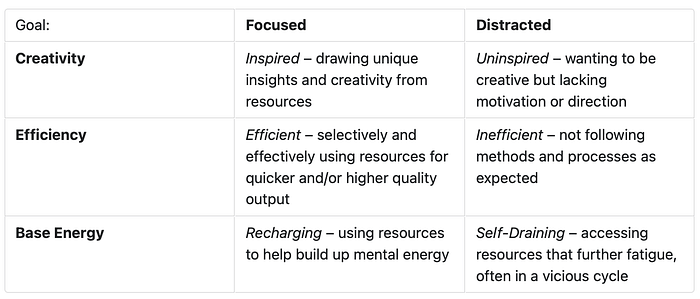
Mental State Matrix
I realized that users reach for webpages that fulfill one of three goals: Creativity, Efficiency, and Base Energy. These subconsciously chosen mental goals reflect the user’s energy level at a given point in time, each with a decreasing amount of energy. After my morning shower, my goal could be Efficiency or — if I’m feeling particularly energized — Creativity. But after that 5k run, my goal would most likely be Base Energy, reflective of my low mental energy.
Then, I remembered that no goal is attainable without focus.
To consider if the user is on track to achieving their mental goal, we introduce engagement as a second dimension in the mental state matrix. Engagement simply determines whether the user is focused or distracted.
For example, if a user wishes to successfully reach Base Energy, they will do so by sticking to entertainment and other web resources that help them recharge. However, if distracted, the user might end up with entertainment that leaves them more drained than they started.
Here is the completed mental state matrix:
User Needs by Trait & Focused State
Putting the user traits and focused states together, we uncover every fundamental web browsing need:
Loyalist
- Inspired — Seeking familiar sources to draw inspiration and unique insights.
- Efficient — Efficiently utilizing trusted tools and sources to achieve a desired output.
- Recharging — Revisiting known resources to rejuvenate mental energy and regain focus.
Explorer
- Inspired — Exploring new sources and pieces to spark creativity and unique insights.
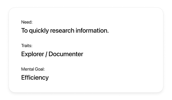
- Efficient — Actively seeking innovative tools, sources, and pieces efficiently or to enhance efficiency in achieving some objective.
- Recharging — Exploring novel pieces, such as unseen videos, as a mental break.
Producer
- Inspired — Using various tools, sources, and pieces to approach tasks creatively and uncover new angles.
- Efficient — Effectively utilizing a diverse set of web resources to optimize work efficiency.
- Recharging — Revisiting web resources to better prepare for future work.
Spectator
- Inspired — Seeking diverse content for creative inspiration and unique perspectives.
- Efficient — Efficiently engaging with entertaining content related to work or education.
- Recharging — Consuming entertaining content as a mental break.
Documenter
- Inspired — Saving and annotating web resources with the potential for serendipitous connections.
- Efficient — Efficiently documenting web resources for future assistance in work-related tasks.
- Recharging — Reviewing past web captures and annotations as a mental break.
Networker
- Inspired — Socially engaging with web resources to foster connections and discover unique insights.
- Efficient — Actively using resources to efficiently connect with others and achieve desired outcomes.
- Recharging — Lightheartedly sharing web experiences with close friends and family.
This updated hypothesis provides a comprehensive understanding of how user needs vary across different traits and focused mental states.
With the user hypothesis completed, I am now ready to introduce the UI side of this redesign.
Let’s take a quick look at the current Arc for iOS app.
7. Taking Design Cues from the Current App
One of my aims with this redesign is to give the Browser Company of New York — the ambitious team behind Arc — a realistic set of suggestions for their mobile app. This demands two requirements:
i. the redesign is technically feasible;
ii. the redesign is a natural progression of Arc’s vision for a mobile web browser.
Since I was 13 years old, I’ve been designing and developing mobile applications. As a result, I have firsthand experience with what can and can’t be done in front-end mobile development. This makes me confident that I can at least ensure requirement (i).
However, since I’ve always designed apps from scratch, I am less confident with requirement (ii). Nevertheless, I’ll try my best to maintain Arc’s existing design language throughout the redesign.

8. Showcasing my Redesign
At this point, I’ve taken a good look at the existing mobile app. We can finally dive into the most hotly anticipated part of any redesign — the completed UI.
For each new feature, I am thinking about the UX first. Alignment with my user hypothesis requires an overview of the combined need, traits, mental goal of the user. Therefore, you’ll see a unique user overview card along with every new feature I introduce.
Let’s dive into the new Arc for iOS interface, one feature at a time:
Quick Results
More than often, people go to the web for quick answers to simple queries. For instance, a quick unit conversion (“4 inches to cm”) or a brief definition for a well-known concept (“what is ui/ux”).
Here, I was inspired by interviewee [C], an explorer who heavily relies on Google’s featured snippets above links to webpages. I thought it would be even more efficient to serve quick results before loading every search result… so welcome Quick Results to Arc.

While a traditional web browser is assumed to rely on a good internet connection for fast results, Arc for iOS can leverage a custom offline search engine and introduce rapid results for quick queries — eliminating the need to wait on Google or DuckDuckGo (or your search engine of choice).

The answer to “what is ui/ux” above was an actual result of some basic ChatGPT prompting:
I will give you a search query for a web browser. You are a summarizer. Your job is to summarize the answer or answers to any search query into a single sentence, between 10 and 15 words. You output nothing other than this summary. Your tone is confident, insightful, and intelligent, but not highbrow. Your job is to help the web browsing user to find a quick answer to any query. Assume the user has the knowledge of a fifth-grade student. Your search query is the following: “what is ui/ux”
Unfortunately, LLMs have no understanding of string length in their current state. Hence, the example output is 19 words long, which almost certainly falls outside the “between 10 and 15 words” prompted range.
Choosing Search Engine of Choice
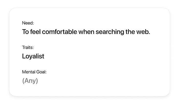
On the note of preferred search engines: the redesigned Arc for iOS includes a choice to specify a search engine other than Google. Most users are not easily persuaded to switch search engines, and some will not search without peace of mind (whether privacy with DuckDuckGo or environmental consciousness with Ecosia).
I’ve been using DuckDuckGo for some years now, so that’s now reflected in my search suggestions.

Waitlisting

Picture this: you’re lucky enough to talk to a professional in your field of interest, and they bring up an unfamiliar concept or tool mid-conversation. You’re certain you won’t remember the concept or tool name once your chat ends. So, what do you do?
You might apologize, put the conversation on pause, and then reach for your primary note-taking device: your phone. Up until now, you’re fine. That’s before you encounter the all-familiar dichotomy:
- Will you open one of several notes apps, create a new empty note (or navigate to a dedicated scratchpad note), append the concept or tool name to the note, and turn off your phone — only to hope to later rediscover that note, copy the name, and paste it into your web browser later?
- Or, will you open your web browser, create a new tab, enter the concept or tool name, submit the search query, turn off your phone, and hope to later rediscover the tab?
All the time you’re fumbling, you feel increasingly rude towards the professional for wasting their time.
That was me two weeks ago. I knew I had to do something about it in the redesign.

Introducing the Waitlist. You can finally save search queries for later, natively in your web browser.
Your search query is automatically added to the waitlist in your current space. If you believe that placing it in a different space or folder within any space would make it easier for you to rediscover the waitlisted query, you can choose a new waitlist destination from the dropdown menu in the temporary popup banner.

When designing the popup banner, I took design cues from the banner displayed when pinning a tab in the current Arc for iOS, including the 2500ms display duration — with two improvements.
- The filled icon already explains the banner, so I avoided adding an unnecessary label like “Added to Waitlist”.
- In the current app, you cannot undo pinning a tab. This is frustrating, to say the least, so I added an undo button.

Naturally, you can also waitlist webpages.
Saving webpages for later is especially useful when you’re focused on one task and don’t want to be distracted by another task. And as we know, humans cannot multitask well. Considering our mental state matrix — distraction turns a user from recharging to self-draining, efficient to inefficient, and inspired to uninspired.

To ensure you can easily rediscover all your waitlisted searches, I display the Waitlist in reverse chronological order in the empty state of the search screen. Once you open a waitlisted search or webpage, it will be automatically removed from the waitlist.
By the way, I’ve also brought Favorites over from Arc for Mac. They’re conveniently accessible with every new search.
Journeys

One of the star features of Arc is auto-closing. After a specified duration (by default, 12 hrs), unused tabs are archived. This is already an explorer’s dream: they can navigate all corners of the web while effortlessly free from the clutter of past tabs.
However, for those who also associate with the documenter trait, there is one piece missing: Journeys.
Journeys help users relive navigating the web given an initial search query.
The library found on Arc for Mac is an obvious home for rediscovering Journeys. However, since Arc for iOS currently is limited to just a “Recents” tab, I first had to introduce the library to the app.

My vision for the Recents list includes more than just webpages, namely: journeys, downloads, notes, and captures.

Open a Journey, and you’ll be greeted with a chronological list of web browsing events, with the initial search at the top. The most common event is visiting a different webpage, but can also include downloads and captures, as illustrated in the example above.
This feature was inspired by interviewee [B], a documenter who describes themselves as “lazy” when it comes to organizing her web experience.
Staying Focused when Watching Videos

This feature is admittedly for me. I don’t use social media (apart from LinkedIn), and I’ve intentionally not installed the native YouTube app on my phone. What occasionally happens, though, is that I scroll mindlessly through YouTube Shorts in my mobile web browser.
I often tell myself that this is due to dark UX patterns rather than my lack of motivation. So, here’s my twofold attempt to prove this:
1. Boosts
Arc for Mac recently got a valuable addition: Boosts.
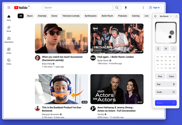
When activated, a Boost allows the user to tweak the visuals of any webpage. That includes changing the page’s color and typography, as well as removing unwanted elements via ‘zapping’. For fellow frontend developers, Boosts is functionally Inspect Element with persistent code modifications.
Unfortunately, Boosts have not yet found their way into Arc for iOS. If you look at the interface for editing a Boost above, you might understand why — there are a lot of options, and you’ll want to see changes in real-time.
Therefore, I’m assuming that it’s most effective to edit Boosts exclusively on the big screen while opening up usage access to the mobile app.
I’m mentioning Boosts because, when configured properly, they can dampen the visual noise of online distractions.

Let’s create the following scenario: you open YouTube in your mobile browser and find an interesting talk. Your mental goal is Base Energy. You start watching the talk, and because you’re still deciding if it’s worth an hour of your time, you haven’t opened the video in full-screen mode yet.

Welcome Boosts over from Arc for Mac. Specifically, a custom “Dimmed YouTube” Boost to dim and greyscale all thumbnails that could distract me. This helps the user successfully recharge by focusing on Base Energy rather than self-drain via the distraction of potentially more interesting video thumbnails.
I thought it would be useful to have visual feedback when toggling Boosts, so I put a mini-preview in the newly added Control Panel. Naturally, I made this mini-preview the button to return to the webpage in its full-size glory. Considering ergonomics, I ensured that the tap target of the mini-preview included the tap target of the icon button to open the Control Panel.

2. Distraction Safeguards
When Boosts aren’t enough, I might still end up distracted on YouTube. As mentioned earlier, YouTube Shorts is my biggest issue, enticing me to scroll vertically through a virtually endless feed of short-form videos.
Introducing Distraction Safeguards in Arc for iOS. If Arc detects both video and a high-frequency repeated vertical swipe gesture, it will know that the media experience has been engineered to be addictive. Since Arc “anticipates” your web browsing needs, it will gently nudge you out of distracting situations.

Distraction Safeguards, like all other Control Panel options, are toggled uniquely for each individual Space — and it’s turned off by default. In my case, I might only enable Distraction Safeguards for the Private Work and UChicago Spaces, since they reflect contexts where I definitely don’t want to be distracted.
On the topic of productivity: I added another browser-wide toggle in the Control Panel, namely, to auto-close cookie popups with your preferred level of privacy.
Closing Thoughts
There’s a lot more I wanted to cover, such as the function of the pencil icon button to create new tabs, pin webpages (loyalist trait), share webpages (networker trait), and create page-specific notes (documenter trait). It appears that the networker trait and mental goal of creativity were neglected in this redesign. For an explorer discovering inspiration in the creative state, I would have wanted to design an image context menu that supports capturing the image to your Arc library.
In the interest of time, however, this is where I’ll draw the line.
Overall, I’m very happy with the design outcome. My whole process took just 25 days in the end, including this article write-up. As a result, I’ve successfully achieved the 30-day challenge I set for myself in the beginning.
While I intended this project to be a snapshot of my current UI/UX design abilities, I definitely advanced my animation and writing skills along the way. Tool-wise, I used Craft for drafting this article, Figma for animated UI prototypes, and Artboard Studio for showcasing static and animated mockups.
Looking back, I can now confidently say that designing a UI with a strong user hypothesis is significantly faster than starting with mere feature ideas. The former approach is user-centric, while the latter is unfavorably option-centric. There will always be unlimited choices for which features to build into software, but only a small subset will ever solve the user’s actual needs. So, it’s useful to know exactly what those needs are first.
If this redesign garners any attention, especially from UI/UX professionals, I would be massively grateful for any and all feedback. Further, in the unlikely case the Browser Company of New York discovers this article, I hope they can gain something from my ideas about Arc.
Now that this project is officially done, I can look ahead to my first sophomore quarter at the University of Chicago with some exciting part-time startup work on the side. I can’t wait to see what opportunities lie ahead, whether it’s app development, marketing strategy, more UI/UX design, or something I’ve not yet considered.
You can download Arc’s current app from here.

