Applying UX methods to uncover and depict the environmental impact of digital products
As part of Intel’s Carbon Reduction and Green Software team, we’re interested in the environmental footprint of technology and how to shrink it. Our team found that many software companies aren’t transparent about the environmental impact of their apps.

TL;DR:
- As our digital footprint expands at a rapid pace, it begs the question — what’s the ecological toll of this growth?
- Almost all software development corporations fail to disclose the environmental implications of their applications.
- It’s difficult to calculate software impacts so an exploration was made to gauge the environmental influence of widely used digital applications.
- An inventive “scorecard” system was conceived to provide a visual representation of these environmental impacts
- They were utilized within a workshop for participants to visualize the impacts of the day-to-day use of these products and services.
- This is an example of factoring environmental concerns into our UX methodologies, advocating for a push towards an eco-friendlier digital future.
OpenVault’s broadband report shows us that our digital lives are getting bigger each day. On average, households are consuming 586.7 GB of broadband data per month, with about 18.7% of broadband subscribers using more than 1 TB of data monthly. That’s a jump of 9.4% from last year.

With stats like these, it’s clear our reliance on digital products isn’t slowing down. But this growth makes me wonder…
What are the environmental implications of these digital tools and services that we’ve grown so accustomed to in our day-to-day lives?
In the autumn of last year, that thought-provoking question found its way into my conversations at work. Our friends in the Client Compute Group had produced some journey maps as part of their research into the day-in-life of users. So, we decided to delve into the environmental commitments of some of the most widely used digital products globally. We were curious to know whether these companies were embedding Environmental, Social, and Governance (ESG) goals, or Corporate Social Responsibility (CSR) objectives within their corporate strategies. And if they were, what were these objectives, and how effectively were they being met?
We began our research by examining the 157 applications that had been featured in the journey maps and our findings, were less encouraging than we’d hoped.
Surprisingly, only about 30% of these companies had formally documented CSRs or ESG goals, and a significant portion of these were focused on reducing the company’s own carbon footprint, while completely disregarding the environmental impact of their software.


The lack of attention towards the latter was rather disheartening, especially considering the constant discussions around sustainability in the manufacturing sector. The glaring difference raised an important question:
Shouldn’t developers also be responsible for the environmental impact of their applications? And more importantly, how can we measure this impact in a digital product?
Determining the environmental impacts of tangible goods, such as hardware, is often a matter of consulting manufacturers’ reports or product information. However, when it comes to intangible goods, specifically digital products like software, the task becomes significantly more challenging.

It quickly became evident that there were no readily available research data or existing tools that could fully capture the scope of true utilization by including, hosting and internet consumption, let alone the additional effects on the hardware running it. This comprehensive insight into the environmental consequences of our digital consumption was noticeably absent.
As a UX Designer, my mind automatically started thinking about how we could create a visual way to capture and understand this information, especially since there weren’t any existing tools or formulas to help us out. I wanted a system where we could visually represent the potential environmental impact of these digital products. Thus, I embarked on an experiment to create a “board” encompassing various system-impacting attributes.
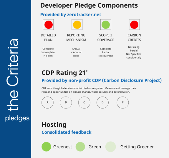
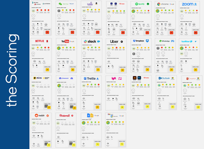
The first step was to select the top most popular 25 applications from the journey maps and include the information about the sustainability goals each company had. I used a combination of zerotracker.net and the non-profit Carbon Disclosure Project, CDP, data to show whether companies had submitted reports and how they were trending to their goals. Then I looked at what infrastructures were used for the hosting of the software and their commitments.
After capturing the companies and their infrastructures’ sustainability goals it was time to turn to their applications for an assessment of their features. I began to evaluate various attributes of each one, such as streaming capabilities, video support, constant network connection requirements, hardware requirements, scrolling, plugin or extension compatibility, rendering, and more.
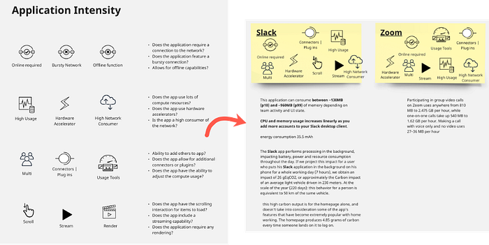
Once the evaluation was completed, a scoring system was developed to weigh these attributes and rank the applications accordingly. This resulted in 25 individual cards, each representing a popular application, ordered from high to low intensity. But interesting as it was, this alone did not paint a full picture of the real-world impact of these applications.
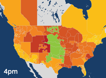
To delve deeper, I returned to the origin of our project: the journey maps from the Client Compute Group. By plotting the 25 cards onto one of these maps, I was able to visualize what applications were being used during the day and their respective durations. This, in turn, allowed us to draw an “energy line”, revealing the peaks and valleys of energy usage throughout the day.
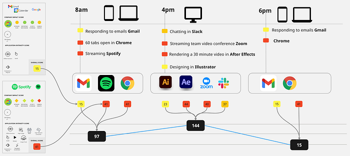
One key observation from this exercise was the timing of high-impact activities, such as video streaming during peak grid-intensity times, which showed just how much of a strain these activities can place on our energy resources.
Armed with these insights, I reached back out to my colleague and we decided to conduct a workshop between our two teams, using these cards and journey maps as tools to understand better the day-to-day impacts of these digital products.
Our workshop used a Figma board to visually organize the cards and journey maps, facilitating discussions around the applications’ environmental impact. Our peers then calculated the potential energy usage, traced the energy lines, and shared their insights from this exercise.
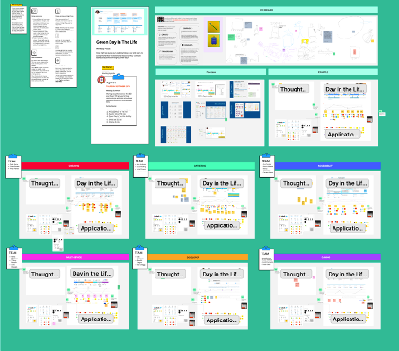
Several insightful observations emerged from the discussion:
- Impact of the number of browser tabs open
- Types of devices being used
- Energy implications of leaving devices on
- Use of multiple devices simultaneously
This workshop was a successful experiment in visualizing the environmental impact of digital products. The incorporation of these insights into our everyday UX assets could drastically influence the future of our digital products.
By consciously integrating environmental considerations into our designs and products, we may begin to tread the path toward a more sustainable digital future.