Apple’s ‘Dynamic Island’ is a master class in product problem solving & embracing constraints.

For years every Apple phone has had a “notch” at the top of the screen. It was there by necessity; it housed an array of cameras and sensors that allowed a variety of functionality. It was there because Apple’s goal has always been to make a phone that’s “just a screen.” The notch allowed the removal of the “chin” and “forehead” on the phone, which in turn made removing a physical home button possible.
The feature matrix of so-called “bar” phones was, by 2017 or so, fairly standardized. Big screen, front camera, side buttons, speakers on the edges. For a few years manufacturers played around with the formula. Some Android phones shipped with “holepunch” displays — screens with small peep holes cut into them just large enough for a camera. Camera quality was questionable, though, and every manufacturer had to dream up their own way to trick Android into addressing this odd little hole in the user interface. Everyone assumed Apple would try to change the form of the notch, or maybe get rid of it. What they finally did was likely beyond expectations.
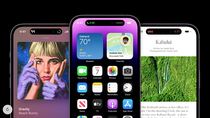
What Apple calls the ‘Dynamic Island’ is a pill-shaped cutout in the top of the display. Like the notch before it, it houses sensors and a camera. But unlike the notch, which is present but mostly just ignored by the iOS user interface, the Dynamic Island is an active part of how the phone works.

As you use the phone, the cutout changes contextually almost like a second “screen within a screen.” Through clever masking its physical dimensions seem to change; notifications or status indicators are added to its sides. In some cases, smaller secondary circles can appear beside it, acting almost like a tiny dock.

In the above image a user is browsing a website, listening to a track in Apple Music, and operating a timer. The Dynamic Island is cleverly flanked by black pixels, changing what would be unused screen space into a software/hardware hybrid with real utility.
Embracing constraints, or turning constraints into features
Design works best when designers are constrained. In the absence of a framework, a system, or a method, it’s easy to get lost in the chasm between “the work” and a “system for doing the work.” Constraints can actually be freeing. They allow a problem solver to work directly on a solution rather than wrangling a process.
One of the more famous creative constraints is the haiku, a Japanese form of poetry that limits the writer to a set number of syllables and only three lines.
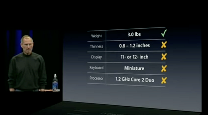
It has long been Apple’s problem solving style to target a handful of constraints in a given product category and work on them to the exclusion of all others. Take the MacBook Air for example. The category of “ultra book” existed for several years before the Air, but Apple’s hyper-focus on just a couple of constraints allowed them to essentially recreate the category and then dominate it from a market standpoint.

This way of approaching product design is incredibly clever for a number of reasons. In some ways, it’s almost a rejection of the entire premise of traditional product design. The slow, methodical study of existing products in a marketplace allows a second mover advantage to anyone willing to slow down and do the work. Apple did this over and over in its golden age, identifying products consumers had “settled” for and essentially improving them to the point of reinvention. (Not me over here noticing the connection between well-known Nipponophile Steve Jobs and a philosophy of product design that is basically industrial design haiku.)
But this time the pressure was internal. This was about a form that Apple itself pioneered. They would look at their own prior work for inspiration, racing only against themselves. These are the terms of the design exercise here:
- We’re never going back to phones with physical buttons on the front. We’re working towards zero ornamentation, minimal to non-existent bezels, etc.
- The selfie isn’t going away. People want front facing cameras. FaceTime demands one, also, as does Face ID. That sensor and camera array are critical to the product in more ways than one.
- Punchout displays are a big compromise. They compromise by trying to put a disruptive blank spot into a phone’s display where you hope the user will eventually just forget about it, but it’s unlikely they will. They compromise in image quality, because they have a limited sensor size — or because manufacturers lack Apple’s sophistication in miniaturization, SOC design, etc.
The answer to all these problems is obviously to lean in deeply to the constraint of this area within the screen. Apple’s approach is what takes a simple embrace of constraints and turns it into a full-on suite of OS-wide functionality, a new visual language for animations and information display, and even a developer framework that allows other apps to take advantage of this new interface.
Embracing constraint in your own work, or the “creative blacklist”
As a digital designer, you need to be prepared to seek out limitations. This is the single best way I know to consistently produce excellent work. As a young designer, this wasn’t always apparent to me; my client hating purple was just a lame stumbling block in my path, not a source of inspiration. But I grew to fear the clients who said “I trust you to just do whatever you like” far more than the ones who opened with “I hate green, and I hate serif fonts.” The former want you to create constraints for them; they want to react to all of your work by telling you what they don’t like.
Now, decades in, I talk first about what clients hate or what teams think they can’t deliver due to constraint x or y. This lets you create a sort of blacklist of approaches, designs, and attributes that are off the table (at least for now.) From that blacklist emerges all the avenues that you can and should pursue. That’s where some really good stuff is hiding, and you can really only access it when you’ve built yourself a set of constraints to work in. Without it design becomes an exercise in all trees and no forest; you’re forced to move from notion to notion without any real idea if it will affect the whole. And that’s because you’re not constrained. Your focus is just too wide.
The creative “blacklist” for the Dynamic Island — we’re keeping the camera array where it is, holepunch displays need a reinvention — allowed Apple’s designers to do their very best work instead of chipping away rock in mines with no gold in them.
How do you test this kind of design? Should you?
As a digital product designer, I’ve gotten accustomed to testing my work with real people. And I’m not the only one. The Dynamic Island is a good opportunity to call out what I think is an uncomfortable truth about product design: often really good design is about delivering things no one saw coming.
I doubt very seriously that, if asked, iPhone owners would have been able to articulate this feature as something they wanted, let alone something that could be made or that would even be focused on by a trillion-dollar company.
Without a massive digression into why all digital design is very similar (and if that’s bad or good), I think it’s safe to say that some of the reason is designing for consensus, or designing to the market. While it’s possible to get something from those processes that is good, it isn’t likely to generate breakout work. The problem is that, frankly, it can be scary if you’re used to the safety net of user feedback. But perhaps scarier still is launching a feature as big as the Dynamic Island and having the entire buying public act as your test subjects.
The secretive Apple of the early 2000’s had something the current one doesn’t, and that’s the ability to truly shock consumers with their products. Leaks happen now with startling regularity, and Mac punditry is a cottage industry. Websites are filled with 3D renderings and CAD drawings of anything Apple has in the pipeline. Surprises are hard to pull off. With the launch of the iPhone 14 Pro everyone who cared already knew what the new phone would look like. By embracing constraints, Apple was still able to deliver surprise and delight. In a very crowded space, the same approach can work for any designer wanting to pull ahead of the pack.

