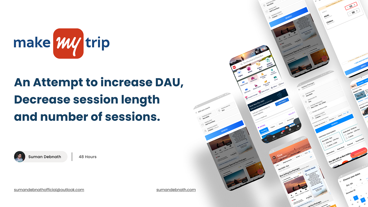
How Might We Improve MakeMyTrip’s DAUs, decrease session length and the Number of Sessions — Case Study
A quick evaluative project finished in hackathon mode over the course of two sleepless nights.
So, where are you planning your next travel destination?
Isn’t it a hassle to plan every single aspect of your trip, starting from transfers, hotels, flights, and activities? This is where MakeMyTrip’s (Technology @MakeMyTrip) “Holiday Package” comes into play.
Table of contents (clickable):
📍Click on the part you want to view📍
Understanding the problem statement
Comparing the current flow and Redesigned Solution
Evaluating the existing flow and identifying problems
Conducting research and validating the hypothesis
Prioritising and Ideating solutions
Formulating How Might We (HMW) questions
Overview:
Hello, I am Suman Debnath, and this is my 48 Hours Hackathon where I worked on MakeMyTrip’s “Holiday Package” flow to improve their DAUs and decrease session length and the number of sessions to make the user flow better and seamless.
▶️ Click here for Final UI and Changes ✅
Timeline/Roles and Responsibilities:
Our team, named “7 Wonders”, consisted of seven members, and we were tasked to pick a problem statement from the given list and improve the metrics of a certain company by evaluating their current flow with a certain user base.
Our team of 7 members are:
- Akhvit
- Akshith
- Beena
- Diksha
- Jaanvi
- Sneha
- Suman (UX Designer & Team lead)
And this was the timeline that we followed for our project.
My primary role was as a “UX Designer & Team Lead”, but I gave my 100% and played a crucial role in other phases of our project. These are some of the tasks to which I contributed:
- Uncovered micro and macro flow for the identified problem area, which helped our team narrow our focus on a certain flow to enhance.
- Conducted heuristic and intuition-based evaluations for every screen in the flow.
- Hypothesized the solutions based on assumptions.
- Conducted the competitor analysis as part of the secondary research.
- Using information from secondary research, we mapped out the ideas that were validated and not validated.
- Formulated HMWs and Ideated based on HMW statements.
- Built wireframes based on the solutions validated.
- Built UI screens and set up base components.
- Contributed to prototype and final UI.
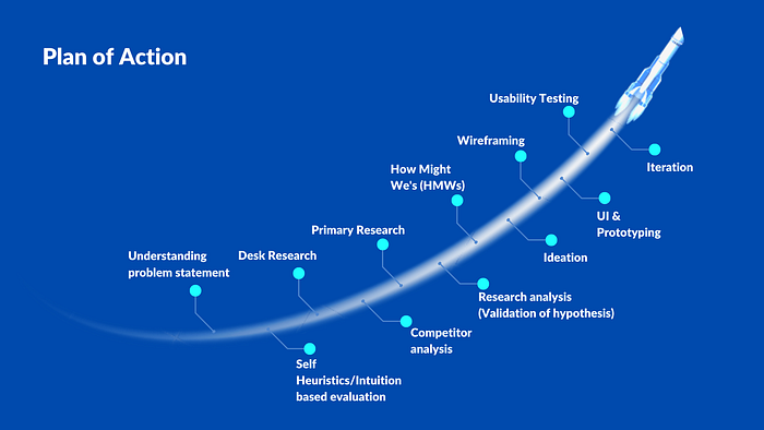
This was our plan of action for the project:
🚩 Understanding the problem statement:
Coming to our problem statement, we were given a total of 12 problem statements with different apps and we chose MakeMyTrip and formulated our problem statement:
☞ Evaluate the holiday packages flow of MakeMyTrip, which targets the booking of holiday packages and redesigns the experience to make the product design better, which will lead to an increase in DAU and decreasing session length and number of sessions.
So you might ask,
❓“Why did you choose MMT?”
Since it was a group project, a member of our team named “7 Wonders”
- We had access to 5-star hotels where we could find people who are frequently booking holiday packages which was an unfair advantage for us.
- Secondly, having access to newly married couples and solo travellers who can be potential users for holiday package flow was an added benefit for us.
- Finally, the Christmas holiday is just around the corner; therefore, we had the opportunity to test new customers who might book holiday packages which can increase MMT’s DAU (Daily Active User).
Based on the understanding of the problem statement these are some of the key findings.
❓What could be improved?
- Increase the conversion rate by increasing DAUs, and decrease session length and the number of sessions.
- Finding opportunities to bring in new users who are looking for holiday packages.
- Modifying the “Holiday Package” flow so that users are able to book holiday packages without any hassle easily.
❓Who could be our target users?
Based on our experiences of using the MMT app, we assumed that holiday packages would generally be used by couples going for honeymoon or Family group holidays which makes the entire booking hassle-free.
Based on our assumptions, we moved forward with the case study.
🚩 Comparing the current flow and the redesigned solution:
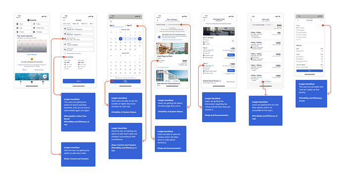
So there are a total of five sections that are present in the “Holiday Package” flow which are the Search Section, Date selection section, Room and guest adding a section, package section, and finally, Payment section.
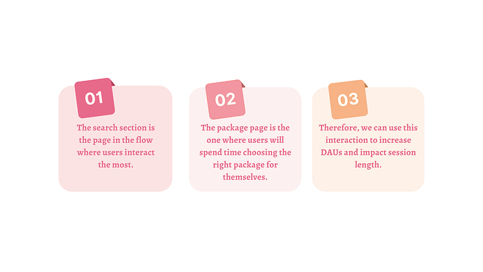
However, for the designation, we decided to work on the package section because of time and resource constraints. Considering the flow attached below, we mapped out the flow within the app using “Red arrows”.

Before we dive deep into the overall research methods and the changes within the app, I would like to give a brief overview of the number of problems we came up with in the current flow.
In total, we validated 9 problems, and from them, we prioritized the top 3 problems within the app, which we prioritized as P0, P1 and P2 and the rest we considered solving only if we had time left (fortunately, we were able to solve a majority of them!).
The three problems which were chosen were having a significant impact on the session length and retention rate.
Some of the problems which we came up with are:
- The users had to input details of their journey every time they opened the search page.
- The users were unable to input the return date and got frustrated, which also led to drop-off.
- The users were not able to add more than 3 adults; however, there is a message which says, “Maximum 4 guests are allowed,” which can confuse users.
and so on…
Before you move on to our in-depth research, let’s find out what is the final solution we came up with for MakeMyTrip.
These are some of the major issues which we identified in the current MMT app, which were having significant impacts on business metrics. Some of the comparisons between the current UI and the updated UI are attached:
🚩 Evaluating the existing flow and identifying problems:
Now that we have a brief idea about the project, now it is time to understand how we found the issues within the app itself. In the following stage, we decided to start our evaluation of the app. We used Heuristic evaluation and Intuition based evaluation methods.
According to adamfard (2022), heuristic evaluation is defined as “Heuristic evaluation is a thorough assessment of a product’s user interface, and its purpose is to detect usability issues that may occur when users interact with a product and identify ways to resolve them”.
Starting with the Heuristic-based evaluation, we used Jakob’s 10 Heuristic Principles, which allowed us to understand, based on those principles, the issues within the app which the users might face.
Other than Heuristic-based evaluation, we also considered Intuition-based evaluation, where we found issues based on our intuitions.
We also provided severity ratings for each and every issue we evaluated. The ratings are based on (0 = not a usability issue to 4 = Severe usability issue).
Below is the image illustrating Jakob’s 10 Heuristic Principles:
Now that we have an idea about the different Heuristic Principles which are applicable to the app. Let’s take a look at the issues we evaluated within the app using Heuristic-based and Intuition based evaluation.

Framing Hypothesis Statements
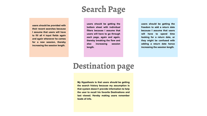
We were done with the heuristic evaluation and came up with a few issues with MMT; we were not sure if they were actually real users’ problems or not, as we did not validate them with any data or research. Therefore, we hypothesized some of the probable solutions for the issues we found in the flow, which I will further discuss in the ideation part. Hence, these are the hypothesis which we laid down.
My Hypothesis is that….

🤔 What did I realize?
What we realized at this stage was that since the time was short, therefore, rather than working on one screen all at once, we divided ourselves into teams of 3, and we took different screens and worked on them. And just like that, we not only finished our heuristics on time which we allotted for ourselves, which was 2 hours.
Since we are done with the hypothesis and the heuristics, there are a few questions that came to our mind by the end of completing this stage, which I was planning to understand at a much deeper level during the research stage:
We needed to understand what the users were actually feeling while using the app.
How did they come to know about the MakeMyTrip application?
How often do they use it?
What are the demographics of MMT?
Are there any statistical insights?
🚩 Conducting research and validating hypothesis:
We moved forward to the next phase of our project where we went on to research data in order to validate our hypothesis. The very first stage we took was to conduct desk research, where we searched online about MMT and insights related to the travel industry, holiday packages or how user experience is impacting the MMT business metric.
🔎 Conduction Desk Research:
About MakeMyTrip:
MakeMyTrip Ltd (MakeMyTrip) is an online travel company. It offers air tickets, hotel accommodation, bus tickets, rail tickets, travel packages, car hire, and other travel requirements such as access to visa processing and travel insurance. MakeMyTrip provides access to all major domestic full-service and low-cost airlines operating in India. The company offers its services through various distribution channels, including websites, call centres, airport counters and travel stores, travel agents’ networks in India, and mobile service platforms. At present, the top countries where the app is used are illustrated in the diagram below.
Insights about the travel industry:
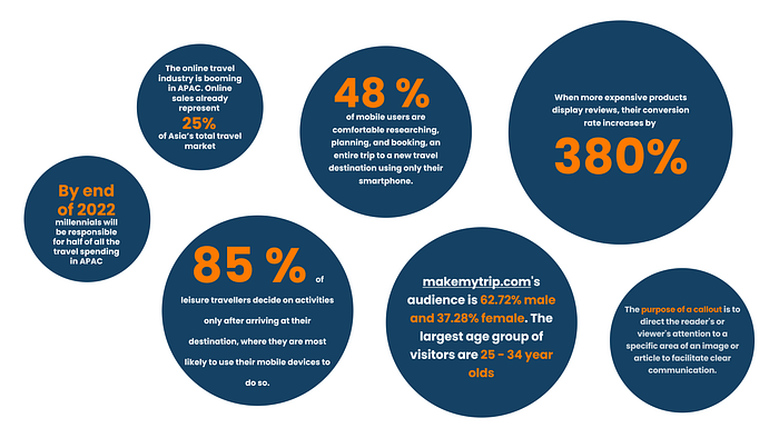
By the end of 2022, millennials will be responsible for half ($340B) of all the travel spending in APAC.
The online travel industry is booming in APAC, and there’s no end in sight. At $82B, online sales already represent 25% of Asia’s total travel market.
Around 48 %of mobile users in the U.S. are comfortable researching, planning, and booking an entire trip to a new travel destination using only their smartphone.
❓So, why did we choose to target the MMT app and not the website for our hackathon project?
During our desk research, we found that:
48 % of mobile users are comfortable researching, planning, and booking, an entire trip to a new travel destination using only their smartphone.
85 % of leisure travellers decide on activities only after arriving at their destination, where they are most likely to use their mobile devices to do so.
Therefore, based on the insight, we found that the majority of the user is using the MMT application for planning their trips and holidays.
Through the desk research, two hypotheses for our flow could be validated:
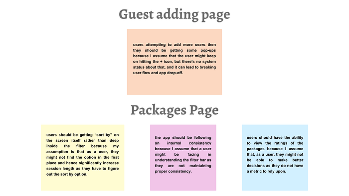
👉🏼 Hypothesis #1:
My Hypothesis is that users attempting to add more users then they should be getting some pop-ups because my assumption is that users might keep on hitting “+”, but there’s no system status about that, and it can lead to breaking user flow and app drop off.
Validation:
The purpose of a callout is to direct the reader’s or viewer’s attention to a specific area of an image or article to facilitate clear communication. (Source: Lifewire)
👉🏼 Hypothesis #2:
My Hypothesis is that users should have the ability to view the ratings of the packages because my assumption is that, as a user, they might not be able to make better decisions as they do not have a metric to rely upon.
Validation:
- 48% of consumers read reviews on sites before making purchases.
- 91% of internet users have read online reviews
- When more expensive products display reviews, their conversion rate increases by 380%.
⏳ Competitor analysis:
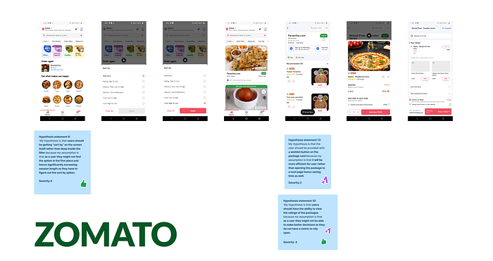
We also considered competitor analysis as the secondary source of data where we evaluated 3 applications (2 direct competitors of MMT and 1 Indirect competitor of MMT).
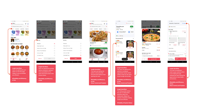
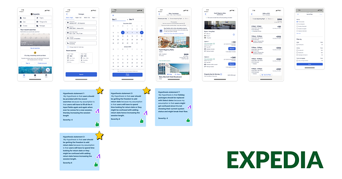
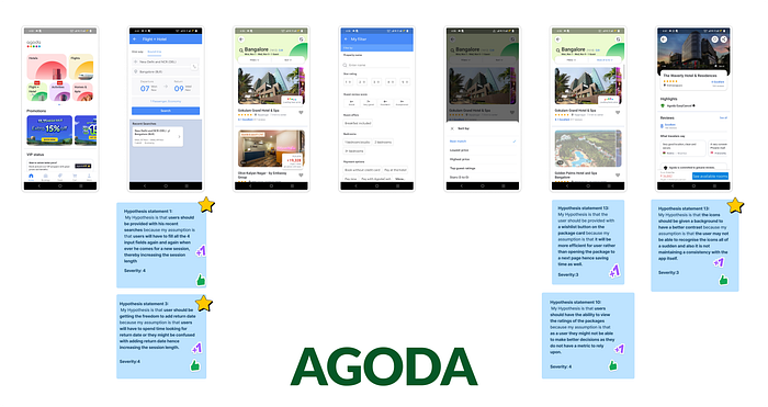
The reason we considered 2 direct competitors of MMT (Expedia and Agoda) is to understand how they are serving a similar user base to MMT and 1 indirect competitor (Zomato) to understand how Zomato is using certain features which make the user journey easy for their user base. This was the necessary step that we included to test our hypothesis against some of the already existing and profitable apps in the market serving similar and different user bases.
🤔 So, what actually did we do at this stage?
Basically, we took screenshots of the flow of booking a holiday package, a hotel booking and finally, ordering food on Zomato. After the screenshots were taken, we ran analysis over the competitors to understand how they were solving the user issues which are similar to MakeMyTrip along with other issues as well.
After evaluating the competitors of MMT, these are the insights that we came up with:
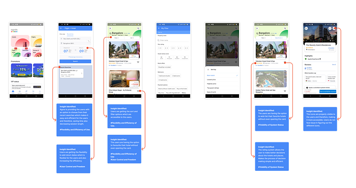
Expedia (Direct Competitor):
Agoda (Direct Competitor):
Zomato (Indirect competitor):
After conducting the competitive analysis of the data, these are some of the insights we came up with:
❓So, what did I realise after conducting the competitor analysis?
After the competition of the competitor analysis, I realized that we could have evaluated the flow of the competitor apps even more and could have had a deeper understanding of what’s the take of Agoda and Expedia being the competitors who are serving similar customers. However, because of time constraints, we were limited with the data available to us and moved forward with the available data and validation which we had as of now.
📊 Conducting Primary Research:
Now that our secondary data are majorly covered, it is time to move to the next phase of the research, and validation is targeting the users for conducting the primary research.
During conducting our desk research, we found useful insight about MakeMyTrip:
The largest age group of visitors is 25–34-year-olds.
Since we had a time constraint; therefore, we were not able to conduct the survey to target the right user. Therefore, based on the demographics data of MMT, we targeted users between the age group of 25 to 34 years. We also decided to target backpackers, couples, and people travelling with family as they not only fall into the age bracket but also hit the majority of the potential users.
These were the data available to us:
Product/Industry — Travel/Hospitality
Percentage of male/female users — 62.72% male and 37.28% female
Age — 25 to 34 years old
Types of users:
Backpackers travelling alone or with friends
Couples going on a honeymoon
Individuals travelling with family
❓How was the planning for the primary research done?
The primary rule which we set for the interview process to avoid any biases is not to interview any of our friends and family.
One of the members of our team had access to multiple hotels in Dubai where users from India and other APAC countries were present. So we targeted them as our users chosen at random.
We planned to have first-hand experience with users using the application.
We prepared 4 tasks that we provided to the users and asked them to complete the task, and while they completed the task, we observed how they were completing the tasks.
❓Tasks provided to the users:
Assuming you’re going with 4 of your friends, Can you book a package to Goa?
Assuming you’re travelling alone, Book the cheapest package to Nainital.
Add a Dolphin Trip Activity on your Honeymoon vacation to the Maldives.
Check out the details of a package to Delhi and add it to your wishlist.
🔎 Points which we decided to observe:
How do users interact with the search page?
How are they planning the journey dates?
User behaviour while adding more than 3 users.
How are they making decisions while choosing a holiday package?
Following are some of the questionnaires which we asked during the interview process. While they were performing the tasks, we also asked probing questions during the interview.
🤔❓What did we observe after conducting the usability testing?
In total, we interviewed a total of 6 users (2 backpackers, 2 couples, and 2 families) for the testing of the current flow of the holiday booking of the MMT app. It was interesting to observe how the users were interacting with the app, and we took notes where the users were facing difficulties and came up with the following insights:
📊 Some crucial insights we noted from the interview:
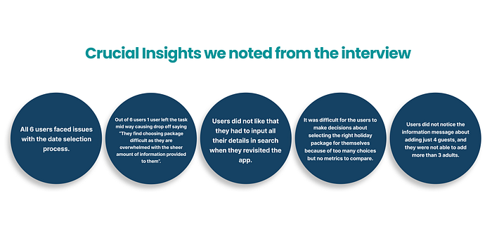
- All 6 users faced issues with the date selection process.
- Users did not like that they had to input all their details in search when they revisited the app.
- Users did not notice the information message about adding just 4 adults, and they were not able to add more than 3 adults.
- It was difficult for the users to make decisions about selecting the right holiday package for themselves because of too many choices but no metrics to compare.
- Out of 6 users, 1 user left the task mid-way, causing a drop-off, saying, “They find choosing package difficult as they are overwhelmed with the sheer amount of information provided to them”.
Let’s have a look at the validation of the hypothesis using the primary data:
These are all the hypotheses that have been validated using the primary data. Some of the hypotheses have also been validated using both primary and secondary data. Along with that, the following image also contains the hypothesis, which includes behavioural insights.
🚩 Prioritizing and ideating solutions:
We did come up with a lot of issues in the app; however, due to time constraints, we were not able to implement a majority of them. Therefore, we needed to prioritize the issues. We prioritized them based on the following:
The hypothesis should be validated with the primary data or secondary data or both.
Consider it, only and only if they are having a significant impact on the business metric of MMT.
✌🏼 Prioritizing the issues:
Hence, based on the criteria, we prioritized them as:
P0, P1 and P2; the rest of the issues will be solved if we have the time and resources available to resolve them.
🙋♂️ Formulating How Might We (HMW) Questions:
Once we had the idea regarding the issues which we needed to resolve, we started coming up with the HMW (How Might We) questions. For the following we used Crazy 8 technique and came up with as many solutions as possible.

The HMWs and their ideations are as follows:
How might we provide an option to the users so that they do not have to recall what they searched for before? (P1)
- Drop down in search with previous search history.
- Recent searches under the search.
- Navigation of “Previous searches >”
How might we ease the process of date selection for the users? (P0)
- Adding a return date option on the search page.
- Single date screen where they are able to add both starting date and return date.
How might we ensure that users are able to understand that they are on the right page?
- Replacing “Holiday Packages” with “Select Dates”
- Adding a status bar to understand the current app status of the user.
How might we ensure that the users are able to understand that there is a limit to adding more than 3 adults? (P2)
- When the person attempts to add more users, then they should be getting some pop up’s.
- There should be information provided besides 4 Guests for the individual adults and children.
- An indication of the maximum limit below the numerical bar.
How might we ensure that users are able to choose their destination easily?
- Having a search history.
- Having popular places as suggestions to the users.
- Pictures to show a visual representation of past search history.
- Popular tour packages.
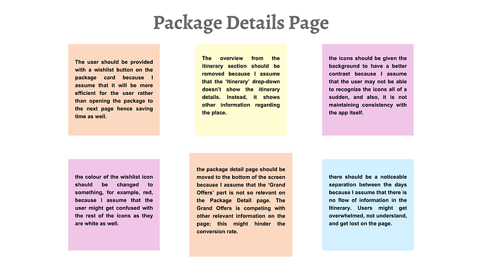
How might we ensure that the users are able to locate the detailed itinerary information without any confusion?
- To remove the overview from the itinerary section
- The overview can be collapsible.
How might we create a cohesive flow of information which is easy to understand for the users?
- The system should convey the fact that the entire itinerary is editable. Therefore, we can provide an edit with your itinerary dropdown.
- Providing recommended activities.
- Make the section for private transfer consistent with the flow.
- Giving a noticeable separation between the days.
- Decrease repetitive information in the heading of each section and provide relevant information.
How might we make sure that the icons are clearly visible to the users?
- Keeping the wish listing on the side of the name to make it more accessible for the users.
- The icon could be changed to something like Insta Bookmark.
- Giving a background to the icons to make them contrasting and hence, more accessible also will maintain consistency within the app.
How might we provide users with a metric to judge the trustworthiness of a package?
- Provide ratings that users can use to judge.
- Provide metrics regarding how many users have chosen this package.
✍🏼 Wireframing the solutions:
With the solutions in hand, it was time to bring those ideas to paper and then we could move on to the designing of the UI process. Hence we started with the Wireframing process.
Taking inspiration from different UIs, we discussed the features which need to be incorporated, and I penned down every idea or feature which we can implement in the best possible way.
Taking all the inspiration, we brainstormed solutions and proceeded with the wireframing process for:
Adding return date (in search page)
Recent Searches
Adding date input space and flexible dates (calendar page)
Adding a number of adults
Rating system

We took inspiration from a variety of apps, but majorly we focused on the competitor apps in the market, such as Agoda and Expedia and understood how they are solving those issues.
🚩 Redesigned UI screens — Before the second Usability testing
After we are done with all the brainstorming sessions as to which changes we need to incorporate into the MMT app, we move on to the UI sections. The members of the team started working on the UI and made all the necessary changes to the app.
You can check the flow of the app here.
Second Usability Testing
Finally comes the usability Testing of the application. The changes which are done by a designer could work great from a designer’s perspective. But we do need to remember that “WE ARE NOT THE USER”. Therefore, it is important to let the users test the design changes and, based on their feedback, make all the necessary changes in the app which can significantly improve the user experience.
We conducted the second round of usability testing, and we tried to stick to the same users who were in the first round. We faced difficulty with two users as we were not able to contact them. However, we conducted the usability with the new users and treated them as fresh users of the app and observed if they were facing the issues which the previous users faced.
During the design process, we came across a huddle regarding designing the “Flexible with date” option. We had arguments within our team as to where we should provide that option, and we came up with two idle places to include them:
- On the search page, just after the date selection option.
- On the calendar page.
To overcome that confusion and settle the arguments, we planned to conduct A/B testing.
According to Hbr (2022), “A/B testing, at its most basic, is a way to compare two versions of something to figure out which performs better”. Therefore, we presented the users with two flows (FLOW A and FLOW B).
And these are the usability feedback which we received.
Therefore, after presenting both the flows to the user, we asked them a probing question as to which flow did they find more comfortable using that is flow A or flow B? And if they have any feedback regarding “flexible with return date”.
▶️ Check Flow A Here ✅
▶️ Check Flow B Here ✅
Design Iteration:
After studying the insights from the second usability test, these are the changes which we came up with.
- We added the “Flexible with return date” on the search page.
- Turned the wishlist icon red to make it more prominent for the user.
- Provided a red outline when the number of adults reached 3 to make the user realise to stop.
- Added text to the calendar to show “Start Date” and “End Date”.
Structure of our UI:
Being the data analyst in the team, I also collaborated on the UI design part and created some of the base elements required for the UI design process using auto layout and they are responsive. Therefore, in the future, if there are any changes introduced within the project they could be done seamlessly.
Therefore, making the following components and system allowed us to make smaller changes and use those instances multiple times anywhere in the app flow.
Final UI:


Future Scope and key learnings:
Key Learnings:
Finally, I would like to conclude with some serious key takeaways:
- The primary thing which we learned was to prioritise the problems which need to be solved first.
- A lot of impacts could be created with the right method and approach even within 48 hours.
- I learned the importance of the skill to understand which problems we need to let go of.
- There are still a lot of areas where I need to work and need more improvement, which I will work on in the future.
- Time management and Documentation is the key to the successful completion of the project, as time management helps in maintaining common objectives as a team. Documentation helps in keeping track of small ideas or notes for the entire team, which might be important.
- While working as a team, there are lots of agreements and disagreements we come across, but it is important to overcome them together as a team.
Future scope:
- There are still a lot of areas where I need to work and need more improvement, which I will work on in the future.
- In the future I would like to improve the review section with more detailed overview of the ratings.
- I would like to work on improving the DAU’s by introducing story feature on MMT app and bring in interaction among travellers.
🍀 Thank you for reading this case study. Feel free to drop your comments and feedbacks 🍀
You can find the Figjam file here → Figjam file
You can find the LinkedIn post and presentation here → LinkedIn Post
You can find the figma link for entire case study here → Figma Case study
You can find the final Prototype here → Final Prototype
Find other case studies on my website → Portfolio

✌🏼Connect with me:
Thank you for reading my case study. We can have further discussion about UX and my case studies.
You can reach out to me on:
📤 Email: sumandebnathofficial@outlook.com
🔗 Website: https://www.sumandebnath.com/
LinkedIn, Instagram and Twitter.

