
Amazon design case study
In this case study, I have tried to understand and evaluate the functionality of Sort & Filters on Amazon’s website and also identified methods to cut down the time taken by shoppers by making it easy to search the item they are looking for and strip out the items they are not interested in.
Introduction
The Indian E-commerce business war started way back in 2014 when Flipkart was by far the undisputed king in this market with a 40% market share. The same year, Amazon noted a share of 12% in the market. But suddenly after 2016, Amazon’s revenue started increasing and within just two years that is in 2018, Amazon registered a market share of 31.2% whereas Flipkart’s market share in the same year was 38.5%.
What happened in 4 years? According to a popular study by Think School [1], One of the main reasons for this sudden shift was the introduction of Amazon Prime. The strategy behind Prime membership was nothing but the Sunk Cost Fallacy. It’s the behavioural design that brings in consumer spending. The studies show that the prime members shopped three times more compared to non-prime members. For instance, Prime helps Amazon reward repeat customers, thus enhancing its platform business. For example, With Mirzapur season 2, the most awaited Indian Series that was scheduled for a release in October just that when Diwali sales start people will become naturally inclined to buy more from Amazon. This is one of the prime reasons for the racking up of revenue in the bucket of Amazon. With $7.5 billion in gross sales, Amazon is India’s number one e-tailer.
Design
Despite being the market leader in e-tailer, Amazon’s UX has always been under the microscope. Designed to inspire, Amazon’s site builds an awe value the minute you enter the webpage and succeeds by offering a minimal, search-oriented user interface (UI) that accommodates both digital natives and internet newcomers. Moreover, Amazon’s website design creates Cognitive ease. According to Daniel Kahneman, cognitive ease is both a cause and a consequence of a pleasant feeling. Cognitive ease makes us feel more favourable toward things that are familiar, easy to understand, and easy to see or read.
Jeff Bezos explains how Amazon is based upon 2 types of decisions.
- Decisions that are irreversible and should be made with caution
- Two-way doors and should be made quickly.
Bezos applied the type 2 method as Amazon’s principle and also incorporated that to Amazon’s website.
According to Jason Brush [2], Head of Innovation at Wunderman Thompson, Amazon’s website is neither simple nor beautiful, it focuses on the simplicity of experience, process and functionality. It makes use of 5 principles:
- Transparent: Great shopping experience makes pricing and purchase process clear and easily understood.
- Tangible: When people have a choice between different products or variations of products, a great shopping experience makes those product choices tangible and immediate, so that people can make confident, informed choices.
- Trustworthy: People want to know the store they are doing business with is upfront.
- Helpful: People don’t always know what they want or how to get what they need. Great shopping experience anticipates their challenge and proactively answer peoples questions.
- Personalization: High level of personalization, makes the whole experience feel as if you are going with a friend who has known you for years and is there to guide you.

Overview
Even though the tech world is increasingly adapting to mobile-first, online shoppers using Amazon still prefer desktop over mobile when they’re making a purchase. 67 per cent of Amazon Shoppers prefer to shop using their desktop computer or laptop (CPC Strategy, 2018). In comparison, only 24 per cent of shoppers preferred to shop using mobile devices. However, Amazon provides a consistent experience across all mobile platforms, which tosses another point in its favour.
According to Mr Merrihew, “The app experience should be as consistent as possible with the desktop experience and store experience, The structure should be similar so you don’t confuse customers.”
In this UX case study, I have focused exclusively on Amazon’s design for Desktop/Laptops and tried to identify some key areas where the experience can be improved for the shoppers. Let’s dive deep into this.
Research Context & Purpose
Amazon’s UX is to increase the adoption and retention rate of visitors making a purchase. UX is search-driven. According to a recent study by a research group, Amazon’s search function is a ‘State of Art’. The search bar makes it easy for the user to search for the item and the website also allows users to filter, refine and view the results in desirable form. A very small proportion of shoppers arrive at an e-commerce platform wanting to buy a specific product, shoppers mostly look around for different options. In such a case, the platform must provide shippers with the facility to easily search the item they are looking for and strip out the items they are not interested in.
Studies show that about 35 per cent of the US e-commerce platforms don’t allow shoppers to apply multiple filters [3]. And unfortunately, close to half of the online shoppers use it. When it comes to increasing the adoption rate and rate of conversions, making users spend an unreasonably large amount of time searching for products might make shoppers experience terrible. On the other hand, Amazon makes it easy for its shoppers to apply multiple filters, enabling them to narrow down their product search to their specific intent in a few clicks. But the waiting time is almost killing the experience for the shoppers. When Amazon makes the whole experience feel as if you are going with a friend who has known you for years and is there to guide you, Imagine you wanted your friend to pick up T-shirts for brands Adidas, Puma and Nike and all of them priced under 1000 INR. But in between the conversation, just after hearing Adidas, your friend rushes to get all T-shirts of Adidas. And then he takes your next choice into consideration, which was to get all T-shirts of Puma. And so on. Would you stop going out shopping with that friend?

Hence, an effective search function with appropriate product filters is necessary to provide shoppers with a decent user experience. Unless a shopper knows exactly what they’re looking for then they may want to filter on more than one option in the same category and may want to perform multiple filtering at the same time. Filtering is useful for any online store, even without extensive lists of products. Filters are a great chance to present a variety of products, improve the UX, reach a wider audience and increase sales. Even the simple act of adding filters at all can increase a website’s conversion by 26%. Fixing issues with filters UX design can produce powerful results.
Research Focus
The purpose of this case study are as follows:
- Understand and evaluate the functionality of Sort & Filters on Amazon’s website
- Cut down the time taken by shoppers by making it easy to search the item they are looking for and strip out the items they are not interested in.
- Identify the experience of shoppers when they try to narrow it down to their specific intent with multiple filters.
Preparation
The next step in this UX case study identifies pain points faced by the proto personas when using the Amazon shopping website. To test if the product or feature is fulfilling shoppers need, created a demographic of the shoppers. And for the same, we use a principle called Heuristic Evaluation. Heuristic Evaluation is a usability testing evaluation system introduced by Jakob Nielsen in collaboration with Rolf Molich in 1990. It enables evaluators to determine a product’s usability based on 10 UX principles known as ‘heuristics’.
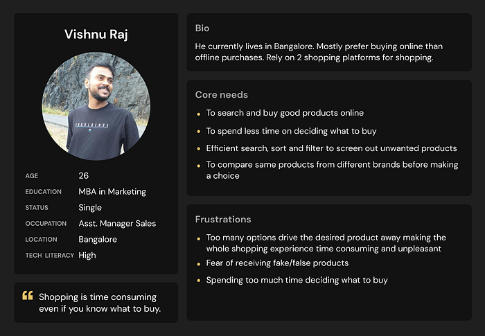
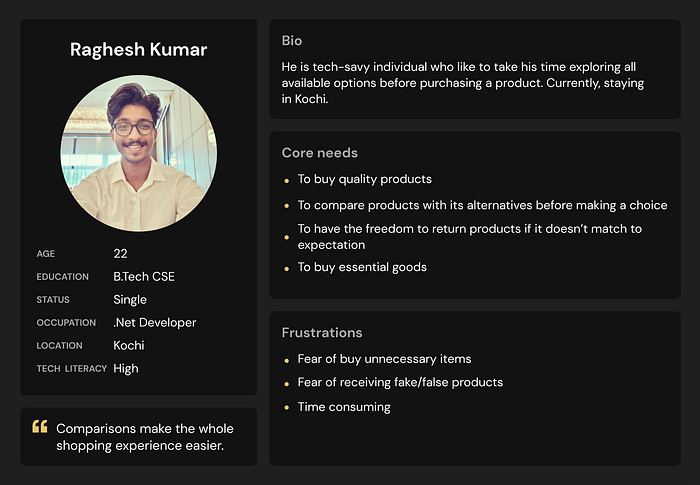
Given below are some proto persona’s:
- A professional executive in the age group of 25–50 who is tech-savvy and has little time to browse through all the products and would like to perform efficient shopping as quickly as possible.
- An individual who is very familiar with online shopping and would like to take their time to research about products and their alternatives before the purchase.
- A tech-savvy individual who has not used Amazon’s shopping site much and prefer its alternatives over Amazon
User Research
Three connections from my Tech Community network were observed individually as they performed the task while thinking aloud. Due to the prevailing condition, Google Meet was used for the user research purpose for the think-aloud process. An introduction to the research was conveyed initially and participants performed the task according to the task given. Their response and behaviour were noticed while they were performing the task and points were noted based on their response.
Roles
- Participant: Three people from my tech community network were requested to participate in this research.
- Moderator/Observer: I acted as both Moderator and Observer as the research was small in size.
Questions and Task
We asked questions on three categories:
- Backgroud question- Getting to know more about user
- Task Question- Task-based following questions were asked for research purposes.
- What do you think of the Amazon Shopping site?
- How does it help in making your life better?
- Is there anything you think can be added or improved to make it much more exciting for you to use?
- When was the last time you used the Amazon shopping site? How was your experience?
- Did you purchase the product you were searching for the last time you came out of the platform?
- What do you think of the search and filter feature?
- How often do you rely on filtering?
- How was your experience while filtering?
- Have you had any difficulties performing the filtering action?
- This is a small task for you to complete:
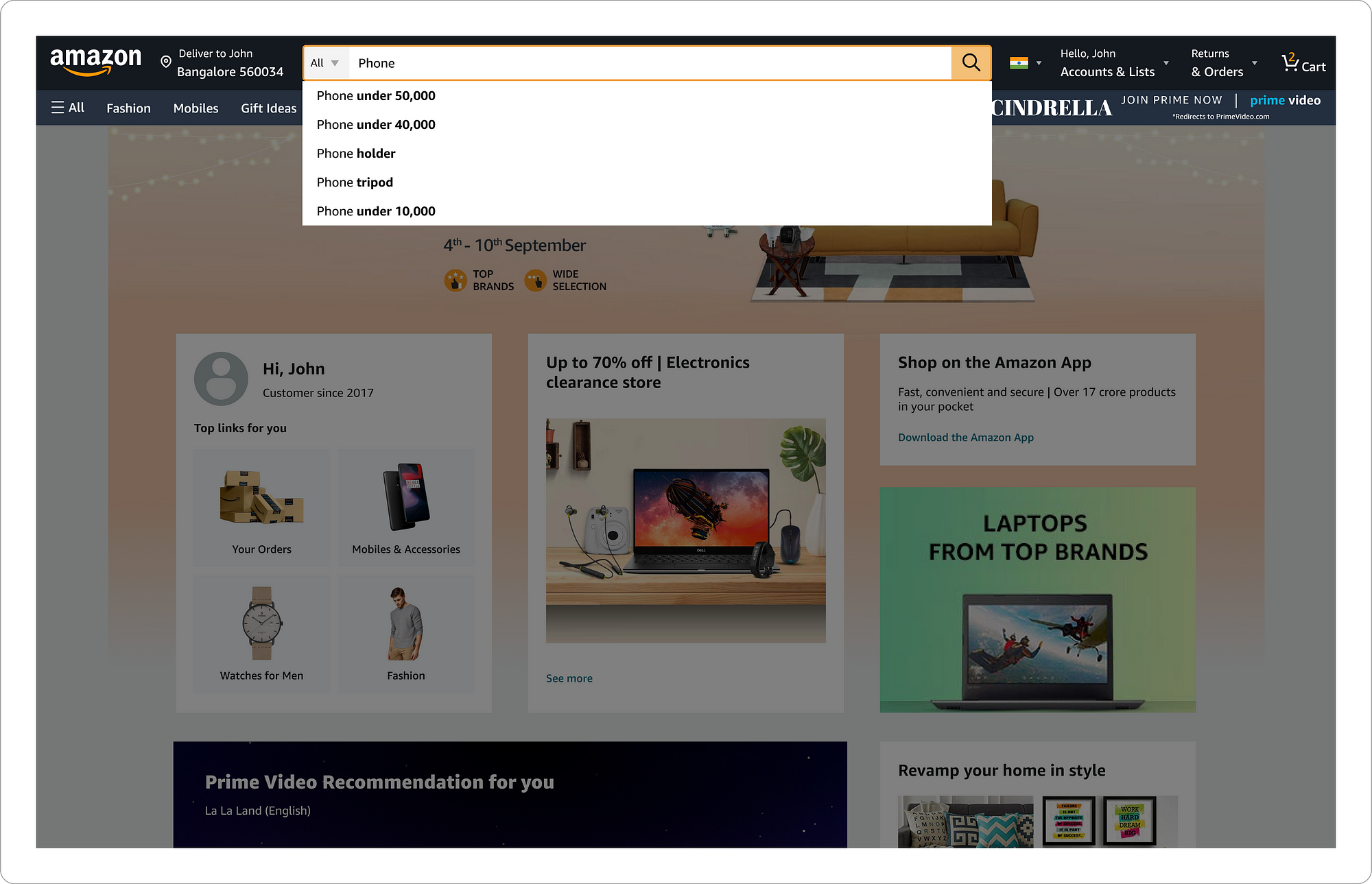
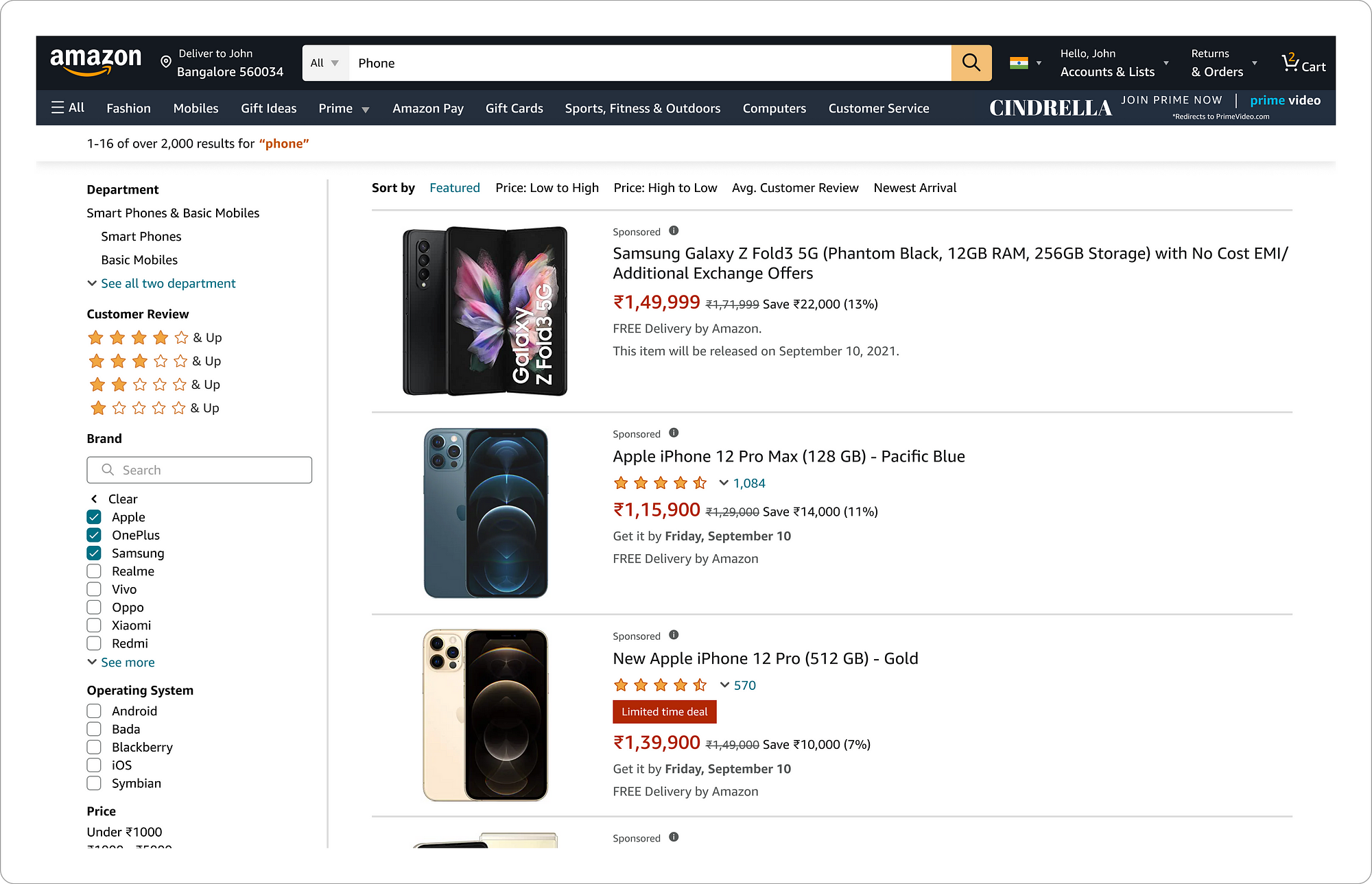
- Imagine you had to buy a Phone
- You want to see the pricing for the following brands: iPhone, Samsung and One Plus.
- Search for ‘Phone’ and filter out the rest by selecting brands iPhone, Samsung and One Plus from the filter.
- View the ‘Phones’ from these 3 brands with the price varying from Low to High
- How was your overall experience performing this task?
- Did you find any challenges while performing the task?
Validation
At this point, after conducting the user research and gathering pain points from the proto personas. I wanted to conduct a wider level of testing with more Amazon users to validate the problem before jumping into finding a solution.
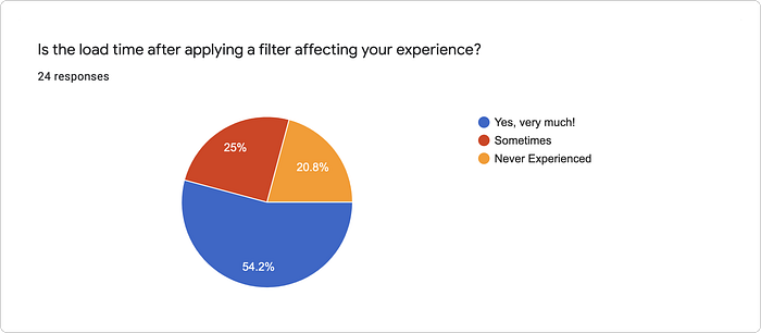
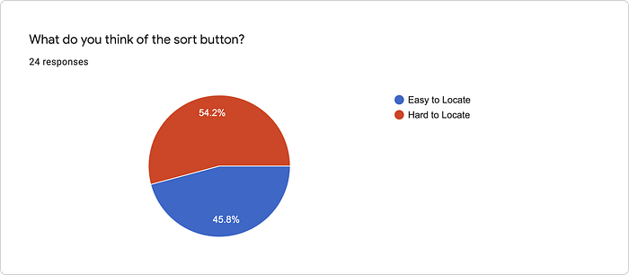
So for that, I prepared a google form with refined questions and a simple task for the participants to perform and send out to 25 people. Their response was collected and is as given below:


User’s Pain Points and Analysis
After the successful completion of User research with the proto personas and closely looking at how the user responds to the task, I have formed a customer journey map.
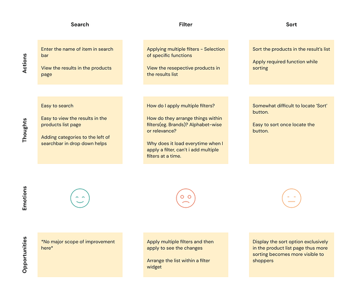
The main aim of the research was to identify if users are finding trouble when it comes to applying multiple filters on the product page. Anything that seemed to get in the way of intuitive navigation for the user was noted. To identify the pain points, we have used the Heuristic evaluation.
Finding 1: Applying multiple filters
- When the user intends to select multiple selections within a filter and then see the result, that use-case has not been considered yet in the current shopping site.
- Since the number of filters catered in the sidebar is more, it takes vertical scrolling to reach the last filter criteria even though expansion and collapsing of them are considered. Hence if the user wants to apply multiple selections within a filter, after clicking one, it gets scrolled to the top and the user losses visibility.
- The waiting time between applying multiple selections is unnecessary.

Finding 2: Arrangement of specifications within a filter widget
- In the filter section, inside an individual filter widget (eg. Review, Price, Size, etc.), most boxes are arranged out of their relevance and in the order of how shoppers expect it to be. For example, If the product is a phone, the size filter is arranged in the following way:
- But when it comes to filtering the brand of a product, there is no proper arrangement, which leaves the user clueless especially when the list is long.

Finding 3: Placement of Sorting
- Building the logic of sorting clear for the user. When the result page displays a large number of products, the first thing users do is figure out the sorting logic.
- From the user research of proto personas, it was found that shoppers at the initial stage found it difficult to spot the ‘sort’ button and also found it easily accessible in some other e-commerce platforms like Flipkart. However, the placement of ‘sort’ is very accurate according to the design standards. Though a single row space is given for just the sort button to be aligned right, I believe there can be a scope of improvement.

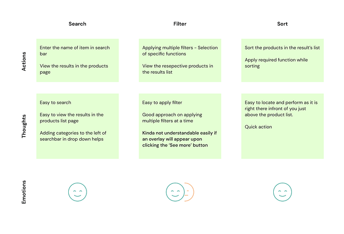
Redesign
From the user research and analysis, gathering the pain points and as the objective was clear, I’ve started redesigning the Amazon Shopping website to improve:
- The experience of choosing multiple filters
- The arrangement of filter contents
- The placement of the sort button
While redesigning, I have followed the same design principle as Amazon’s and was using the font and colour style as they represent Amazon’s brand identity.
Home Page

Product Listing
Improvements in filter:
- Inclusion of search within filter
- Upon clicking ‘see more, a new dialogue overlay appears in which the respective filter items are arranged in alphabetical order. The user can also search for the filter item within the overlay.


Sorting
Improvement in Sorting:
- The sorting is positioned just above the product listing and is expanded instead of a collapsed button. In such a way, the user can perform sorting right from this page without a double click (selecting sorting post a click on the sorting button)

Prototype
To view the prototype, Click here.
Feedback
Validation is a super important part when it comes to problem-solving. It allows you to test your ideas and get feedback without having to invest in fully building out the idea. Upon successful completion of the redesigning, I set up a meeting with two users and asked them to try out the prototype and provide feedback. As a part of the feedback session, the same task was given to them. As the users execute the task, they were asked to note any problems and thoughts with the prototype.
Even though the prototype was not fully functional in all directions. It was noted that the user was able to complete the given task in 44% less time compared to before. Given below is the customer journey map post the redesigning.
References
As designers, we depend on our inspiration to work creatively. And I don’t think I would be able to complete this case study without these references upon which I heavily relied. It was great reading/watching them and it truly has inspired a lot in this case study and in enlightening me.
[1]. Think School — How Flipkart is beating amazon using its business strategy?
[2]. Jason Brush — The design theory behind Amazon’s billion $5.6 billion dollar success
[3]. Convert Cart — 10 smart ideas to improve eCommerce filters (and 7 lessons from Amazon)
[4]. Oleh Kryvytski — Uptech — Amazon Shopping App UX Case Study — An In-Depth Evaluation
[5]. Kate Shokurova — 9 Filtering Design Best Practices to Improve E-Commerce UX
[6]. Canvas Flip — Amazon vs Walmart: Whose search UX is more usable?
Summary
“In every Annual Report, Jeff Bezos attaches a copy of his original 1997 Letter to Shareholders. In that 1997 letter, Bezos outlines the fundamental measures of Amazon’s potential success — relentlessly focusing on customers, creating long term value over short-term corporate profit, and making many bold bets.” — Daniel Slater, Worldwide Lead, Culture of Innovation, AWS.
I have always been an admirer of the functioning of Amazon and its customer-first mentality. And I truly believe these principles of Amazon has got a lot of influence on its designers and must be the core principle behind each UX decision. In this case study, I have focused on a problem statement which initially I faced a lot as a shopper. I discussed it with some of my colleagues and was surprised to know many of them felt the same way about it. And that’s how I started this case study. I must say, I thoroughly enjoyed working on it and believe I have formed a solution that adds more value to the Amazon shopping site.
Free Amazon UI kit
While redesigning the app, I also made an Amazon UI Kit. And made it an open-source design file with a Product page and Home page in it along with all the master components. Feel free to use them. To view the UI kit, Click below:
https://www.figma.com/file/TWYIpvCy91NvjiQf0BrtU6/Amazon-Case-Study?node-id=145%3A1472
Please share this with all your Medium friends and hit that 👏 button 50 times if you enjoyed this article and to spread it around even more.
Also please 💬 comment on the article to let me know what you think about the article.
About me
I’m a Product Designer based in Bangalore, India. Current working for Intugine. Minimal principles are the basis of my work, with a well thought out theory behind them. The focus of my work varies between mediums ranging from; user experience and interfaces, web design and development, and branding.
Click here to know more about me. You can also connect with me on LinkedIn.

