Advanced component properties and variables in Figma for faster product design.

Switch from the “components for developers” paradigm to the “components for the design team” paradigm.
Introduction

Properties and variables in Figma are relatively new tools. When they were announced, the community was excited, but then the noise died down and there was hardly any mention of properties anymore.
The reason for this is that they are difficult to learn. I hear more and more designers say, “I became a designer to make things look good, not to program logic,” but properties and variables are not logic. Just like any complex tool, you only need to learn it once and then it will speed up your work every day.
That’s how it was with me. I kept putting off learning these features for too long. I opened the variables playground many times and closed it again. And finally I needed to put together a UI kit for an internal product, and in the course of working, sorting through a mess of components, I finally decided to do it. I went through the playgrounds, read all the articles I could find, but I didn’t find the answers to all the questions that came up along the way. Therefore, in this article I will not focus in detail on what variables are, where to include them, and what types they are (after all, this is all in the tutorials). I will discuss how and why to use properties and variables to speed up the design process, as well as share insights I gained along the way.
Why use properties and variables?
Of course, variants are already a great tool, they are enough for simple components, such as a checkbox with text. But when we move on to more complex components, consisting of several other components (navigation menus, tables, or complex filter blocks), variables and properties offer new advantages.
- Speed.


Currently, in our team, components are organized so that there are 1 or 2 properties in each, each of which has 2 or 3 variants. Inside these variants, we manually turn on/off the elements that are not needed in this instance. If a component is complex, searching for states and manually selecting the required layers can take a really long time.
Properties of a component allow you to bring all the important characteristics of a component to the sidebar and have quick access to them.
2. You know what you can change and what you can’t. Thats allow to manage your design system better.
I like the approach that “it should be clear what can be changed and what cannot be changed within a component.” This is literally stated in the introductory video for Figma properties. If we start to manually dig into the layers of a component, it can lead to bad consequences.
If you have managed to make a complex component from pure variants, then when trying to change any of its individual parts, you may have to disassemble it and move something inside. As a result, you lose the original->instance connection, cannot update the layout if the original is updated, other people coming to the layout will not know that this is not your creativity, but an already existing component.
And another one: if you disassemble a component, the developer can no longer learn that this element already exists in your library, can make it again, make it again the same as the previous one is almost impossible, it will be almost the same as the old one. Which one will then appear in your product is impossible to predict, and all this leads to chaos.
3. Advanced prototyping.
To be honest, I haven’t explored this part in detail yet. But they say that now you can make an input that accepts data in the prototype, and this already sounds like a huge breakthrough.
How to build complex components
The main idea is that the component should be built in such a way that working with it is simple and quick when performing daily product design tasks. This requires switching from the “components for developers” paradigm to the “components for the design team” paradigm.
(I want to note that you also need to describe the components for developers separately, but only when they first appear. After that, you will simply reuse the already finished component without unnecessary comments.)
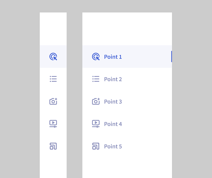
So, we decided to finally assemble a large large component. What to do? Let’s look at the example of a navigation menu. A typical menu for dashboards, a narrow strip on the left, expanding on hover.
Define the context in which you most often work with the component.
Most of our team’s tasks are adding new features to an existing product. In order to reflect this in the mockups, it is necessary to repeat the product screens on which the changes occur many times. This means that in the context of the menu component, we most often need to be able to select and display the menu section in which we are working. The second most frequent task is creating a new section.
Therefore, our component should be able to:
- Open/close
- Easily add a new section
- Easily select the current section
️️️️Breaking down into simple components taking into account the properties that need to be passed up
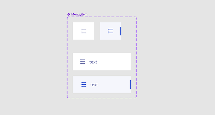
The menu component consists of multiple instances of a single menu item component.
The item has states: selected/unselected, open/closed. (There are also states default/hover/focused, but we will omit them for simplicity for now). We can create these variants with a grid of variants and pass the properties of the items up.
Let’s check how it looks — open menu with 4 menu items.
Checking:
✅ Turns on/off
✅ Allows you to easily add a new section
➖ Allows you to easily turn on/off a section. Yes, but along with the “current — on/off” property, we also passed the open/closed state up, and we have 4 unnecessary controls on the panel that we don’t need. That’s ok, but it make it harder to work with this menu.
This means that we have a requirement for the “menu item” component: the on/off property should be the only property, so that when we pass the property up to the menu component, we don’t have any unnecessary settings.
We create a component with 2 variants: on/off menu item.
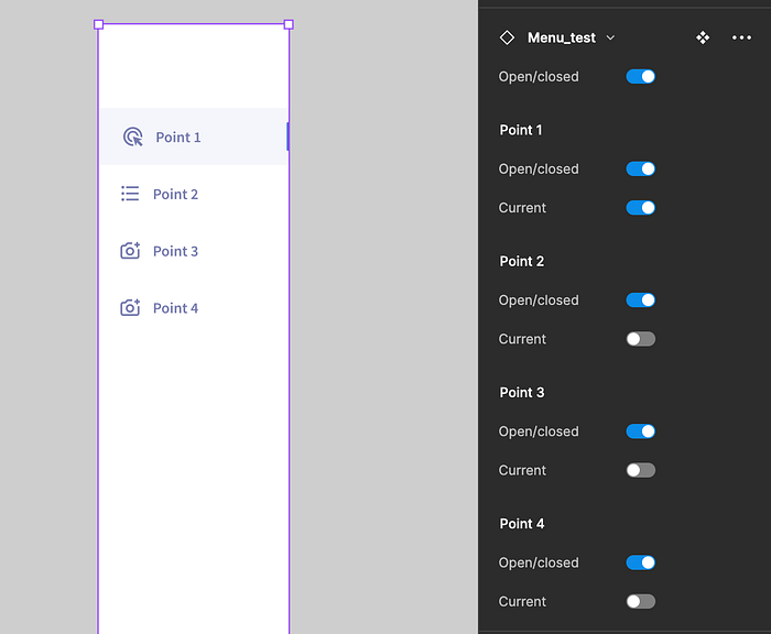
How can we otherwise make the open/closed menu item properties? Here, variables can help us. An open item differs from a closed item by the presence of text.
We create a local boolean variable for the visibility of text. For the open mode, it is true. For the closed mode, it is false.
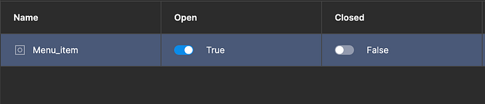
We assign the value of the variable to the visibility of text.
We create 2 variants of the menu component. One is assigned the mode Open, the other is assigned the mode Closed.
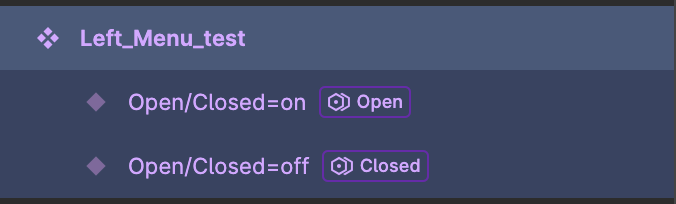
And now we have clean and simple panel for managment state of our menu.

Voila! All requirements are met, we are great!
Tiny Tips:
- Create complex components semantically — open/closed menu, not by states — usual/hover. This is not the same as components for development. Some states may not be necessary, you can describe them separately if it allows you to make a cleaner component for product work.
- Use naming that is understandable to the design team. Ideally, you should team up with development and develop a unified naming code. But if you write a vague name that looks like a variable name in code, developers will still not use it, and the design team will quickly get confused about what means what.
has_search_field=true/false => search field = on/off
I hope this was helpful! 👋🏻

