Case study: adding a restaurant feature in MyFitnessPal

Popular by health and fitness fanatics all over the world: MyFitnessPal. It’s a web-based diet and fitness social media app, acquired by Under Armour in 2015, to help users keep track of their daily food and beverage intake. With the nutritional and excercise information users collect and share, they can adjust their diet and training regarding their health and fitness goals. The app also offers recipes, workout videos and a vivid community, most of it for free.
The Brief
For a four day sprint, I was asked to create a feature that would allow users to see recommended healthy meals from different restaurants/cafes nearby, which contains a star rating of the meal and nutritional info. That way it would be easier for users to make healthy choices when going out. Another wish was to have the recommendations shown on a map.
Empathize: what do users need?
By using the Lean Survey Canvas I analyzed what I already know, what information is missing and where I will find this information. Next I formulated both survey and interview questions, to validate some assumptions fast and have some in-depth conversations on motivations and needs as well.
Through user research I popped 17 respondents inside out about their behavior and desires. Their average age was 30 years old and almost two third of the respondents were female. I structured the collected data using the Affinity Diagram and Empathy Map. Both served as a sounding board during the project to stay close the users needs and expectations. In the Empathy Map I gathered my findings and extracted the user’s biggest pains and gains.

Overall, I found that:
- yes, respondents like to see health ratings and learn about healthy places to get a meal;
- respondents are interested in nutritional info and calories, both for health and dietary reasons;
- users want to be able to save favorites;
- they would like to exchange recommendations with friends and family;
- a lot of the respondents struggle to balance eating healthy with their social lives.
I used these core findings, and the respondants profiles, to assemble a true-to-life user persona.
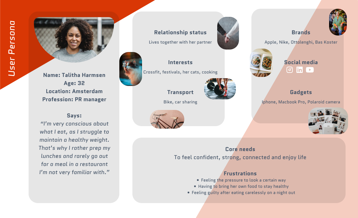
Meet Talitha, 32 years old an Amsterdam based PR manager. I displayed her preferences and interests above, together with a quote that summarizes what I learned from the interviews; the struggle to maintain a healthy weight and the trouble people go through to do so (including prepping meals and endlessly scrolling through restaurant menus to find a meal they feel comfortable with).
To narrow down the touchpoints and opportunities for the new feature, I reconstructed a situation a MFP user like Talitha might find herself in, in maintaining her healthy goals. The Journey Map also shows the different phases, actions, and emotions.
Especially the struggle to maintain both a social and healthy lifestyle, resonated with me. It defines a deeply-rooted problem MyFitnessPal might start to solve with this feature.
How will this feature boost the brand strategically?
If done right, this new feature helps MyFitnessPal optimize its market position. To make sure not to waste any opportunities here, I created a UX Strategy Blueprint to zoom in on the company’s challenges, aspirations and guiding principles.

Next, I analyzed four competitors that have a strong resemblance to MyFitnessPal. What I discovered, comparing the apps, is that they seem very alike in terms of app features. Actually, the only distinct difference I could find was the pricing. Weight Watchers doesn’t offer a limitless free version that stands by itself. As far as I can tell from this first analysis, the user’s choice now mostly depends on brand and design preferences. It’s also clear that there’s a big market for these types of apps.
Whereas competitors focus only on food tracking, recipes and exercise, MyFitnesspal could lift its proposition by focusing on how to implement healthy choices in everyday social life. That’s why I will be mainly looking at ways to match the desire for a healthy and social life balance, with the community driven power of the brand.
Define: What to focus on?
How might we help the user find healthy and enjoyable alternatives (user’s needs)? By creating a feature that helps the user find nearby options for healthy meals, MyFitnessPal has the opportunity to create a more active community (brand’s promise) and a distinct advantage over its now very similar competitors in the international market (brand’s position).
That’s why I focused on providing the user community recommended places for healthy meals and sharing options first. This is most in line with what I found from research. I will look for ways to implement the feature in a way that feels natural to the user. For now, I won’t focus on a redesign of the current app structure.


I started out with a MOSCOW model and different userflows to ideate on what the path would be needing to connect to the core of my research. From here I decided on a flow and created a lo-fi and mid-fi wireframe for usability testing.

For this I designed one path to see if users would intuitively finish the task of finding and selecting a restaurant onto making a reservation. It was incredibly valuable, and very humbling, to see how far from happy the first userpath turned out to be. Again, I chose not to change anything about the current design of the app. Instead I rallied the feature behind the ‘More’ item in the menu, where all features are hidden except for the food tracking. And hidden it was. Analyzing the usability heatmaps was like browsing volcanic landscapes.
Therefore I added two alternative paths to the design that would lead directly from the home screen to the recommendations feature. These two paths would serve as an A/B test to see where the user would navigate to. In the image I highlighted the new sections, plus section C, the troublemaker in the first test, which I will keep in the design for consistency purposes.
Providing new options to the user turned out to help significantly. It was clear to see which of the paths worked for the user, improving the direct success rate of the task by 27%.
Talking to testers, I also found out that the copy used for the buttons could be improved, which I also adjusted in my last prototype.
Below the result of the final design I made for this project. It’s a mash-up of two paths; the longest path from the homescreen to making a reservation, and the shortest path, skipping the menu and map view.

The Results
My research showed that over 75% of the respondents would be interested in using the feature. Taking into account that almost 85% of the respondents were using, or would be interested in using the app, that is still around 65% of the respondents. Of course I would recommend research and testing on a greater scale. But even if half of the users would behave accordingly, it would mean that the feature adds significant traffic and is very likely to attract users from other fitness apps to the MyFitnessPal platform. And the costs? After development, it will be mostly the community that keeps the feature running and up to date.
The feature could be the user’s tool to (re)add a social element to their healthy lifestyle and find the balance they’re seeking. And MyFitnessPal demonstrates true understanding for its user’s needs, which strengthens the brand’s image as a community service.
Methods and models used:
Design Thinking | Competitors analysis | Positioning chart | Lean Survey Canvas | Interviews | Affinity diagram | Empathy Map | UX Strategy Blueprint | User persona | User Journey Map | How Might We, Problem and Hypothesis Statements | Userflows | MOSCOW | Usability testing | Lo-fi, mid-fi and hi-fi wireframes

