Case study: Share food delivery orders with friends
A UX case study, from User Research to Hi-fi Prototype

Intro
For my first solo project at Ironhack’s UX/UI bootcamp, I had to design a new feature for Glovo app that would allow users to place shared food delivery orders.
Process summary
This feature was designed following a Lean approach.
- Learning: market research, competitive analysis, user research with interviews to define the user persona and customer journey.
- Building: defined scenarios and use cases low-fi wireframes, hi-fi wireframes, prototypes.
- Measuring: usability tests.
Outcome: a high fidelity prototype of the feature.
About Glovo
Glovo is a Spanish app with international presence, whose value proposition is being able to receive anything you need anywhere in your city. (Almost) anything can be delivered through Glovo, but one of its most popular features is food delivery orders.
How do people order food delivery?
According to a recent study by Just Eat, 66% of users who order food delivery do it with their couple, 26% with family and 13% with friends. Only 13% of people order food for their own.
User interviews
Goal: understand users behaviour when they order food delivery for several people.
I interviewed 7 people aged from 25 to 35, that use food delivery apps to discover what are their pains while ordering food for a group meal.

Jimena and Alex Friday’s dinner
Let’s help Jimena create a shared order with Alex
User Personas


Scenario
Tonight Jimena invited her friend Alex home for dinner. It’s the first time they meet in months. She is very excited and doesn’t want to lose time cooking, so she is thinking about ordering food with Glovo.
Customer journey
With the current Glovo functionalities this would be Jimena’s customer journey:

We can clearly see 2 pain points in Jimena’s current customer journey:
🎯 Jimena needs to be able to order food from different restaurants in the same order.
🎯 She wants that each can pay his/her share of the order, because she doesn’t want to have to remind Alex his payment.
Problem statement
All these data and insights were put into an affinity diagram in order to get to the problem I will try to solve:
Glovo users need a way to order food delivery with more people in which each can order, pay his/her own food and make sure it all arrives at the same time.
How does competition answer these pain points?
In the competitive analysis I included Just Eat, Deliveroo and Uber Eats. Only Uber eats allows to place group orders in which each user can choose and pay his own food, but this feature is only available on the web platform for the US market. And it only works for orders placed in 1 restaurant.
So there is currently no one offering a solution to Jimena’s problem.
How can we offer Jimena de chance to create a food delivery order with her friend Alex, in which each can choose and pay his/her own share of the order?
It’s time for ideation
It was now time for ideation and thinking about ways in which users could create a shared order. With 3 ideas on the table, with which I conducted a concept testing with 6 users to understand which one matched better my user’s mental model.
The best accepted idea was being able to create a shared order and include people in it from your phone contacts directly.
User flow definition
How will users order a shared delivery with Glovo?
The goal was to design a seamless experience, so that the new feature fits perfectly in Glovo’s existing product.
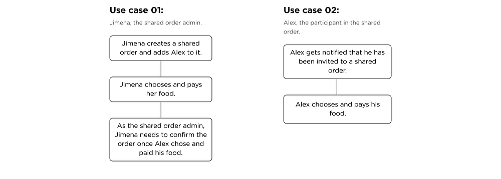
We also need to take into account 2 use cases and flows:
- Creating the shared order
- Participating in a shared order

Ordering a shared food delivery order
Jimena and Alex will neither have to argue about what to have for dinner, nor will Jimena need to remind Alex to pay his part, because each will be able to choose and pay their own.
Here is the final result of the new feature integrated in Glovo, to which I arrived after doing 3 usability tests and applying the changes needed according to user’s feedback.
👉 Jimena’s prototype
👉 Alex’s prototype
Iterations: validation through user testing
3 user testings were done, with 5 users each, which were essential to iterate the feature on:
- Introducing the new functionality to the user
- Steps and sequence to complete a shared order
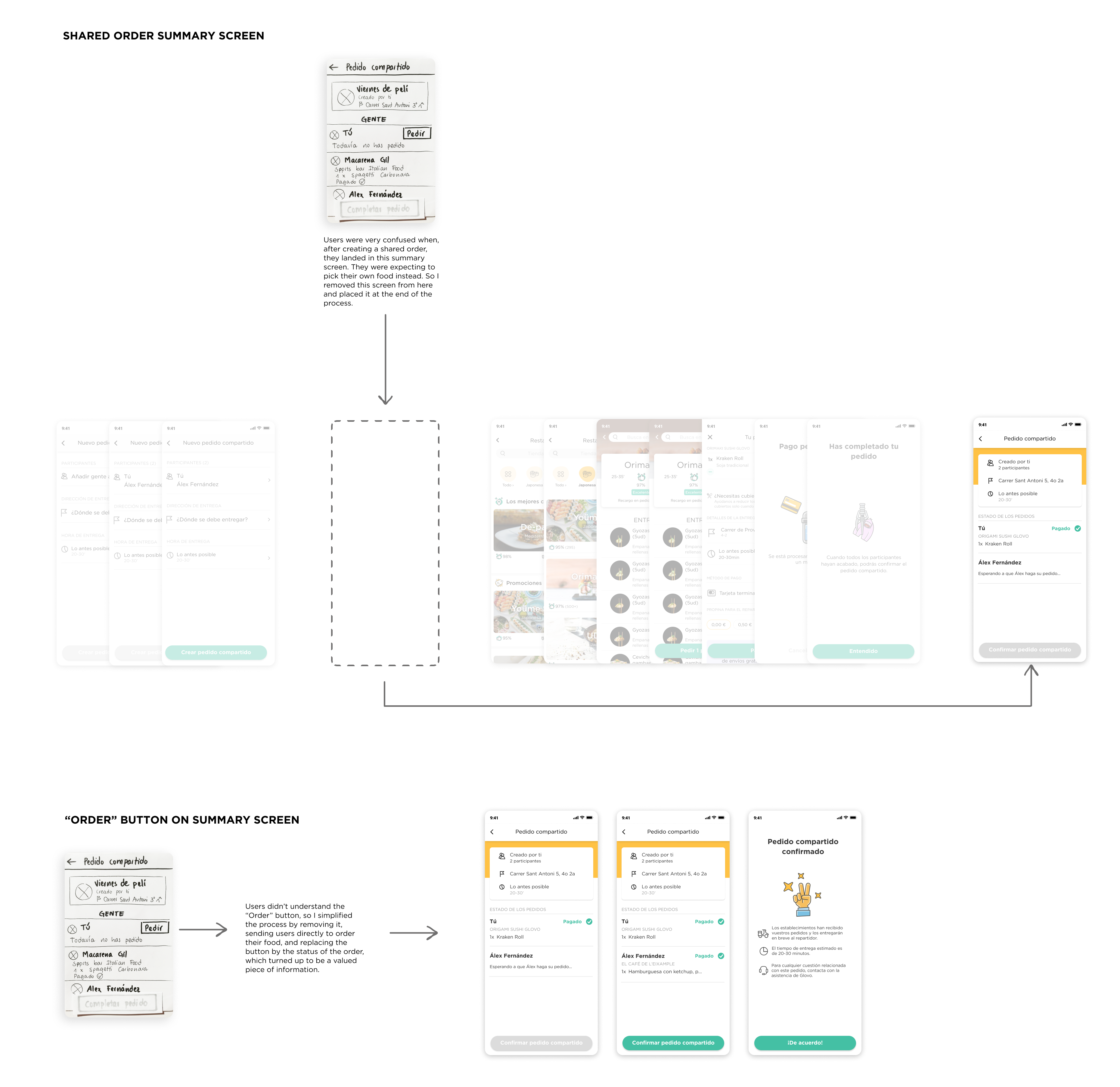
- Shared order summary screen
Iteration 1: Introducing the new feature to the user
First tests were done on a low fi prototype. Users understood and liked the feature but were missing an onboarding to know what to expect from the feature and how it works.
When testing the mid fi prototype, I realised users were happy to have the onboarding screen, but did not read it or remember what it said 2 screens after seeing it. So I decided to include some feedback screens along the flow after every action taken, telling the user what happened and what to do next.

Iteration 2: Steps and sequence to complete a shared order
The goal here was to introduce as little new steps as possible to be able to create a shared order, and keep the flow similar to how it is now.
After testing the low fi prototype, I removed some of the steps which added no value according to users feedback, like adding a name or a photo to the shared order.

Iteration 3: Shared order summary screen
On the low and mid-fi user testing, the flow was as follows:
Add participants → Add address → Add delivery time → Shared order screen
On the last screen, users could see the summary of the shared order that they just created and click on “Place my order”. But user testing showed that this was very confusing. Users were expecting to go straight to order their own food, so I removed this screen from this point in the flow and placed it right after the user orders his/her food.

Retrospective
Learnings and outcomes
After 2 weeks working on this project on my own, I got some learnings that are worth mentioning here:
- Plan your research carefully: It is key to take the right approach during the investigation phase, knowing what is your goal and what information you need to get from it.
- The answer is in the data: If you got your research right, then the data will give you the solution (almost) by itself.
- Test, test and test again. And never ever think that the design will be obvious, because it might be for you but not for the user. Don’t take anything for granted but test it instead.
Thanks for reading 🙌🏻
If you have any comment, suggestion, or just want to connect and have a chat, you can find me on Linkedin.

